
Recommended
More Related Content
What's hot
What's hot (17)
More from JadeOckerby
Recently uploaded
Recently uploaded (20)
Colour scheme media
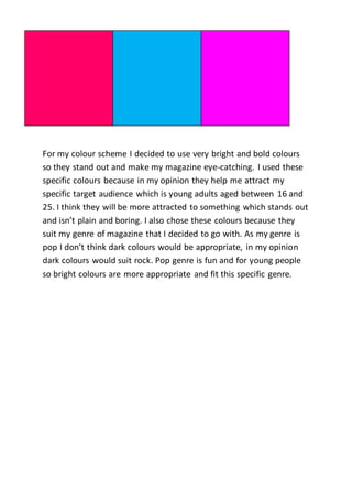
- 1. For my colour scheme I decided to use very bright and bold colours so they stand out and make my magazine eye-catching. I used these specific colours because in my opinion they help me attract my specific target audience which is young adults aged between 16 and 25. I think they will be more attracted to something which stands out and isn’t plain and boring. I also chose these colours because they suit my genre of magazine that I decided to go with. As my genre is pop I don’t think dark colours would be appropriate, in my opinion dark colours would suit rock. Pop genre is fun and for young people so bright colours are more appropriate and fit this specific genre.