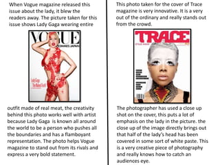
1. When Vogue magazine released this This photo taken for the cover of Trace
issue about the lady, it blew the magazine is very innovative. It is a very
readers away. The picture taken for this out of the ordinary and really stands out
issue shows Lady Gaga wearing entire from the crowd.
outfit made of real meat, the creativity The photographer has used a close up
behind this photo works well with artist shot on the cover, this puts a lot of
because Lady Gaga is known all around emphasis on the lady in the picture. the
the world to be a person who pushes all close up of the image directly brings out
the boundaries and has a flamboyant that half of the lady’s head has been
representation. The photo helps Vogue covered in some sort of white paste. This
magazine to stand out from its rivals and is a very creative piece of photography
express a very bold statement. and really knows how to catch an
audiences eye.
2. When Q magazine released issue it was The cover featuring Kings Of Leon however
there worst ever selling till date. Cheryl more fitted the readers of Q magazine. The
Cole is not the artist that the Q readers photo used for the cover shows the band
were particularly drawn to. Q is known for jumping through glass as if they were coming
appealing to a much older audience than out the photo.
magazines such as NME.
Cheryl Cole is not your usual rock chick artist
therefore she didn’t fit in with the way she This relates to the slogan “Break Through”
was being represented in the picture. Q’s used on the issue. The photo brings a
audience being older than a lot of other freshness to the band because they have
magazines meant that they would not be had so much success and relates to what
drawn to read this issue if they saw an artist the band is really about. The photo and text
who fits the genre of hip pop and younger used on the cover would definitely make
people lie to see readers want to buy the issue.
3. Clash magazine are known for the This picture of singer Beyoncé on the cover
simplistic covers and strong eye catching Billboard is very stylish and comes across as
photography. This cover in particular is quite fashionable. The picture uses very
very bold and would catch anybody's simple and natural colures that when all put
eye. together they compliment all aspects of the
photo.
The close photo uses a basic colure
Also her hair is done in a way that the
scheme of blue and white. The blue used
surrounding headline and straplines on
is very bright and allows the white stand
the covers are framing her face. The range
out against it. The cover is so simple yet it
of font used on the cover is playful and
makes readers so intrigued by taken on
breaks up the different features it also
the futuristic theme making people think
makes it easier for the readers.
what could be inside.