This is a Double Page Spread taken from alternative music magazine NME. The layout of this double 
page spread (DPS) is very catchy to the eye, this is because it is very bold and uses thick black colours 
on a white background. This will help the pictures and text to stand out. Additionally, there is only 
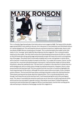
one photo of Mark Ronson smashing up a trumpet. This is entertaining for the reader as the title 
states it is his ‘revenge’ which adds the idea of gossip into the magazine. This is romanticised to 
stand out to the reader. The title itself can be seen to be breaking conventions of a DPS as it starts 
on the left hand side rolling up the page and proceeds to state the name of an artist running along 
top of the pages. The photo itself is extremely simplistic with a man sitting down in stylish attire, 
with a hammer in hand and a broken trumpet on the floor. To a reader this screams ‘stories’ as this 
is peculiar for a musician to be destroying an instrument, it will entice the reader to find out what 
the photo is about by reading the text. The text itself is simplistic in the idea that it is black text on a 
white background, with no really colour change to emphasise key points. However, there is a box 
present within the text box itself. This has a quote from the musician in it and thus highlights the 
most important part of the article. Although this article seems to be very simple, it has a complex 
system of boxes. The text and title have boxes outlining its borders as does the starting character. 
These boxes overlap and can draw attention towards them. This is counterproductive as, even 
though it will draw the eye to the text box itself, it will keep drawing the eye to the overlapped 
areas. This doesn’t seemed to be aimed at a particular sex as there are no defining features of the 
article and can be concluded it is gender neutral. Alternative music doesn’t follow the general 
conventions and neither does this magazine DPS as it overlays boxes, has the title running up the 
side and having no indication of what page number this magazine is.
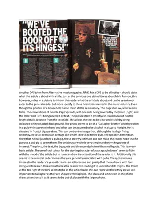
Another DPS taken from Alternative music magazine, NME. For a DPS to be effective it should state 
what the article is about with a title, just as the previous one stated it was about Mark Ronson, this 
however, relies on a picture to inform the reader what the article is about and can be seen to not 
cater to the general reader but more specify to those heavily interested in the music industry. Even 
though the photo is of a household name, it can still be seen as lazy. The pages foll ow, what seems 
to be, the conventions of Double Page Spreads, with one side being covered by the photo (right) and 
the other side (left) being covered by text. The picture itself it effective in its colours as it has the 
bright details separate from the text side. This allows the text to be clear and visible by being 
coloured white on a dark background. The photo seems to be of a ‘Gallagher Brother’ and shows him 
in a pub with cigarette in hand and what can be assumed to be alcohol in a cup to his right. He is 
situated in front of big speakers. This can portray the image that, although he is a high flying 
celebrity, he is still seen as an average Joe whom likes to go to the pub. The speakers behind can 
show that he had just done a pub gig, these are very intimate and can make the reader hope that he 
goes to a pub gig to seem them. The article as a whole is very simple and only 4 key points of 
interest. The photo, the text, the big quote and the second photo with a small quote. This is a very 
basic article. The use of teal colour for the starting character of a paragraph doesn’t seem to fit in 
with the mood of the article but in turn can draw the attention of the reader to it. Additionally this 
seems to be aimed at older men as they are generally associated with pubs. The quote induces 
interest in the readers’ eyes as it creates an action scene and gossip that the audience with feel 
intrigued to reader. This almost forces the reader into reading it to understand its origins. The Photo 
at the top right of the DPS seems to be of the whole band, this can represent how they are all still 
important to Gallagher as they are shown with his photo. The black and white edit on the photo 
draws attention to it as it seems to be out of place with the larger photo.
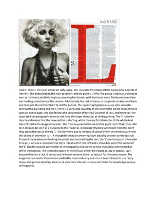
Taken From Q. This is an article on Lady GaGa. This is a extremely basic article having only 3 points of 
interest. The photo (right), the main text (left) and the giant ‘L’ (left). The photo is obviously aimed at 
men as it shows Lady GaGa topless, covering her breasts with her hands and a flamboyant necklace 
and looking seductively at the camera. Additionally, the lack of colour in the photo is extremely basic 
and relies on the content itself to sell the picture. This is portraying GaGa as a sex icon, aimed at 
teens with a big libido and men. There is a very large quantity of text within the article that seems to 
span an entire page, this also follows the convention of having 3 Columns of text, and however, the 
separated key paragraphs seem to not have the larger character at the beginning. The ‘S’ is shown 
clearly and means that the new section is starting, while the very first character of the whole text 
doesn’t start with a bigger character. The final key point of interest is the giant red ‘L’ that covers the 
text. This can be seen as a nuisance to the reader as it consistently draws attention from the point 
they are in the text to the big ‘L’. Furthermore due to the lack of colour within the article as a whole 
this draws all attention to it. Although this may be annoying it can actually be seen as very tactical. 
To avoid the reader only looking the photo and not reading the text, the ‘L’ seems to push the reader 
to read. It acts as a reminder that there is text within this DPS and it should be seen! The colour of 
the ‘L’ also follows the convention of the magazine as it seems to have the colour scheme Red on 
White throughout. The simplistic nature of the DPS can either be viewed as lazy or tactical. Lazy 
because there is a lack of colour and relies on content alone, or tactical for the same reason. The 
magazine is aimed at those interested in the music industry and in turn doesn’t need to use fancy 
colour and pictures to draw them in, it uses their interest in music and thirst for knowledge as a key 
selling point.

Dps analysis

  • 1.
    This is aDouble Page Spread taken from alternative music magazine NME. The layout of this double page spread (DPS) is very catchy to the eye, this is because it is very bold and uses thick black colours on a white background. This will help the pictures and text to stand out. Additionally, there is only one photo of Mark Ronson smashing up a trumpet. This is entertaining for the reader as the title states it is his ‘revenge’ which adds the idea of gossip into the magazine. This is romanticised to stand out to the reader. The title itself can be seen to be breaking conventions of a DPS as it starts on the left hand side rolling up the page and proceeds to state the name of an artist running along top of the pages. The photo itself is extremely simplistic with a man sitting down in stylish attire, with a hammer in hand and a broken trumpet on the floor. To a reader this screams ‘stories’ as this is peculiar for a musician to be destroying an instrument, it will entice the reader to find out what the photo is about by reading the text. The text itself is simplistic in the idea that it is black text on a white background, with no really colour change to emphasise key points. However, there is a box present within the text box itself. This has a quote from the musician in it and thus highlights the most important part of the article. Although this article seems to be very simple, it has a complex system of boxes. The text and title have boxes outlining its borders as does the starting character. These boxes overlap and can draw attention towards them. This is counterproductive as, even though it will draw the eye to the text box itself, it will keep drawing the eye to the overlapped areas. This doesn’t seemed to be aimed at a particular sex as there are no defining features of the article and can be concluded it is gender neutral. Alternative music doesn’t follow the general conventions and neither does this magazine DPS as it overlays boxes, has the title running up the side and having no indication of what page number this magazine is.
  • 2.
    Another DPS takenfrom Alternative music magazine, NME. For a DPS to be effective it should state what the article is about with a title, just as the previous one stated it was about Mark Ronson, this however, relies on a picture to inform the reader what the article is about and can be seen to not cater to the general reader but more specify to those heavily interested in the music industry. Even though the photo is of a household name, it can still be seen as lazy. The pages foll ow, what seems to be, the conventions of Double Page Spreads, with one side being covered by the photo (right) and the other side (left) being covered by text. The picture itself it effective in its colours as it has the bright details separate from the text side. This allows the text to be clear and visible by being coloured white on a dark background. The photo seems to be of a ‘Gallagher Brother’ and shows him in a pub with cigarette in hand and what can be assumed to be alcohol in a cup to his right. He is situated in front of big speakers. This can portray the image that, although he is a high flying celebrity, he is still seen as an average Joe whom likes to go to the pub. The speakers behind can show that he had just done a pub gig, these are very intimate and can make the reader hope that he goes to a pub gig to seem them. The article as a whole is very simple and only 4 key points of interest. The photo, the text, the big quote and the second photo with a small quote. This is a very basic article. The use of teal colour for the starting character of a paragraph doesn’t seem to fit in with the mood of the article but in turn can draw the attention of the reader to it. Additionally this seems to be aimed at older men as they are generally associated with pubs. The quote induces interest in the readers’ eyes as it creates an action scene and gossip that the audience with feel intrigued to reader. This almost forces the reader into reading it to understand its origins. The Photo at the top right of the DPS seems to be of the whole band, this can represent how they are all still important to Gallagher as they are shown with his photo. The black and white edit on the photo draws attention to it as it seems to be out of place with the larger photo.
  • 3.
    Taken From Q.This is an article on Lady GaGa. This is a extremely basic article having only 3 points of interest. The photo (right), the main text (left) and the giant ‘L’ (left). The photo is obviously aimed at men as it shows Lady GaGa topless, covering her breasts with her hands and a flamboyant necklace and looking seductively at the camera. Additionally, the lack of colour in the photo is extremely basic and relies on the content itself to sell the picture. This is portraying GaGa as a sex icon, aimed at teens with a big libido and men. There is a very large quantity of text within the article that seems to span an entire page, this also follows the convention of having 3 Columns of text, and however, the separated key paragraphs seem to not have the larger character at the beginning. The ‘S’ is shown clearly and means that the new section is starting, while the very first character of the whole text doesn’t start with a bigger character. The final key point of interest is the giant red ‘L’ that covers the text. This can be seen as a nuisance to the reader as it consistently draws attention from the point they are in the text to the big ‘L’. Furthermore due to the lack of colour within the article as a whole this draws all attention to it. Although this may be annoying it can actually be seen as very tactical. To avoid the reader only looking the photo and not reading the text, the ‘L’ seems to push the reader to read. It acts as a reminder that there is text within this DPS and it should be seen! The colour of the ‘L’ also follows the convention of the magazine as it seems to have the colour scheme Red on White throughout. The simplistic nature of the DPS can either be viewed as lazy or tactical. Lazy because there is a lack of colour and relies on content alone, or tactical for the same reason. The magazine is aimed at those interested in the music industry and in turn doesn’t need to use fancy colour and pictures to draw them in, it uses their interest in music and thirst for knowledge as a key selling point.