Strategies for Unlocking Knowledge Management in Microsoft 365 in the Copilot...
Article Anaylisis
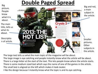
1. Double Paged Spread
The large text tells us what the main topic of the magazine will be about.
The large image is eye catching and people instantly know what the article will be about.
There is a large letter at the start of the text. This lets people know where the article starts.
There is some medium sized text which says the name of one of the games in the article.
The small text is aligned on the left which makes it look neater.
I like the design because I instantly know what the topic is and its eye catching.
The main
title, tells us
what its
about.
Big and red,
a main
subject in
the article.
Big
picture.
People
know
what it is
about.
Smaller
pictures.
Other
subjects in
the article.
Descriptio
n of article.
2. Double Paged Spread
The image spreads across the entire image and shows us what the article will be
about. A lot of people will instantly recognize what the film is.
The text at the top is large and does not directly tell us what the article will be about.
There is some bold medium sized text below the large text which is a quote which is
meant to hype up the film.
The new James Bond is on the front cover and the car from the older films. The main
title could be referring to this, or it could be referring to the return of an old film
series.
I like the design of the article because it catches my eye and looks very slick and clean.
Main Title.
Eye Catching.
Small text.
The main
contents of
the article.
Quote in bold,
slightly bigger
than main text.
The image fills the
whole page.