
Recommended
More Related Content
What's hot
What's hot (18)
Viewers also liked
Viewers also liked (17)
Similar to Font reserch and planning.
Similar to Font reserch and planning. (20)
More from Jacob Ellington
Recently uploaded
Recently uploaded (20)
Font reserch and planning.
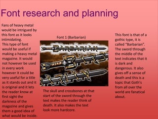
- 1. Font research and planning Font 1 (Barbarian) This font is that of a gothic type, it is called “Barbarian”. The sword through the middle of the text indicates that it is dark and dangerous. It also gives off a sense of death and this is a topic that Goth's from all over the world are fanatical about. The skull and crossbones at that start of the sword through the text makes the reader think of death. It also makes the text look more hardcore. Fans of heavy metal would be intrigued by this font as it looks intimidating. This type of font would be useful if making a heavy metal magazine. It would not however be used in every work however it could be very useful for a title as it stands out and it is original and it lets the reader know at first sight the darkness of the magazine and gives them a good idea of what would be inside.
- 2. Font Research and planning. The name of this font is “Royal Acid Bath”. The font is most commonly found of the rolling stone magazine logo. It fits it extremely well with the genre of the magazine as well. They fill the font with red to give it a dangerous edge. The style of the font is slick and jazzy and instantaneously when people see this font they think of rock and roll. Font two (Royal Acid Bath) Because the font is so well known but original it encourages the reader to buy the magazine “rolling stone”
- 3. Font research and Planning. This font is called “cheerful party” It indicates a party sort of sense that is generous. Its connotes that the text is happy and cheerful hence the name. this font would often be found in pop magazines. It would be most useful in a masthead as it stands out on the page and grabs the attention of the reader.