SlideShare a Scribd company logo
1 of 3
Masthead
The word ‘Metal’ is written inside the ‘H’ of the word
‘Hammer’. They are written in different fonts; ‘Metal’ is
written in a gritty, worn and beaten up looking sans serif
font, whereas the word ‘Hammer’ is fairly bold and solid,
also in a sans serif font, with a technique that the
Metallica logo used, which has these points on the H and
the R. This allows the logo to tie in heavily with the metal
genre, as when people see this logo they are instantly
going to associate it with the band Metallica thanks to this
small technique.
Banner
‘Slipknot’ is one of the first things we see when we look at the
page, as we tend to read from the top left of the page down to
the bottom right. It was tactically placed there to grab fans of the
bands attention. The banner is a the top of the page so when it is
on a magazine rack, it will stick out above the other magazines.
Fonts
Almost all of the cover lines and words on the page are
written in a white sans serif font, in capital letters and
with letters that are quite thin instead of being very bold.
This gives the page a more spacious look. The other fonts
used are either logos for bands, or the pull quote that says
“This is my vision” which is written in a graffiti, etched or
handwritten looking font; it looks quite manly as though
the person on the cover has etched it himself, or that it
has a deeper meaning. Almost all the text on the page is
written in white (some in yellow) which works as the
background is very dark and so it stands out well.
Cover Lines
The cover lines are placed on the left third of the page,
and feature lots of bands that are famous within the
metal scene. This will instantly attract any fans of those
bands who see the cover and will want to read about their
favourite bands. The fonts used are thin sans serif fonts in
a white text and all capital letters. The capital letters make
the text stand out to the reader. The main cover line
features a pull quote written in a gritty, graffiti and urban
looking font that reads “This is my vision”. The font used is
very conventional for a magazine based in the metal
genre, as it looks quite ‘hardcore’.
Colour scheme
The colours most commonly used on the cover are white, yellow and
black. The yellow and black elements (as seen in the puff/buzz box) look
very similar to the hazardous/toxic warning signs you often see, which are
often deadly. The magazine uses this technique as not only do the two
colours stand out extremely well, but the fact that they are associated
with these warning signs makes the cover look as though it itself is deadly,
relating fairly well into the ‘metal’ genre scene, as a lot of the music is
often about death, and warning things away. It draws the eye yet also has
connotations associated with the genre itself.
Main Image
A picture of Robb Flynn, the lead singer of the band Machine Head. He has
a very angry look on his face, and is using direct address by looking
straight into the camera. He almost looks as though he is looking directly
at the reader, intimidating them into buying the magazine. He is dressed
very stereotypically for someone in the metal scene; long hair, untidy
beard, tattoos, sleeveless denim jacket, angry face expression and edgy
wrist bands. Any reader who associates themselves within the metal
scene is going to see this man on the cover, and if they don’t know him
already from his band Machine Head, they will be likely to pick up the
magazine simply because he/she dresses the same or can relate to the
way Flynn dresses and the music associated with this look.
Puffs/buzz boxes
There is a diamond shaped box in the left third of the page that reads
“World Exclusive!”. They used colours not seen in much other places on
the magazine cover to make this box stand out, and the reader will think
because this is world exclusive they should definitely pick it up and give it
a read. Below the main cover line, there is also a small black and yellow
box that reads “Plus!”. This draws the readers attention to the other cover
lines in case they don’t care for the main cover line, so they still have a
reason to pick the magazine up.
Final Impression
The cover uses lots of stereotypical conventions that would be accepted
within the metal scene. It appeals heavily to those who are interested in
specific bands, or are looking to find new bands to listen to. The fonts and
colour schemes fit the genre well, and overall looks very attractive.
Layout
The contents are split neatly into two columns on the
left half of the page, right below the title which also
features the issue date. The list features a white
background as to stand out against the rest of the page
which features images. They wanted the list of contents
and articles to stand out as this is where the readers will
find exactly what they want within the magazine, and so
it is important that it is able to distinguish the contents
easily. They separated the list of articles from the
photos to organise things better, and used folios to
allow readers to match the articles with the pictures to
make it easier to find what page the photos are linked
to.
Font
On most areas of the page, the main font that is used is
an ancient/old-timey looking serif font. This is probably
due to the metal music genre being linked heavily (or
having similar connotations and associations) to things
of the past, war and the idea of battles and bloodshed.
The font makes the page distinguishable to other
magazine, as most other modern magazines would
choose a very blocky sans serif font. Other fonts on the
page (such as where it says "Incoming!" in the bottom
left hand corner of the page) features a blocky sans serif
font with scratch and ware marks on it, which would be
associated heavily with the metal genre and suits the
page and its themes well.
Contents Title
Metal Hammer logo is featured above the title to ensure the reader
recognises the brand upon seeing the page. The 'Contents' title is
found at the top left of the page as expected. Uses the same font
for the rest of the page and uses black colouring to stand out well
against the white background.
Images
The images on the page feature famous artists from within the genre, so
typically any reader who picks up the magazine and sees one of the
artists they like will want to purchase the magazine in order to read
about them. Every person featured in the images are dressed in a way
that would be expected within the genre; some of them have face
makeup, some have long hair and shaggy beards, they all wear dark
clothes, have wrist bands, some are playing guitars and other
instruments- all of these things are typical of people within this genre, so
people who dress the same way will see these icons and immediately
associate themselves within this genre and with this magazine. The
people in the images are representing a certain style and look.
Contents
Each different section of the contents page features a red folio, a black
contents title, and a description in a smaller font to let the reader know
exactly what the page article is about and what it features(some also
have subtitles that describe what the article is about). They are
organised neatly into two columns, and some articles have pictures
associated with them on the other half of the page, and uses folio
numbers to link the two together, as opposed to having the images right
next to their linked contents article that clutter the page. The contents
are also listed in chronological order, so the readers will find it easier to
find the page they are interested in, and can keep track of what page
they may want to read next.
Language
The language used on the page is extremely descriptive. For each section
of the contents page, there is a small blurb or description that comes
with it, allowing the reader to fully understand what is on each page
before they turn to it. For the titles, it is mostly very basic, as most of the
titles feature the name of the band the article is about, or a short
sentence or phrase that briefly describes the page. Most of the actual
language on the page is very informal, and uses techniques like
rhetorical questions to address the reader directly, giving a
friendly/welcoming attitude. On the right hand side of the page, under
where it says "Editor speaks", we see lots of informal langauge and
direct address used.
Extra features
The page features lots of additional info and features,
such as the 'editor speaks' section on the far right of the
page, which allows us to get info directly from the editor
himself about the magazine. Under the contents list we
also see info about reviews and small bits of
advertisement, appealing to those interested in the little
details in the magazine.
Main Image
Features the man seen on the cover of the magazine,
Robb Flynn, sitting on a throne confidently, implying
he is powerful, which is often what people that listen
to metal music want the most, to rebel and gain their
own power. He is dressed conventionally for someone
within the metal scene (long hair, beard, ripped denim
jacket, tattoos etc.). The throne looks very unique yet
also quite old-timey, which is a typical denotation for
imagery within this genre.
Themes
The whole page has a very dark,
ancient looking theme, which is very
stereotypical within the metal genre.
This is recognisable due to the
colours used (dark colours suck as
black, grey, and also a faded gold
type colour) and also due to the
imagery, which has denotations of
things such as thrones, head statues,
cold-looking brick walls, snakes etc.
The title of the article is also called
'Command and Conquer' which
immediately gives off connotations of
war, and ancient battles. The border
of the page looks as though it is an
ancient looking picture frame, which
represents how the audience may see
this genre, as a piece of art. The
metal genre often features lots of
connotations that are associated with
ancient mystery and history, which is
extremely different to what other
genres represent themselves as, and
so this whole page looks very unique
for a music magazine.
Pull Quote
The pull quote is centred in the middle of the article text, and is presented in a way that links to the
theme, which is in an almost arty and old-timey fashion (as the pull quote has these borders
around it almost like a picture frame). The quote reads "we knew the blackening would
overshadow whatever we did". It isn't very descriptive, so readers who turned to this page and
read the pull quote would be forced to read more to find out exactly what he is referring to. There
is also another pull quote beneath the main image, reading "Is it my vision? Yeah it is, it's been my
vision for 22 years". This pull quote adds an 'epic' sort of effect as he talks about his vision, and he
uses the '22 years' part to add to the periodic medieval theme and make it sound like he worked
hard to get to where he is today, which is admirable and makes his fans respect him.
Drop Cap
Found at the beginning of the text
in the article, it is written in an
almost fancy looking serif font and
features the same gold colour that
links to the theme. It is featured
on the page to ensure that the
reader knows exactly where to
begin reading, and also adds to the
aesthetic of the page.
Title
"Command & Conquer" has lots of
connotations the relate to the theme
that is medieval and old-timey, as this
phrase is often associated with battles
and war. It is written in a very fancy
looking font, that also links to the
theme, and the same golden colour
that is seen throughout the page. It
also has the same border type effect
around it as the pull quote, adding
aesthetic to the page, and once again
adding to the medieval looking theme.
Strapline
The strapline is quite long, and is found
underneath the title. It uses adjectives
like 'maddening' when describing his
'vision' to add to the effect that he
worked hard to get to where he is, and
gets him respect from his fans. It has an
'epic' sort of effect due to the language
used such as "being the general has
rarely been simple" to put Robb Flynn
on this pedestal and make him seem
like a god, linking to the main image
and the theme.

More Related Content

What's hot

Analysis of music magazine covers/contents/doublepage
Analysis of music magazine covers/contents/doublepageAnalysis of music magazine covers/contents/doublepage
Analysis of music magazine covers/contents/doublepagejamsterdj
 
Kerrang Magazine Deconstruction
Kerrang Magazine Deconstruction Kerrang Magazine Deconstruction
Kerrang Magazine Deconstruction bethhupchurchh
 
Analysis of music magazines
Analysis of music magazinesAnalysis of music magazines
Analysis of music magazinesLauraASMagazine
 
Analysis of Contents Page
Analysis of Contents PageAnalysis of Contents Page
Analysis of Contents PageLterry95
 
Analysis of existing products
Analysis of existing productsAnalysis of existing products
Analysis of existing productsLee Popplewell
 
AS Media Studies Evaluation Question 1
AS Media Studies Evaluation Question 1AS Media Studies Evaluation Question 1
AS Media Studies Evaluation Question 1Christopher Slemensek
 
Analysis of professional contents pages
Analysis of professional contents pages Analysis of professional contents pages
Analysis of professional contents pages katepownall
 
Analyse of front cover, contents and double page spread
Analyse of front cover, contents and double page spreadAnalyse of front cover, contents and double page spread
Analyse of front cover, contents and double page spreadasmediae15
 
Task 2 - Detailed Analysis of Music Magazines
Task 2 - Detailed Analysis of Music MagazinesTask 2 - Detailed Analysis of Music Magazines
Task 2 - Detailed Analysis of Music Magazinesayreslou
 
How to research music magazines web resource
How to research music magazines web resourceHow to research music magazines web resource
How to research music magazines web resourceGc Howard
 
Evaluation question 1
Evaluation question 1Evaluation question 1
Evaluation question 1asmediae15
 
Analysis of professional magazine front cover
Analysis of professional magazine front coverAnalysis of professional magazine front cover
Analysis of professional magazine front coverjacobcrossley37
 
Feature Article Analysis
Feature Article AnalysisFeature Article Analysis
Feature Article Analysisjessicahooker6
 
Analysis of front covers
Analysis of front coversAnalysis of front covers
Analysis of front coversJessicaolds
 

What's hot (16)

As 21
As 21As 21
As 21
 
Analysis of music magazine covers/contents/doublepage
Analysis of music magazine covers/contents/doublepageAnalysis of music magazine covers/contents/doublepage
Analysis of music magazine covers/contents/doublepage
 
Kerrang Magazine Deconstruction
Kerrang Magazine Deconstruction Kerrang Magazine Deconstruction
Kerrang Magazine Deconstruction
 
Analysis of music magazines
Analysis of music magazinesAnalysis of music magazines
Analysis of music magazines
 
Analysis of Contents Page
Analysis of Contents PageAnalysis of Contents Page
Analysis of Contents Page
 
Analysis of existing products
Analysis of existing productsAnalysis of existing products
Analysis of existing products
 
AS Media Studies Evaluation Question 1
AS Media Studies Evaluation Question 1AS Media Studies Evaluation Question 1
AS Media Studies Evaluation Question 1
 
Analysis of professional contents pages
Analysis of professional contents pages Analysis of professional contents pages
Analysis of professional contents pages
 
Question 1
Question 1Question 1
Question 1
 
Analyse of front cover, contents and double page spread
Analyse of front cover, contents and double page spreadAnalyse of front cover, contents and double page spread
Analyse of front cover, contents and double page spread
 
Task 2 - Detailed Analysis of Music Magazines
Task 2 - Detailed Analysis of Music MagazinesTask 2 - Detailed Analysis of Music Magazines
Task 2 - Detailed Analysis of Music Magazines
 
How to research music magazines web resource
How to research music magazines web resourceHow to research music magazines web resource
How to research music magazines web resource
 
Evaluation question 1
Evaluation question 1Evaluation question 1
Evaluation question 1
 
Analysis of professional magazine front cover
Analysis of professional magazine front coverAnalysis of professional magazine front cover
Analysis of professional magazine front cover
 
Feature Article Analysis
Feature Article AnalysisFeature Article Analysis
Feature Article Analysis
 
Analysis of front covers
Analysis of front coversAnalysis of front covers
Analysis of front covers
 

Viewers also liked

Metal hammer analysis
Metal hammer analysisMetal hammer analysis
Metal hammer analysiskieranhyde
 
Principales ventajas del SAI
Principales ventajas del SAIPrincipales ventajas del SAI
Principales ventajas del SAICastelec
 
Jim DeLorenzo: Public Speaking-Media Training Presentation July 2012
Jim DeLorenzo:  Public Speaking-Media Training Presentation July 2012Jim DeLorenzo:  Public Speaking-Media Training Presentation July 2012
Jim DeLorenzo: Public Speaking-Media Training Presentation July 2012Jim DeLorenzo
 
Public CIO Magazine February 2010
Public CIO Magazine February 2010Public CIO Magazine February 2010
Public CIO Magazine February 2010GovLoop
 
New Wine range for most European & ME Markets
New Wine range for most European & ME MarketsNew Wine range for most European & ME Markets
New Wine range for most European & ME MarketsRichard Tatton AIWS
 
Encuesta ausuarios de internet
Encuesta ausuarios de internetEncuesta ausuarios de internet
Encuesta ausuarios de internetDamian Emanuel
 
1 guía de propiedades periódicas 2011
1 guía de propiedades periódicas 20111 guía de propiedades periódicas 2011
1 guía de propiedades periódicas 2011frank8k8k8
 
uncertainty quantification of SPDEs with multi-dimensional Levy processes
uncertainty quantification of SPDEs with multi-dimensional Levy processesuncertainty quantification of SPDEs with multi-dimensional Levy processes
uncertainty quantification of SPDEs with multi-dimensional Levy processesZheng Mengdi
 
Chocolate suizo
Chocolate suizoChocolate suizo
Chocolate suizoordonez7
 
Oportunidades de negocio en turismo mediante tic
Oportunidades de negocio en turismo mediante ticOportunidades de negocio en turismo mediante tic
Oportunidades de negocio en turismo mediante ticJacques Bulchand
 
Unit 1 teaching english to children iv
Unit 1  teaching english to children ivUnit 1  teaching english to children iv
Unit 1 teaching english to children ivSandra Carrero
 

Viewers also liked (20)

Metal hammer analysis
Metal hammer analysisMetal hammer analysis
Metal hammer analysis
 
Principales ventajas del SAI
Principales ventajas del SAIPrincipales ventajas del SAI
Principales ventajas del SAI
 
OeKB: Bilanz Transfer im Überblick
OeKB: Bilanz Transfer im ÜberblickOeKB: Bilanz Transfer im Überblick
OeKB: Bilanz Transfer im Überblick
 
Jim DeLorenzo: Public Speaking-Media Training Presentation July 2012
Jim DeLorenzo:  Public Speaking-Media Training Presentation July 2012Jim DeLorenzo:  Public Speaking-Media Training Presentation July 2012
Jim DeLorenzo: Public Speaking-Media Training Presentation July 2012
 
“Pregnant adolescents- Delivering on global promises of hope” (WHO) 2006
 “Pregnant adolescents- Delivering on global promises of hope” (WHO) 2006 “Pregnant adolescents- Delivering on global promises of hope” (WHO) 2006
“Pregnant adolescents- Delivering on global promises of hope” (WHO) 2006
 
Ardora 3
Ardora 3Ardora 3
Ardora 3
 
Public CIO Magazine February 2010
Public CIO Magazine February 2010Public CIO Magazine February 2010
Public CIO Magazine February 2010
 
New Wine range for most European & ME Markets
New Wine range for most European & ME MarketsNew Wine range for most European & ME Markets
New Wine range for most European & ME Markets
 
Encuesta ausuarios de internet
Encuesta ausuarios de internetEncuesta ausuarios de internet
Encuesta ausuarios de internet
 
Fashion House Group llc
Fashion House Group llcFashion House Group llc
Fashion House Group llc
 
1 guía de propiedades periódicas 2011
1 guía de propiedades periódicas 20111 guía de propiedades periódicas 2011
1 guía de propiedades periódicas 2011
 
uncertainty quantification of SPDEs with multi-dimensional Levy processes
uncertainty quantification of SPDEs with multi-dimensional Levy processesuncertainty quantification of SPDEs with multi-dimensional Levy processes
uncertainty quantification of SPDEs with multi-dimensional Levy processes
 
Playas de veracruz
Playas de veracruzPlayas de veracruz
Playas de veracruz
 
Chocolate suizo
Chocolate suizoChocolate suizo
Chocolate suizo
 
Oportunidades de negocio en turismo mediante tic
Oportunidades de negocio en turismo mediante ticOportunidades de negocio en turismo mediante tic
Oportunidades de negocio en turismo mediante tic
 
Controldeperdidas 100708203705-phpapp01
Controldeperdidas 100708203705-phpapp01Controldeperdidas 100708203705-phpapp01
Controldeperdidas 100708203705-phpapp01
 
Evoca. Número 5. Identidad digital y reputación online
Evoca. Número 5. Identidad digital y reputación onlineEvoca. Número 5. Identidad digital y reputación online
Evoca. Número 5. Identidad digital y reputación online
 
Unit 1 teaching english to children iv
Unit 1  teaching english to children ivUnit 1  teaching english to children iv
Unit 1 teaching english to children iv
 
Texto edelstein
Texto edelsteinTexto edelstein
Texto edelstein
 
Turismo de cruceros
Turismo de crucerosTurismo de cruceros
Turismo de cruceros
 

Similar to Metal Hammer Magazine Analysis

Media contents and dps analysis
Media contents and dps analysis Media contents and dps analysis
Media contents and dps analysis RahSutton
 
Covers research
Covers researchCovers research
Covers researchaarons0902
 
Media Evaluation - Quuestion 1
Media Evaluation - Quuestion 1Media Evaluation - Quuestion 1
Media Evaluation - Quuestion 1KatyBB1997
 
Magazine research
Magazine researchMagazine research
Magazine researchcurtcollis
 
musi magazine double Page Spread
musi magazine double Page Spreadmusi magazine double Page Spread
musi magazine double Page SpreadTheo Perry
 
Double Page Spread
Double Page SpreadDouble Page Spread
Double Page SpreadTheo Perry
 
Music Magazine Analysis
Music Magazine AnalysisMusic Magazine Analysis
Music Magazine Analysisliamsacko
 
Music contents codes and codes and conventions
Music contents codes and codes and conventionsMusic contents codes and codes and conventions
Music contents codes and codes and conventionsbs05067421
 
Kerrang Magazine Deconstruction
Kerrang Magazine Deconstruction Kerrang Magazine Deconstruction
Kerrang Magazine Deconstruction katedawsonn97
 
Contents Research
Contents ResearchContents Research
Contents ResearchTheo Perry
 
Music and school Magazine analysis
Music and school Magazine analysisMusic and school Magazine analysis
Music and school Magazine analysishalimashalim
 
Magazine Cover Deconstruction
Magazine Cover DeconstructionMagazine Cover Deconstruction
Magazine Cover DeconstructionLawrenceNorman
 
AS Media Analysis of Music Magazines
AS Media Analysis of Music MagazinesAS Media Analysis of Music Magazines
AS Media Analysis of Music MagazinesIxDooom
 
Magazine cover analysis_worksheet deadmau5 contents rap
Magazine cover analysis_worksheet deadmau5 contents rapMagazine cover analysis_worksheet deadmau5 contents rap
Magazine cover analysis_worksheet deadmau5 contents rapHarryateccles
 

Similar to Metal Hammer Magazine Analysis (20)

Media contents and dps analysis
Media contents and dps analysis Media contents and dps analysis
Media contents and dps analysis
 
Covers research
Covers researchCovers research
Covers research
 
Media Evaluation - Quuestion 1
Media Evaluation - Quuestion 1Media Evaluation - Quuestion 1
Media Evaluation - Quuestion 1
 
Magazine research
Magazine researchMagazine research
Magazine research
 
As 21
As 21As 21
As 21
 
Music
MusicMusic
Music
 
DPS 1
DPS 1DPS 1
DPS 1
 
musi magazine double Page Spread
musi magazine double Page Spreadmusi magazine double Page Spread
musi magazine double Page Spread
 
Double Page Spread
Double Page SpreadDouble Page Spread
Double Page Spread
 
Music Magazine Analysis
Music Magazine AnalysisMusic Magazine Analysis
Music Magazine Analysis
 
Music contents codes and codes and conventions
Music contents codes and codes and conventionsMusic contents codes and codes and conventions
Music contents codes and codes and conventions
 
Kerrang Magazine Deconstruction
Kerrang Magazine Deconstruction Kerrang Magazine Deconstruction
Kerrang Magazine Deconstruction
 
Contents Research
Contents ResearchContents Research
Contents Research
 
Music and school Magazine analysis
Music and school Magazine analysisMusic and school Magazine analysis
Music and school Magazine analysis
 
Magazine Cover Deconstruction
Magazine Cover DeconstructionMagazine Cover Deconstruction
Magazine Cover Deconstruction
 
Billboard
BillboardBillboard
Billboard
 
AS Media Analysis of Music Magazines
AS Media Analysis of Music MagazinesAS Media Analysis of Music Magazines
AS Media Analysis of Music Magazines
 
Magazine cover analysis_worksheet deadmau5 contents rap
Magazine cover analysis_worksheet deadmau5 contents rapMagazine cover analysis_worksheet deadmau5 contents rap
Magazine cover analysis_worksheet deadmau5 contents rap
 
Classic Rock
Classic Rock Classic Rock
Classic Rock
 
Media magaine analysis
Media magaine analysisMedia magaine analysis
Media magaine analysis
 

More from Ronnie Smyth

Evaluation Question 1
Evaluation Question 1Evaluation Question 1
Evaluation Question 1Ronnie Smyth
 
Storyboard for music video
Storyboard for music videoStoryboard for music video
Storyboard for music videoRonnie Smyth
 
Music video treatment
Music video treatmentMusic video treatment
Music video treatmentRonnie Smyth
 
Questionnaire results
Questionnaire resultsQuestionnaire results
Questionnaire resultsRonnie Smyth
 

More from Ronnie Smyth (6)

Evaluation Question 1
Evaluation Question 1Evaluation Question 1
Evaluation Question 1
 
Risk assessment
Risk assessmentRisk assessment
Risk assessment
 
Storyboard for music video
Storyboard for music videoStoryboard for music video
Storyboard for music video
 
Music video treatment
Music video treatmentMusic video treatment
Music video treatment
 
PHOTO SHOOT 1
PHOTO SHOOT 1PHOTO SHOOT 1
PHOTO SHOOT 1
 
Questionnaire results
Questionnaire resultsQuestionnaire results
Questionnaire results
 

Recently uploaded

Painted Grey Ware.pptx, PGW Culture of India
Painted Grey Ware.pptx, PGW Culture of IndiaPainted Grey Ware.pptx, PGW Culture of India
Painted Grey Ware.pptx, PGW Culture of IndiaVirag Sontakke
 
Blooming Together_ Growing a Community Garden Worksheet.docx
Blooming Together_ Growing a Community Garden Worksheet.docxBlooming Together_ Growing a Community Garden Worksheet.docx
Blooming Together_ Growing a Community Garden Worksheet.docxUnboundStockton
 
Employee wellbeing at the workplace.pptx
Employee wellbeing at the workplace.pptxEmployee wellbeing at the workplace.pptx
Employee wellbeing at the workplace.pptxNirmalaLoungPoorunde1
 
MARGINALIZATION (Different learners in Marginalized Group
MARGINALIZATION (Different learners in Marginalized GroupMARGINALIZATION (Different learners in Marginalized Group
MARGINALIZATION (Different learners in Marginalized GroupJonathanParaisoCruz
 
Meghan Sutherland In Media Res Media Component
Meghan Sutherland In Media Res Media ComponentMeghan Sutherland In Media Res Media Component
Meghan Sutherland In Media Res Media ComponentInMediaRes1
 
What is Model Inheritance in Odoo 17 ERP
What is Model Inheritance in Odoo 17 ERPWhat is Model Inheritance in Odoo 17 ERP
What is Model Inheritance in Odoo 17 ERPCeline George
 
ENGLISH 7_Q4_LESSON 2_ Employing a Variety of Strategies for Effective Interp...
ENGLISH 7_Q4_LESSON 2_ Employing a Variety of Strategies for Effective Interp...ENGLISH 7_Q4_LESSON 2_ Employing a Variety of Strategies for Effective Interp...
ENGLISH 7_Q4_LESSON 2_ Employing a Variety of Strategies for Effective Interp...JhezDiaz1
 
Organic Name Reactions for the students and aspirants of Chemistry12th.pptx
Organic Name Reactions  for the students and aspirants of Chemistry12th.pptxOrganic Name Reactions  for the students and aspirants of Chemistry12th.pptx
Organic Name Reactions for the students and aspirants of Chemistry12th.pptxVS Mahajan Coaching Centre
 
“Oh GOSH! Reflecting on Hackteria's Collaborative Practices in a Global Do-It...
“Oh GOSH! Reflecting on Hackteria's Collaborative Practices in a Global Do-It...“Oh GOSH! Reflecting on Hackteria's Collaborative Practices in a Global Do-It...
“Oh GOSH! Reflecting on Hackteria's Collaborative Practices in a Global Do-It...Marc Dusseiller Dusjagr
 
ECONOMIC CONTEXT - LONG FORM TV DRAMA - PPT
ECONOMIC CONTEXT - LONG FORM TV DRAMA - PPTECONOMIC CONTEXT - LONG FORM TV DRAMA - PPT
ECONOMIC CONTEXT - LONG FORM TV DRAMA - PPTiammrhaywood
 
18-04-UA_REPORT_MEDIALITERAСY_INDEX-DM_23-1-final-eng.pdf
18-04-UA_REPORT_MEDIALITERAСY_INDEX-DM_23-1-final-eng.pdf18-04-UA_REPORT_MEDIALITERAСY_INDEX-DM_23-1-final-eng.pdf
18-04-UA_REPORT_MEDIALITERAСY_INDEX-DM_23-1-final-eng.pdfssuser54595a
 
Difference Between Search & Browse Methods in Odoo 17
Difference Between Search & Browse Methods in Odoo 17Difference Between Search & Browse Methods in Odoo 17
Difference Between Search & Browse Methods in Odoo 17Celine George
 
Procuring digital preservation CAN be quick and painless with our new dynamic...
Procuring digital preservation CAN be quick and painless with our new dynamic...Procuring digital preservation CAN be quick and painless with our new dynamic...
Procuring digital preservation CAN be quick and painless with our new dynamic...Jisc
 
EPANDING THE CONTENT OF AN OUTLINE using notes.pptx
EPANDING THE CONTENT OF AN OUTLINE using notes.pptxEPANDING THE CONTENT OF AN OUTLINE using notes.pptx
EPANDING THE CONTENT OF AN OUTLINE using notes.pptxRaymartEstabillo3
 
How to Make a Pirate ship Primary Education.pptx
How to Make a Pirate ship Primary Education.pptxHow to Make a Pirate ship Primary Education.pptx
How to Make a Pirate ship Primary Education.pptxmanuelaromero2013
 
Computed Fields and api Depends in the Odoo 17
Computed Fields and api Depends in the Odoo 17Computed Fields and api Depends in the Odoo 17
Computed Fields and api Depends in the Odoo 17Celine George
 
Earth Day Presentation wow hello nice great
Earth Day Presentation wow hello nice greatEarth Day Presentation wow hello nice great
Earth Day Presentation wow hello nice greatYousafMalik24
 

Recently uploaded (20)

Painted Grey Ware.pptx, PGW Culture of India
Painted Grey Ware.pptx, PGW Culture of IndiaPainted Grey Ware.pptx, PGW Culture of India
Painted Grey Ware.pptx, PGW Culture of India
 
Blooming Together_ Growing a Community Garden Worksheet.docx
Blooming Together_ Growing a Community Garden Worksheet.docxBlooming Together_ Growing a Community Garden Worksheet.docx
Blooming Together_ Growing a Community Garden Worksheet.docx
 
Employee wellbeing at the workplace.pptx
Employee wellbeing at the workplace.pptxEmployee wellbeing at the workplace.pptx
Employee wellbeing at the workplace.pptx
 
MARGINALIZATION (Different learners in Marginalized Group
MARGINALIZATION (Different learners in Marginalized GroupMARGINALIZATION (Different learners in Marginalized Group
MARGINALIZATION (Different learners in Marginalized Group
 
Meghan Sutherland In Media Res Media Component
Meghan Sutherland In Media Res Media ComponentMeghan Sutherland In Media Res Media Component
Meghan Sutherland In Media Res Media Component
 
What is Model Inheritance in Odoo 17 ERP
What is Model Inheritance in Odoo 17 ERPWhat is Model Inheritance in Odoo 17 ERP
What is Model Inheritance in Odoo 17 ERP
 
ENGLISH 7_Q4_LESSON 2_ Employing a Variety of Strategies for Effective Interp...
ENGLISH 7_Q4_LESSON 2_ Employing a Variety of Strategies for Effective Interp...ENGLISH 7_Q4_LESSON 2_ Employing a Variety of Strategies for Effective Interp...
ENGLISH 7_Q4_LESSON 2_ Employing a Variety of Strategies for Effective Interp...
 
Organic Name Reactions for the students and aspirants of Chemistry12th.pptx
Organic Name Reactions  for the students and aspirants of Chemistry12th.pptxOrganic Name Reactions  for the students and aspirants of Chemistry12th.pptx
Organic Name Reactions for the students and aspirants of Chemistry12th.pptx
 
OS-operating systems- ch04 (Threads) ...
OS-operating systems- ch04 (Threads) ...OS-operating systems- ch04 (Threads) ...
OS-operating systems- ch04 (Threads) ...
 
“Oh GOSH! Reflecting on Hackteria's Collaborative Practices in a Global Do-It...
“Oh GOSH! Reflecting on Hackteria's Collaborative Practices in a Global Do-It...“Oh GOSH! Reflecting on Hackteria's Collaborative Practices in a Global Do-It...
“Oh GOSH! Reflecting on Hackteria's Collaborative Practices in a Global Do-It...
 
ECONOMIC CONTEXT - LONG FORM TV DRAMA - PPT
ECONOMIC CONTEXT - LONG FORM TV DRAMA - PPTECONOMIC CONTEXT - LONG FORM TV DRAMA - PPT
ECONOMIC CONTEXT - LONG FORM TV DRAMA - PPT
 
18-04-UA_REPORT_MEDIALITERAСY_INDEX-DM_23-1-final-eng.pdf
18-04-UA_REPORT_MEDIALITERAСY_INDEX-DM_23-1-final-eng.pdf18-04-UA_REPORT_MEDIALITERAСY_INDEX-DM_23-1-final-eng.pdf
18-04-UA_REPORT_MEDIALITERAСY_INDEX-DM_23-1-final-eng.pdf
 
Model Call Girl in Bikash Puri Delhi reach out to us at 🔝9953056974🔝
Model Call Girl in Bikash Puri  Delhi reach out to us at 🔝9953056974🔝Model Call Girl in Bikash Puri  Delhi reach out to us at 🔝9953056974🔝
Model Call Girl in Bikash Puri Delhi reach out to us at 🔝9953056974🔝
 
Difference Between Search & Browse Methods in Odoo 17
Difference Between Search & Browse Methods in Odoo 17Difference Between Search & Browse Methods in Odoo 17
Difference Between Search & Browse Methods in Odoo 17
 
Procuring digital preservation CAN be quick and painless with our new dynamic...
Procuring digital preservation CAN be quick and painless with our new dynamic...Procuring digital preservation CAN be quick and painless with our new dynamic...
Procuring digital preservation CAN be quick and painless with our new dynamic...
 
EPANDING THE CONTENT OF AN OUTLINE using notes.pptx
EPANDING THE CONTENT OF AN OUTLINE using notes.pptxEPANDING THE CONTENT OF AN OUTLINE using notes.pptx
EPANDING THE CONTENT OF AN OUTLINE using notes.pptx
 
How to Make a Pirate ship Primary Education.pptx
How to Make a Pirate ship Primary Education.pptxHow to Make a Pirate ship Primary Education.pptx
How to Make a Pirate ship Primary Education.pptx
 
Computed Fields and api Depends in the Odoo 17
Computed Fields and api Depends in the Odoo 17Computed Fields and api Depends in the Odoo 17
Computed Fields and api Depends in the Odoo 17
 
9953330565 Low Rate Call Girls In Rohini Delhi NCR
9953330565 Low Rate Call Girls In Rohini  Delhi NCR9953330565 Low Rate Call Girls In Rohini  Delhi NCR
9953330565 Low Rate Call Girls In Rohini Delhi NCR
 
Earth Day Presentation wow hello nice great
Earth Day Presentation wow hello nice greatEarth Day Presentation wow hello nice great
Earth Day Presentation wow hello nice great
 

Metal Hammer Magazine Analysis

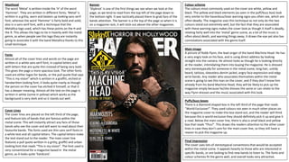
  • 1. Masthead The word ‘Metal’ is written inside the ‘H’ of the word ‘Hammer’. They are written in different fonts; ‘Metal’ is written in a gritty, worn and beaten up looking sans serif font, whereas the word ‘Hammer’ is fairly bold and solid, also in a sans serif font, with a technique that the Metallica logo used, which has these points on the H and the R. This allows the logo to tie in heavily with the metal genre, as when people see this logo they are instantly going to associate it with the band Metallica thanks to this small technique. Banner ‘Slipknot’ is one of the first things we see when we look at the page, as we tend to read from the top left of the page down to the bottom right. It was tactically placed there to grab fans of the bands attention. The banner is a the top of the page so when it is on a magazine rack, it will stick out above the other magazines. Fonts Almost all of the cover lines and words on the page are written in a white sans serif font, in capital letters and with letters that are quite thin instead of being very bold. This gives the page a more spacious look. The other fonts used are either logos for bands, or the pull quote that says “This is my vision” which is written in a graffiti, etched or handwritten looking font; it looks quite manly as though the person on the cover has etched it himself, or that it has a deeper meaning. Almost all the text on the page is written in white (some in yellow) which works as the background is very dark and so it stands out well. Cover Lines The cover lines are placed on the left third of the page, and feature lots of bands that are famous within the metal scene. This will instantly attract any fans of those bands who see the cover and will want to read about their favourite bands. The fonts used are thin sans serif fonts in a white text and all capital letters. The capital letters make the text stand out to the reader. The main cover line features a pull quote written in a gritty, graffiti and urban looking font that reads “This is my vision”. The font used is very conventional for a magazine based in the metal genre, as it looks quite ‘hardcore’. Colour scheme The colours most commonly used on the cover are white, yellow and black. The yellow and black elements (as seen in the puff/buzz box) look very similar to the hazardous/toxic warning signs you often see, which are often deadly. The magazine uses this technique as not only do the two colours stand out extremely well, but the fact that they are associated with these warning signs makes the cover look as though it itself is deadly, relating fairly well into the ‘metal’ genre scene, as a lot of the music is often about death, and warning things away. It draws the eye yet also has connotations associated with the genre itself. Main Image A picture of Robb Flynn, the lead singer of the band Machine Head. He has a very angry look on his face, and is using direct address by looking straight into the camera. He almost looks as though he is looking directly at the reader, intimidating them into buying the magazine. He is dressed very stereotypically for someone in the metal scene; long hair, untidy beard, tattoos, sleeveless denim jacket, angry face expression and edgy wrist bands. Any reader who associates themselves within the metal scene is going to see this man on the cover, and if they don’t know him already from his band Machine Head, they will be likely to pick up the magazine simply because he/she dresses the same or can relate to the way Flynn dresses and the music associated with this look. Puffs/buzz boxes There is a diamond shaped box in the left third of the page that reads “World Exclusive!”. They used colours not seen in much other places on the magazine cover to make this box stand out, and the reader will think because this is world exclusive they should definitely pick it up and give it a read. Below the main cover line, there is also a small black and yellow box that reads “Plus!”. This draws the readers attention to the other cover lines in case they don’t care for the main cover line, so they still have a reason to pick the magazine up. Final Impression The cover uses lots of stereotypical conventions that would be accepted within the metal scene. It appeals heavily to those who are interested in specific bands, or are looking to find new bands to listen to. The fonts and colour schemes fit the genre well, and overall looks very attractive.
  • 2. Layout The contents are split neatly into two columns on the left half of the page, right below the title which also features the issue date. The list features a white background as to stand out against the rest of the page which features images. They wanted the list of contents and articles to stand out as this is where the readers will find exactly what they want within the magazine, and so it is important that it is able to distinguish the contents easily. They separated the list of articles from the photos to organise things better, and used folios to allow readers to match the articles with the pictures to make it easier to find what page the photos are linked to. Font On most areas of the page, the main font that is used is an ancient/old-timey looking serif font. This is probably due to the metal music genre being linked heavily (or having similar connotations and associations) to things of the past, war and the idea of battles and bloodshed. The font makes the page distinguishable to other magazine, as most other modern magazines would choose a very blocky sans serif font. Other fonts on the page (such as where it says "Incoming!" in the bottom left hand corner of the page) features a blocky sans serif font with scratch and ware marks on it, which would be associated heavily with the metal genre and suits the page and its themes well. Contents Title Metal Hammer logo is featured above the title to ensure the reader recognises the brand upon seeing the page. The 'Contents' title is found at the top left of the page as expected. Uses the same font for the rest of the page and uses black colouring to stand out well against the white background. Images The images on the page feature famous artists from within the genre, so typically any reader who picks up the magazine and sees one of the artists they like will want to purchase the magazine in order to read about them. Every person featured in the images are dressed in a way that would be expected within the genre; some of them have face makeup, some have long hair and shaggy beards, they all wear dark clothes, have wrist bands, some are playing guitars and other instruments- all of these things are typical of people within this genre, so people who dress the same way will see these icons and immediately associate themselves within this genre and with this magazine. The people in the images are representing a certain style and look. Contents Each different section of the contents page features a red folio, a black contents title, and a description in a smaller font to let the reader know exactly what the page article is about and what it features(some also have subtitles that describe what the article is about). They are organised neatly into two columns, and some articles have pictures associated with them on the other half of the page, and uses folio numbers to link the two together, as opposed to having the images right next to their linked contents article that clutter the page. The contents are also listed in chronological order, so the readers will find it easier to find the page they are interested in, and can keep track of what page they may want to read next. Language The language used on the page is extremely descriptive. For each section of the contents page, there is a small blurb or description that comes with it, allowing the reader to fully understand what is on each page before they turn to it. For the titles, it is mostly very basic, as most of the titles feature the name of the band the article is about, or a short sentence or phrase that briefly describes the page. Most of the actual language on the page is very informal, and uses techniques like rhetorical questions to address the reader directly, giving a friendly/welcoming attitude. On the right hand side of the page, under where it says "Editor speaks", we see lots of informal langauge and direct address used. Extra features The page features lots of additional info and features, such as the 'editor speaks' section on the far right of the page, which allows us to get info directly from the editor himself about the magazine. Under the contents list we also see info about reviews and small bits of advertisement, appealing to those interested in the little details in the magazine.
  • 3. Main Image Features the man seen on the cover of the magazine, Robb Flynn, sitting on a throne confidently, implying he is powerful, which is often what people that listen to metal music want the most, to rebel and gain their own power. He is dressed conventionally for someone within the metal scene (long hair, beard, ripped denim jacket, tattoos etc.). The throne looks very unique yet also quite old-timey, which is a typical denotation for imagery within this genre. Themes The whole page has a very dark, ancient looking theme, which is very stereotypical within the metal genre. This is recognisable due to the colours used (dark colours suck as black, grey, and also a faded gold type colour) and also due to the imagery, which has denotations of things such as thrones, head statues, cold-looking brick walls, snakes etc. The title of the article is also called 'Command and Conquer' which immediately gives off connotations of war, and ancient battles. The border of the page looks as though it is an ancient looking picture frame, which represents how the audience may see this genre, as a piece of art. The metal genre often features lots of connotations that are associated with ancient mystery and history, which is extremely different to what other genres represent themselves as, and so this whole page looks very unique for a music magazine. Pull Quote The pull quote is centred in the middle of the article text, and is presented in a way that links to the theme, which is in an almost arty and old-timey fashion (as the pull quote has these borders around it almost like a picture frame). The quote reads "we knew the blackening would overshadow whatever we did". It isn't very descriptive, so readers who turned to this page and read the pull quote would be forced to read more to find out exactly what he is referring to. There is also another pull quote beneath the main image, reading "Is it my vision? Yeah it is, it's been my vision for 22 years". This pull quote adds an 'epic' sort of effect as he talks about his vision, and he uses the '22 years' part to add to the periodic medieval theme and make it sound like he worked hard to get to where he is today, which is admirable and makes his fans respect him. Drop Cap Found at the beginning of the text in the article, it is written in an almost fancy looking serif font and features the same gold colour that links to the theme. It is featured on the page to ensure that the reader knows exactly where to begin reading, and also adds to the aesthetic of the page. Title "Command & Conquer" has lots of connotations the relate to the theme that is medieval and old-timey, as this phrase is often associated with battles and war. It is written in a very fancy looking font, that also links to the theme, and the same golden colour that is seen throughout the page. It also has the same border type effect around it as the pull quote, adding aesthetic to the page, and once again adding to the medieval looking theme. Strapline The strapline is quite long, and is found underneath the title. It uses adjectives like 'maddening' when describing his 'vision' to add to the effect that he worked hard to get to where he is, and gets him respect from his fans. It has an 'epic' sort of effect due to the language used such as "being the general has rarely been simple" to put Robb Flynn on this pedestal and make him seem like a god, linking to the main image and the theme.