
Recommended
More Related Content
What's hot
What's hot (20)
Viewers also liked
Viewers also liked (20)
Similar to Eminem's Swagger Style
Similar to Eminem's Swagger Style (20)
More from Jacob Ellington
Recently uploaded
Recently uploaded (20)
Eminem's Swagger Style
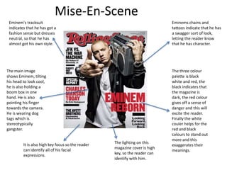
- 1. Mise-En-Scene Eminems chains and tattoos indicate that he has a swagger sort of look, letting the reader know that he has character. The main image shows Eminem, tilting his head to look cool, he is also holding a boom box in one hand. He is also pointing his finger towards the camera. He is wearing dog tags which is stereotypically gangster. The lighting on this magazine cover is high key, so the reader can identify with him. It is also high key focus so the reader can identify all of his facial expressions. Eminem's tracksuit indicates that he has got a fashion sense but dresses neutral, so that he has almost got his own style. The three colour palette is black white and red, the black indicates that the magazine is dark, the red colour gives off a sense of danger and this will excite the reader. Finally the white couler helps for the red and black colours to stand out more and this exaggerates their meanings.
- 2. Contents Page The magazine have kept with the consistency of a three colour palette, this being black, red and white. The red colour insights danger and this is accompanied by black, which makes the reader think of darkness. The white colour helps to make these two stand out. This contents page is split into three different sections, this lets the viewer know that there is something for everyone. It is split into ‘features’, ‘national affairs’ and ‘departments’. The layout of the magazine is similar to that of a newspaper. The picture of Barak Obama highlights this and shows the reader that this is not just a music magazine and it has factual news about politics also. The contents page is different to that of a normal music magazine as it doesn’t have an editors letter, this helps to create a sense of welcoming to the reader.
- 3. Double Page Spread. Lady gaga has a ambiguous facial expression, indicating what she is about to say in this story is honest, severe and genuine. This instantly intrigues the reader. The article is put into paragraphs making it easier on the eye of the reader. The theme of this article is sex and danger, shown through the colour scheme. The massive red L gives a sense to the reader of Lady Gaga’s individuality and how she stands out compared to anyone else, it shows this as it is the only colour on the page. The drop capitals create a sense of where different parts of the sequence starts and therefor the reader to understand.
- 4. How This Will Influence My Work • It will encourage me to make my front page’s model look neutral but still have character. • I will take into consideration what my model will wear, for example, if my magazine was on hip hop, I would have the model wear chains. • I will take into consideration my colour palette, so if I made a pop magazine I would use purple and pink colours. • I may change the layout of the magazine to look different so that my reader knows that there is diversity in my magazine. • Throughout my mgazine I will stay consistent with the colour palette of my choice.