
Recommended
More Related Content
What's hot
What's hot (17)
Similar to Choosing an Indie Rock Magazine Masthead Font
Similar to Choosing an Indie Rock Magazine Masthead Font (20)
More from KatyMarwood
More from KatyMarwood (20)
Recently uploaded
Recently uploaded (20)
Choosing an Indie Rock Magazine Masthead Font
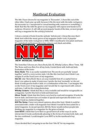
- 1. Masthead Evaluation The title I have chosen for my magazine is ‘Encounter’, I chose this out of the other titles I had came up with because it fits the most with the indie rock genre. An encounter is a ‘unexpected or casual meeting with someone or something’, I think that this fits with the genre as my magazine will expose new bands to it’s audience. However, It will still present popular bands of the time, as most people will buy a magazine for the artist(s) featured. I chose a variety of fonts from the website ‘dafont.com’, I chose the ones that I think best reflect the music genre of my magazine (indie rock.) A popular magazine of the indie rock genre is NME. NME’s masthead is very plain and basic. It’s capitalised and features three key colours; red, black and white. The fonts that I chosen are; Story Book, Edo SZ, Whisky Lickers, Oliver Twist, Kill The Noise and Love Riot. For all my fonts, I tested them with bold and italic. Evaluation of the fonts- Story Book: This is an easily readable font. The words are partially ‘joined together’ and it’s a very cursive style. I do like this font but I don’t think I can imagine It on the front cover of my magazines. Edo SZ: Like ‘Story Book’ this is an easy readable font. It’s a capital font so there’s no option to make it lowercase. I prefer the font ‘normally’ as I do not think it looks good in bold or italic or a combination of the two. I can imagine this on the front cover of my magazine and I would like to experiment with colours and sizes, I will do this using photoshop. Whisky Lickers: I think that this is very readable and would be recognizable on a magazine. I prefer this font in bold and lowercase. Oliver Twist: I think that this font is very hard to read and recognise. It looks the best in italic and lowercase as it makes it special and seperates the letters so it doesn’t look too cluttered together. Kill The Noise: I have very mixed opinions about this font. I think it could be associated with a indie rock magazine but I think it would be best suited for a metal magazine. In my perspective, Kill the Noise would confuse people into thinking my magazine is a magazine for the genre of metal. Love RIOT: I think that Love Riot is a good font in all of the ways it can be interpreted. It looks aesthetically pleasing in the forms of normal, bold, italic and the two combined. I could imagine Love RIOT to be the masthead of my magazine. I have decided that I am going to use the font ‘Edo SZ’ for my magazine.
- 2. I am going to use this font to create my final masthead, I will experiment with a range of styles in the programme photoshop.