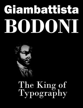
2. Giambattista Bodoni was an Italian typographer born
in Saluzzon, Italy on February 16th, 1740. Among other
things he was also a type-designer, compositor, printer,
and publisher. Although Bodoni is best known for the
many modern typefaces he created that are still very
much in use today. His entire family was in the printing
industry, so it was no surprise that when he grew up he
would be too. He began to fully immerse himself into
the field at an early age of 18, although he began much
earlier than that working with family.
At eighteen years old Bodoni went to Rome to
apprentice/study under Abbate Ruffierei at the Vatican
polyglot press. About a decade later Bodoni took over
as leader of the ducal printers in Parma at the Stamperia
Reale where he continued in his field of typography and
printing. It was during this time that Bodoni became
familiar with the fonts of Pierre Fournier of Paris and it
really interested him, so much he began working on his
own. He first began working on old style typefaces that
were more decorative than functional. Some of them
were down right gaudy. However, soon after he began
to take interest in the theories of a French printer by the
name of Pierre Dido. In 1787 his decorative designs in
typefaces all but disappeared and he began with mod-
ern typefaces. Bodoni continued working his typefaces
during his employment with the Stamperia Reale.
Giambattista
Bodoni was an
Italian type
designer,
printer,
compositer,
& publisher
born in
Saluzzon,
Italy on
February
16th, 1740
3. After three years with the company Bodo-
ni created his first font pattern book all of
his own with the title Saggio tipografive di
fregi e maiuscole meaning wise typograph-
ic in English. One his best known books
created in 1788 called Manuale Tipografico
meaning inventory of types, which was a
collection of 291 roman and italic mixed
in with some other from Greek plus many
more . Around the 1800’s Bodoni created a
new type of type which was more uniform
as well as symmetrical and proportionate.
He named it Bodoni Classical and it was
his masterpiece to be used by millions of
other typesetters and even by many still
today. Bodoni aka prince of typographers
and printer of kings passed away in 1813
still living and working in Parma.
“Beauty is found on harmony, subordinate
to the critique of reason” ~
Giambattista Bodoni
There were many fonts designed by
Giambattista Bodoni that include EF
Bauer Bodoni family, URW Bodoni, Bodoni
family, ITC Bodoni, Gianotten, and many
more. Most, not all, of Bodoni’s typefaces
are serif. The ITC Bodoni Seventy-Two has
very large serifs, and the descenders have a
defined loop to them. If you look at the eye
of the B’s it has a very thin stroke at the top,
middle, and bottom, but the stems are still
thick, and this goes for all of the type that
has an arm or a crossbar.
The Bodoni Linotype is very similar to the
other Bodoni fonts in that it is serif, but this
one is more of a condensed bold typeface. Its
eyes are more condensed and squished; the
serifs are bolder, and the shoulder looks like a
thin strip with a ball on its end. The crossbars
and arms are still very thin strokes, but the
stems are extremely large. With most of his
being similar to each other there is one Bodo-
ni did step outside his comfort zone to create
and that is a more roman style script text.
“Beauty is found on harmony,
subordinate to be the
critique of reason”
Giambattista Bodini
4. The Bodoni Antiqua Bold type is similar
to the Linotype version except a few slight
changes. The apex does not come to a point
but rather is a flat line. The ascenders slope
to connect with the arms and crossbars to
form only lengthy piece. The stems are even
thicker than the condensed version, and the
descenders on the g’s and q’s are missing
the loop, instead they just use a stem, filet/
brackets and serifs at the bottom. Off the
beaten path Bodoni created a unique
typeface different from all the rest.
Separate from the Bodoni family, is the
Gianotten typeface. This one is quite
different from any one of his fonts, but
uses something from each of them. The
terminals as usual have the ball at the end
with a slight curve. The file/bracket curves
out on the a and u’s. There is still the very
thin stroke on the arms and crossbars with
the thick stems though. The eyes of the type
are a mix between condensed and regular
type as they have the thicker stems on the
sides but the eye is a little wider. The cap
and x-height are of average size in all of his
typefaces except this one, where the capital
G is a bit smaller or the lower case is over-
sized. Overall this is a nice serif font, as
most of Bodoni’s have been.
Although most of Bodoni’s fonts are very
similar I see a couple that steer away from
his usual style of type creation. Most
designers have the same font with slight
differences because they have many
different uses for legibility or readability
or need. Giambattista Bodoni became very
famous for not only his printing, but his
creation of so many different typefaces in
which he made books for in multiple
languages. All hail the king of typography!
The Bodoni Linotype is very similar to the
other Bodoni fonts in that it is serif, but this
one is more of a condensed bold typeface. Its
eyes are more condensed and squished; the
serifs are bolder, and the shoulder looks like a
thin strip with a ball on its end. The crossbars
and arms are still very thin strokes, but the
stems are extremely large. With most of his
being similar to each other there is one Bodoni
did step outside his comfort zone to create and
that is a more roman style script text.
Bodoni Classic Chancery is an old Roman
style handwriting/script font. The terminals,
ascenders, descenders, and where the serifs
would be all have a curvature to them. This is
one typeface that most likely uses a bowl and
loop for the g although I do not have the full
library to see. The filet/bracket of the type is
where the curve starts to happen creating a
beautiful seamless font design. This particular
font is old school and therefore not used a
whole lot, and neither is our next font.
All hail the KING T
Y
P
O
G
R
A
P
H
Y
of