1. Font Analysis
I decided to analyse some existing magazines and
researched about the masthead and managed to find what
font they have used. I did this as part of my research in
order to observe the type of fonts they use and how they
may/may not conform to the hip hop genre. The font
featured in this opening sequence is quite bold. Due to the
hip hop genre being bold and standing out from other genres, I believed that this font would be
suitable. With my magazine being called Presidential it’s important that the font stands out from
others. My font needs to be bold, recognisable and easy for my target audience to read. It needs to
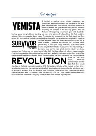
catch the audience’s eye, and American Captain (top left) has all
these qualities. Whereas this second font, Survivor Series
(middle left) is also quite jumpy and looks quite sharp which
creates a symbiotic link to the music genre. The V’s are sharp, in
the same way as the male artists in the industry are being
portrayed as. It’s bold and eye catching and I also think that they will go well with my music magazine
it’s a hip hop magazine. I think that this font could work well with the images on the front cover of the
magazine as it would stand out as a sharp, intimidating font; the exact same way that the artists would
pose on the front
cover.
Revolution
(bottom left) is another
bold font; they would
stand out at the top o my music magazine. With the background being white, it would be hard for my
target audience to miss the masthead with this font, allowing them to become familiar with it and see it
as an icon or emblem. This font shows a quite bossiness characteristic, and could read the words
Presidential really well. To conclude I think that all of my fonts that I have chosen will work well in my
music magazine. Therefore I am going to use all of the fonts through my magazine.