
Recommended
More Related Content
What's hot
What's hot (19)
Viewers also liked
Viewers also liked (16)
Similar to Pop magazine
Similar to Pop magazine (20)
More from Jacob Ellington
Recently uploaded
Recently uploaded (20)
Pop magazine
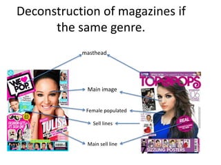
- 1. Deconstruction of magazines if the same genre. masthead Main image Sell lines Main sell line Female populated
- 2. Contents page deconstruction Masthead Colour used to highlight key information for the reader. Page number Visual images, that mostly attract the female gender. Pull Quotes Serif Sans Serif
- 3. Double page spread deconstruction (1) The designer has chosen to have Nicky Minaj sown the middle of the double spread to give the whole page a sexy look. Pull Quotes Text columns make it easy for the audience to understand. The use of the pink highlighter on Nicky’s quotes attract the reader. The background fits in with what Nicky is wearing and it also helps her to stand out. The bold text to present the models name is the biggest attraction other than the model herself. This font stands out to the audience and makes a statement. The colour pink dominates the double page spread and also helps the reader to identify the genre of the magazine, as it is stereotypically a female pop magazine. Nicky is wearing jewelry that is full of colour, this draws attention to her and helps her to stand out, as the jewelry is not mainstream. She also appears to be wearing a large ring that reads ‘icon’, this suggests that Nicky is confident in herself and its also ironic.
- 4. Double page spread deconstruction (2) Bold masthead in orange writing to advertise the topic to the reader. The sub-title ‘Fun Fearless Female, would attract a female audience making them want to read on as it makes them feel as thought hey can relate to her. The interviews questions are in highlighted orange to attract the reader and draw attention, then Jessie’s answers are in black so that the audience can distinguish between the questions and the answers. The main image of Jessie J takes up over fifty percent of the two pages, she is wearing a fur coat to help her stand out and shows individuality which attracts readers.
- 5. • For my front cover I will have an eye catching masthead that’s attractive to the reader. I will also have a main image that takes over about 50% of the page, I will use pull quotes also to help sell the magazine. • For my contents page I will use serif to attract the readers eye, I will also use pull quotes to make sure the reader wants to read on. I’ll also use colour to help distinguish different titles for the reader. • Finally on my double page spread, I will have my models image covering just over 50% of the page, he/she will be wearing something eye catching and it has to be entertaining for the viewer. I will also use bright bold text and an attractive masthead so the reader is intrigued.