
Recommended
More Related Content
What's hot
What's hot (16)
Viewers also liked
Viewers also liked (16)
Similar to Feedback on everything
Similar to Feedback on everything (20)
Recently uploaded
Recently uploaded (20)
Feedback on everything
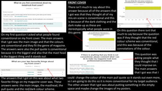
- 1. FRONT COVER On my first question I asked what people found conventional on my front cover. The main answers that I got was the main image and that the colours are conventional and they fit the genre of magazine. The answers were also the pull quote is conventional because it is the biggest and also that the mast head is the biggest thing and it stands out. The answers that I got on this was about what two favorite things on my magazine cover was. These answers were: the main image, the masthead, the pull quote and the red/dark colour scheme. There isn’t much to say about this answer because all of the answers that I got was that they thought all of my mis-en-scene is conventional and this is because of the dark clothing and the dark make-up as these are stereotypically what people were in this genre. On this question there isnt that much to say because the question was if they thought that the red colour scheme was conventional, and this was because of the connotations of the colour. This question was asking people what they thought that I could improve on. The main answers that I got was that I could change the colour of the main pull quote so it stands out even more, so I am going to do this so it is more conventional for my target audience. The other answer that I got was about putting something in the empty space and maybe change the images of my posters.
- 2. CONTENT PAGE On my first question I asked what people found conventional about my content page. The main answers that I got was about the images used, especially the Redfest image. The answers were also about the sans serif typography and what the actual articles are about as they are all to do with rock/metal music and therefore fir into the genre conventionally. The answers that I got on this was about what two favorite things on my content page was. These answers were: the sans serif fonts, the images and the content of my magazine. There isn’t much to say about this answer because all of the answers that I got was that they thought all of my mis-en-scene is conventional and this is because of the clothing, the make-up and the locations as these are conventional as they are concerts and a plain background. On this question there isn’t that much to say either because the question was if they thought that the colour scheme was conventional, and this was because the colours came in from the front cover. This question was asking people what they thought that I could improve on. The main answers that I got was that I didn’t have to change anything, but I feel like I have to change the locations of one of my images on my front cover and also make sure that all of the columns are lined up, so I will do this to make my magazine look more conventional.