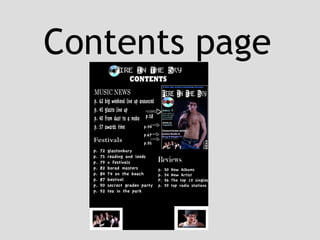
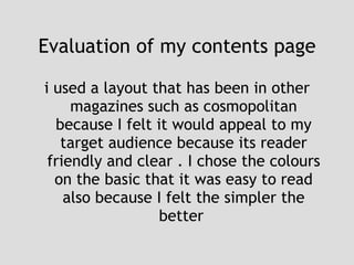
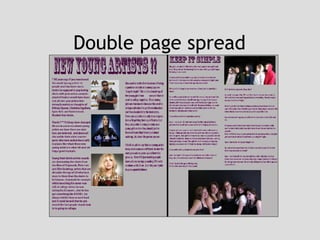
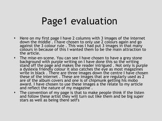
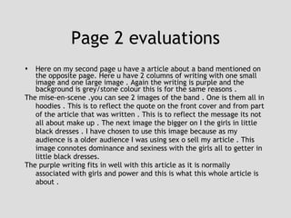
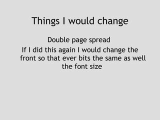
Evaluations  of my music magazine Rosie Casey
Here is my front cover I have made . I have tried to follow the general  convections of a music magazine .
Here is the contents page I have chosen to use a style similar to what cosmopolitan uses this is because I feel it makes for clear reading and understanding of hat is in the magazine
Here is my double page spread
In what way does your media product use , develop or challenge forms and conventions of a real media product ? Front cover  The model on the front cover is to the right of the page . I got the model to stand in this way because it fits with the generic convention of a music magazine  , this is so its eye catching and appealing to my audience . Having a image off a topless male appeals to women where as the puff next to the image appeals to the male readers
In what way does your media product use , develop or challenge forms and conventions of a real media product ? Contents page On my contents page I have chosen to follow the layout of cosmopolitan this isn't following there gernic conventions of a music magazine but I feel it makes it more inviting . I have put a image of the front cover to illustrate where there articles that have appeared on the front will be . This makes it clear for the reader to flick straight to these articles which have attracted them to the magazine and then they will also look at what other articles feature in this magazine
In what way does your media product use , develop or challenge forms and conventions of a real media product ? Double page spread page 1 “new young artist!!” Here I have followed the normal generic convention of having columns on the page to spilt the text. I have chosen to put my 3 images that I have gotten of the internet . I have chosen to go against the generic convention doing this but I feel it intrigues the read about there reading and they are relevant to be centre of attention. I have chosen to write in red so that the writing stands of the page instead of black . This is because I felt red is a easier colour to read also it will integer the readers as its eye catching
Front cover  Here is my evaluation of the front cover broken down
Central image The artist that is my central image on the front cover is a topless man . I have chosen to have him as my front cover because it is relevant and fits with my puff the new bad boy of music . The model is standing with a aragonite expression on this face with his t-shirt over his shoulder and a baseball cap the wrong way round on his head . With a chain and his boxers on show . This is a typical stance and poison for male stars on the front cover of magazine . With it being so effective of reflecting they ‘Big Time’ statues it also makes the readers (mainly female) want to read this as the image connotes sex and domance Front cover image
Masthead My masthead is in 2 places . The barcode , prices and month of issue is in the bottom right hand corner . I have placed this here so that its clear plus if it was getting scanner buy a till it a easier place to scan . I have made the price clear but also I have put it next to the months of issue so its clear this a monthly issues hence the price of £3 The title area on my magazine is neither feminine or mescaline this is because im trying to appeal to both sex . I have done the title in black and white an in a non-gernic conventional way . This is so it catches the eye of the potential readers . It will stand out against other magazine title
Mode of address My front cover is aimed to talk at people aged between 18-25 .  Denotations~ the denotations of my magazine are a topless mixed race male. This takes up 50% of my front cover . Also there is a image of a CD . These to aspects are to entice the reader . I have 3 puff/teasers to catch the readers eye  Connotations ~(central images )if you read this you will look like the model or learn how to be successfully as the artist . (small image) you will learn how to have a close group of close mates and learn how to achive your dreams art a young age
Title  The title “fire in the sky” reflects the change of something unpredictable . I have chosen this because if reflects the way it will sit among the other music magazines . Also if there was a fire I  the sky people world sit and watch and marvel at it an I want them to to sit and look and read my magazine with the way its layout is and how it defies some of the general conventions .
Puffs  I have 2 puffs that stand of the page interview and articles on I chose this because they will intrigue the reader about what's to come in the magazine .
Teasers  I have 2 teasers I have chosen to put a quote “its not all about the makeup” from my double page spread .also I have written “the new bad boy of music is here to give reviews and spills about his sex life” I have done this because it will convince and enthuse new readers to read my magazine . Also with show our every month reader that we still have ideas and articles
Niche magazine market  My magazines is aimed at people aged between 18-25 and at Indie music listeners/fans . I decided this by looking at my results of my survey monkey . This genre of music was the most popular .
Contents page
The of contents page  The colours I have used are black and white I have only used 2 colours because I feel it looks simpler and clear and easy to read.  I have chosen to put 4 images on my front cover . One of a CD as I advertised  a free CD on the front cover . There are two photos at the bottom with photos relating to the articles I have written and then there is a photo of the cover of my magazine
Evaluation of my contents page i used a layout that has been in other magazines such as cosmopolitan because I felt it would appeal to my target audience because its reader friendly and clear . I chose the colours on the basic that it was easy to read also because I felt the simpler the better
Double page spread
Page1 evaluation  Here on my first page I have 2 columns with 3 images of the internet down the middle . I have chosen to only use 2 colours again and go against the 3 colour rule . This was I had put 3 images in that many colours in because of this I wanted them to be the main attraction to the article. The mise-en-scene. You can see I have chosen to have a grey stone background with purple writing on I have done this so the writing stand off the page and makes the reader intrigued . Not only is purple a dyslexia friendly colour it also catches the eye as most magazines write in black . There are three images down the centre I have chosen these of the internet . These are images that are regularly used as 2 are of the album covers and one is of chipmunk getting his mobo award. I have chosen to use these images a the relate to my article and reflect the nature of my magazine . The convention of my page is that to make people think if the listen and follow these artist they will turn out like them and be big super stars as well as being there self's
Page 2 evaluations Here on my second page u have a article about a band mentioned on the opposite page. Here u have 2 columns of writing with one small image and one large image . Again the writing is purple and the background is grey/stone colour this is for the same reasons .  The mise-en-scene .you can see 2 images of the band . One is them all in hoodies . This is to reflect the quote on the front cover and from part of the article that was written . This is to reflect the message its not all about make up . The next image the bigger on I the girls in little black dresses . I have chosen to use this image because as my audience is a older audience I was using sex o sell my article . This image connotes dominance and sexiness with the girls all to getter in little black dresses. The purple writing fits in well with this article as it is normally associated with girls and power and this is what this whole article is about .
How does your music magazine  relate to existing examples of these media forms? my music magazine has gone against some of the normal conventions with having more then 3 colours on the front cover and only having 2 colours on bother the double page spread and the contents page . I have done this so it eye catching also I have gone for a different genre then most music magazines go for with aim my magazines and indie listeners rather then rock . This is because I found it’s a genre that need more and had more to work with .
I approach the my main tasks individually because I felt it was easier to work on my our . I found that as I was working on my own I could manage my time easier because I was only realigning on myself to hit dead lines I had set my self time, I found using the Macs was so much easier then trying to use a pc, as all the software I knew how to work around as I been using it for over a year in other subjects . For instance using Photoshop helped me devolved my magazine in every stage as it made it easier to edit or change pars when I felt it wasn’t the standard I wanted to make .
Can you provide examples of creative problem-solving decisions  you have had to make in relation to: •   the development of ideas? For my front over I changed my layout as well as my central images and colors this has made the magazine look more professional  •   still photography? The only problem I had with the photography is that what i wanted as my central images was landscape and didn’t was to distort it so I had to change it for a different landscape image •   image editing? I had to sharpen and manipulate some images to make then fit with the conventions of a music magazine . •   printing and trialing your work? I have used facebook and other social networks to show off my work I felt this was easier and better for the environment then printing also as we are show casing out work on a blog there as been opportunities for people to look at my work digitally
How did you manage locations for photographs and any costumes  and props? I used a photography a studio at Bodmin college to take my photos this ment I had proper lighting and a decent camera to take my images on . The studio was a basic layout with a black backdrop with 2 studio lights.  The props I used my shots we clothes witch just ment having somewhere for my models to get changed . I felt this was easier then props because i was working with a group of 5 girls for my main photo shoot . And having them to hold props would have been more complicated and end in drama.
Reflect on the importance of design drafting and how the final  outcome relates to the draft layout in each case. Flat plan Final cover  Here you can see there isn't a lot of difference in my flat plan and my final cover . I have chosen just to have my teasers and puff down the side to increase its clarity . Also I have added another 2 images In this make the reader more interested in what they are about to read.
Reflect on the importance of design drafting and how the final  outcome relates to the draft layout in each case. Flat plan  Contents pages Here you can see my flat plan and my final contents page . Thought the design and creating process I decide to change the layout of my contents page . I felt the flat plan style layout was to complicated and to scattered . Where as I look in magazines and saw this simple layout which I went with .this made it cleat and simple to read and understand
  Reflect on the importance of design drafting and how the final  outcome relates to the draft layout in each case. Flat plan  Final double page spread I changed the layout of my double page spread because I felt having less images and more writhing would entices the reader to read more . I still only used 2 columns on each side so that I could have bigger writing then if I had 3 also this gave me more room for bigger images. so there will be clear for the reader to see .
How did you manage your time, and with what success? My time management was brilliant but I did keep to most of my self's set deadlines . For examples  I set my self the challenge of getting all my double page spread an front cover done in the Easter half term so I had time if I needed to change something . This work cause I need to change loads to both my front cover and double page spread .
Thinking about audience Throughout this activities I have been making creative decisions based on ideas I was developing about my readers. I decide that’s to get the most out of my project but doing research .I need to get input for others I used survey monkey asking question about music colours price ect. I felt having this sort of information I would have a good basis to start designing my work .This helping fluencies parts of my magazine such as , detail of shot composition and framing, anchorage, layout, mode of address and register because I knew what my costumes and consumer market wanted . The audience feedback confirm some thing I thought where as it surprised me on other like the genre of music to appeal to ect.
Representing My ideas and their execution amount to specific  representations of my music and the readers of  music magazines? I decide that I would represents indie music in my project but move to up and coming artist as that’s the issues I was making .i used images and wrote stuff that relate`s to up and coming artist but also looks like it is written for a new band . This was important as instead of taking a image to look like someone I made a hole new band up . the sense of reality have constructed is that I have made my articles as real to a magazine as possible . I read main articles where people invite . I looked at music magazine for this as well as cosmopolitan . I looked at cosmopolitan because the have a style of writing invites I liked and I thought it expressed the artist the best way .also I have used images that are taken in a studio because this is very similar to what is magazines these days .
Feed back  Caz 25 Front cover –I think this front cover looks like a girls teen mag more then a music magazine due to the image of the young man on the front cover. Contents page –front cover images would look better more central so that its clearer then the would only be 2 columns at the bottom this would make a clear layout  Double page spread- I like the way the photos are in different places and the way the background makes the text stand out . Also the font the tittles of each articel
Feed back  Sam 19 Front cover – although there is a topless man on the front cover I think its rather eye catching . The title is different and the style in which the title is written would jump out off the shelf at me . Contents page – I think its a very clear layout witch make sit easy for readers to navigate around the magazine . Double page spread- I like the layout not sure on the colouur of the writing though
Feed back Lee 23 Front cover- the colours catch the eye as well as the free cd image and writing witch draws the reader in Contents page-its good easy to read and simple layout. Double page spread –again this catches the eye with its colour scheme changing it draws the reader to the page . Also it makes it stand out more
Feed back  Lauren 18 Front cover – like this cover its really eye catching . The writing is fun and the title is different for any other music magazine I know of. Contents page – the contents page is inviting for the reader . Could do with a third colour thou to brake up the black and white  Double page spread – I like the colours that have been used . I also like the images . I think the writing could be bigger though
Things I would change  Front cover If I did this project again I would use a image of a female on the front cover as my central images instead of a male this is because It would go with the theory of the male gaze . Where women can look at another women with out being stereotype where as a man with my front cover could be classed as a homosexual at looking or buying my magazine with the front cover it has at the moment. Also I would try to make my magazine more aimed at older people as I doesn’t fit with the age group I was going for . This could mean changing the layout or colours  I would also change the way I put my central image on because if u look closely you can the change in colour where I have only burn the edges of the image.
Things I would change Contents page  On my contents page I would add another colour so it follows the 3 colour rule . Also I would make it so the articles I have written link together better
Things I would change Double page spread  If I did this again I would change the front so that ever bits the same as well the font size

Evalutaion powerpont

  • 1.
    Evaluations ofmy music magazine Rosie Casey
  • 2.
    Here is myfront cover I have made . I have tried to follow the general convections of a music magazine .
  • 3.
    Here is thecontents page I have chosen to use a style similar to what cosmopolitan uses this is because I feel it makes for clear reading and understanding of hat is in the magazine
  • 4.
    Here is mydouble page spread
  • 5.
    In what waydoes your media product use , develop or challenge forms and conventions of a real media product ? Front cover The model on the front cover is to the right of the page . I got the model to stand in this way because it fits with the generic convention of a music magazine , this is so its eye catching and appealing to my audience . Having a image off a topless male appeals to women where as the puff next to the image appeals to the male readers
  • 6.
    In what waydoes your media product use , develop or challenge forms and conventions of a real media product ? Contents page On my contents page I have chosen to follow the layout of cosmopolitan this isn't following there gernic conventions of a music magazine but I feel it makes it more inviting . I have put a image of the front cover to illustrate where there articles that have appeared on the front will be . This makes it clear for the reader to flick straight to these articles which have attracted them to the magazine and then they will also look at what other articles feature in this magazine
  • 7.
    In what waydoes your media product use , develop or challenge forms and conventions of a real media product ? Double page spread page 1 “new young artist!!” Here I have followed the normal generic convention of having columns on the page to spilt the text. I have chosen to put my 3 images that I have gotten of the internet . I have chosen to go against the generic convention doing this but I feel it intrigues the read about there reading and they are relevant to be centre of attention. I have chosen to write in red so that the writing stands of the page instead of black . This is because I felt red is a easier colour to read also it will integer the readers as its eye catching
  • 8.
    Front cover Here is my evaluation of the front cover broken down
  • 9.
    Central image Theartist that is my central image on the front cover is a topless man . I have chosen to have him as my front cover because it is relevant and fits with my puff the new bad boy of music . The model is standing with a aragonite expression on this face with his t-shirt over his shoulder and a baseball cap the wrong way round on his head . With a chain and his boxers on show . This is a typical stance and poison for male stars on the front cover of magazine . With it being so effective of reflecting they ‘Big Time’ statues it also makes the readers (mainly female) want to read this as the image connotes sex and domance Front cover image
  • 10.
    Masthead My mastheadis in 2 places . The barcode , prices and month of issue is in the bottom right hand corner . I have placed this here so that its clear plus if it was getting scanner buy a till it a easier place to scan . I have made the price clear but also I have put it next to the months of issue so its clear this a monthly issues hence the price of £3 The title area on my magazine is neither feminine or mescaline this is because im trying to appeal to both sex . I have done the title in black and white an in a non-gernic conventional way . This is so it catches the eye of the potential readers . It will stand out against other magazine title
  • 11.
    Mode of addressMy front cover is aimed to talk at people aged between 18-25 . Denotations~ the denotations of my magazine are a topless mixed race male. This takes up 50% of my front cover . Also there is a image of a CD . These to aspects are to entice the reader . I have 3 puff/teasers to catch the readers eye Connotations ~(central images )if you read this you will look like the model or learn how to be successfully as the artist . (small image) you will learn how to have a close group of close mates and learn how to achive your dreams art a young age
  • 12.
    Title Thetitle “fire in the sky” reflects the change of something unpredictable . I have chosen this because if reflects the way it will sit among the other music magazines . Also if there was a fire I the sky people world sit and watch and marvel at it an I want them to to sit and look and read my magazine with the way its layout is and how it defies some of the general conventions .
  • 13.
    Puffs Ihave 2 puffs that stand of the page interview and articles on I chose this because they will intrigue the reader about what's to come in the magazine .
  • 14.
    Teasers Ihave 2 teasers I have chosen to put a quote “its not all about the makeup” from my double page spread .also I have written “the new bad boy of music is here to give reviews and spills about his sex life” I have done this because it will convince and enthuse new readers to read my magazine . Also with show our every month reader that we still have ideas and articles
  • 15.
    Niche magazine market My magazines is aimed at people aged between 18-25 and at Indie music listeners/fans . I decided this by looking at my results of my survey monkey . This genre of music was the most popular .
  • 16.
  • 17.
    The of contentspage The colours I have used are black and white I have only used 2 colours because I feel it looks simpler and clear and easy to read. I have chosen to put 4 images on my front cover . One of a CD as I advertised a free CD on the front cover . There are two photos at the bottom with photos relating to the articles I have written and then there is a photo of the cover of my magazine
  • 18.
    Evaluation of mycontents page i used a layout that has been in other magazines such as cosmopolitan because I felt it would appeal to my target audience because its reader friendly and clear . I chose the colours on the basic that it was easy to read also because I felt the simpler the better
  • 19.
  • 20.
    Page1 evaluation Here on my first page I have 2 columns with 3 images of the internet down the middle . I have chosen to only use 2 colours again and go against the 3 colour rule . This was I had put 3 images in that many colours in because of this I wanted them to be the main attraction to the article. The mise-en-scene. You can see I have chosen to have a grey stone background with purple writing on I have done this so the writing stand off the page and makes the reader intrigued . Not only is purple a dyslexia friendly colour it also catches the eye as most magazines write in black . There are three images down the centre I have chosen these of the internet . These are images that are regularly used as 2 are of the album covers and one is of chipmunk getting his mobo award. I have chosen to use these images a the relate to my article and reflect the nature of my magazine . The convention of my page is that to make people think if the listen and follow these artist they will turn out like them and be big super stars as well as being there self's
  • 21.
    Page 2 evaluationsHere on my second page u have a article about a band mentioned on the opposite page. Here u have 2 columns of writing with one small image and one large image . Again the writing is purple and the background is grey/stone colour this is for the same reasons . The mise-en-scene .you can see 2 images of the band . One is them all in hoodies . This is to reflect the quote on the front cover and from part of the article that was written . This is to reflect the message its not all about make up . The next image the bigger on I the girls in little black dresses . I have chosen to use this image because as my audience is a older audience I was using sex o sell my article . This image connotes dominance and sexiness with the girls all to getter in little black dresses. The purple writing fits in well with this article as it is normally associated with girls and power and this is what this whole article is about .
  • 22.
    How does yourmusic magazine relate to existing examples of these media forms? my music magazine has gone against some of the normal conventions with having more then 3 colours on the front cover and only having 2 colours on bother the double page spread and the contents page . I have done this so it eye catching also I have gone for a different genre then most music magazines go for with aim my magazines and indie listeners rather then rock . This is because I found it’s a genre that need more and had more to work with .
  • 23.
    I approach themy main tasks individually because I felt it was easier to work on my our . I found that as I was working on my own I could manage my time easier because I was only realigning on myself to hit dead lines I had set my self time, I found using the Macs was so much easier then trying to use a pc, as all the software I knew how to work around as I been using it for over a year in other subjects . For instance using Photoshop helped me devolved my magazine in every stage as it made it easier to edit or change pars when I felt it wasn’t the standard I wanted to make .
  • 24.
    Can you provideexamples of creative problem-solving decisions you have had to make in relation to: • the development of ideas? For my front over I changed my layout as well as my central images and colors this has made the magazine look more professional • still photography? The only problem I had with the photography is that what i wanted as my central images was landscape and didn’t was to distort it so I had to change it for a different landscape image • image editing? I had to sharpen and manipulate some images to make then fit with the conventions of a music magazine . • printing and trialing your work? I have used facebook and other social networks to show off my work I felt this was easier and better for the environment then printing also as we are show casing out work on a blog there as been opportunities for people to look at my work digitally
  • 25.
    How did youmanage locations for photographs and any costumes and props? I used a photography a studio at Bodmin college to take my photos this ment I had proper lighting and a decent camera to take my images on . The studio was a basic layout with a black backdrop with 2 studio lights. The props I used my shots we clothes witch just ment having somewhere for my models to get changed . I felt this was easier then props because i was working with a group of 5 girls for my main photo shoot . And having them to hold props would have been more complicated and end in drama.
  • 26.
    Reflect on theimportance of design drafting and how the final outcome relates to the draft layout in each case. Flat plan Final cover Here you can see there isn't a lot of difference in my flat plan and my final cover . I have chosen just to have my teasers and puff down the side to increase its clarity . Also I have added another 2 images In this make the reader more interested in what they are about to read.
  • 27.
    Reflect on theimportance of design drafting and how the final outcome relates to the draft layout in each case. Flat plan Contents pages Here you can see my flat plan and my final contents page . Thought the design and creating process I decide to change the layout of my contents page . I felt the flat plan style layout was to complicated and to scattered . Where as I look in magazines and saw this simple layout which I went with .this made it cleat and simple to read and understand
  • 28.
    Reflecton the importance of design drafting and how the final outcome relates to the draft layout in each case. Flat plan Final double page spread I changed the layout of my double page spread because I felt having less images and more writhing would entices the reader to read more . I still only used 2 columns on each side so that I could have bigger writing then if I had 3 also this gave me more room for bigger images. so there will be clear for the reader to see .
  • 29.
    How did youmanage your time, and with what success? My time management was brilliant but I did keep to most of my self's set deadlines . For examples I set my self the challenge of getting all my double page spread an front cover done in the Easter half term so I had time if I needed to change something . This work cause I need to change loads to both my front cover and double page spread .
  • 30.
    Thinking about audienceThroughout this activities I have been making creative decisions based on ideas I was developing about my readers. I decide that’s to get the most out of my project but doing research .I need to get input for others I used survey monkey asking question about music colours price ect. I felt having this sort of information I would have a good basis to start designing my work .This helping fluencies parts of my magazine such as , detail of shot composition and framing, anchorage, layout, mode of address and register because I knew what my costumes and consumer market wanted . The audience feedback confirm some thing I thought where as it surprised me on other like the genre of music to appeal to ect.
  • 31.
    Representing My ideasand their execution amount to specific representations of my music and the readers of music magazines? I decide that I would represents indie music in my project but move to up and coming artist as that’s the issues I was making .i used images and wrote stuff that relate`s to up and coming artist but also looks like it is written for a new band . This was important as instead of taking a image to look like someone I made a hole new band up . the sense of reality have constructed is that I have made my articles as real to a magazine as possible . I read main articles where people invite . I looked at music magazine for this as well as cosmopolitan . I looked at cosmopolitan because the have a style of writing invites I liked and I thought it expressed the artist the best way .also I have used images that are taken in a studio because this is very similar to what is magazines these days .
  • 32.
    Feed back Caz 25 Front cover –I think this front cover looks like a girls teen mag more then a music magazine due to the image of the young man on the front cover. Contents page –front cover images would look better more central so that its clearer then the would only be 2 columns at the bottom this would make a clear layout Double page spread- I like the way the photos are in different places and the way the background makes the text stand out . Also the font the tittles of each articel
  • 33.
    Feed back Sam 19 Front cover – although there is a topless man on the front cover I think its rather eye catching . The title is different and the style in which the title is written would jump out off the shelf at me . Contents page – I think its a very clear layout witch make sit easy for readers to navigate around the magazine . Double page spread- I like the layout not sure on the colouur of the writing though
  • 34.
    Feed back Lee23 Front cover- the colours catch the eye as well as the free cd image and writing witch draws the reader in Contents page-its good easy to read and simple layout. Double page spread –again this catches the eye with its colour scheme changing it draws the reader to the page . Also it makes it stand out more
  • 35.
    Feed back Lauren 18 Front cover – like this cover its really eye catching . The writing is fun and the title is different for any other music magazine I know of. Contents page – the contents page is inviting for the reader . Could do with a third colour thou to brake up the black and white Double page spread – I like the colours that have been used . I also like the images . I think the writing could be bigger though
  • 36.
    Things I wouldchange Front cover If I did this project again I would use a image of a female on the front cover as my central images instead of a male this is because It would go with the theory of the male gaze . Where women can look at another women with out being stereotype where as a man with my front cover could be classed as a homosexual at looking or buying my magazine with the front cover it has at the moment. Also I would try to make my magazine more aimed at older people as I doesn’t fit with the age group I was going for . This could mean changing the layout or colours I would also change the way I put my central image on because if u look closely you can the change in colour where I have only burn the edges of the image.
  • 37.
    Things I wouldchange Contents page On my contents page I would add another colour so it follows the 3 colour rule . Also I would make it so the articles I have written link together better
  • 38.
    Things I wouldchange Double page spread If I did this again I would change the front so that ever bits the same as well the font size