The document discusses how the media product challenges and develops conventions of real music magazines. It analyzes several elements of the magazine's design:
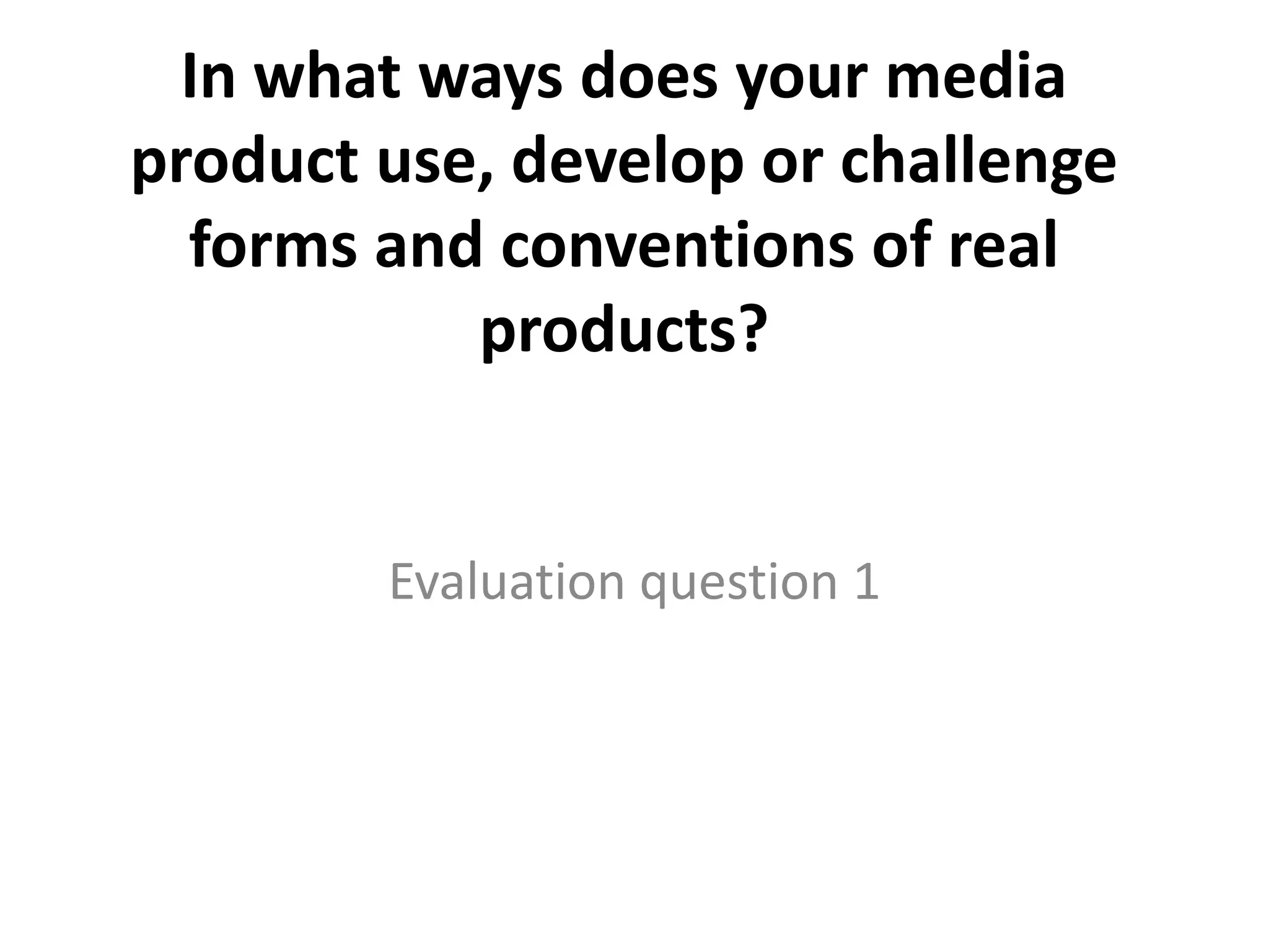
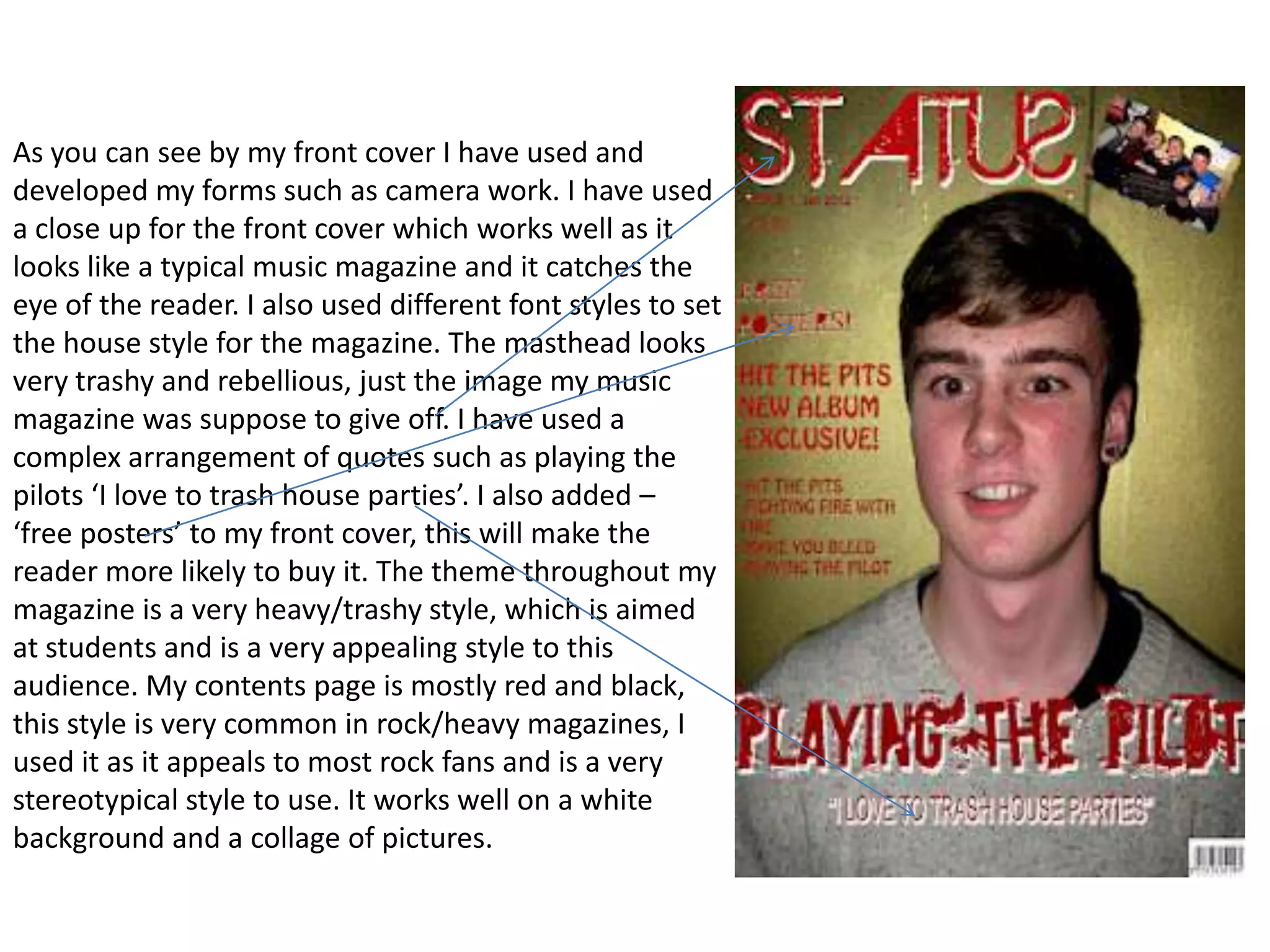
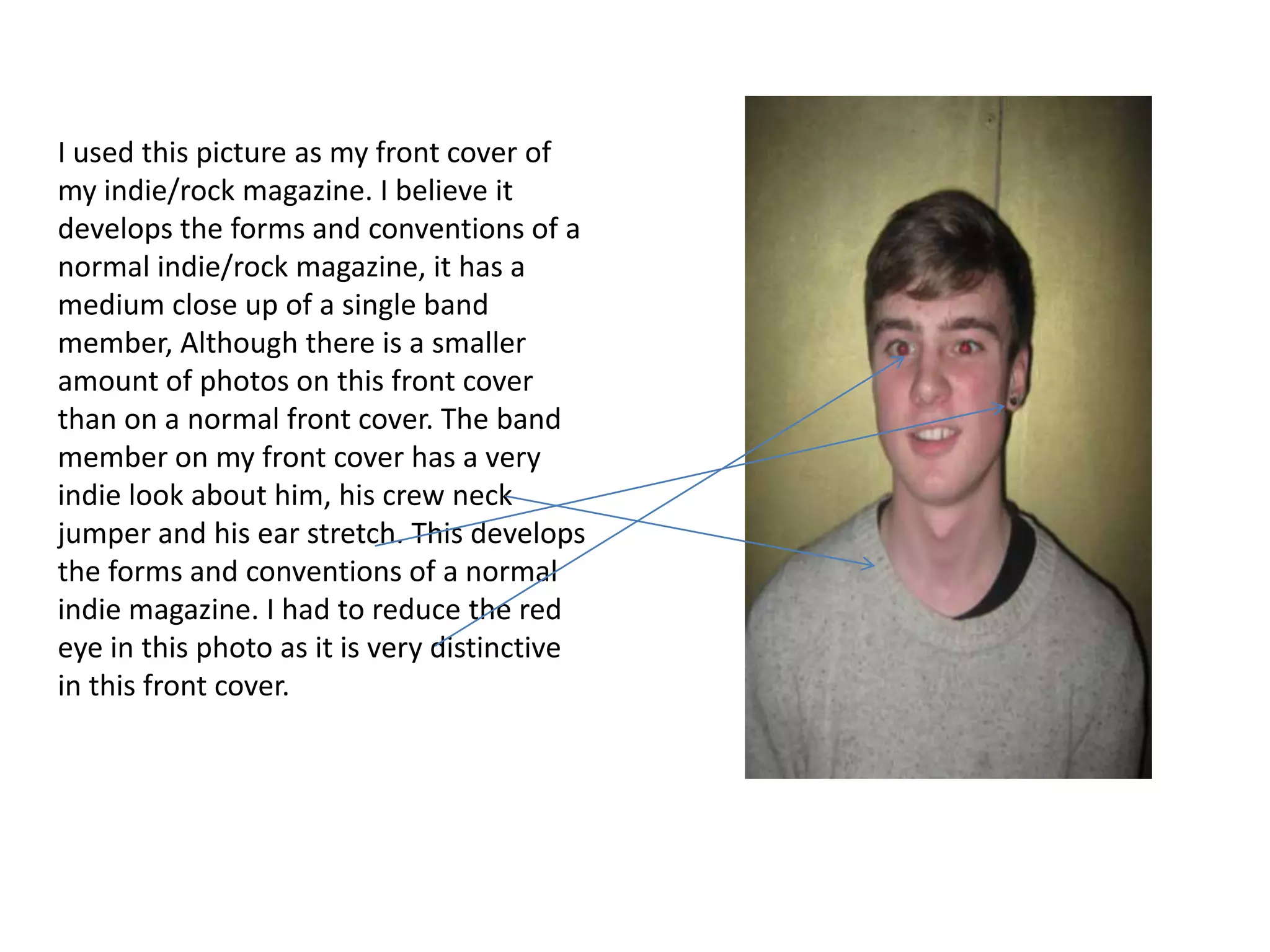
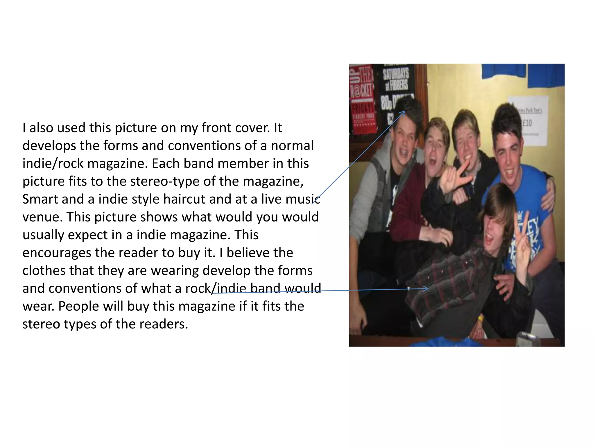
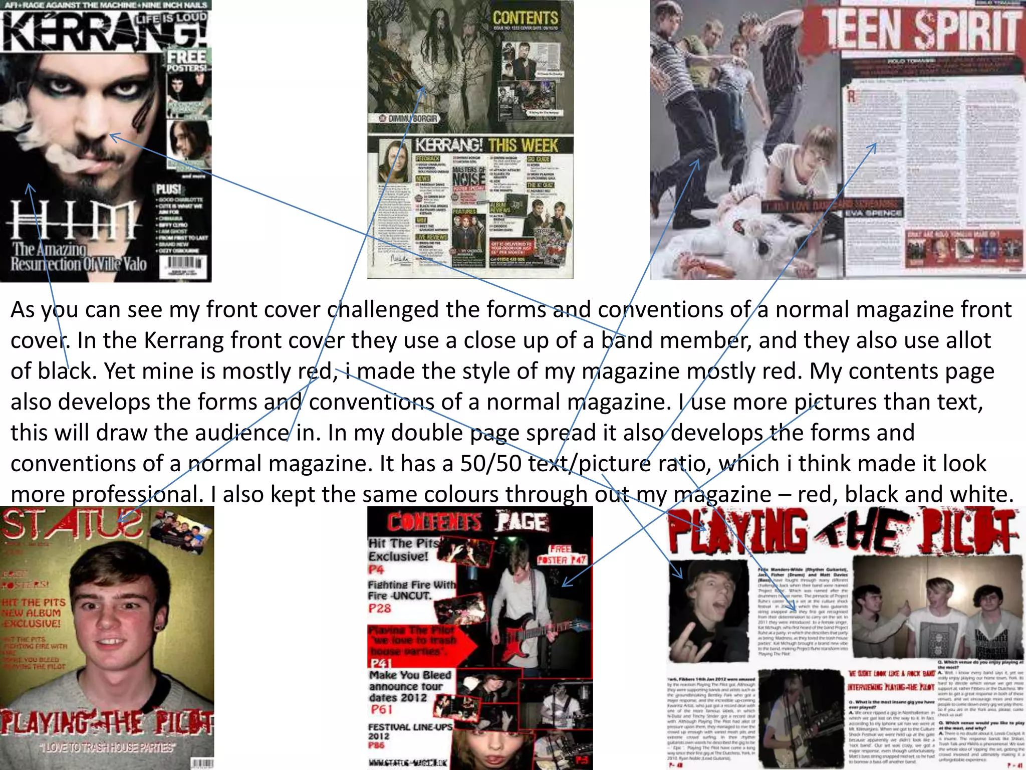
1) The front cover uses a close-up shot and free poster offer to catch readers' attention, while establishing a trashy, rebellious style through font and masthead design.
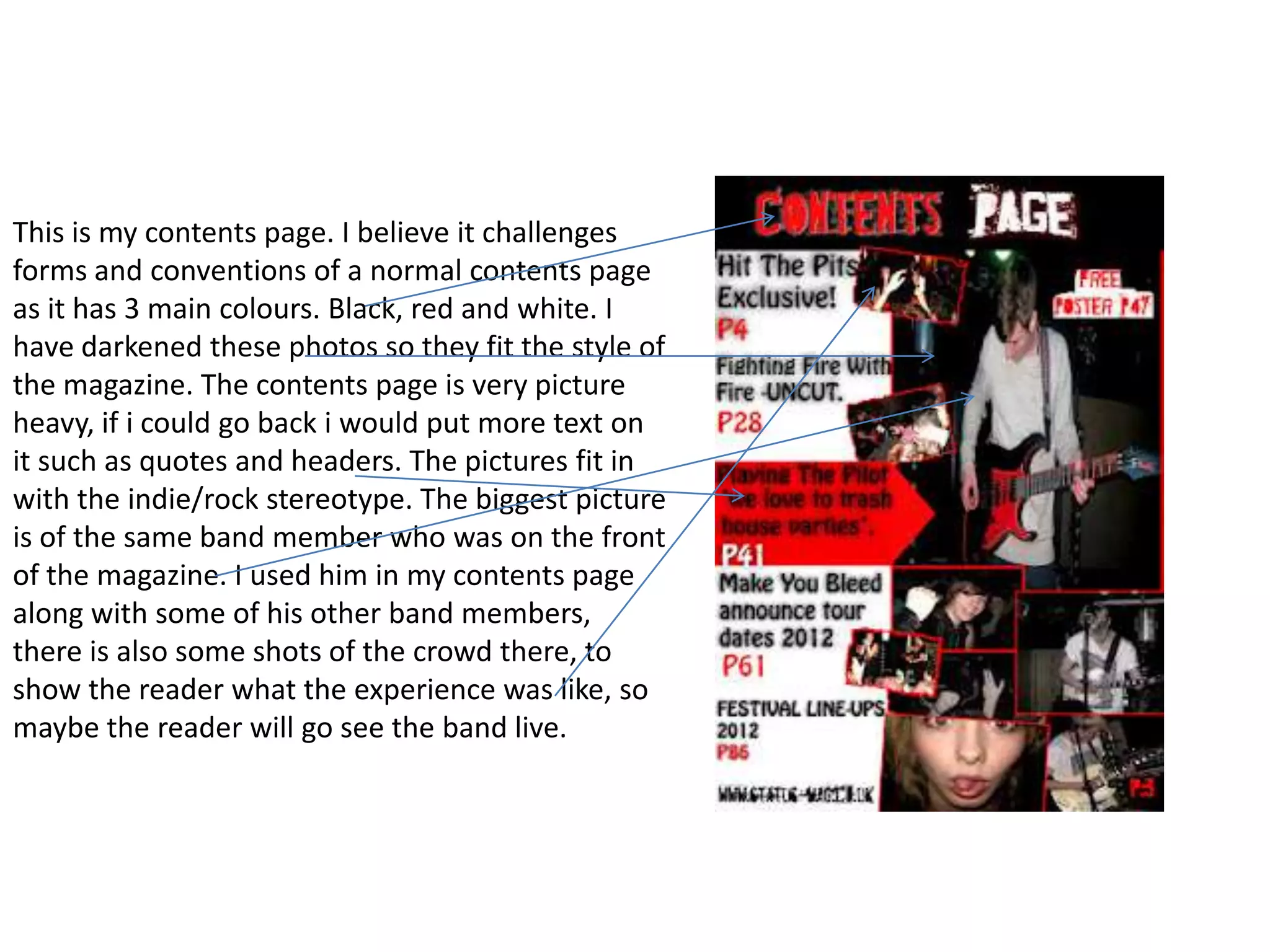
2) The contents page heavily features pictures over text in a mostly red-black color scheme common to rock magazines.
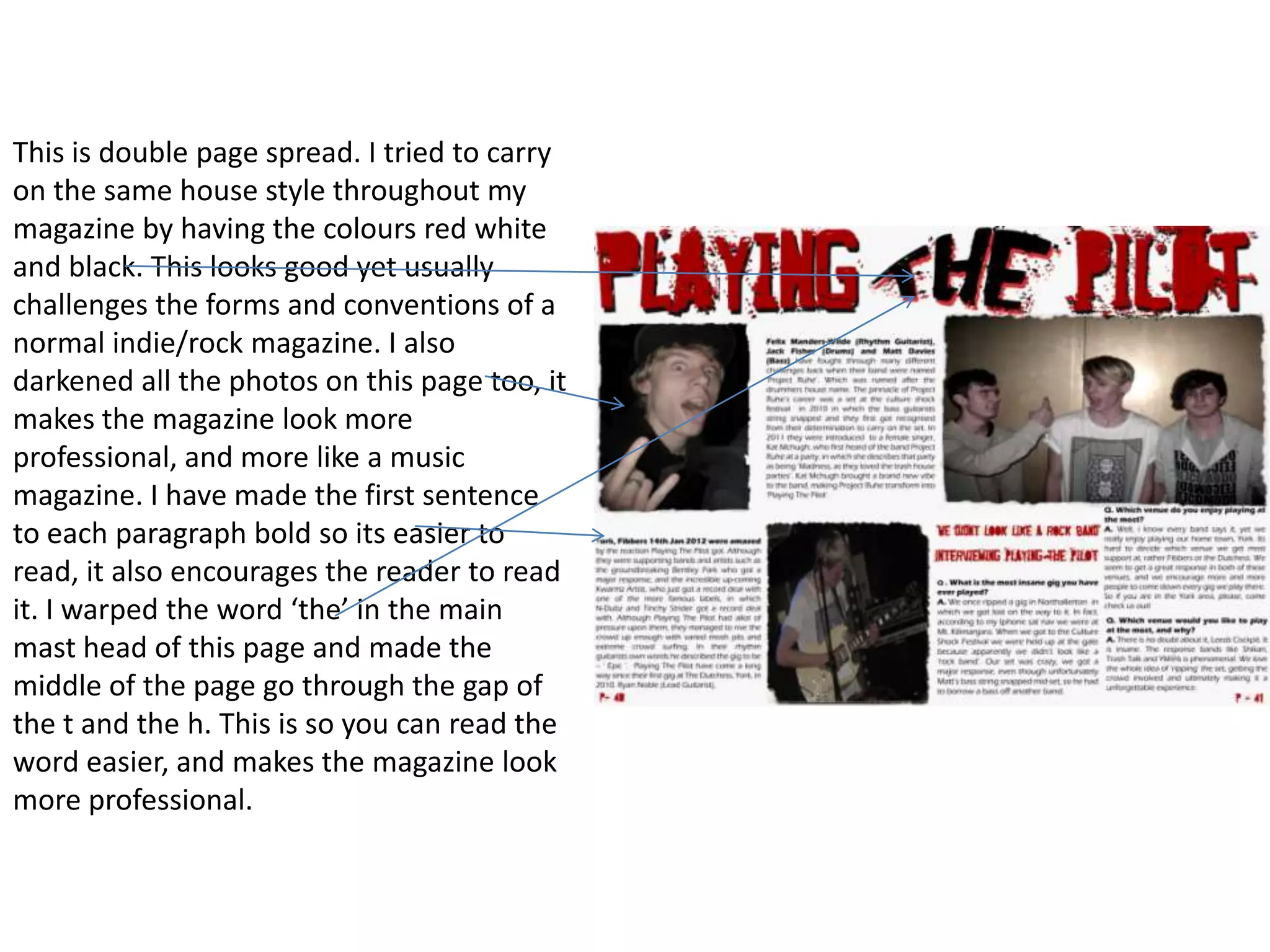
3) A double-page spread maintains the red-black-white color scheme and uses bold text and photo warping to encourage reading in a more professional design.
Overall, the magazine challenges conventions through its extensive use of red and picture-heavy
