
Recommended
More Related Content
What's hot
What's hot (20)
Similar to Digipak feedback
Similar to Digipak feedback (20)
More from Amy Clarke
Recently uploaded
Recently uploaded (20)
Digipak feedback
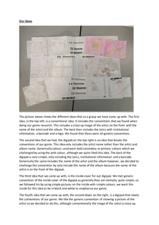
- 1. Our Ideas The picture above shows the different ideas that as a group we have come up with. The first idea, in the top left, is a conventional idea. It includes the conventions that we found when doing our genre research. This includes a close up image of the artist on the front with the name of the artist and the album. The back then includes the lyrics with institutional information, a barcode and a logo. We found that these were all generic conventions. The second idea that we had, the digipak on the top right is an idea that breaks the conventions of our genre. This idea only includes the artist name rather than the artist and album name. Generically colours used were bold secondary or primary colours which we challenged by using the pink colour, although we quite liked this idea. The back of the digipak is very simple, only including the lyrics, institutional information and a barcode. Generically the spine includes the name of the artist and the album however, we decided to challenge this convention by only include the name of the album because the name of the artist is on the front of the digipak. The third idea that we came up with, is the inside cover for out digipak. We met generic convention of the inside cover of the digipak as generally they are normally quite simple, so we followed his by using simple pictures on the inside with simple colours, we want this inside for this idea to be in black and white to emphasise our genre. The fourth idea that we came up with, the second down on the right, is a digipak that meets the conventions of our genre. We like the generic convention of showing a picture of the artist so we decided to do this, although conventionally the image of the artist is close up,
- 2. we quite liked the idea of using a long shot of the artist. The back of the digipak it again quite conventional due to the simplicity of it. Only including the lyrics, the barcode, institutional information and a smaller image, shows this convention of our genre. The fifth idea that we had, the one on the bottom left, we again kept this quite simple but used imagery that represents the genre of our music video, using acoustic music sheets. We also liked the idea of including a guitar on the right hand side because this again reflects imagery from our genre, acoustic pop. We challenged the convention of bright primary and secondary colours as we thought that black and white would enable audiences to identify with our genre more. Our final idea, on the bottom right, we decided to keep again quite conventional. We decided to stick the primary colour theme by using a blue for the background. We then included a medium shot of the artist to emphasise who the album is by and included the name and song of the artist, the artist name being bolder than the name of the song. On the back of the digipak we as we decided to include the lyrics and a small picture to emphasise the genre, again a generic convention. We then included the institutional information, studio logo and he barcode as this is also conventional of a digipak and we liked this idea. The picture also includes ideas of our fonts, we decided to follow the conventions of our genre and keep them bold and using simple fonts so that the artist name and album name are easily seen and recognised. Feedback
- 3. The image above shows the feedback that we got from other people. The arrows show what people preferred. We were told that they liked the back panel of the first idea they thought it was effective of the genre however, we were told that they feel like for the back panel there should be some graffiti or a newspaper on the wall just to make it look more interesting. We were also told the first idea was simple but effective of the genre and that they really liked this idea. Someone said they didn’t like the close up of the guitar on the 5th idea because they didn’t know what it was until we explained it to them so we should replace this with something else. Someone also said that they didn’t mind the pink background on the second idea as they though it was conventional of the genre. Another person said that they didn’t like the black and white and that we should use bolder colours to keep the digipak more conventional. Changes and Decisions Made From all the feedback given, we decided to make a few changes and swap ideas around. We decided that we liked the first idea and that were going to use this for our digipak however we were going to swap the picture of the artist playing the guitar on the back panel, to the pictures of the guitar standing against the chair on the inside panel of our third idea. We then decided that we were going to use the inside panel of the fifth idea because we really likew the idea of them music sheets, however we are going to change the close up of the guitar to something that will represent our genre more and so that the audience can identify what it is rather than getting confused.