
Recommended
More Related Content
What's hot
What's hot (20)
Viewers also liked
Similar to Magazine Layout Design Draft
Similar to Magazine Layout Design Draft (20)
More from Aubert Cavallo
More from Aubert Cavallo (20)
Recently uploaded
Recently uploaded (20)
Magazine Layout Design Draft
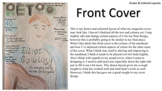
- 1. This is my drawn and coloured layout of what my magazine cover may look like. I haven’t finalised all the text and colours yet, I may slightly edit and change certain aspects of it for my final design, however this is probably going to be similar to my final piece. What I like about this front cover is the colours of the masthead and how I’ve depicted certain aspects of colour for the other areas of the cover. What I think may need to altering and improving is the masthead, I think it needs to be placed over his head slightly. Also I think with regards to my actual cover, when I come to designing it, I need to add more text especially down the right side just to fill it out a bit more. This drawn layout gives me a rough insight to what has worked well and what hasn’t work so well. However, I think this has gave me a good insight to my cover design. Drawn & Colored LayoutsDrawn & Colored Layouts Front CoverFront Cover
- 2. This is my drawn and coloured layout of what my contents page for my magazine may look like. As you can see, its got a variety of my own photographs including other artists/singers and a concert I attended. What I like about this is the consistency following on from the front cover, consistency of colours, and overall theme. This will help make the magazine look professional. Obviously there are still things I could change and alter as this is only a draft. I think I need to add more text over the photographs maybe a puff to specific pages which will engage the audience more so. I also think I could try and get some photos of a band, as opposed to just individual artists. However I think this contents page looks quite effective because its tidy, neat and has enough information to provide what's going on what page. Drawn & Colored LayoutsDrawn & Colored Layouts Contents PageContents Page
- 3. Drawn & Colored LayoutsDrawn & Colored Layouts Double Page SpreadDouble Page Spread Text/story This is my drawn and coloured layout of what my DPS for my magazine may look like. What I like about this is the consistency following on from the front cover, and contents page with regards to the consistency of colours, and overall theme throughout. This will help make the magazine look professional. Obviously there are still things I could change and alter as this is only a draft. I think when it comes to designing my DPS I am going to alter it around and maybe have a catchy title brining the audiences attention to that artist.