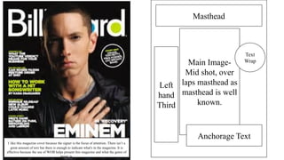
1. Masthead
Main Image-
Mid shot, over
laps masthead as
masthead is well
known.
Text
Wrap
Anchorage Text
Left
hand
Third
I like this magazine cover because the signer is the focus of attention. There isn’t a
great amount of text but there is enough to indicate what's in the magazine. It is
effective because the use of WOB helps present this magazine and what the genre of
music is.
3. Main Image-
Close up shot
Text Wrap
Masthead
Anchorage
Text
Barcode
Left
hand
Third
I like this magazine cover because the signer is the
focus of attention. There isn’t a great amount of text
but there is enough to indicate what's in the magazine
and who it is about, hence the main image on the
cover.
4. Main focal point- Close up
of artist.
Text/story about artist
Masthead, dates and website
I like this magazine DPS because the signer is the focus of
attention on the right hand side. The text is all placed on
the left hand side. This is an effective DPS as we know
who thee article is based around.
Large Lettering- grad
attention to that
lettering.
5. Main focal point- Mid shot of band.
Bands name.
Text about the
band.
I like this magazine DPS because the signer is the focus of
attention on the left hand side which is a boy band, it
crosses over onto both pages which gives us a better
understanding of what the article is based around. There
isn't much text but there is enough to tell us what they need
to tell us.
6. Main focal point- Close up
of artist.
Text
Wrap
Puff
Text.
Masthead
I like this magazine DPS because the signer is the focus of
attention on the left hand side. There is a lot of textual
information on the right-hand side which gives us a good
insight about the artist.
7. Masthead- contents
and date.
Smaller photos-
close up and mid
shot
Main Title-photo that links with title
LefthandThird
LargestImage-longshot
Photographs- Long shot
and mid shot.
Puff
I like this magazine Contents page because there is
lots of images which make us want to read what's
inside. There's more images than textual
information.