1. Evaluation
I am evaluating work that for my final major project where I have created
a fashion magazine, this includes a front cover, contents page and double
page interview. I have received feedback on my work for what they
thought was successful and what could have been improved. Here is an
example of some of the feedback I have received “The layout and
composition look professional as its something that you would see in a
fashion magazine. The colours are eye catching and the pictures have
been taken well” I think that the colours I have chosen are eye catching
and anchored down that the fashion magazine was based around spring.
However I think that I should have used a different colour other than
yellow for some of my text as it can be difficult to read. “Layout of the
front cover looks really good and the pictures you have used are good,
could maybe change the yellow text as it's a bit hard to read.” I agree
with the feedback I have been given and think that I could make
improvements to make my work seem more professional. I think that the
photos I used fit in well with the magazine but I could have edited them
more to make them stand out and look more professional.
The reason I chose the colour blue as a constitant theme throughout my
magazine was because i think that the colour worked well with the images
and gave the magazine a more fashion feel about than a different colour
would have done.
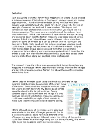
I think that on my front cover I had too much text over the image
meaning that the image became less of the main focus
of the cover. I only used one image on my front cover
this was to anchor down who my double page spread
would be about to the target audience. On my
contents page I set out the text and image in a way
that was consitent with fashion magazines although I
could have used different style of text in order to
make sure that the magazine didn't become boring.
I think although some of my images were good and
were similar to the kind of images you would find in
a fashion magazine I could have had different styles
of images e.g long shots and different poses. the editing of the photos
could been better with the image being cut out more precisely, this would
help make the magazine seem more professional.