1. The masthead is large “Q” which is easily
recognisable therefore standing out against
competitors such as “Vibe, Billboard.”
The selling line is the motto “Discover
Great Music.” Its easy to remember and
quite short and snappy which means more
people will be able to recognise the
magazine and therefore purchase it. The
genre of Q magazine is Indie Rock.
Mise en scene is very effective on this front
page as her facial expressions suggests that
she is very serious about her music, yet is
slightly sexual as her hands are on her
cheeks, this may help to attract different
types of audiences.
The use of blue rectangles helps to separate
the information, the use of small amounts of
blue help pick up her eyeshadow
This magazine has a specific colour scheme
and rarely changes consisting of white and
red, this allows the magazine to become
easily recognisable for the audience.
House style is very consistent as Florence
hair is very vibrant red/orangey colour,
which compliments the pale complexion of
her skin and the white writing that stands
out on the bright background. Her bright red
hair give connotations of fire and rebellion,
giving her a daring image which makes the
magazine seem rather exciting for the
audience.
Main image fills the whole cover page of the
magazine, which suggest that all the
attention should be on her, giving her a
powerful and vibrant image. The use of
direct address creates a relationship between
the reader and her, meaning that they are
more likely to buy it.
The barcode is a legal requirement on a magazine. Having the issue number, date and the
price is one of the code and conventions of a magazine. It allows the audience to know
which issue they are reading and allowing them to make sure they are up to date, it allows
them to know how much they are paying for the magazine.
Main cover line immediately states who the
magazine will focus on and what’s inside. This
will catch attention of fans of the artist, helping
to encourage them to buy it.
2. The use of blocked rather
straight lettering picks up
with the black solid
blocks, saying that the
magazine is quite a serious
article, more aimed for
those who are slightly
older. The use of black text
also picks out the shadows
(in her hair, between her
fingers, hey eyeshadow
too) on the following page.
The copy of the text is
quite bulk but not too
much just enough for the
reader to get a concept of
the artist.
In the bottom left hand
corner the use of “Q” has
been identified. The “Q” is
constant of every page of
this magazine to inform
what magazine it is.
House style is very consistent
as Florence hair is very
vibrant red/orangey colour,
which compliments the pale
complexion of her skin and
the white writing that stands
out against the white
background, on the oppose
page. Her bright red hair give
connotations of fire and
rebellion, giving her a daring
image which makes the
article seem rather exciting
for the audience to read.
The main photograph of Florence is exactly the same as the one on the cover, again filling the
whole page, which suggest that all the attention should be on her, giving her a powerful and vibrant
image. The use of direct address creates a relationship between the reader and her, meaning that
they are more likely to feel more connected with the article.
3. The word “Now” makes its headline stand out because
it forces upon the idea of urgency and interest, caused
by that specific word along with the help of an
exclamation mark.
The mouse pointer overlays the “140 songs to
download now”, which simply helps draw attention
to that specific article due to the arrow, and also
relates to the internet context inside the article. This
will really help this magazine attract younger
audience perhaps in comparison to an older
generation as younger ones tend to use the internet
more so than older generation.
The masthead is where it is always positioned on “Q”
magazine this shows the audience that it is exactly the
same magazine and is easily recognisable as it is a
well known brand and a well established magazine. It
always uses the same colours- red and white so this
keeps to the code and conventions of having the
masthead the same on each section and having it on
every page helps it stand out and also sticks to the
code and conventions of a music magazine. The
magazine masthead Q is clear on the cover, this
symbol can clearly be seen repeated to the left of the
masthead “Contents”. The red colour of the
background of the Q itself contrasts with the white,
also helps pick out other red textual features including
“Issue 302, column title, as well as the page numbers,
this helps the audience because they can easily
identify that it is from Q magazine.
The positioning of the model is stylized in this
particular way because they don’t want to reveal to
much to the audience about who it is, making you
want to read the specific article about that specific
person.
The use of blood seeing as it red link nicely and picks
up amongst the other red elements on this page. The
use of this, causes the image to stand out even more,
because it provides the idea that there is an interesting
story about someone which makes the audience want to
buy it.
The feature headlines, straplines, and page numbers are
clearly listed in the column inch towards the left of the
page informing the reader where to look for what story.
This also helps the reader give an understanding of what
each article/story may be about. The black colour of the
masthead and the features headline and straplines, along
with the red of the tagline “Discover great music” really
contrasts with the white background of the page which
makes the mast head, the tagline and the feature headlines
and straplines stand out amongst the background..
4. The masthead is always positioned in the left top
corner of “Q” magazine this shows the audience
that it is exactly the same magazine and is easily
recognisable as it is a well known brand and a well
established magazine. It always uses the same
colours- red and white so this keeps to the code
and conventions of having the masthead the same
on each section and having it as the largest texts on
the front page stands out and also sticks to the code
and conventions.
The sky line “The stories of the year by those that
made them” appeals to the target audience because
its stories about artists/bands that they will be
interested in so that they will want to hear all the
gossip.
The cover lines about both older, well known
artists such as Pink Floyd and Wilko Johnson
which will appeal towards the older end of the
target audience. They also talk about more
modernised artists like Kasabian and Royal Blood
which will help attract a younger audience.
Q magazines sells line says “Awards Special Edition”
this would attract target audience as they wouldn’t want
to miss out on a special edition magazine.
The puff “50 Albums of 2014” stands out because of
the red background. The word “Essential” would grab
the readers attention and make them want to buy the
magazine, as they would want to make sure that they
are up to date with their taste in music.
The cover lines in this magazine show that Q don’t
just talk about music they talk about news of
important people from the music industry- Wilko
Johnson and how he is beating cancer.
The main image breaks the codes and conventions of
most magazines by not using a direct mode of address,
instead Ed Sheeran is looking to the right as oppose to
the reader. This is very unusual to do as using a direct
mode of address is something that appeals and attracts
the audience because Q is so well known and respected
they didn’t have to worry about appealing to the
audience through the mode of address that much. The
guitar shows that he is an acoustic singer and plays his
own music on the guitar.
The main cover line tells the audience who is on
the front cover, it relates to the main image
(anchorage text) and to the main in this issue of the
magazine.
The barcode is a legal requirement on a magazine. Having the issue number,
date and the price is one of the code and conventions of a magazine. It allows
the audience to know which issue they are reading and allowing them to make
sure they are up to date, it allows them to know how much they are paying for
the magazine.
The footer bar tells the audience more of the articles
which are going to be in the magazine. “War on
drugs” would stand out as well as “The return of
AC/DC” they are an old band so would therefore
appeal to older range of the target audience. The
word “Plus” suggests that there will be loads going
on inside the magazine making the reader feel as
though they are getting there moneys worth and will
encourage them to buy the magazine.
5. The central image of Ed Sheeran
symbolises how casual he is, by
using the city as a background
setting shows that he is a “city
boy” and isn’t a high classed
musician, it also symbolises his
lifestyle and how he moved to the
city to become a busker. The
clothes he is wearing suggests he
is a normal guy, which suggests
upon the idea that the article is
genuinely relaxed, friendly feel
about the article. The article main
focus is on Ed Sheeran
suggesting that its about Ed on a
personal level, which would help
attract his fans read the magazine
and therefore buy it.
The subheading is written as a
quote from Ed Sheeran himself,
which tells the audience that it is
personal, which would intrigue a
fan. Its in large, bold, vibrant font
contrasting against the
background making it stand out
so that the audience read it. The
word “ginger” is coloured in red,
which is the highlighting colour
of this double paged spread.
The page number is highlighted
in red, which helps to continue
the house style of the double
paged spread keeping the
connection between Ed and the
double paged spread.
This is the central image- London's capital city, it’s
the articles concentration point. The choice of
image is large and covers the Double paged
spread.
The masthead is written in bold, which
contrasts to the background, the colour
red connects with the word “ginger” in
the heading of the other page, as well
as the highlighted parts of text across
the main article. This makes the reader
make connections between the
highlighted words, it also brings the
concentration of the article to those
certain points.
This is the main text across the double
paged spread, its mounded onto a text
box with a white background in order
to make sure the words are easy to
read and not hidden by the central
image of the background. The red box
at the start of the text connects with
the other important words in the
double paged spread, suggesting that
the text is an important part, and also
making clear where the article starts.
The text is set out in 2 columns, which
is a traditional article layout. The text
is fit into a shape that goes around a
smaller box in the middle, which
emphasises the importance of the text
that is placed in the middle.
6. The masthead is always positioned in the
left top corner of “Q” magazine this shows
the audience that it is exactly the same
magazine and is easily recognisable as it is
a well known brand and a well established
magazine. Again it uses the same colours-
red and white so this keeps to the code and
conventions of having the masthead the
same on each section and having it on
every page of the magazine a substantial
size which allows it stands out therefore
sticks to the code and conventions of music
magazine designs.
The feature headlines, straplines, and page
numbers are clearly listed in the column
inch towards the left of the page informing
the reader where to look for what story.
This also helps the reader give an
understanding of what each article/story
may be about.
“Every Month” makes the reader want to
buy it because they don’t want to miss out
on the fun things that the magazine contains
like crosswords, Sudoku's, IQ tests etc., it
would help encourage people who like
games want to buy the magazine monthly.
The image takes up the majority of the
space on this page. The models are
positioned in a certain way, so they look
like a band together, usually tending to
the main singers positioned at the
front/main focal point and the musicians
slightly behind him. They are wearing
rather casual clothing suggesting that
they are a rock band also the use of
sunglasses give the impression that they
are a rock band.
The strapline purposely is positioned
over the photograph, this grabs the
audiences attention and allows them to
know what is one of the main story’s in
the article amongst others.
The use of a puff “THE WORLDS
BIGGEST AND BEST MUSIC GUIDE”
helps the magazine sell better as it
boosts the confidence of the magazine.
“Biggest and best” straight away imply
the idea that no other magazine is better
than this one, it is competing against
other magazine brands so therefor wants
to try and encourage people to buy it
through the use of capital letters and
persuasive language.
7. Masthead- largest letter on the page, it is
positioned in the left hand top corner of
the page, which will be the first thing
the reader will see. The consistency of
this masthead makes the white stand out
against the red, this is a logo that semi
literate audiences would recognise as a
music magazine. The Q is monolithic
which means one word.
There a few cover lines down each side
of the magazine but the are only short
cover lines, this intrigues the reader
making them want to buy it. There
aren’t many of these because the
magazine designer wants the main focus
to be on Cheryl the main image.
Main cover line is the largest text on the
cover page, it anchors the meaning of
the image and tells us as the reader what
the main article is based upon.
The photograph of this cover, takes up
the majority of the space, this tells us
that the article is mainly based around
that artist in this case Cheryl Cole. The
use of direct address in this photograph
tells us that the article is quite
personalised about her, I think this
photograph sexualizes her as a person
because of the way she is positioned and
the use of water. This may attract other
audience members.
There are anew buzzwords across this
cover page- “Best and “Biggest” this
helps the audience to want to buy the
magazine because it sounds amazing.
The overall colour palette of this cover
consists of “red, white, grey and black”.
The red text pick up with the red
lipstick, the white and grey text picks up
with the colour of her skin and the rain
drops. The target audience for this
specific magazine is usually for the
older generation, but in this case Cheryl
seems to be inviting a younger audience
as she is more contemporary.
8. .The use of A large
“C” which
overlays some of
the text- grabs the
readers attention
because the red
contrasts with the
white and black.
The red of the “C”
helps to pick up
the red lipstick she
is wearing and the
red text on the
bottom left corner
as well as the
masthead Q in the
bottom left corner
in small print.
The use of a black
rectangular box
helps to split up
the article.
The small photo
helps the reader
imply what the
article is about.
The masthead of this DPS is “Cheryl Cole” telling us this article is about her. The photograph
takes up a whole
page with the main
article on the
opposite page. The
background is plain
white because it
makes the reader
just focus on the
artist.
Its quite a
simplistic DPS
because the
designer wants the
reader to focus on
the article and not
be distracted by
colour, photos and
other bits of
unnecessary text.
The colour palette
consists of mainly
dark, bland
colours, red, white
and black.
9. The consistency of this masthead makes
the white stand out against the red, this
is a logo that semi literate audiences
would recognise as a music magazine.
The Q is monolithic which means one
word. The masthead “Q” is placed also
in the left hand bottom corner, its
consistency helps the reader remember
the masthead as opposed to other
magazines in which do not use that
specific feature.
The main column of the contents is the
feature section, which presents the main
features inside the magazine, and a page
number, which is in the same textual
font as the feature. It also have a brief
description of what the feature is about.
The style of the features column is a
mix between white, black and red fonts.
The use of smaller photographs helps
the reader to inform what other main
articles there are and what page number.
The main photo is of Cheryl Cole
which takes up the majority of the
page meaning that the main article is
about her, we can tell its about her
because the cover page was a photo
of her too, also the large black text
“46”tells us what page to look for,
for her article. Cheryl’s clothing
looks quite rock like, suggesting that
the article is about a
concert/performance.
The sub headlines- “Top 2010
preview” give the idea that also
inside the magazine they are telling
us the best artists of that year 2010.
The use of black test picks up with
the clothing of Cheryl and the large
number “46” they both use the same
font and are both italic showing that,
that sub headline is also a article
inside this magazine.
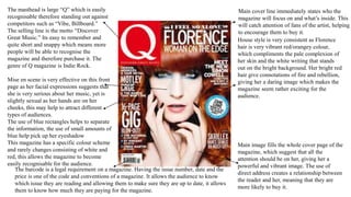
10. Masthead- largest letter on the page, it is positioned in
the left hand top corner of the page, which will be the
first thing the reader will see. The consistency of this
masthead makes the white stand out against the red,
this is a logo that semi literate audiences would
recognise as a music magazine.
Usually the main cover line is about the image
portrayed on the front cover, but in this case it is
about another big feature in the magazine. “The 100
greatest front men” which contrasts with the image
when clearly Florence is a woman. The colour
matches Florence's outfit and the banner at the top.
The fonts vary in size purely so that they match up
into the same line, the font is consistent with the “Q”
of the masthead along side other text on this cover
page.
The plug is the only bit of information towards the
bottom left of the page. It matches the colour palette
and the actual cover title with a white background.
The words highlighted in red are purposely
highlighted to attract the reader when browsing at
different magazines.
The colour palette is simply red, white and black with
a small amount of gold. White is the background
colour contrasting against the red, the white also is
similar to the colour of Florence’s skin. The red is
used to mainly attract attention to the main parts of
the magazine eg:masthead, cover line and main
image. The red also features in Florence’s hair, the
black can be seen in her outfit and some cover lines.
The barcode is a legal requirement on a magazine. Having the issue number, date and the price is one of the
code and conventions of a magazine. It allows the audience to know which issue they are reading and allowing
them to make sure they are up to date, it allows them to know how much they are paying for the magazine.
The cover lines vary in style, colour and font. All of
it falls to the right of the main image and the
majority of it falls straight onto the white
background. It is split into three using the rule of
thirds underneath the cover line. The first being very
small, written in gold, which isn’t meant to attract
the audience to much as its not about the main
article. It uses different font each time and the
writing is centred. The second headline gives
information about the main article about the artist
“Florence And The Machine” the colour matches he
trademark red hair, the writing is split into two lines
with the smaller line in capitals and the bigger line
not. The last of these three is a quote from Florence,
following on from the other two. Again it is over
two lines but the font has stayed the same size as it
is a direct quote.
The main image dominates the page. There are two
parts to it. First being the artist Florence, positioned
in the centre, her stance is very strong and slightly
off centre. The second part of the main image is the
background of all the buildings which Florence
towers over. It appears they are positioned in height
comparison to each other.
11. Masthead- largest title on the
page, “USA got the love” is one
of Florence’s songs she produced
so its quite significant towards
this article.
Florence herself is positioned
sitting down which could imply
that she is quite a relaxed artist in
a sense. Her mode of address is
direct which implies to the reader
that this article is based upon her,
the use of direct address provides
a connection between the reader
and the article. She is wearing
black which straight away picks
up the text “got the love”. She is
sitting on what looks like the
American Flag, which links
nicely to the masthead “USA”.
The colour palette is simply red, white and black with a subtle amount of blue. White is the background colour
contrasting against the red flag, the red flag brings out the red hair, and Florence's rosy cheeks. The white is similar to the
colour of Florence’s skin. The black can be seen in her clothing and is some of the text.
12. .As you can see the title of the magazine “Q”
is headlined along with the contents, which
are in big text suggesting that they are
important. “Q” is in a red box which follows
the house style of the magazine associating
the colours red and white together with black
text.
The main column of the contents is the
feature section, which presents the main
features inside the magazine, and a page
number, which is in the same textual font as
the feature. It also have a brief description of
what the feature is about. The style of the
features column is a mix between white,
black and red fonts.
In the bottom left and corner, there is an
“every month” which shows us information
about what features are in every months
edition magazine. They have highlighted
“every month” with a large red banner to
make the text stand out more and appear
more eye catching for the customer. There is
also a column showing “Women's music” in
the magazine, this tells us what artists are
inside and a brief phrase of what their
interview consists of.
In the top right corner, there is a date and
issue number. The fact that this is
positioned her it is stating that it is vital as
the date needs to be clearly seen, it blends
in well with the colour format of the
“contents” with the black background and
white font. The website is underneath the
date so that people can easily access the
website of the magazine company by
typing it in on the internet.
The main photo dominates this page, as it
is the largest feature, the pose/gesture of
the model is very simply but highly
effective because she is looking at the
camera but not directly towards it. Her face
has been focused on in particular as oppose
to her neck and body because it gives the
photograph a sense of perspective.
In the bottom right hand corner of the page.
There is a review section showing the page
number it is on inside the magazine. The
layout is very neat using rectangular boxes
and squares to fit text into. The heading Q
Review is bold and uses rather large text to
stand out more and make it more easily
noticeable for customers.