
Recommended
More Related Content
What's hot
What's hot (20)
Viewers also liked
Viewers also liked (19)
Similar to Print screens.pptx
Similar to Print screens.pptx (20)
More from lyndon19999
Recently uploaded
Recently uploaded (20)
Print screens.pptx
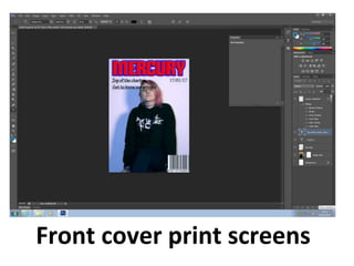
- 1. Front cover print screens
- 2. I changed the colour scheme of my front cover as well as added in more cover lines. The image isn't the image I will be using for my front cover, it is a draft whilst I arrange to take my magazine photos.
- 3. This is now the image I will using for my Front cover, I have removed the Masthead to focus on the editing of the image itself.
- 4. I have now added back in my masthead and cropped around the image to allow me to experiment with different background colours.
- 5. I have now added back in my cover lines, adding colour overlays and strokes to them to allow them to stand out.
- 7. I keep re arranging my cover lines to see where they best fit around the page.
- 8. I added a strap line which was originally on my plan and experimented with different overlays and gradients as well as fonts.
- 9. I changed the position of the date as well as the character of the text to allow more space and easier reading.
- 10. I have now added more cover lines as well as starting to introduce some Indie Artists to get the audiences attention.
- 11. I have now added puff to advertise extra features included inside the magazine. And a secondary image to show what content will be included.
- 12. I later decided to change the background colour as before it was unnatural, this background doesn’t over power the main image itself .
- 13. I am considering changing the colour of the lips to fit the colour scheme more.
- 14. I have changed the lip colour of my model, to suit the overall theme of colours already used.
- 16. I decided to change the lip colour again to allow the lips to be a stand out feature. As well as darkening her eyebrows and texture of hair.
- 18. I have added many more cover lines, to include more artists to reach out more to the audience and attract them to buy.
- 19. I have changed the colour of the text to allow it to stand out on the cover and be easily read from a distance.
- 20. I have now made all the text bold and embossed to give it a 3D effect.
- 21. I have changed the strapline at the bottom, to have wider text as before the text didn’t stand out and the spacing was off.
- 23. I have added a gradient background for the background of my contents page.
- 24. I have now added the images I want to include on my contents page.
- 25. I am experimenting with different positioning and layout of my images.
- 26. I am now starting to put in text for the columns that will later appear. This is so that it shows the links to the other pages in the magazine.
- 27. I am adding more titles to what other pages and articles are included inside the magazine.
- 29. I have added the page numbers and linked them to the relevant picture.
- 30. I have added more detail to the extra titles and have embossed them to make them stand out more compared to the normal text underneath it.
- 31. I have added puff, to advertise other features inside the magazine. I have done this by adding a shape and making it bold.
- 32. I have added a title, to identify to the reader that this is the contents page.
- 33. I have added more text as well as social media links at the bottom of the page.
- 35. I have made the text bolder, as well I have edited one of the images by changing the background colour. To allow the models to stand out.
- 37. I have added a shape in the background as a border to allow the text to stand out.
- 39. I have added a border to the black box/shape, to make it tie the colours in to the overall theme.
- 41. Double page spread I changed the order of the pages to allow it to be in the correct order/format of a magazine.
- 42. This is the amount of columns i selected, it ranged from 0-5, I found 3 was most appropriate for the amount of text I had.
- 43. This tool allowed me to insert any shape I required, I decided to use a rectangle to create some form of text box to stand out from my picture.
- 44. By selecting “Place” it allowed me to select the image I wanted to appear on my pages.
- 45. Margins, meant that my text would stay in the selected area i had placed it in and not go over the page or out of the selected box.
- 46. Zoom in and Zoom out allowed me to be able to focus on different areas on the page.
- 47. These tools, meant that I could see the overall construction lines/areas and controls to allow me to have an overall idea of what my final product would appear like.
- 48. I used a stroke on my text, to allow it to stand out against my article text. I did this by changing the weight and thickness of my stroke and the border colour.
- 49. This tool allowed me to select the colour of my text as well as the opacity of my shapes and fill. I found this useful as it had a variety of hues to choose from.