
Recommended
More Related Content
What's hot
What's hot (19)
Viewers also liked
Similar to Draft copies
Similar to Draft copies (20)
More from Aubert Cavallo
More from Aubert Cavallo (20)
Recently uploaded
Recently uploaded (20)
Draft copies
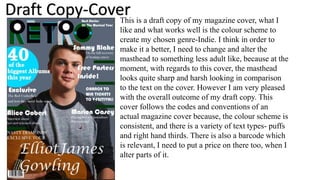
- 1. This is a draft copy of my magazine cover, what I like and what works well is the colour scheme to create my chosen genre-Indie. I think in order to make it a better, I need to change and alter the masthead to something less adult like, because at the moment, with regards to this cover, the masthead looks quite sharp and harsh looking in comparison to the text on the cover. However I am very pleased with the overall outcome of my draft copy. This cover follows the codes and conventions of an actual magazine cover because, the colour scheme is consistent, and there is a variety of text types- puffs and right hand thirds. There is also a barcode which is relevant, I need to put a price on there too, when I alter parts of it. Draft Copy-Cover
- 2. Draft Copy-Contents This is a draft copy of my contents page, what I like about this is the fact that it looks like part of the magazine due to the constancy of clothing on the main model also the masthead and colour scheme. With regards to altering this for my final design, I need to add some text next to the main artist and possibly crop out the background, so that he is the main attention. I like this as my contents page because there is a variety of text telling us exactly what's new/on. I like the variety of different photos from mid shots and long shots.
- 3. Draft Copy-DPS I am currently working on this as my draft DPS. What needs improving is the background, making it a similar or the same colour as the front cover just for consistency of it. However I like the image and the overlap of the text, again the colour scheme is constant. In order to improve, I need to finish parts of it and possibly edit the model a bit, so he looks similar to the edited version on the cover. Overall I am very pleased with the outcome, I think it meets the codes and conventions of an actual magazine.