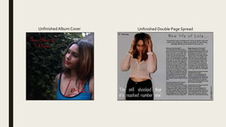
2. Feedback 1
What do you think of the font colours on the album cover?
I think the font itself is good and could work well with certain things, but I don’t think it fits well with the
background of the cover, although the red works well with the lips, but other parts of the cover, such as the blue
top, don’t fit the font colour.
On the double page spread, I still need to change the masthead font, however what do you think of it?
I think it needs to stand out a bit more but I think the style of the font works well with the design of the page, just
need something to make it stand out.
On both pieces of work, what do you like best?
I like the double page spread, I think the picture in the background works well with the page and the way the
page is laid out is done well, with the photo on one side and the text the other. Also the quote works well with
the rest of the page.
3. Feedback 2
What do you think of the font colours on the album cover?
I think they are okay but it could maybe be slightly brighter as I think it is too dark and it’s readability would be
improved with a slightly brighter red.
On the double page spread, I still need to change the masthead font, however what do you think of it?
I think it is quite good as it is not just a basic style of font and the letters are spaced out well to cover the article
underneath it. It could potentially be resized to a slightly bigger font to cover more space.
On both pieces of work, what do you like best?
On the album cover I quite like the simplicity of it and how it is not overcrowded. On the DPS I think that the left
side of the two looks good as there is a lot of space and the white text works well on top of it.
4. Feedback 3
What do you think of the font colours on the album cover?
Could be brighter and more eye catching.There needs to be more detail added to the colours so stand out more
such as a drop shadow or an inner shadow. I really like the red contrasting with the blue but make it brighter so
they stand out more.
On the double page spread, I still need to change the masthead font, however what do you think of it?
The background is very simple and needs more detail.You could try a brighter colour and adding some images or
graphics so that it is more eye catching and makes you want to read it. I like the large image on the page
however you could include smaller images surrounding it so that some empty space is filled. I think the mast
head and the body text needs to be bolder and more clear- perhaps a different font that is more basic and easy
such as a sans serif font.
On both pieces of work, what do you like best?
I really like the photographs because they look professional and stand out.The colours work well together on the
page which makes it look professional and realistic. However there needs to be more detail such as graphics or
more images.
5. Summary
Some improvements that was mentioned was:
AlbumCover:
Overall, it was to change the text colour so it was brighter and made it stand out more as the background was too dark.
Double Page Spread:
They thought it was good, however it needed needed something to stand out and resize the text so it spreads out more. The third feedback was
where I got more inspiration out of as they said that the background was ‘very simple’ and gave me different options to add to it, such as, images
and change the font so it was more bold.
Conclusion:
The double page spread won out of both pieces of work, but they liked the images that were used as they looked professional and realistic.
I have taken this feedback on board and changed my work to what they have suggested. However, I have not changed the darkness of the font or
the background because after I moved the name, it looked better. On the album cover, I have now moved ‘Lola’ to the top left corner and enlarged it
so it stands out more, then I have placed the album title underneath in a smaller size. Also, I have now added a back cover which has a red graffiti
brick wall with ’Lola’ and flowers as the graffiti.
From the feedback, I have changed the colour of the masthead and the quotation into the same red as her name.This was so I could move the
quote underneath the article so then I could add in Polaroid's with images of the model so it didn’t look blank there which was in the feedback. Also,
I have done a graffiti background on here too and added in ‘Lola’ and the flowers. I have also changed the questions into bold and changed the rest
of the text not in bold so then you could see a clear difference from each response.