
Recommended
More Related Content
What's hot
What's hot (19)
Similar to Creating the magazine on InDesign
Similar to Creating the magazine on InDesign (20)
Recently uploaded
Recently uploaded (20)
Creating the magazine on InDesign
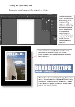
- 1. Creating The Regional Magazine To create the regional magazine itself, I designed it on InDesign. Opena newpage,and sort out the spacingthat will be neededforthe frontcover of the magazine.Idecidedto keepa white borderasit mimicsthe well-known style of ‘Wavelength’ a surf magazine that usuallyhasa white borderto itsfront cover, whichgivesita standout identityasitisnot a commonstyle usedin magazines. As shownhere inmydraft of the front cover,the white borderispresent.Withinthe borderIalsoplaceda barcode whichfitsinwell anddoesnotoverlapanytextor image onthe cover. Alsoincludedisthe brandidentityof the logo,thisiscarried ontoour othermagazine.Thisisimportanttocreate identity and standout to the audience.The textarounditisan easy wayof explainingitisa regional magazine withthe Proper nounsof local townsin the area.
- 2. Creating The Regional Magazine I addedpagesto create a double page spreadfor the magazine.The use of double page spreads allowsanenlargedimage tocrossthe page infull detail andhave roomto fitin textandarticles.I usedthisforboth contentspage anddouble spread to getthe full effectof animage.Thishas been done inmost magazinesanddouble page images are commonlyfeaturedinsportmagazinestotake out andplace on wallsforslightlyyounger audiences. Addingarticlestodouble page spreadto keepthe articlesneatandin order, makingiteasierforthe audience toreadand direct themselvesaroundthe page. I chose to setit out with3 columnsforthe double page spreadon one side,andleave 1 columnonthe otherto spreadthe text,yetleave space for the images.
- 3. Creating The Regional Magazine [Grab yourreader’sattentionwithagreatquote fromthe documentoruse thisspace to emphasize akeypoint.Toplace thistextbox anywhere onthe page,justdrag it.] Thisis the article seenonthe double page spread,itwascreatedusingcolumnbutremained slightlyconfusingandoutof alignmentsoIimprovedthisaftermydraftmagazine. Thisis the double page spreadafterI had movedaroundimages and replacedsome to standout slightlymore to appeal tothe audience. I unhyphenatedthe text inthe article andmade sure the columnswere equallyspreadapartin the double page spread. I alsouseda pull quote inthe middle of the article to create a more eye catchinglayout.
- 4. Creating The Regional Magazine When the images were imported the quality was not to the needed standard so it was necessary to turn the image quality to the highest possible resolution to get an idea on if the image will fit the page. The outcome of the image helps determine whether or not the image fits in and looks correct in the chosen page of the magazine. This can depend on many things such as theme, colour scheme and lighting of the image. Due to this issue of the magazine revolving around summer, a lighter image with a warmer glow fits the theme better, where as a winter issue would suit a darker, cooler looking image. A high quality display is selected to improve the quality of the image.
- 5. Creating The Regional Magazine On the contentspage I gave more character to the textby puttingthe contentsof the magazine andinformation fromleftto right.I alsomovedthe sizesof the textboxes asthe textwentfurther downto shape aroundthe image. The textgoesaround the mainpart of the image and keepsitvisible.This keepsacleanerlookto the magazine and preventsoverlapping, makingitmore appealing and easiertoread. The fontsusedin the magazine remainthe same acrossbothissues.We kepta brand identitytogive characterandrecognitiontothe magazine. Thishelpsitstandout fromother magazinesandcan fitto the genre of magazine we are creating. For the article and smallertextthe font‘Verdana’isusedandvaries betweenboldorregulardependingonif the textisa subheading/importantpiece of textorwhetheritisjusta regular informative piece of text. For the mainheadersandlogothe font‘Impact’hasbeenusedbecause it hasa boldstyle toitand is basic.The fact the textis basickeepsthe magazine lookingbasicwhichisintendedforourstyle of magazine.The genre behinditbeingsurfingandskateboardingusuallytrendsamore boldand basiclook,nota ‘fancier’type look.The audience for skateboardingandsurfingmagazinesare generallymore intendedto show off imagesratherthan text,thereforemore focusisplacedon images. I editedthe size of differentpartsof textby changingthe spacingbetweenletters.Thisworked well forpartssuch as the title thatfeatureda more spacedout smallertextunderneathstatingwhat type of magazine itis.The general sizingof textwas: 75 pt for logo(tostand outfrom othertext) 18 pt for headers 12 pt for subheadings 9 pt forinformative text