1. Strengths: This font would be appropriate to use as a masthead for an indie/rock music
magazine, due to it being bold and unique. I think this font would suit the casual,
‘imperfect’ style of indie music, as the font appears messy and hand-drawn.
Weaknesses: This font would be less appropriate to use on a contents page, as it may
appear too bold.
Strengths: I think this font would potentially look good for teasers on the front page, or as
a font on the contents page as it is bold. It is also quite simplistic, which is the theme on
many indie/rock band’s album covers, and indie/rock magazines.
Weaknesses: This font wouldn’t be as effective to use as a masthead on my magazine
front cover due to it not being very bold and unique. This particular font may also not
appear to be very stereotypicalof indie/rock music, so the overall genre may not be as
apparent at first.
Strengths: Similarly to ‘Pacifico’, I like the style of this font because of how simplistic it is. I
think a simplistic style of font would be very appropriate and well suited for my
minimalistic front cover design, as it relates to the genre and the presentation of indie
bands. I’m considering using a similar font for teasers on my front cover, or to use on the
page listings on my contents page.
Weaknesses: This particular font isn’t very bold, so wouldn’t be a suitable choice for a
masthead, so it couldn’t be used throughout my magazine.
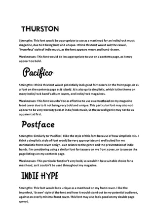
Strengths: This font would look unique as a masthead on my front cover. I like the
imperfect, ‘drawn’ style of the font and how it would stand out to my potential audience,
against an overly minimal front cover. This font may also look good on my double page
spread.
2. Weaknesses: This font may be less appropriate to use as page listings on my contents
page, smaller text on my front cover and the main text on my double page spread as it is
too bold.
Strengths: This font would be appropriate as a masthead on front cover, due to it being
bold and like ‘Thurston’ and ‘Indie hype’ it has a similar messy, hand drawn appearance. I
think this would reflect the ‘scruffy’ nature of indie/rock music.
Weaknesses: This font may not be as appropriate for smaller text, such as the body of the
double page spread.
Strengths: This would be a good font to use for the main body of text on a double page
spread as it is easy to read and will not draw attention away from the images on the page.
Weaknesses: The font isn’t genre-specific so may have less purpose to it. The font is also
very bold and unique so couldn’t be used as a masthead.
Final masthead -
I think I will use the font ‘Indie Hype’ as my masthead on my magazine. This is due to its
unique, hand drawn appearance. I think I will use this for my final front cover because it
would be appropriate for an indie magazine and it looks modern, so it would also be
appropriate for an audience of young adults. I am considering making this font
red/burgundy in my final front cover.
Final text –
I think I will use the font ‘Phobo’ for the main body on text on the double page spread of
my magazine, and possibly on my contents page. This is because it is easy to read, yet is
still unique and different to the typical fonts used. While the font isn’t genre-specific, it
looks modern which would appeal toa young audience, who my magazine is aimed at.