
Recommended
More Related Content
What's hot
What's hot (18)
Viewers also liked
Viewers also liked (18)
Similar to Analysis of professional music magazine double page spread
Similar to Analysis of professional music magazine double page spread (20)
More from Katielewis98
More from Katielewis98 (15)
Recently uploaded
Recently uploaded (20)
Analysis of professional music magazine double page spread
- 1. ANALYSIS OF PROFESSIONAL MUSIC MAGAZINE DOUBLE PAGE SPREAD Katie Lewis
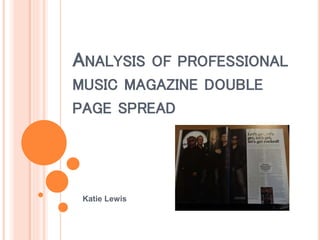
- 2. MAIN IMAGE The main image on the double page spread takes up the full left page and goes a bit on to the right page. This is called ‘bleeding’. The image is of five men who are Rick Savage, Phil Collen, Joe Elliott, Rick Allen and Vivian Campbell. They are all looking directly at the camera and are standing in a very powerful pose. They are looking directly at the camera because it makes direct address with the reader. They all look very serious as they're not smiling. The shot of the men is a long shot as you can see their whole body. On the left page, at the top in the corner is a white circle which states a website address to find out more news. The image of the men covers the middle of the circle so you can only see the website address not the additional information written. This has happened because the image of the men is more important than the writing as because peoples eyes are more drawn to the image of the men, as they are well known this is allowed to happen. The men are all dressed in black which goes nicely with the background colour of the main image which is brown. This stands out more than the writing on the right page which is just plain white background. At the bottom of the image is a small bit of writing which is very small, and written in white which states the names of the five men and says “prepared to go our own way”. This then makes readers want to read about them once they've seen the image.
- 3. HEADLINE The headline is the biggest text on the page which is located at the top of the right page just above all the writing. The headline says “lets get, lets get, lets get, lets get rocked!”. It uses the use of repetition in the headline which creates a small bit of suspense because you just want to read on. The use of an exclamation mark is there to say lets go. The headline is in a bold text which is quite big and travels across the top of the right page but it starts from the middle because the left side of the right page is the image. What the headline says has been used because that's something the men would say before they start a show/gig or a quote taken from the interview they had.
- 4. STAND FIRST The magazine double page spread includes a stand first. This is an introduction to the article which is only two lines long but is a snappy sentence. The stand first includes a rhetorical question which is used to make the reader think and also to make the reader connect with the magazine. The stand first contains extra information which is used to make the reader want to search more about the article and find out more from the magazine. It is located just above the article (just under the headline) and is in a slightly big text to make it stand out before readers read the article. It is just in a plain black text so it doesn't draw to much attention to it because the headline is the most important thing viewers need to look at first.
- 5. COLUMNS The double page spread includes columns which keep the page looking neat and professional. This double page spread includes two columns and includes a line down the middle to separate the two sides of the text columns. By using columns it makes it easier for readers to follow the article as if it was messy it would make it harder for them to read and they wouldn’t pay that much attention to it.
- 6. BY LINE At the end of the article is a by line which is the initials of the man who wrote the double page spread article. The man who wrote the article is called ‘Paul Elliott’. Instead of writing his full name at the end of the article they only wrote his initials which are in a bold text style, and a slightly bigger font size than the writing of the article.
- 7. THE LANGUAGE The language used in the article is informal. They use informal language because they are establishing a relationship with the reader. The writing of the article is in a plain font style, and is written in black with a small font size. In between the two sides of the columns is a quote which relates to the article. It is written in a bold, dark blue font and stands out because its a bigger font size than the rest of the article. This is known as a ‘drop quote’ which is when a quote is placed in the text.
- 8. PAGE NUMBERS The page number is located at the bottom right hand corner of the right page. The number is in black writing, and is in a bold font. Page numbers are used so people can easily find the page they are looking for without searching through the whole magazine to find the page they are looking for. Next to the page number which is ‘15’ for this page, there is a website address which is the address for the magazine website which is advertised a lot in the magazine.
- 9. COLOUR SCHEME The colour scheme that's used on the double page spread is very basic and plain. The colours consist of white, black, and brown. These colours all work well together without clashing. On the front page, the main image involves the men wearing the colours white, black, and brown. The colour scheme used there is continued just in a different format on the double page spread.
- 10. THINGS THE MAGAZINE HASN'T INCLUDED THAT ARE PART OF THE CODES AND CONVENTIONS: Photographer - On the main image there is usually the name of the photographer that took the image which will either run vertically or horizontally in very small writing. None of the double page spreads include this in my magazine but what it does include is a page which lists all the photographers names who contributed to this magazine.
- 11. THINGS THE MAGAZINE HASN'T INCLUDED THAT ARE PART OF THE CODES AND CONVENTIONS: Drop capital - Usually the first letter of the text will be a big capital that covers a few lines. My magazine doesn't include one in the double page spread I chosen but it does include it in a different double page spread. The drop capital used covers four lines and is in a bold black font.
- 12. THINGS THE MAGAZINE HASN'T INCLUDED THAT ARE PART OF THE CODES AND CONVENTIONS: Questions – Sometimes there are questions featured in the double page spread. These will be in a different colour so they stand out and will normally have the names of who asked the questions. My magazine doesn't include any questions in any double page spreads. This is what it would look like in a magazine.
- 13. THINGS THE MAGAZINE HASN'T INCLUDED THAT ARE PART OF THE CODES AND CONVENTIONS: Release date - After the full stop at the end of the double page spread article, they may sometimes have a release date or tour date on it. My magazine or any of the double page spread articles don't have it included.
- 14. THINGS THE MAGAZINE HASN'T INCLUDED THAT ARE PART OF THE CODES AND CONVENTIONS: Full stop - Instead of using a full stop at the end of the article, they may have a small block or letter related to the article to show its the end of the article. This is so readers know not to carry on reading. In the double page spread I had chosen it didn't include one, but in a different double page spread it did. The one used is a little image of lightning.