Top profile Call Girls In Agartala [ 7014168258 ] Call Me For Genuine Models ...
Fonts
1. Fonts.
The
fonts
are
dramatically
influential
over
the
rest
of
the
magazine
as
different
styles
create
different
moods
that
appear
to
be
adopted
and
interpreted
by
other
features
on
the
pages.
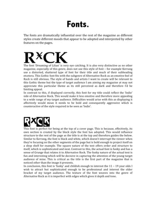
RxCK
The
font
‘Dreaming
of
Lilian’
is
very
eye
catching.
It
is
also
very
distinctive
as
no
other
magazine,
especially
of
this
genre,
does
not
use
this
style
of
font
–
for
example
Kerrang
use
a
distorted,
shattered
type
of
font
for
their
title
and
much
of
their
subheading
etcetera.
This
Gothic
font
fits
with
the
subgenre
of
Alternative
Rock
as
an
emotive
feel
of
Rock
is
still
obvious.
The
style
of
bands
and
artists
I
want
to
create
will
be
relevant
to
this
Gothic
theme
but
the
type
of
target
audience
I
am
aiming
my
magazine
at
may
not
appreciate
this
particular
theme
as
its
still
perceived
as
dark
and
therefore
I’d
be
limiting
appeal.
In
contrast
to
this,
if
displayed
correctly,
this
font
for
my
title
could
reflect
the
‘Indie’
side
of
Alternative
Rock.
This
would
make
it
less
emotive
and
therefore
more
appealing
to
a
wide
range
of
my
target
audience.
Difficulties
would
arise
with
this
as
displaying
it
affectively
would
mean
it
needs
to
be
bold
and
consequently
aggressive
which
is
counteractive
of
the
style
required
to
be
seen
as
‘Indie’.
RxCK
This
font
is
perfect
for
being
at
the
top
of
a
cover
page.
This
is
because,
effectively,
its
own
section
is
created
by
the
block
style
the
font
has
adopted.
This
would
influence
structure
to
the
rest
of
the
page
as
the
title
is
at
the
top
and
therefore
guides
the
below.
Similar
to
Kerrang,
the
font
is
black
and
white,
which
doesn’t
interrupt
the
viewer
when
they’re
focusing
on
the
other
segments
of
the
page
but
is
bold
enough
to
project
itself
on
a
shop
shelf
for
example.
The
square
nature
of
the
text
offers
order
and
structure
to
itself,
which
is
sophisticated
and
neat.
Contrast
to
this,
the
actual
font
is
funky
and
has
a
sense
of
Grunge
that
relates
it
to
Alternative
Rock.
The
funky
nature
of
the
actual
text
is
fun
and
interesting
which
will
be
decisive
in
capturing
the
attention
of
the
young
target
audience
of
mine.
This
is
critical
as
the
title
is
the
first
part
of
the
magazine
that
is
noticed
other
than
the
image
it
presents.
In
conclusion,
this
font
is
‘funky’
and
childish
enough
to
interest
the
11
–
19
year
olds
I
wish
to
attract
but
sophisticated
enough
to
be
professional
and
interest
the
older
bracket
of
my
target
audience.
The
texture
of
the
font
weaves
into
the
genre
of
Alternative
Rock
as
it
is
imperfect
with
edges
which
gives
it
depth
and
tone.
2. 5eaking 6d 3s
TV
shows
are
a
topic
I
wish
to
include.
Breaking
Bad
is
on
of
the
most
relevant
TV
series
in
my
opinion
as
it
focuses
on
young
adults
but
teenagers
are
known
to
watch
it.
The
nature
of
the
show
is
very
controversial
and
rebellious
and
therefore
teenagers
would
be
attracted
to
this.
Breaking
Bad
could
be
relative
to
Rock
as
it’s
similar
in
atmosphere
by
which
I
mean
it’s
very
emotive,
messy
and
has
a
theme
of
drugs
and
ill
behaviour
that
could
relate
to
Grunge,
which
is
a
subgenre
of
Alternative
Rock.
I
will
link
said
TV
show
by
staging
the
circumstance
where
a
featured
band
has
a
song
or/and
an
appearance
in
the
show.
I
could
create
a
short
article
or
a
branch
of
this
on
my
content
page.
I
also
have
considered
images
that
relate
to
the
show,
for
example
a
hazmat
costume.
Heading
The
font
“coal
hand
Luke”
is
an
eye
catching
font
because
it
isn’t
what
would
be
expected
in
a
printed
magazine.
This
handwritten
style
gives
the
magazine
an
informal
suggestiveness
and
therefore
connects
with
my
target
audience.
The
texture
of
the
font
is
scruffy
which
links
with
my
theme.
Therefore,
I
could
present
the
title
in
a
way
that
suggests
it
influences
the
rest
of
the
page.