
Recommended
More Related Content
What's hot
What's hot (19)
Similar to Fonts media copy 3
Similar to Fonts media copy 3 (20)
Recently uploaded
Recently uploaded (20)
Fonts media copy 3
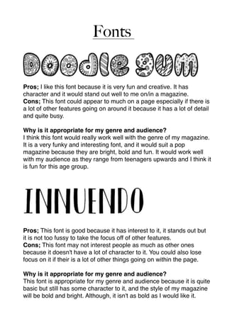
- 1. Fonts Pros; I like this font because it is very fun and creative. It has character and it would stand out well to me on/in a magazine. Cons; This font could appear to much on a page especially if there is a lot of other features going on around it because it has a lot of detail and quite busy. Why is it appropriate for my genre and audience? I think this font would really work well with the genre of my magazine. It is a very funky and interesting font, and it would suit a pop magazine because they are bright, bold and fun. It would work well with my audience as they range from teenagers upwards and I think it is fun for this age group. Pros; This font is good because it has interest to it, it stands out but it is not too fussy to take the focus off of other features. Cons; This font may not interest people as much as other ones because it doesn't have a lot of character to it. You could also lose focus on it if their is a lot of other things going on within the page. Why is it appropriate for my genre and audience? This font is appropriate for my genre and audience because it is quite basic but still has some character to it, and the style of my magazine will be bold and bright. Although, it isn't as bold as I would like it.
- 2. Pros; I like this font because it is very simple yet it stands out. It is a very thin font, but it stands out because of the effects of each letter. Cons; Although being a thin font is a pro, it can also be a con because it can take the focus away from the text, and people still want to be interested in the text as well as pictures. Why is it appropriate for my genre and audience? It is appropriate for my genre and audience because my audience do not want a font that is to overpowering, they want it to be a good even range of text and pictures. It is also suitable for my genre because pop magazines focus of a lot of pictures and colours most of the time. Pros; This font is really good because it is very bold and stands out, yet it is simple, there is not to much going on with it that would take over from other things. Cons; It may not be suitable to use this font for writing an interview on a DPS as it may be too bold. Why is it suitable for my genre and audience? It is suitable for my genre because the font is bold, and with colour it will really stand out. It is a fun font for the audience and is different from other genres fonts.
- 3. Pros; This font is very modern and eye catching. It is quite simplistic whilst looking funky. Con; This font, in amongst other text and pictures, could look to busy and be hard to read. Why is it suitable for my genre and audience? It is suitable for my genre and audience because it is modern and it can appeal to a younger audience. Pros; This font is quite gimmicky, fun and it is quite modern. Con; Although this font would fit the theme of a pop magazine, it is also only suitable and appealing to a certain audience and wouldn't suit some articles in my magazine. Why is it suitable for my genre and audience? It is suitable because it would appeal to a teenage audience, but mainly females. It would suit the romantic ideal that some teenage readers would have for a certain artist/band.
- 4. Mastheads Reload Pros; It relates to music because it has the “vinyl” effect to it, that DJ’s would use, because my genre, pop/top charts, would be the most popular genre of music that DJ’s would play. Cons; People could think that the theme is retro because the font looks slightly retro, not so much pop/top charts. ReloadPros; It is easy to read and simple, but it also has some character to it. The love hearts make it relatable to pop, and it makes it quite girly. Cons; It can appear too girly and pop, and doesn't really fit in with the top charts theme. Males could also be put off by this. ReloadPros; I like this font because it is quite funky and unusual. It would stand out from other magazines. Cons; This font is not very bold. For other parts of my magazine it would look good but for the masthead it wouldn’t stand out, and could get lost within other features.