Keppel Ltd. 1Q 2024 Business Update Presentation Slides
Font choices
1. This font is called a dripping marker. I have this as my
masthead, I think it is very effective because it links
with a music type of vibe and also stands out, it is the
only time I have used this font in my magazine which
will also attract the reader to look at it.
This font is called Lucida handwriting, I used this for my
pull quote. I used a handwriting style font because I
think it makes it look quite personal and makes the
reader feel like its direct to them which relates to my
target audience.
This font is called Star avenue, I used this font for my mast
head on my front cover so I have kept a bit of consistency
throughout my magazine by using this font. It is also a way
to remind the reader what magazine they are reading.
This font is called movie letters, I used this writing for part of
my masthead. I used this font because within the mast head
I have the name of the artist in it and I believe to grab the
readers attention you need to have a relatable font- this is a
well known recognizable font especially within music.
This font is called Silom and I used it for the main part of
my text. I decided to use this type of font because it is
quite a funky but readable font and is suitable for a big
chunk of text. I also used it because it is quite young
looking text which relates to my target audience.
2. This font is called lemon drop and I have used It for my mast
head. I have used this font because I think it is funky and is quite
like a music style font, it doesn't’t just represent one genre- it
represents all which is what my magazine is aiming to do.
This font is called LeviRebrushed, I have used this font for a
sub heading on my cover. I have used this font because it
looks very different from all of the other fonts I have used
which is how I want my magazine to look- original. I believe
it is very striking and would attract my chosen target
audience.
This font is called square font, I have used it for another sub heading and I
have used it because it is edgy but bold at the same time and represents
what the article is about. I think it will appeal to my primary and secondary
audience which is males and females aged 13-30.
This font is used is Lou gramm, I have used this for a sub heading on
my cover page. I have used this font because it is funky but young at
the same time. It appeals to a younger audience. I also think it fit in
well with my front cover and looked good.
This font is again square font and I used It in my
in my information bar, I think it links with the
purpose of an information bar- it aims to be
stand out and easy to read. This font does both.
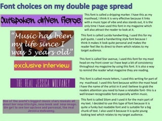
3. This font is called star avenue and I have used it for my mast head
on my contents page. I have consistently used this font because I
think it gives the reader that little bit of familiarity with the
magazine and I think this makes if feel more personal.
This font is called Lucida handwriting, I have used this for a sub heading
because it links in with my double page spread. I also think the font links in
with my target audience- which is teenagers and young adults, this is a young,
funky and fun font which will appeal to young people.
This font is called impact and I have used it for all of my sub heading’s
which are representing my articles, I have used this because it is bold and
stands out which draws the attention of the reader to it and encourages
the to read the article within the magazine.
This font is called Kannada MN and I have used this for my main text under
my various sub headings, I have used this because this font is very easy to
read but also stands out, this is all I want the text to do. I also think this
font is quite fresh which also relates to my target audience.
This font is called star avenue which is the same font as the masthead on the
cover and the contents page, this creates a link between all of my pages which
will have a positive effect on the reader because there is some familiarity
throughout the magazine and it also reminds the reader what magazine they
are reading. I have used this font for the page numbers, this font is quite quirky
and stylish which relates to the style of magazine I am doing- music, all genres.