
Recommended
More Related Content
What's hot
What's hot (20)
Viewers also liked
Viewers also liked (14)
Similar to Question 1
Similar to Question 1 (20)
Recently uploaded
Recently uploaded (20)
Question 1
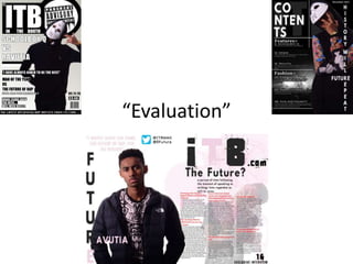
- 1. “Evaluation”
- 2. How have I used forms and conventions within/throughout my music magazine? Cover page
- 3. Within my cover page I have used a range/wide variety of forms and conventions. One of the many forms and conventions that I have developed within the cover of my music magazine is the text; the text within my cover page is a statement because of the Bold and black on white text therefore creates a stand out effect for my text on my cover page of y music magazine. Throughout the page as a whole the text starts off larger at the top half of the magazine and then proceeds to become gradually smaller along the length/way down the page.
- 4. The graphics on my cover page are there to make my music magazine cover more visual, so that my audience that I am aiming my music magazine also have more to look at on the page, therefore using a variety of graphics ensure that the cover of my music magazine is still constantly intriguing and not just another boring music magazine on the shelves.
- 5. The Main image on the other hand is another form of my cover page, I have the artist dressed and clothed in typical rap style/clothing to suggest to the audience that this is therefore a rap magazine, I also have the artist modeling a typical pose of a famous rap artist, and I also have him modeling a white out ski mask to give my cover page more of an effect so that my cover page doesn't just look like any other rap magazine on the shelves, but gives my cover page the character which others do not have within the bindings.
- 6. My selling line is at the bottom of the page rather than your typical selling line in which you have it at the top of your magazine. This is because one I had no space at the top of the page to produce a selling line and two in my opinion it looks better on my magazine at the bottom than it would contrast at the top and therefore that is why my individual selling line is at the bottom of the page rather than at the top of my cover page.
- 7. How have I used forms and conventions within/throughout my music magazine? Contents
- 8. Within my Contents page I have used a wide variety of technical aspects to ensure that my contents page is at its possible best. One of the many forms and conventions that I have used to ensure that my contents page is produced at a high quality/standard is that my contents page contains a wide range of fonts and one of these many fonts (artistic) is used within the headline of my contents page. The headline is bold and again stands out from the background of the black to ensure that it draws the attention again of the reader. The font used it is very different from normal fonts and therefore this will make it more interesting towards the reader of the magazine and again makes it stand out from the rest of the page. This is not necessarily what you would want from a contents page; for everything to be standing out on the page.
- 9. Other fonts used within the contents page include others for the subheadings etc. and these fonts also stand out on the page because of the black outline that I gave to some of them such as the word fashion, and “times gone bye”.
- 10. The main image however takes up the whole of one half of the page and also gives the contents page a bit of colour because the rest of the contents page is very monotone (black and white) therefore giving it the colour from the image on the page will therefore lift the whole page on a whole all together. The pose again as shown in the cover page symbolizes that of an artist fro the rap industry and is very closed in his hands gestures What also gives this away is the gold watch of the artists normally many rap artists are not afraid to show there wealth off so therefore show a lot of there wealth throughout there costume/clothing and what they wear. Rap derives from the American streets/background/culture and therefore the colour of the artist will determine the genre of the music to in which/in this case the artists is black and therefore this is the culture that is perceived to heavily influence the rap industry and therefore this is why I used a black model so that people will understand the genre of the music better. The style and clothing also of the model/artist is also very similar to that of a rap artist and therefore again this influences the genre of the magazine in which it being rap.
- 11. The heading down the side of the page gives the page more content to the page and isn’t another normal headline and therefore for it being along the side of the page it differs the page from being all one style and adds to the character of the magazine on a whole. The word “future” suggests that the artists may be the future of the genre/industry and the way it is embedded in the headline that runs along the side of the page downwards, for a change. I have also included other conventions and forms such as the date in the top hand left corner of the page of my contents page. The background image of the contents page is that of a concert and therefore thus the graphic brings a little something else to the table rather that just being a normal boring background colour on the contents page.
- 12. How have I used forms and conventions within/throughout my music magazine? Article Page
- 13. My article page shows various forms and conventions and one of these being the heading that flows down the page rather than across the top of the page (horizontal), this therefore breaks convention rules. But breaking the rules/boundaries can be a good/successful thing in some cases. It also makes the page more visual and therefore the reader
- 14. The headline font is different from the rest of the pages within my magazine article. The others include a flow of the similar fonts such as Impact etc. where as this I tried to change and differ it up a bit so that the fonts, colour and style of the headline stands out on the page. I used pink within the colours of the page and title because the colours black and pink mix well together and look clean on the page providing a professional look to the page
- 15. My article page has many styles of fonts, colours, size etc. and this doesn't’t differ from the actual article itself, the text is In 3 different colours one is the pink that runs throughout the article page, another is the red of the questions and the last is obviously just the plain black of the text. The different font styles, which include 3 provide a change within the page. I have also included a drops capital within the text to breakdown the text for the reader. In the bottom right hand corner of the page there is another text that reads Exclusive interview and the page number in again a variety of fonts where as in previous pages I have usually stuck to the same font or similar fonts but within my article I changed my methods to make it more interesting to read.
- 16. Within my article page, I also included these features such as the Twitter page of the magazine and the Twitter page of the artist as Well. The twitter Icon/graphic also breaks the page down again giving something else to look at on the page other than the 2000 plus word within the article.
- 17. I also embedded a quote within the article page from the artist himself, this is also in a different font and colour/style because as all the text is different from one another to make it more abstract on the page I produced the quote as a different font but the same colour that flows throughout the page, but in a different shade of pink contrast to the rest of the page beacsue if the same colours are flowing throughout it will just make the page
- 18. The main image on the article page has the model/artist looking direct at the camera/eye contact. This is because it therefore directly involves the reader within the page, it gives the reader/audience a sense of feel that the artist is