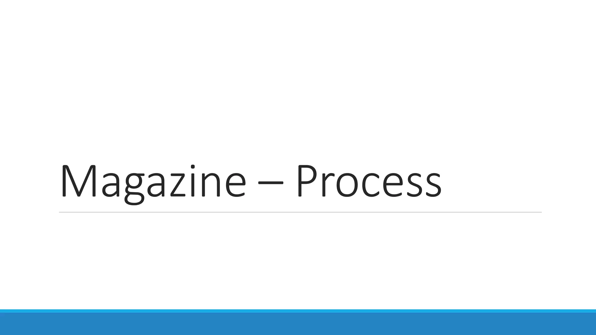
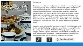
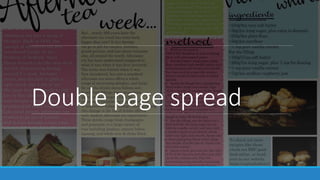
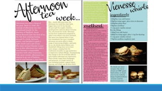
Magazine – Process
Front cover
The process
To create my front cover I used photo-shop. I started by inserting the image
as the background. I then went onto dafont.com to get the fonts for the
title ‘the homely magazine’. I took screenshots of the fonts and then
opened them on photo shop. Using the magic want tool I deleted the
background so I only had the writing. For the white fonts I used the paint
bucket tool a long with the magic wand tool to change the colour from
black to white. For ‘homely’ to create the effect you can see, I took the
black font screenshot and inserted it, and then took the same screenshot
and edited it so the font was white, and layered the two on top of each
other.
I used the same technique for ‘afternoon tea week!’. I used the magic wand
tool to get rid of the background on the screenshot so I was only left with
the writing. The barcode at the bottom of the page is just an image I
dragged onto the page and remastered. The other fonts on the page are
from the photo shop programme. I used the text tool to create text box’s
and used the same font for the rest of the writing on this page.
Contents page
The process
To create this page I used photo shop. I used the same technique as on the front
cover with erasing the background of the font screen shots. I used the magic wand
tool along with the eraser tool. I used the line tool to put a line underneath the title
after I inserted the title. I did the same for ‘contents’ by finding the font on
dafont.com and erasing the background. The blue box I created using the
rectangular tool. I created the rectangle shape and then filled it in blue. To create
the jagged effect on the outside I used the smudge tool. This smudge the blue
colour to create that effect. I did the same on the pink box at the bottom of the
page.
Besides the ’featured’ title which I created in the same way as the title, all the other
fonts on this page are from photo shop. I used the text tool to create multiple text
box’s for each paragraph of information, including the page numbers. To create the
lines on the side of the page numbers I inserted a line using the line tool.
Getting the images into the shape on the bottom left was extremely difficult using
the tools provided on photo shop so to create this I used wix. On the home page of
my website you will find the same design but with different images. To insert this
onto my magazine, I took a screenshot of the images from the website, and just
dragged this image onto this page, and then remastered it so it was clear.
Double page spread
The progress
Again I used photo shop to create the double page spread. First I put a line down the middle of the page
to show that it is across two pages. I did this using the line tool. After I created the layout by drawing
the coloured boxes using the rectangle tool. After I drew the boxes I filled them in, fitting with the
colour scheme. After this I used the smudge tool to create the jagged outline like on the contents page.
I then added in the images onto the page, in the gaps I had left. After this I started to make the title. I
did this how I had done it for each page, by taking a screenshot of the font and using the magic wand
tool with the eraser tool to get rid of the background. I then dragged these onto the page and moved
them around till they fit how I wanted them to. I did this for ‘afternoon tea week’ only at first. I then
used the text tool to insert the article, and all written information besides titles on the page. Once I was
happy with the size of the font and the font itself I again started working on the titles. I again used the
magic wand tool and eraser tool to get the title. I wanted to do this after the article was put in so that I
knew how much space I had for the title. I underlined these title by drawing lines using the line tool. I
created thick and thin lines.

Magazine process

  • 1.
  • 2.
  • 3.
    The process To createmy front cover I used photo-shop. I started by inserting the image as the background. I then went onto dafont.com to get the fonts for the title ‘the homely magazine’. I took screenshots of the fonts and then opened them on photo shop. Using the magic want tool I deleted the background so I only had the writing. For the white fonts I used the paint bucket tool a long with the magic wand tool to change the colour from black to white. For ‘homely’ to create the effect you can see, I took the black font screenshot and inserted it, and then took the same screenshot and edited it so the font was white, and layered the two on top of each other. I used the same technique for ‘afternoon tea week!’. I used the magic wand tool to get rid of the background on the screenshot so I was only left with the writing. The barcode at the bottom of the page is just an image I dragged onto the page and remastered. The other fonts on the page are from the photo shop programme. I used the text tool to create text box’s and used the same font for the rest of the writing on this page.
  • 4.
  • 5.
    The process To createthis page I used photo shop. I used the same technique as on the front cover with erasing the background of the font screen shots. I used the magic wand tool along with the eraser tool. I used the line tool to put a line underneath the title after I inserted the title. I did the same for ‘contents’ by finding the font on dafont.com and erasing the background. The blue box I created using the rectangular tool. I created the rectangle shape and then filled it in blue. To create the jagged effect on the outside I used the smudge tool. This smudge the blue colour to create that effect. I did the same on the pink box at the bottom of the page. Besides the ’featured’ title which I created in the same way as the title, all the other fonts on this page are from photo shop. I used the text tool to create multiple text box’s for each paragraph of information, including the page numbers. To create the lines on the side of the page numbers I inserted a line using the line tool. Getting the images into the shape on the bottom left was extremely difficult using the tools provided on photo shop so to create this I used wix. On the home page of my website you will find the same design but with different images. To insert this onto my magazine, I took a screenshot of the images from the website, and just dragged this image onto this page, and then remastered it so it was clear.
  • 6.
  • 8.
    The progress Again Iused photo shop to create the double page spread. First I put a line down the middle of the page to show that it is across two pages. I did this using the line tool. After I created the layout by drawing the coloured boxes using the rectangle tool. After I drew the boxes I filled them in, fitting with the colour scheme. After this I used the smudge tool to create the jagged outline like on the contents page. I then added in the images onto the page, in the gaps I had left. After this I started to make the title. I did this how I had done it for each page, by taking a screenshot of the font and using the magic wand tool with the eraser tool to get rid of the background. I then dragged these onto the page and moved them around till they fit how I wanted them to. I did this for ‘afternoon tea week’ only at first. I then used the text tool to insert the article, and all written information besides titles on the page. Once I was happy with the size of the font and the font itself I again started working on the titles. I again used the magic wand tool and eraser tool to get the title. I wanted to do this after the article was put in so that I knew how much space I had for the title. I underlined these title by drawing lines using the line tool. I created thick and thin lines.