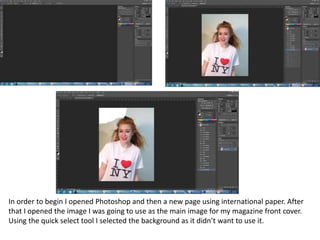
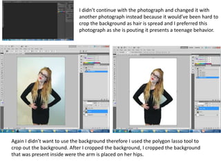
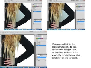
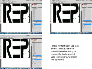
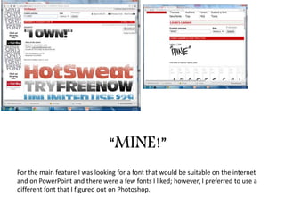
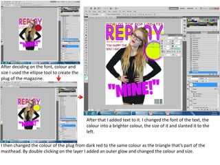
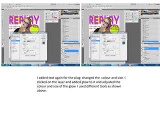
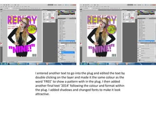
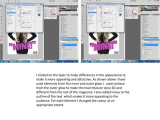
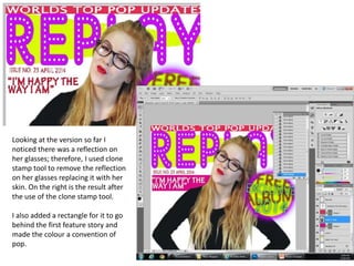
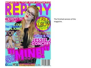
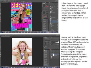
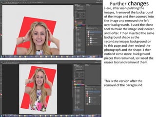
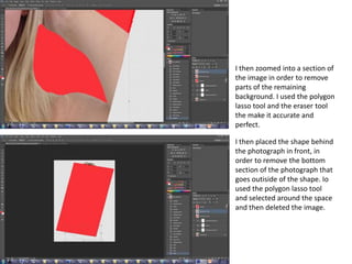
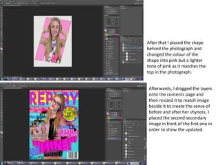
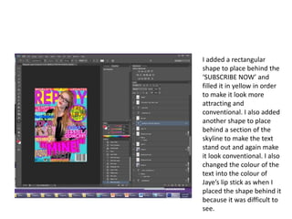
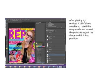
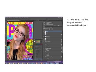
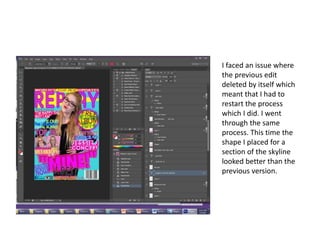
The document describes the process taken to design a magazine cover in Photoshop. Key steps include:
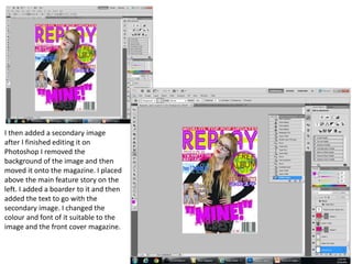
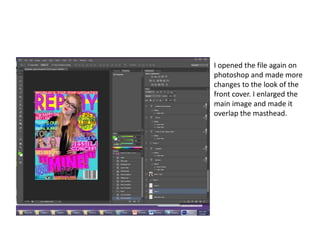
- Opening Photoshop and selecting an image to use as the main cover photo. Cropping out the background using selection tools.
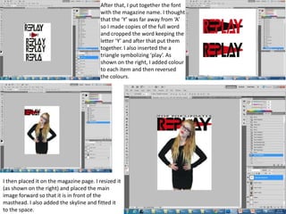
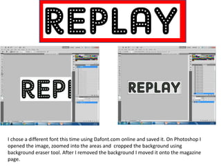
- Designing the magazine masthead by choosing fonts, arranging letters, and adding colors and graphics.
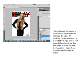
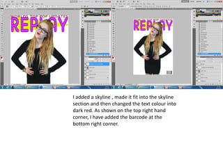
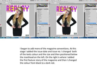
- Adding additional design elements like issue details, barcodes, and social media icons.
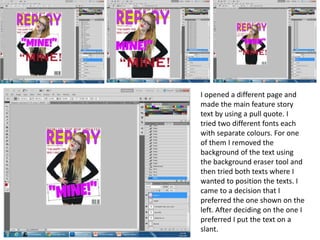
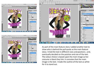
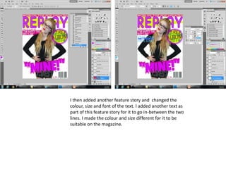
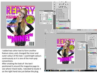
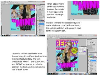
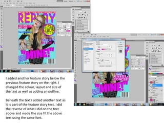
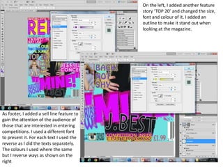
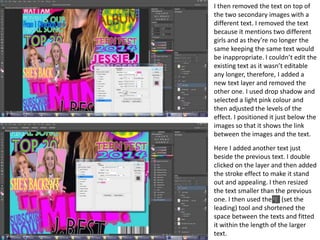
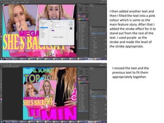
- Formatting feature stories by selecting fonts, adjusting colors and sizes of text, and positioning text on the page.
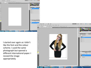
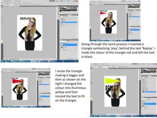
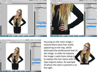
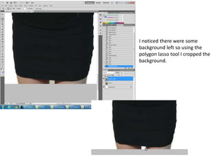
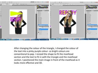
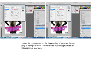
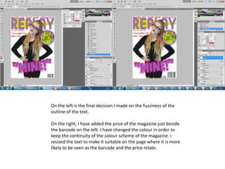
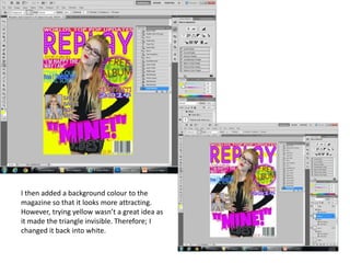
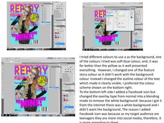
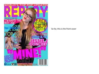
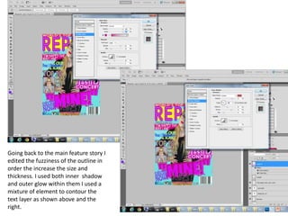
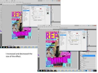
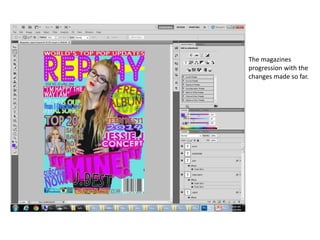
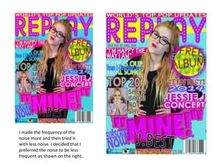
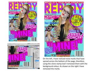
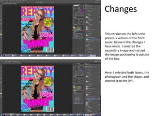
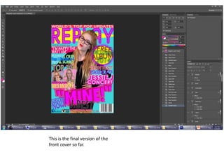
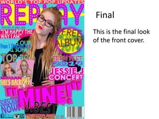
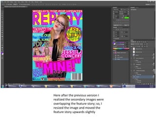
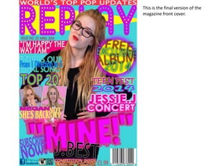
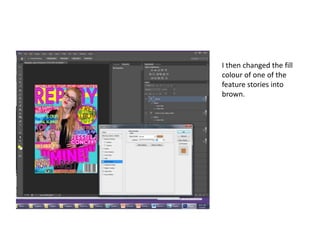
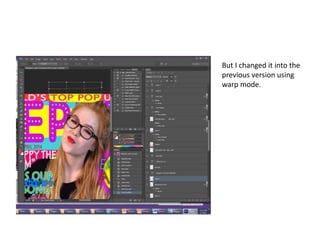
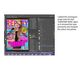
- Refining the cover design through multiple iterations, including changing colors, fonts, images and layout.