8 Copywriting Tips For A Better Website
•
8 likes•2,637 views

Content is king. But your content will only conquer the visitor if it follows these 8 rules.

Recommended
Recommended
More Related Content
Viewers also liked
Viewers also liked (18)
More from AGConsult
More from AGConsult (18)
Recently uploaded
Recently uploaded (20)
8 Copywriting Tips For A Better Website
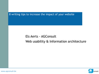
- 1. 8 writing tips to increase the impact of your website Els Aerts - AGConsult Web usability & Information architecture
- 2. These slides were created to support an oral story. In an attempt to make them interesting without hearing the story, I've added these bubbles. I hope they will give enough context to tell the story.
- 3. 3 tips to get visitors to your website
- 5. BMW Belgium ranks 1st for the word 'concession holder'. Good for them.
- 6. Pity users are not using the phrase 'concession holder' while searching.
- 7. They are looking for a 'garage'. Google Insights makes this very clear.
- 8. BMW garage in Neerpelt. BMW garage in Herentals. Pity for BMW they are not on the first page after a search for 'BMW garage'. Two local ‘concession holders’ are…
- 9. Ford Belgium makes a similar mistake. They call their list of garages the 'Ford network‘.
- 10. Let's check in Google Insights what the user calls it. 'Ford network' = 0 'Ford garage = 68 If I was the boss of Ford, I would use garage on my website.
- 12. What Google shows here, is the title tag of a page. This a pretty good example. It mentions the brand, what the company does and which country’s site it is.
- 13. This is a pretty bad example. I wouldn't click on it. Looks like a virus or something.
- 14. This is an excellent example of how a page title can harm you. Not very inviting for a user who's looking for a good bottle of champagne.
- 16. This description is spot on. People will click on it. Make sure your description is as attractive.
- 17. Again, this is how to do it. They even include their phone number. Even before getting to their website, the user can call them. Now that is customer service!
- 18. 5 tips to help people find what they’re looking for on your website
- 20. Give information This is a headline on the homepage of a university in Italy. Isn't that a great title? No. Not at all. Who the hell is Karel De Gucht? Why would a visitor click on that? Would you click on a link that says 'Visit of Els Aerts'?
- 21. Give information This is a headline on the homepage of a business school in Spain. This is better. Much better. It's not the messenger but the message that is important. You have the chance to see the world authority on competitive strategy. That's the message. His name? Michael Porter.
- 22. Give information All visitors are impatient. You are too when visiting other websites. But being a copywriter you want the visitor to notice how smart and funny you are. So you write cryptic headlines without any real meaning. Newsflash: the visitor is also impatient on your website. Less people will click on a cryptic title than on a clear one.
- 23. Give information Tell the truth: is this what you expected when you saw the headline "Whistling while we work"?
- 24. Put the most important word first At least one thing is clear when seeing this page. These articles are on the website of a company called Key Job Training. But because we already were on their website, we already knew that. So what's the added value: zero. It's even sub zero. Because the average surfer will only see 'Key Job Training', 'Key Job Training' and 'Key Job Training' when quickly scanning this page. The real message is lost in cyberspace.
- 25. This is what visitors do when 'viewing' a page. They start at the top and go down. When there's a headline they will read 2 or 3 words. If those words are not interesting, they will move on. This heat map is proof. The red area is where >80% of visitors look at. Yellow is 60 tot 80%. The first words of your headings are very very important.
- 26. Avoid jargon, abbreviations and names This is a good example. They use a product name ("Bébédélice") but immediately describe what it is ("steam cooker & mixer"). If they had only said "20% reduction on Bébédélice", this would have been a bad example.
- 28. Sub-headings on a short page.
- 29. Sub-heading and jump links on a long page.
- 31. Links please! This is the page for 'Senior citizens' on a government website. Sure, most senior citizens have more time than working people, but that doesn't mean they want to spend that time reading boring texts on your web site. Don't waste people’s time with fluffy texts. Just show them the links to the real information you have for them.
- 32. This is the page for 'professionals' on the website of an electricity company. There's a funny contradiction in their intro. It says "if you're in charge of a company, you only have time to focus on your core business". Guess what: just by reading that sentence, I've lost precious time. Just show me the links to what you've got to offer me. And because I'm so busy, I think I would also like to see a phone number.
- 33. This is the main page of 'climate solutions for your home' on the website of Samsung air conditioning. It's filled with cosy pictures and a text that says that the climate in your home is important for your comfort and blah blah blah. Guess what? I already knew that. That's why I'm looking for an air conditioner. Can you show me your products? Please?
- 35. What do these links tell the visitor? Nothing.
- 36. Meaningful links This is how it should be. A meaningful link ("Choose the best car insurance out of 4 formulas".)
- 38. Good writing takes time… Writer: 10 min Reader: 6 min Reader: 6 min Reader: 6 min Reader: 6 min For 500 readers: 3.000 min 10 min Total: 3.010 min
- 39. … but pays dividends Writer: 60 min Reader: 3 min Reader: 3 min Reader: 3 min Reader: 3 min For 500 readers: 1.500 min 60 min Total: 1.560 min
- 40. That's it. Wait. I have one more tip.