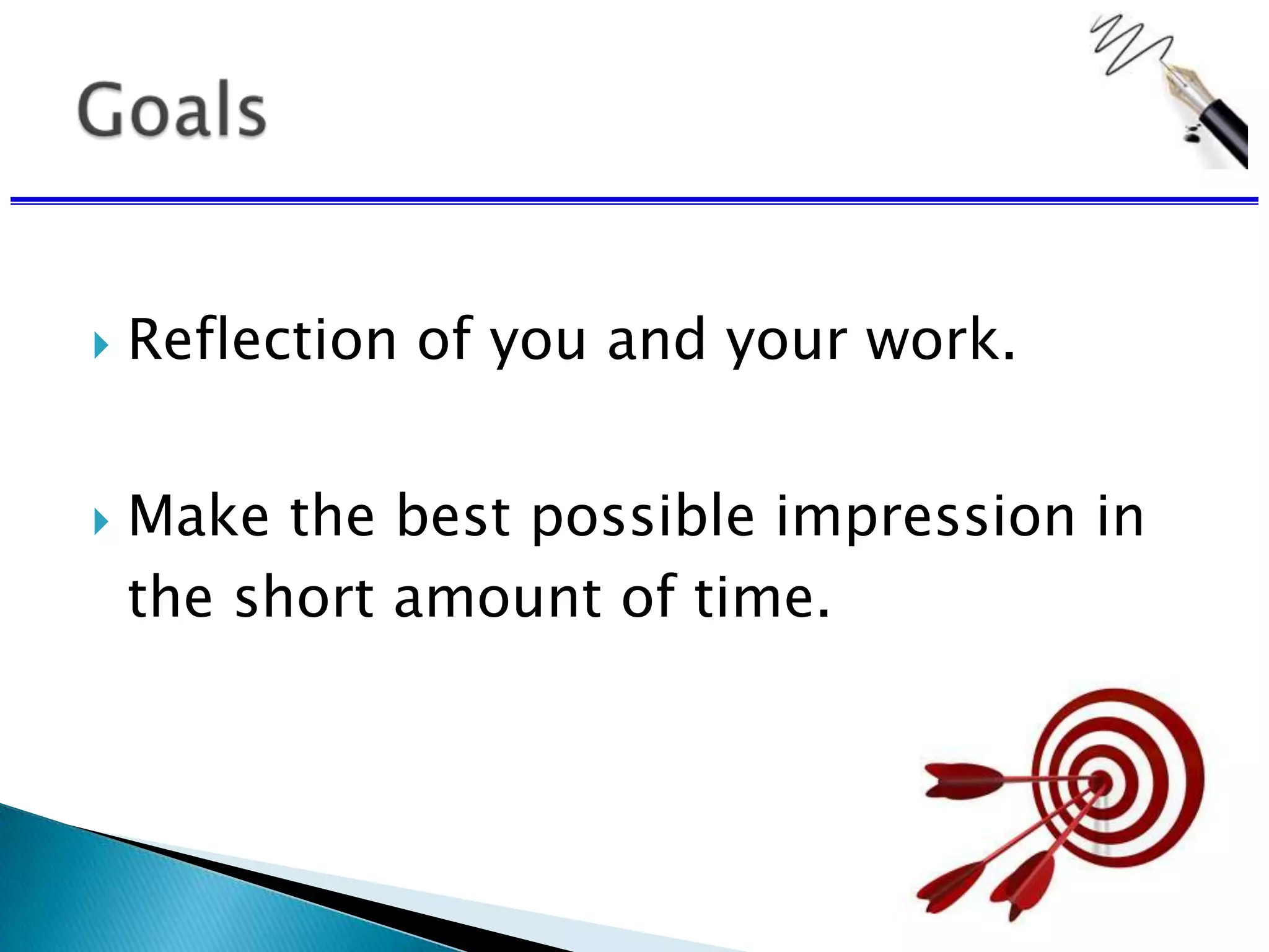
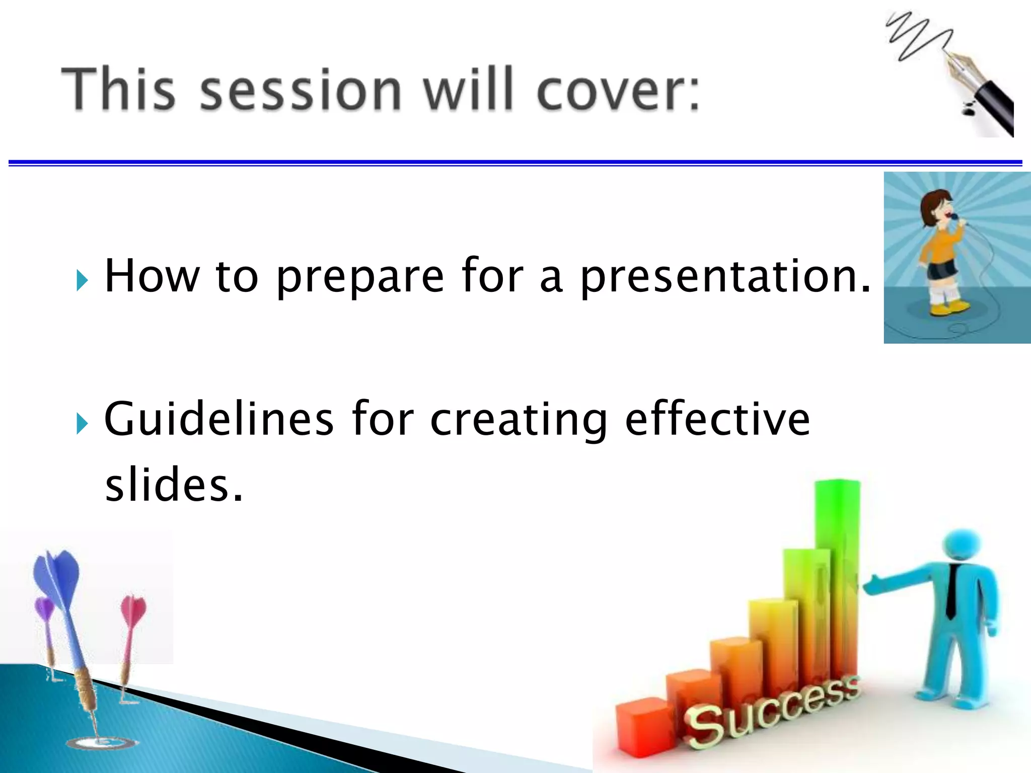
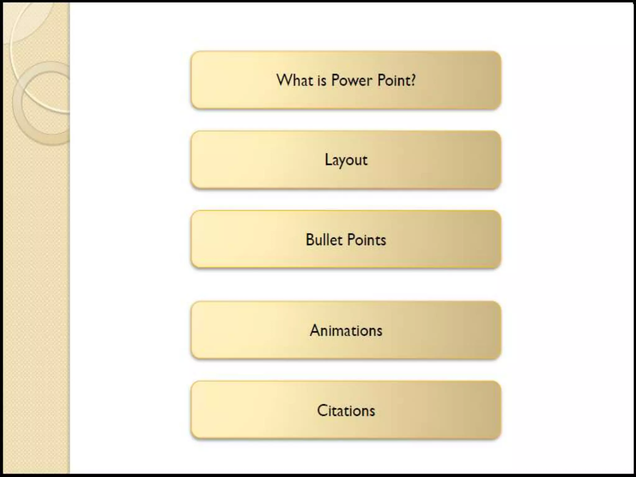
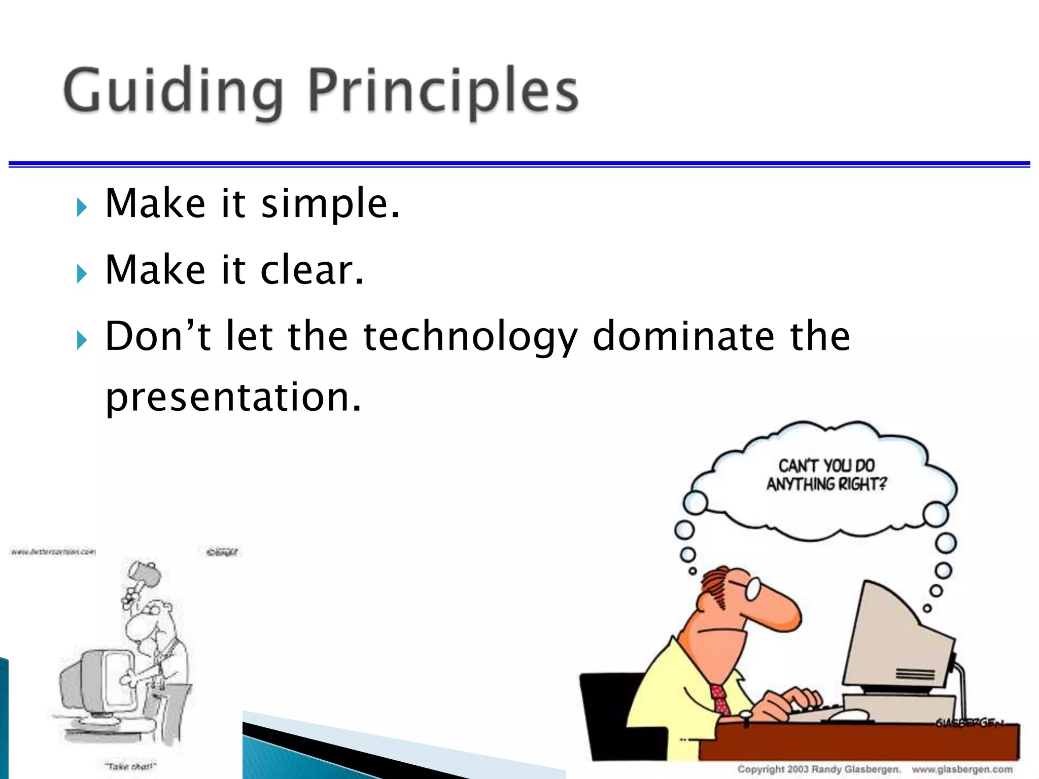
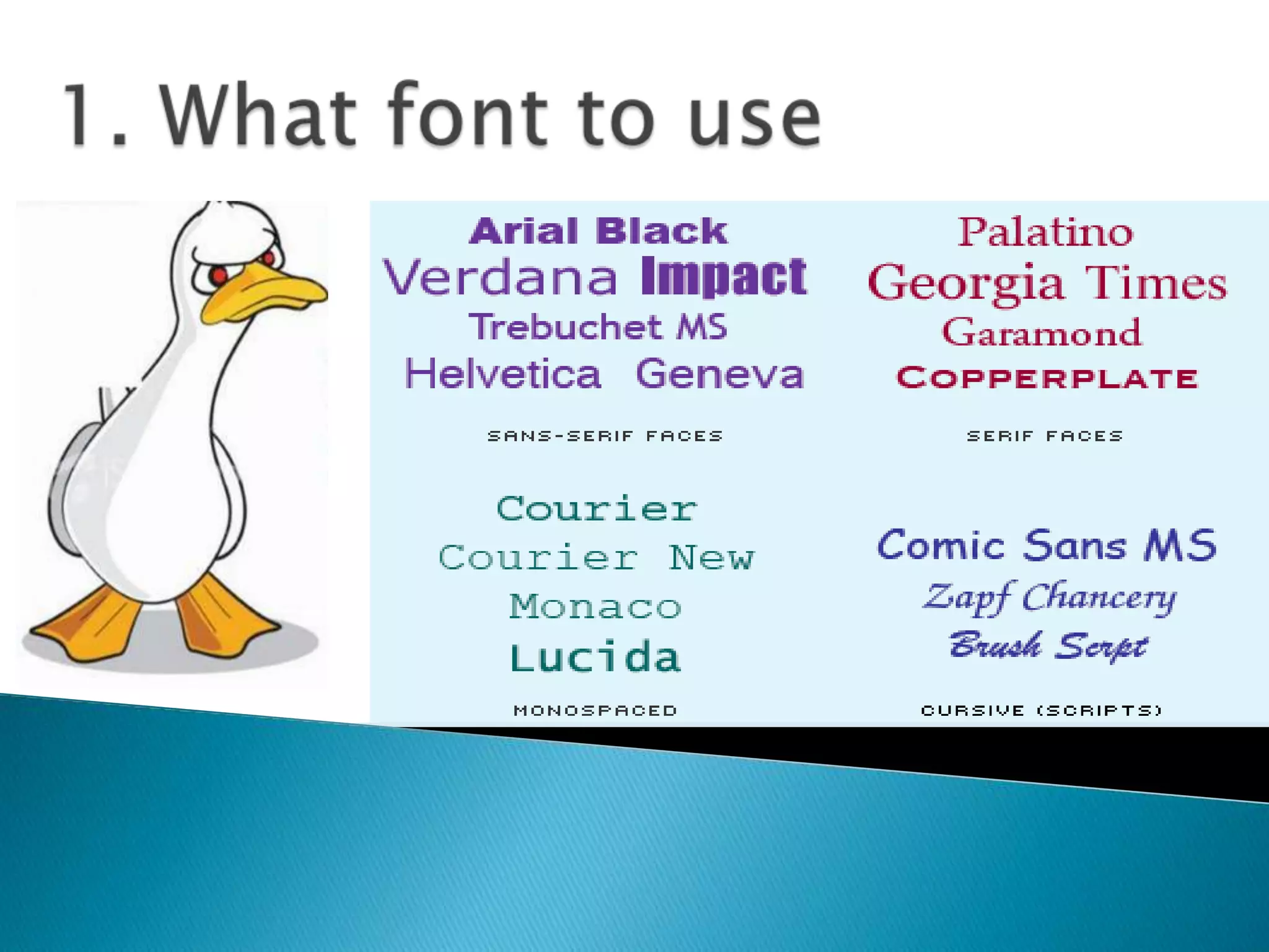
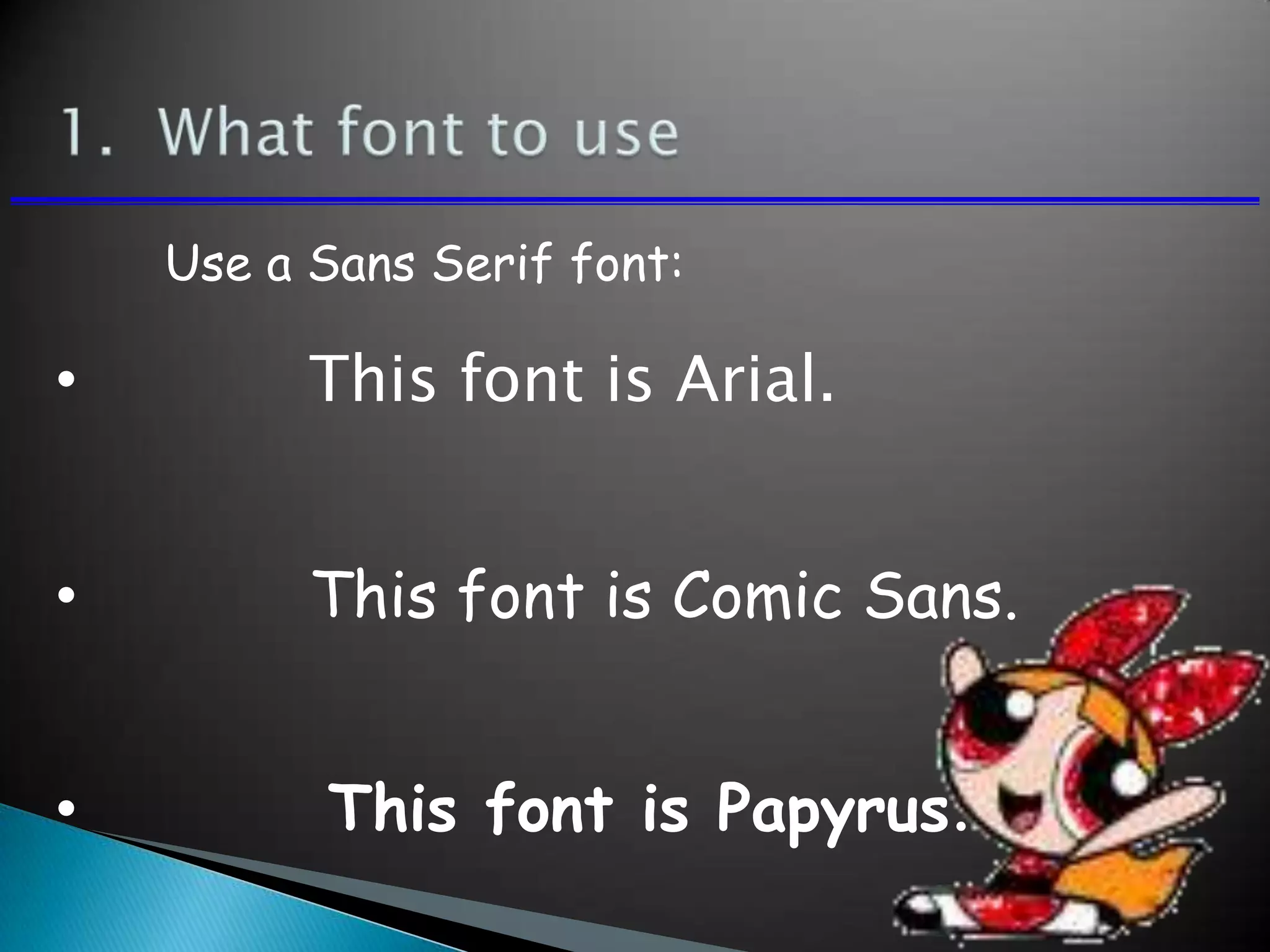
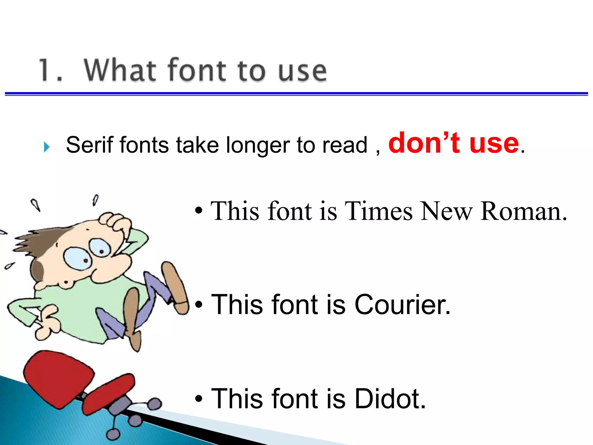
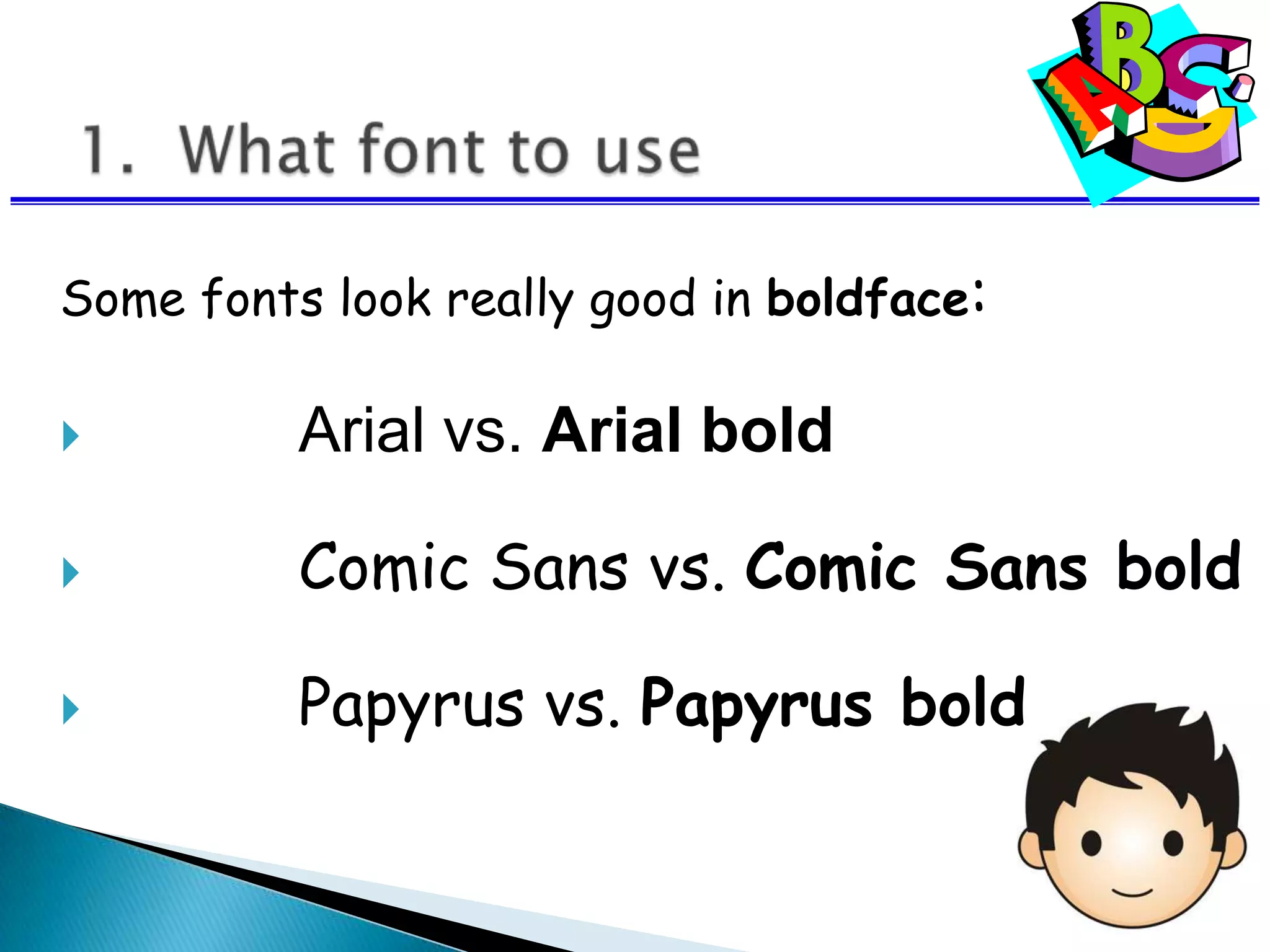
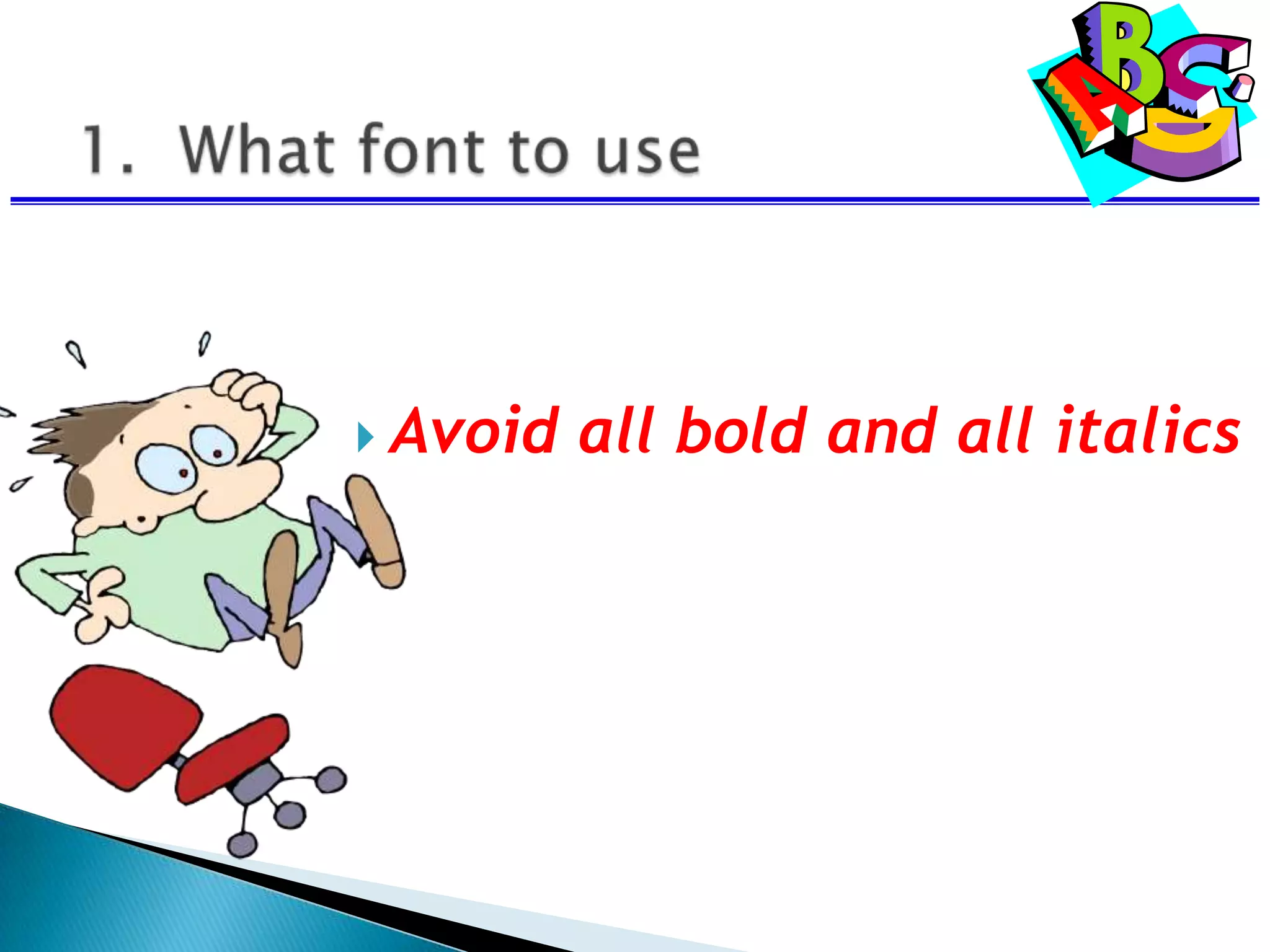
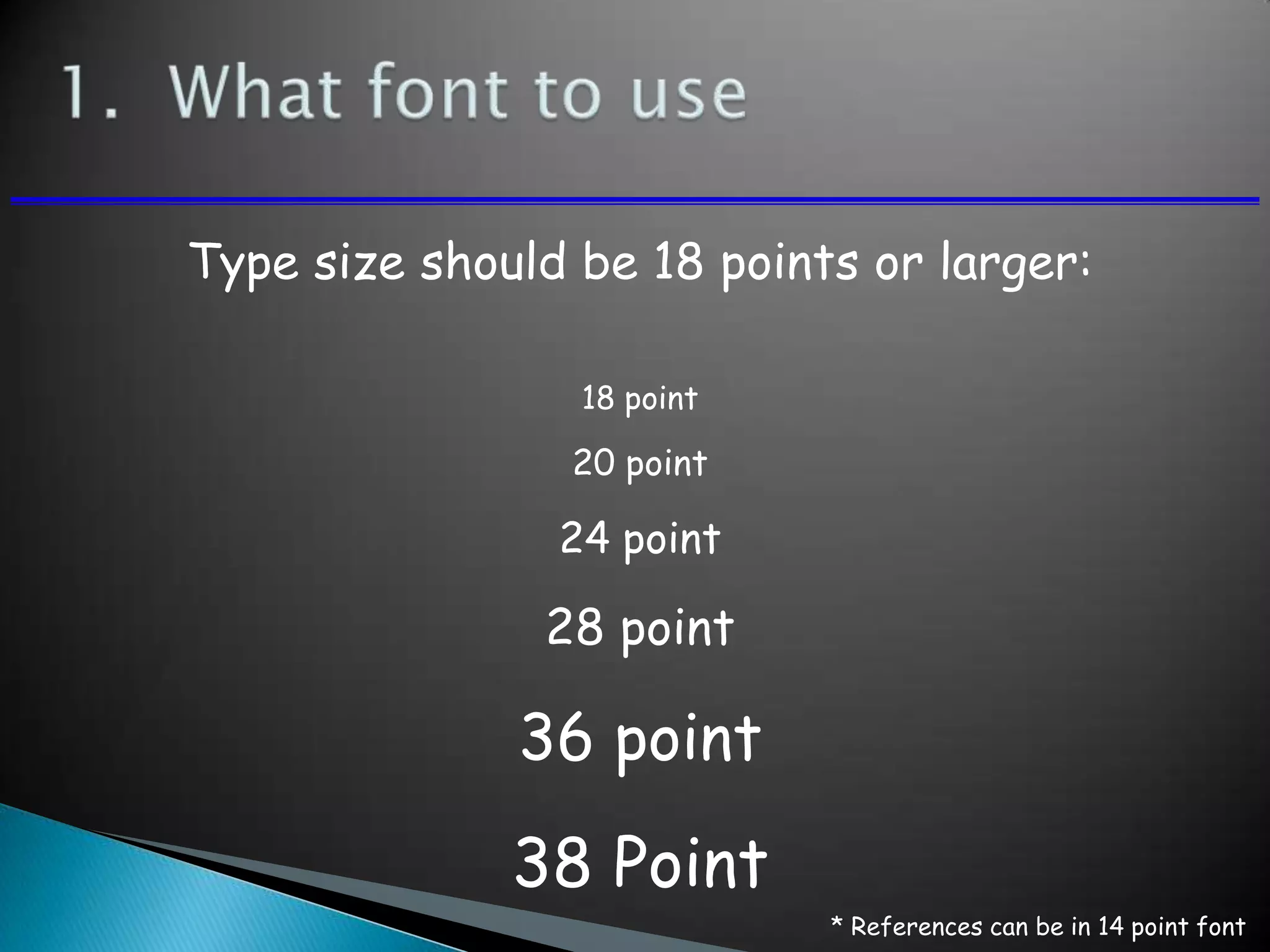
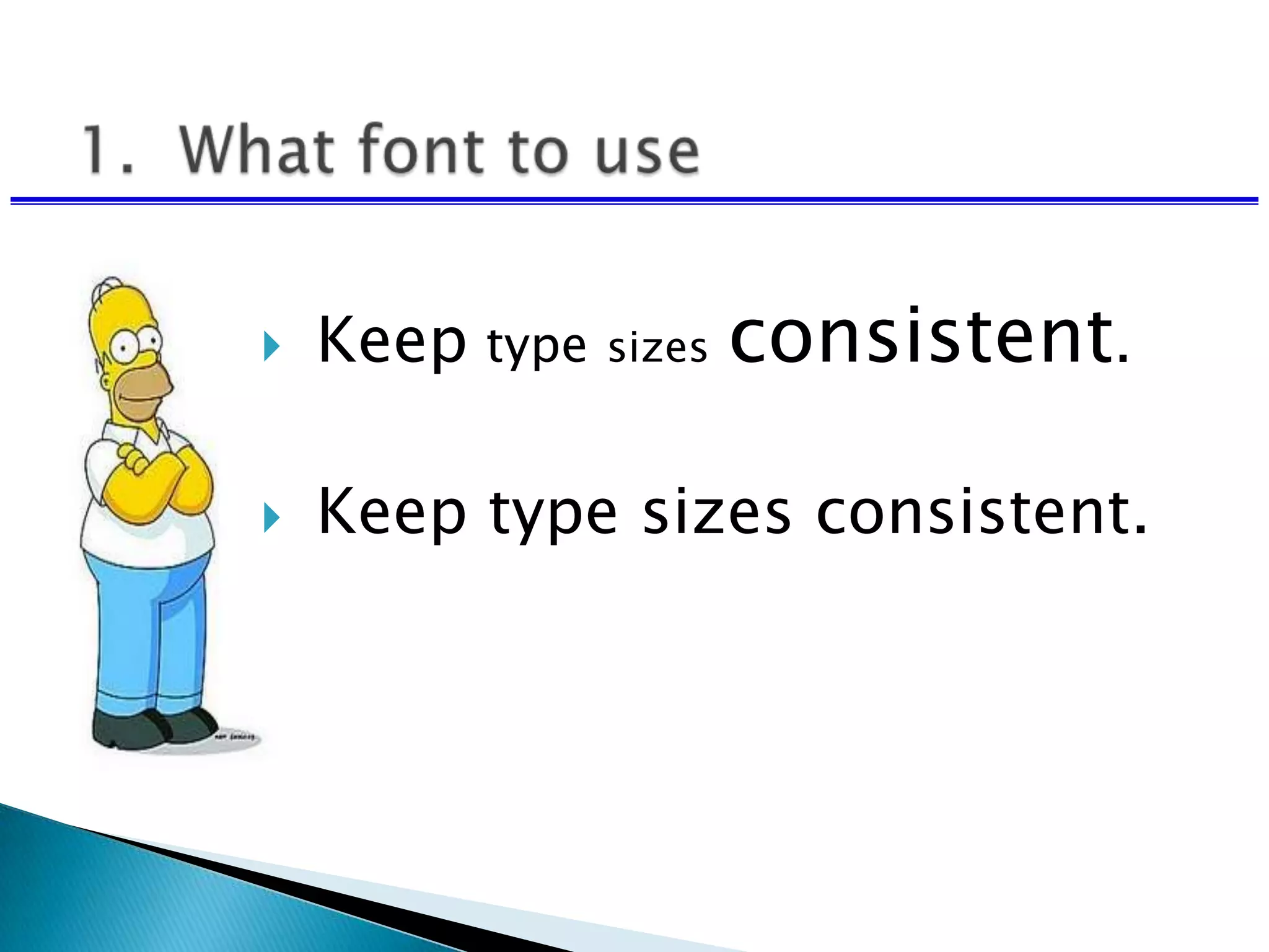
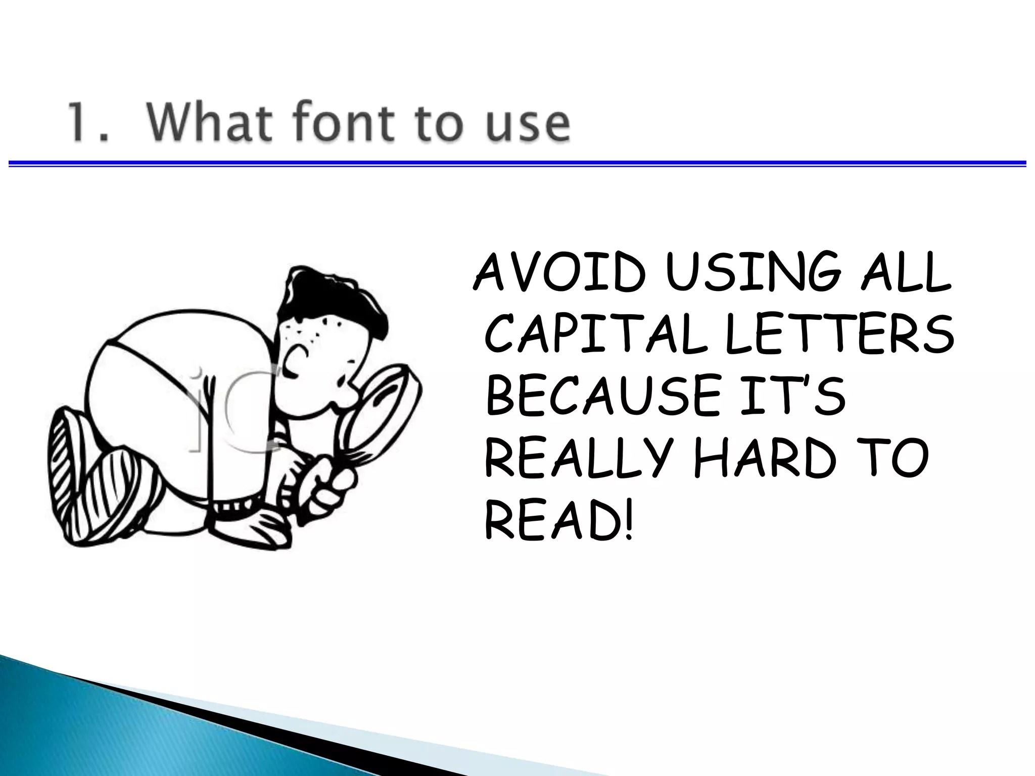
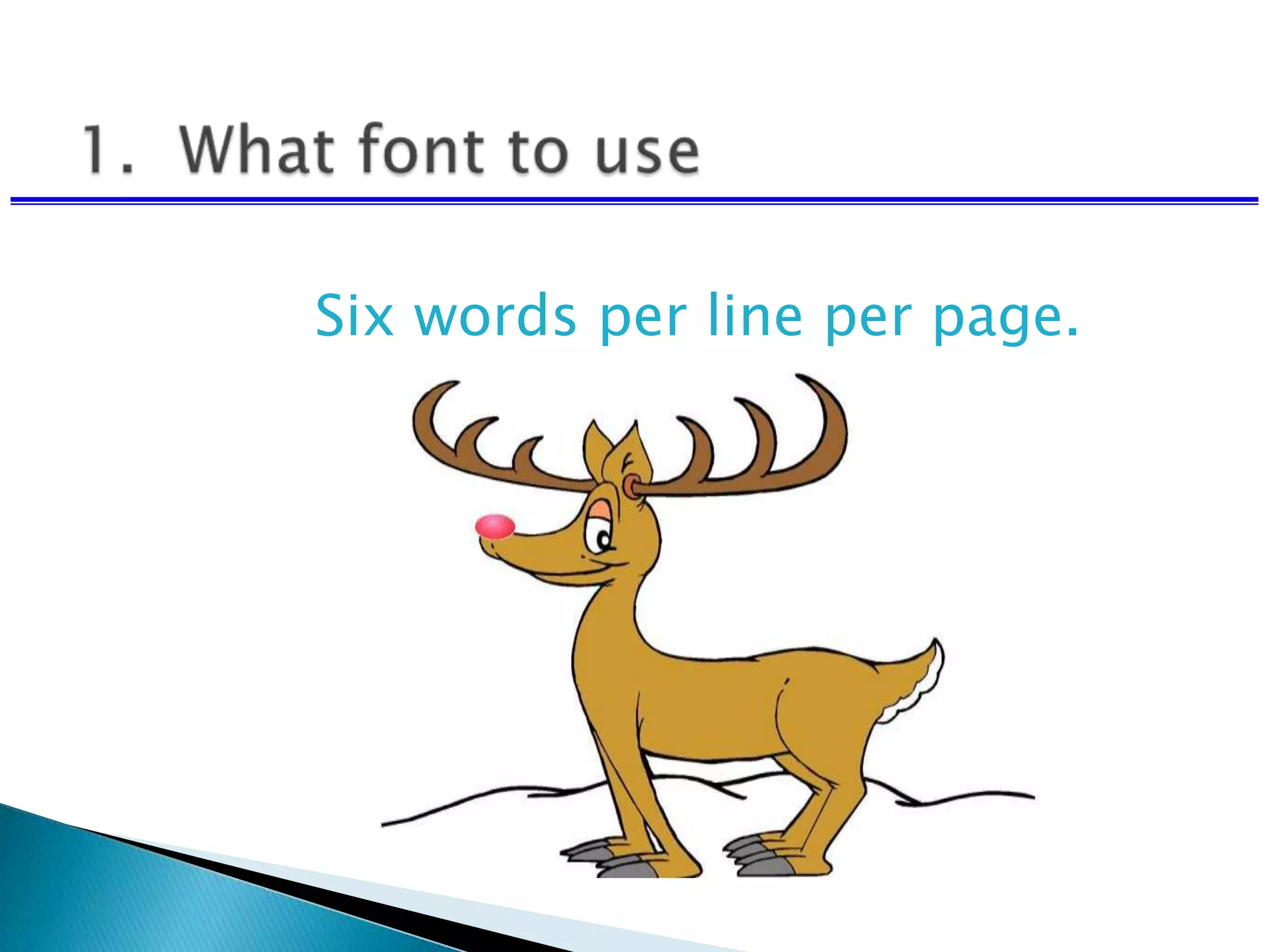
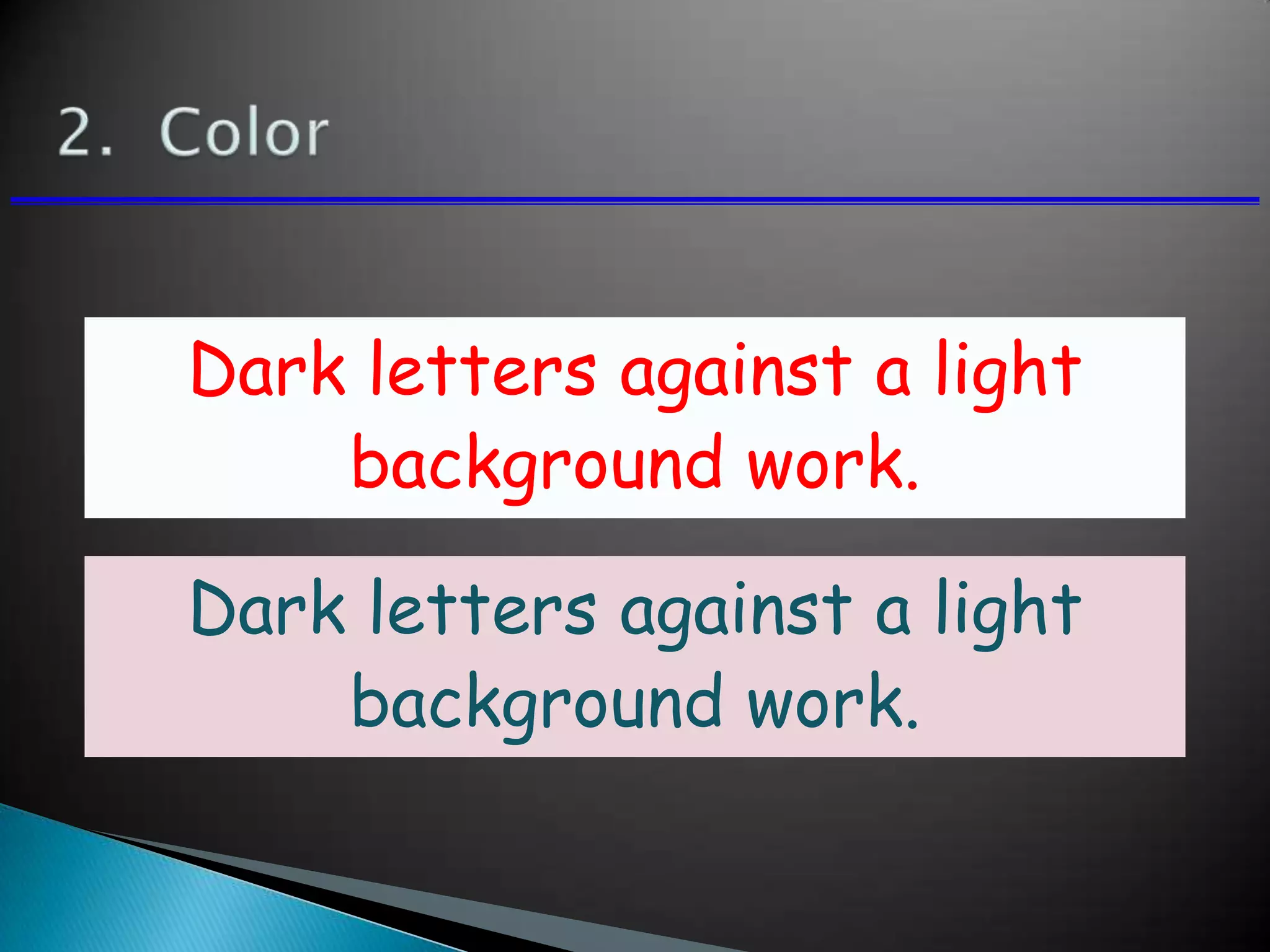
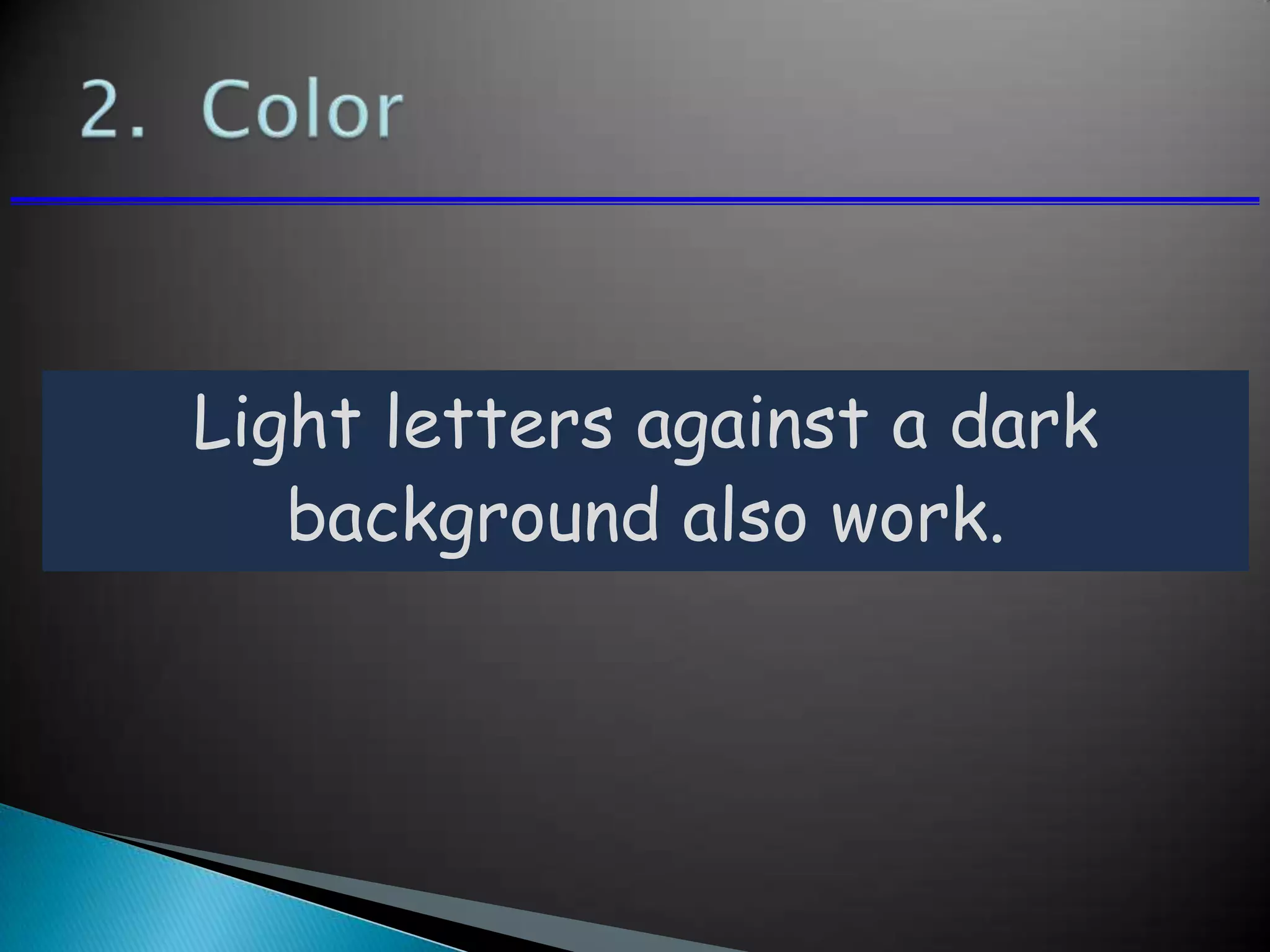
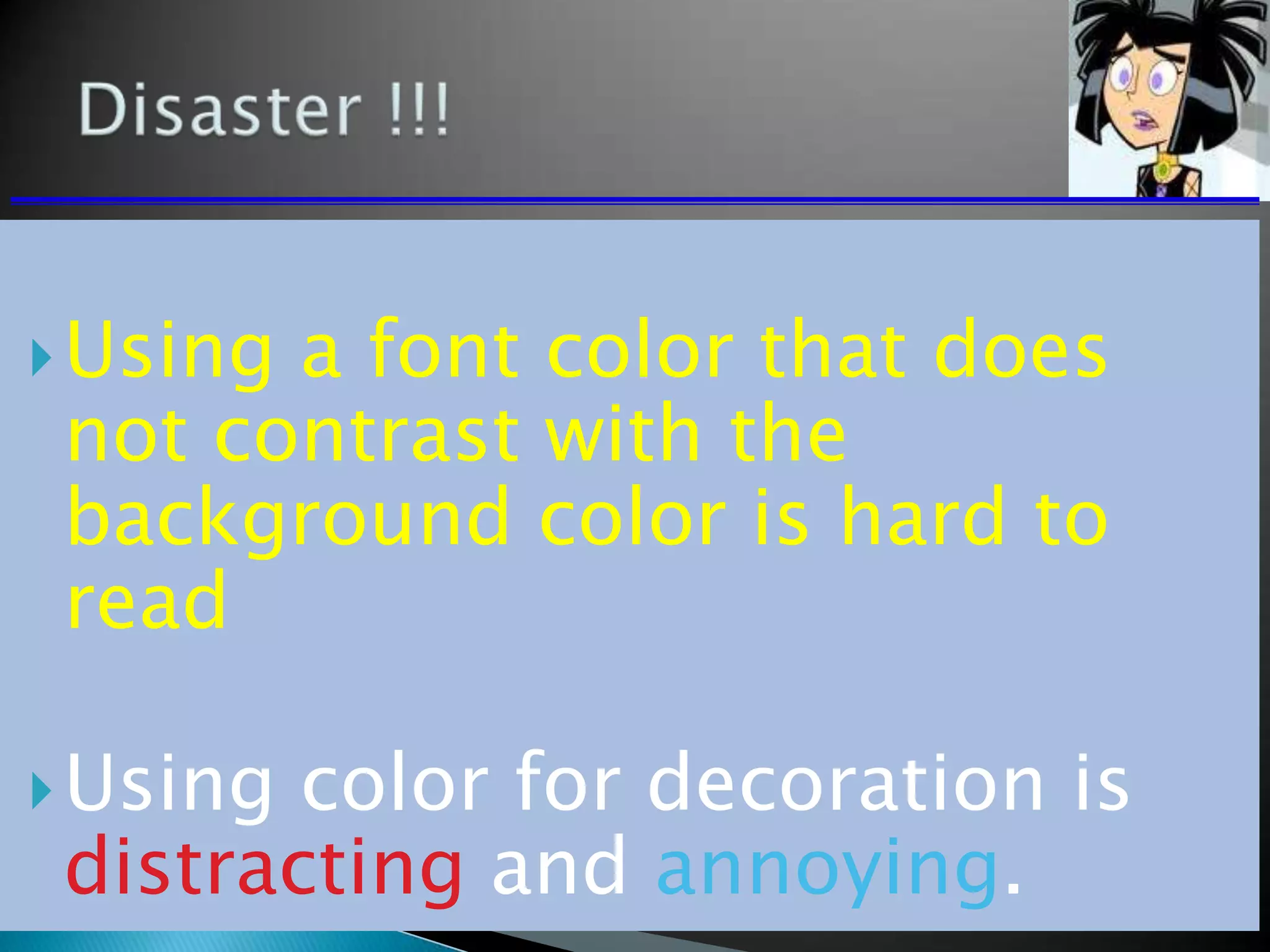
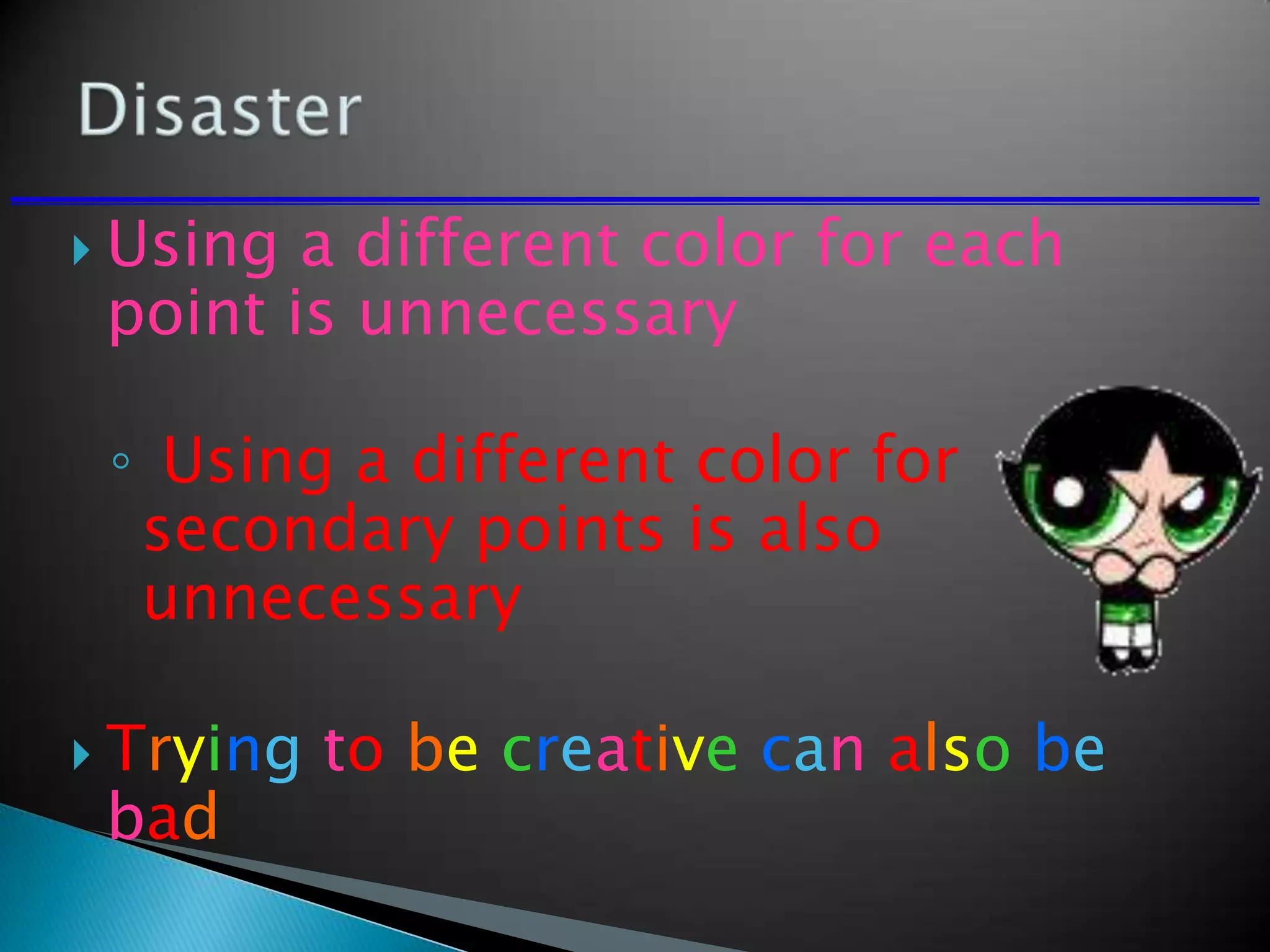
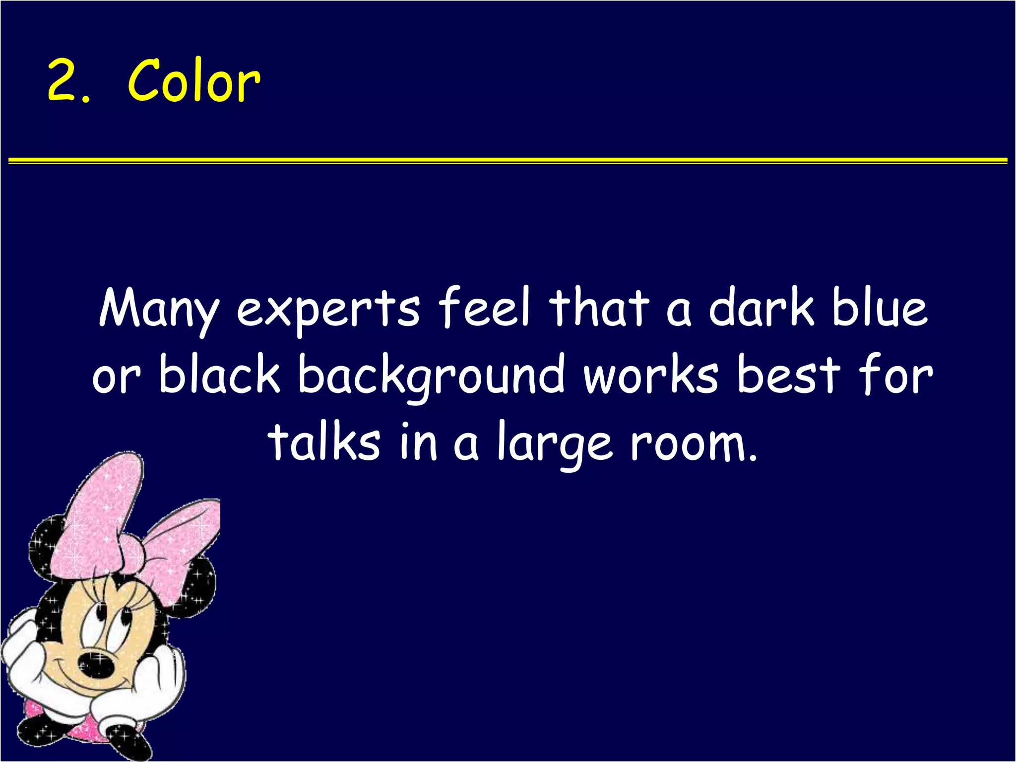
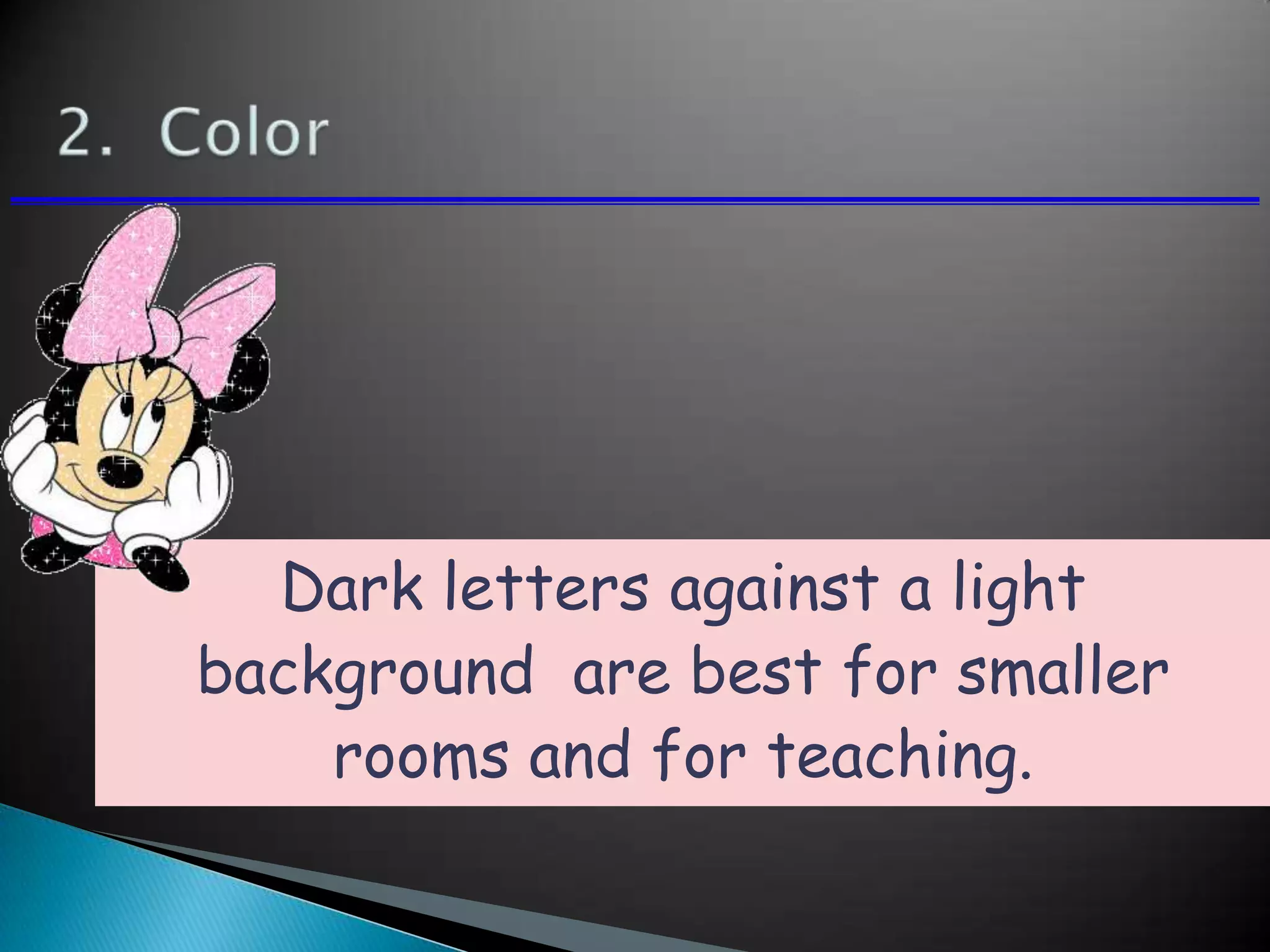
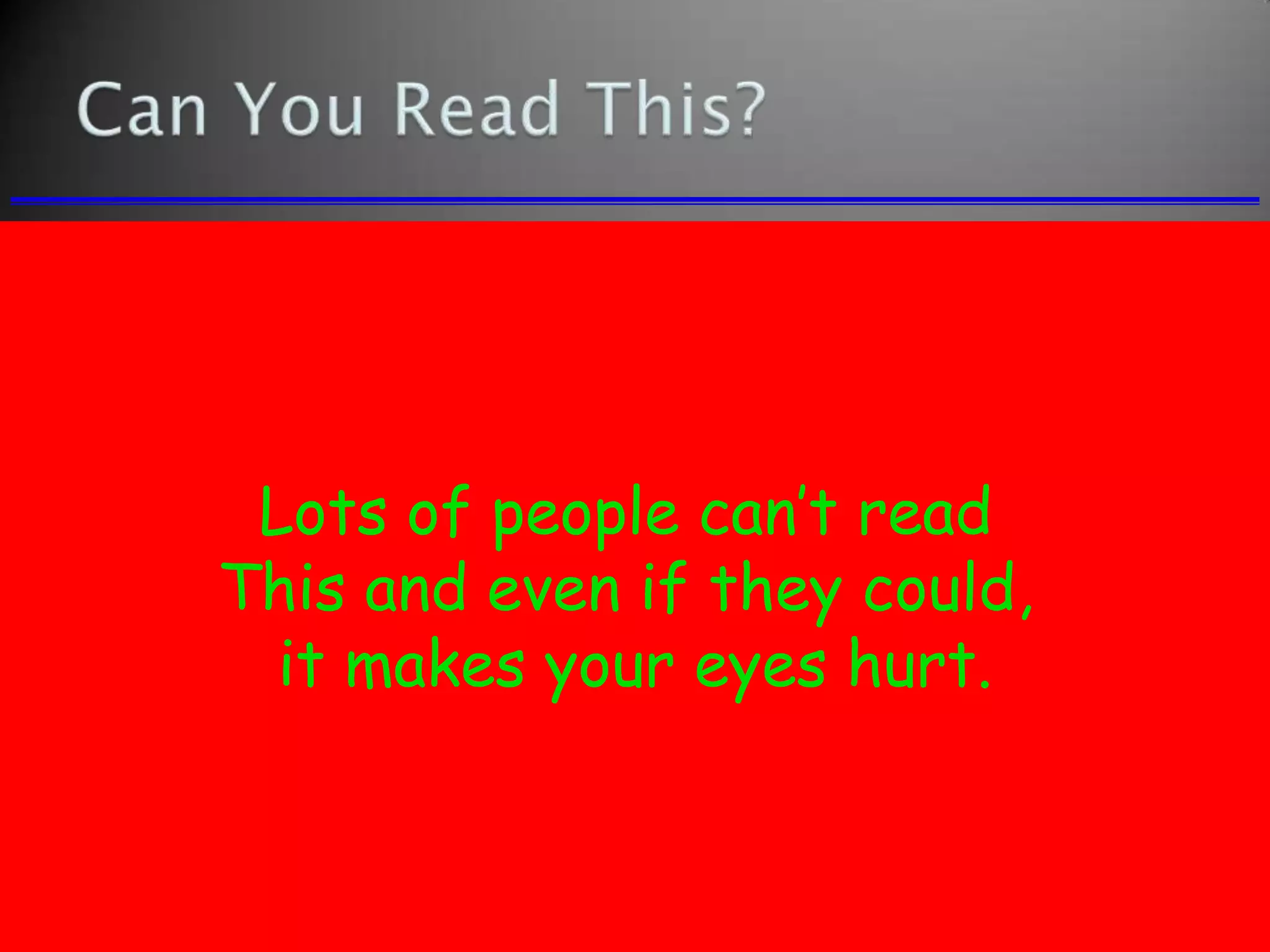
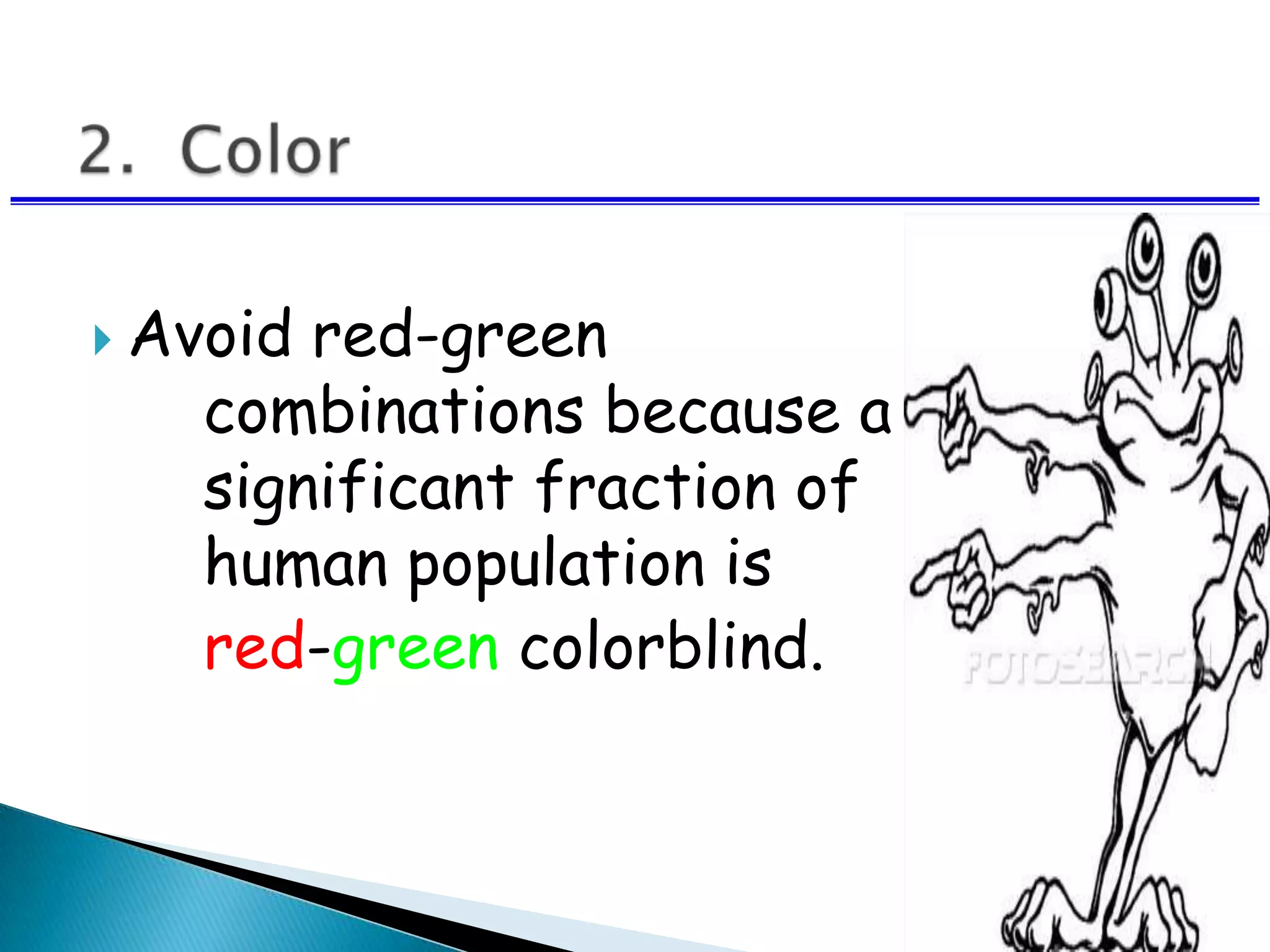
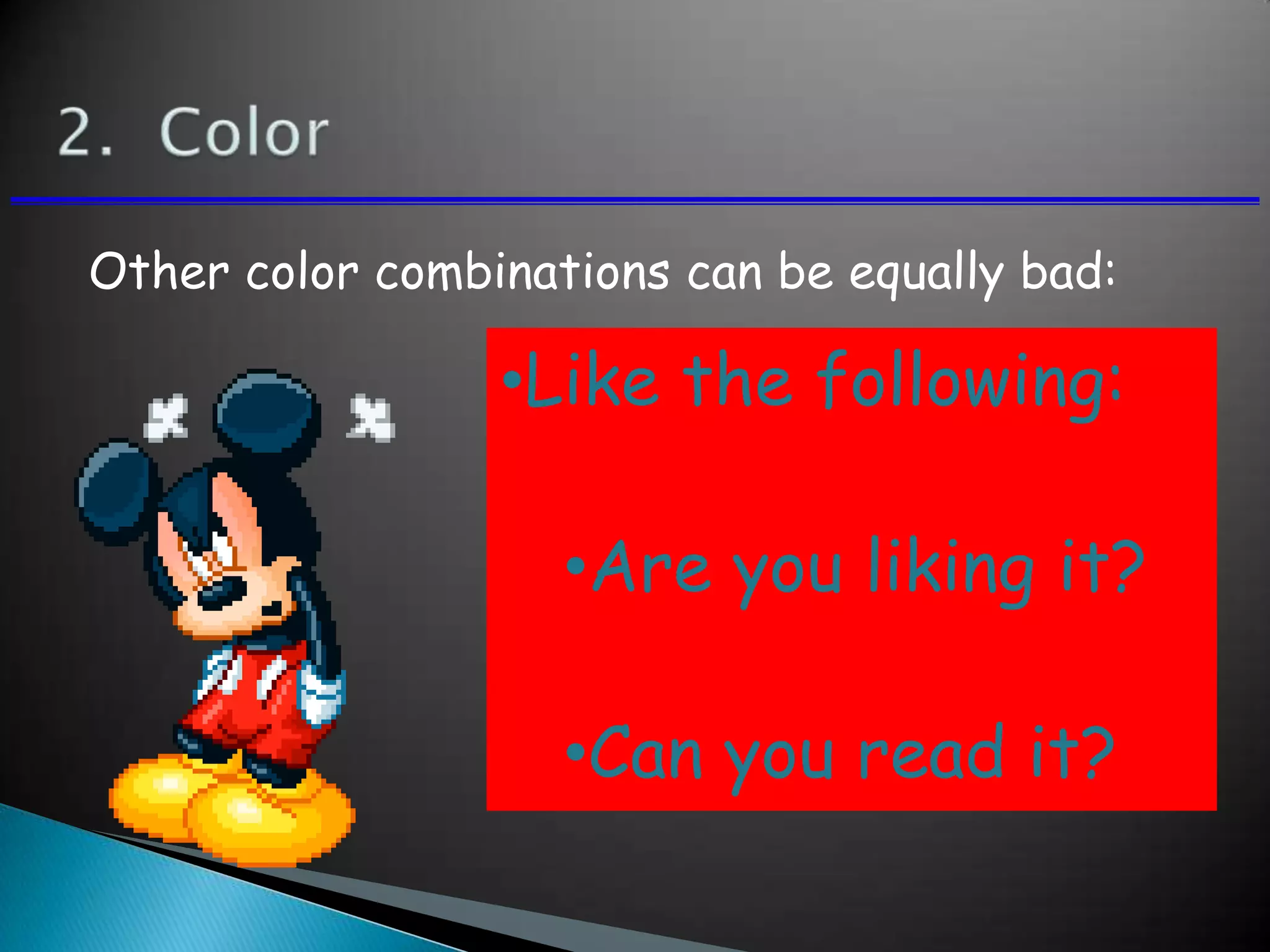
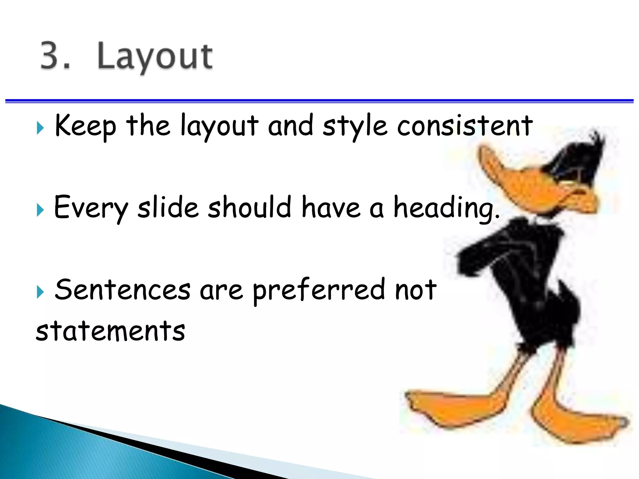
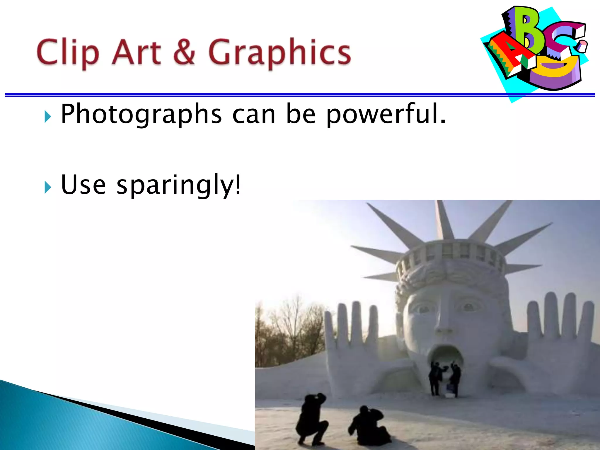
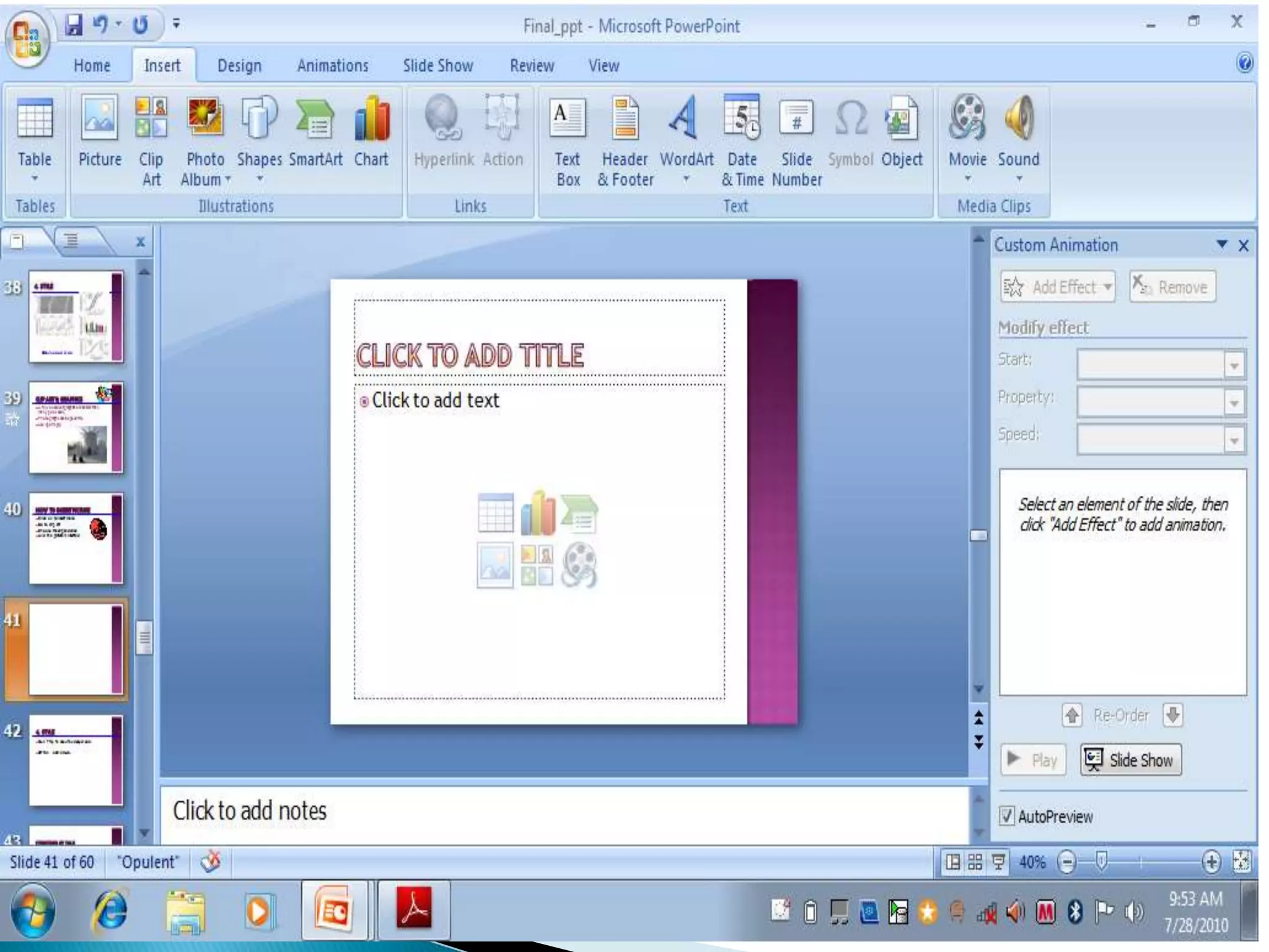
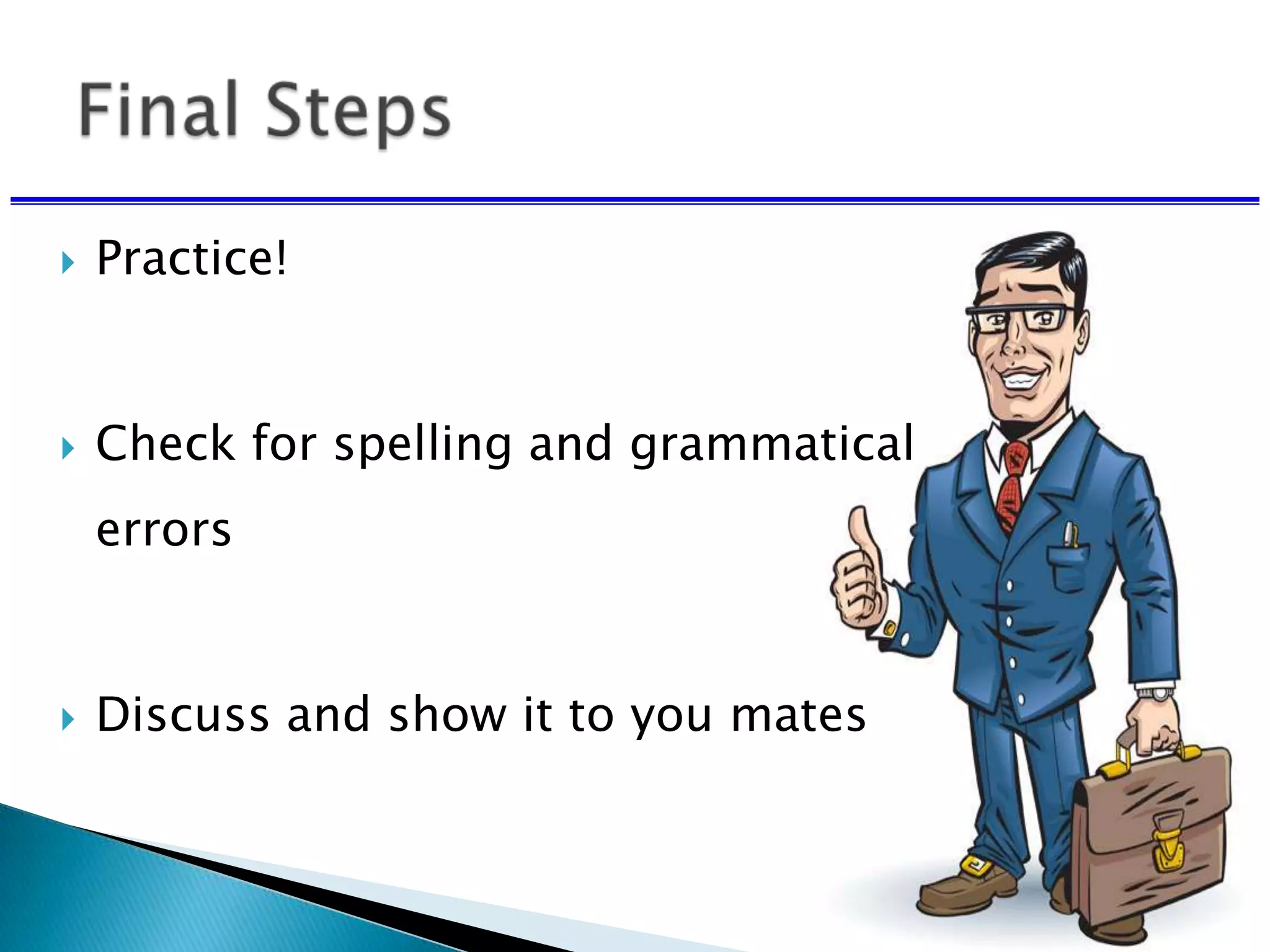
Course Instructor: Sneha Sharma
 Reflection of you and your work.
 Make the best possible impression in
the short amount of time.
 How to prepare for a presentation.
 Guidelines for creating effective
slides.
 Make it simple.
 Make it clear.
Religious leader
Civil rights activist
Author/poet
Labor activist
Minister
Antiwar activist
•Religious leader
•Civil rights activist
•Author/poet
•Labor activist
•Minister
•Antiwar activist
 Make it simple.
 Make it clear.
 Don’t let the technology dominate the
presentation.
Limit to 6-7 rows
Use effective headings
Test the table for readability
 Prepare well in advance
 Consider all equipment you will need:
◦ Internet connection
◦ Computer
◦ Microphone
◦ Software
 Consider what could go wrong and plan
accordingly.
 Always have a backup.
 Bring a handout that covers all of your
slides.
• This font is Arial.
• This font is Comic Sans.
• This font is Papyrus.
Use a Sans Serif font:
 Serif fonts take longer to read , don’t use.
• This font is Times New Roman.
• This font is Courier.
• This font is Didot.
Some fonts look really good in boldface:
 Arial vs. Arial bold
 Comic Sans vs. Comic Sans bold
 Papyrus vs. Papyrus bold
 Avoid all bold and all italics
Type size should be 18 points or larger:
18 point
20 point
24 point
28 point
36 point
38 Point
* References can be in 14 point font
 Keep type sizes consistent.
AVOID USING ALL
CAPITAL LETTERS
BECAUSE IT’S
REALLY HARD TO
READ!
Six words per line per page.
 Masculine appeal
◦ Used in cosmetic or beauty products
◦ Appeal aims at creating the impression
◦ Product will infuse the perfection
◦ Example: Raymond, Panteen
Dark letters against a light
background work.
Dark letters against a light
background work.
Light letters against a dark
background also work.
Using a font color that does
not contrast with the
background color is hard to
read
Using color for decoration is
distracting and annoying.
 Using a different color for each
point is unnecessary
◦ Using a different color for
secondary points is also
unnecessary
 Trying to be creative can also be
bad
2. Color
Many experts feel that a dark blue
or black background works best for
talks in a large room.
Dark letters against a light
background are best for smaller
rooms and for teaching.
Lots of people can’t read
This and even if they could,
it makes your eyes hurt.
 Avoid red-green
combinations because a
significant fraction of the
human population is
red-green colorblind.
Other color combinations can be equally bad:
•Like the following:
•Are you liking it?
•Can you read it?
 Keep the layout and style consistent
 Every slide should have a heading.
 Sentences are preferred not
statements
Limit text blocks to no more
than two lines each.
 The reason for limiting text blocks to
two lines is that when the text block
goes on and on forever, people in the
audience are going to have to make a
huge effort to read the text, which will
preclude them from paying attention to
what you are saying. Every time you
lose their focus, your presentation
suffers!
 Which one was easier to read this slide or the
previous one.
 You must have understood the difference
between the two.
 Lists should contain no more than 3
items:
 Item 1
 Item 2
 Item 3
 It is often effective to “unveil” your list
one by one
 You can do this using the “custom
animation” - option
 Point 1
 Point 2
 Point 3
Avoid sub lists !
• Item 1
Item 1a
Item 1b
Item 1c
• Item 2
- Item 2a
- Item 2b
• Item 3
 Do not center bullet points.
 It makes the text ragged and
difficult to read
 Generally, left-justify bullets.
 Be generous with empty space.
If you try to cram too much
into a slide, and place things
too close to the sides, they
can get cut off if you’re
using a poor projector. In
any case, the slide looks all
cluttered and junky.
Let’s break down the
previous slide into its
minimum essential
components
RT-PCR
Western
MDCK (kidney)cells
RT-PCR
Western
MDCK cells
MDCK cells
Surface view from lumen
gp135 -catenin ZO-1
gp135 -catenin ZO-1
Surface view from lumen
Side view of lumen
MDCK cells
gp135 -catenin ZO-1
MDCK cells EMK1 knockdown
 Try your best to include a Simple image
on every slide.
 Limit the number of items on
each slide.
 Each slide should make just one
or two points
 Don’t try to show too many slides.
 Often, less is more.
 Photographs can be powerful.
 Use sparingly!
 Click on to insert menu
 Go to clip art
 Choose the clip and click
 And the picture is inserted
1. Click on to insert menu
2. Go to sound
3. Choose the sound
4. And the sound is inserted
1. Click on to insert menu
2. Go to video
3. Choose the video
4. And the video is inserted
 Practice!
 Check for spelling and grammatical
errors
 Discuss and show it to you mates

How To Make An Effective Presentation

  • 1.
  • 2.
     Reflection ofyou and your work.  Make the best possible impression in the short amount of time.
  • 3.
     How toprepare for a presentation.  Guidelines for creating effective slides.
  • 4.
     Make itsimple.
  • 6.
  • 7.
    Religious leader Civil rightsactivist Author/poet Labor activist Minister Antiwar activist
  • 8.
    •Religious leader •Civil rightsactivist •Author/poet •Labor activist •Minister •Antiwar activist
  • 9.
     Make itsimple.  Make it clear.  Don’t let the technology dominate the presentation.
  • 11.
    Limit to 6-7rows Use effective headings Test the table for readability
  • 13.
     Prepare wellin advance  Consider all equipment you will need: ◦ Internet connection ◦ Computer ◦ Microphone ◦ Software
  • 14.
     Consider whatcould go wrong and plan accordingly.  Always have a backup.  Bring a handout that covers all of your slides.
  • 18.
    • This fontis Arial. • This font is Comic Sans. • This font is Papyrus. Use a Sans Serif font:
  • 19.
     Serif fontstake longer to read , don’t use. • This font is Times New Roman. • This font is Courier. • This font is Didot.
  • 20.
    Some fonts lookreally good in boldface:  Arial vs. Arial bold  Comic Sans vs. Comic Sans bold  Papyrus vs. Papyrus bold
  • 21.
     Avoid allbold and all italics
  • 22.
    Type size shouldbe 18 points or larger: 18 point 20 point 24 point 28 point 36 point 38 Point * References can be in 14 point font
  • 23.
     Keep typesizes consistent.  Keep type sizes consistent.
  • 24.
    AVOID USING ALL CAPITALLETTERS BECAUSE IT’S REALLY HARD TO READ!
  • 25.
    Six words perline per page.
  • 26.
     Masculine appeal ◦Used in cosmetic or beauty products ◦ Appeal aims at creating the impression ◦ Product will infuse the perfection ◦ Example: Raymond, Panteen
  • 28.
    Dark letters againsta light background work. Dark letters against a light background work.
  • 29.
    Light letters againsta dark background also work.
  • 30.
    Using a fontcolor that does not contrast with the background color is hard to read Using color for decoration is distracting and annoying.
  • 31.
     Using adifferent color for each point is unnecessary ◦ Using a different color for secondary points is also unnecessary  Trying to be creative can also be bad
  • 32.
    2. Color Many expertsfeel that a dark blue or black background works best for talks in a large room.
  • 33.
    Dark letters againsta light background are best for smaller rooms and for teaching.
  • 34.
    Lots of peoplecan’t read This and even if they could, it makes your eyes hurt.
  • 35.
     Avoid red-green combinationsbecause a significant fraction of the human population is red-green colorblind.
  • 36.
    Other color combinationscan be equally bad: •Like the following: •Are you liking it? •Can you read it?
  • 37.
     Keep thelayout and style consistent  Every slide should have a heading.  Sentences are preferred not statements
  • 38.
    Limit text blocksto no more than two lines each.
  • 39.
     The reasonfor limiting text blocks to two lines is that when the text block goes on and on forever, people in the audience are going to have to make a huge effort to read the text, which will preclude them from paying attention to what you are saying. Every time you lose their focus, your presentation suffers!
  • 40.
     Which onewas easier to read this slide or the previous one.  You must have understood the difference between the two.
  • 41.
     Lists shouldcontain no more than 3 items:  Item 1  Item 2  Item 3
  • 42.
     It isoften effective to “unveil” your list one by one  You can do this using the “custom animation” - option  Point 1  Point 2  Point 3
  • 43.
    Avoid sub lists! • Item 1 Item 1a Item 1b Item 1c • Item 2 - Item 2a - Item 2b • Item 3
  • 44.
     Do notcenter bullet points.  It makes the text ragged and difficult to read  Generally, left-justify bullets.
  • 45.
     Be generouswith empty space.
  • 46.
    If you tryto cram too much into a slide, and place things too close to the sides, they can get cut off if you’re using a poor projector. In any case, the slide looks all cluttered and junky.
  • 47.
    Let’s break downthe previous slide into its minimum essential components
  • 48.
  • 49.
  • 50.
    MDCK cells Surface viewfrom lumen gp135 -catenin ZO-1
  • 51.
    gp135 -catenin ZO-1 Surfaceview from lumen Side view of lumen MDCK cells
  • 52.
    gp135 -catenin ZO-1 MDCKcells EMK1 knockdown
  • 53.
    MDCK cells EMK1knockdown
  • 54.
    MDCK cells EMK1knockdown
  • 55.
     Try yourbest to include a Simple image on every slide.
  • 56.
     Limit thenumber of items on each slide.  Each slide should make just one or two points  Don’t try to show too many slides.  Often, less is more.
  • 57.
     Photographs canbe powerful.  Use sparingly!
  • 58.
     Click onto insert menu  Go to clip art  Choose the clip and click  And the picture is inserted
  • 62.
    1. Click onto insert menu 2. Go to sound 3. Choose the sound 4. And the sound is inserted
  • 66.
    1. Click onto insert menu 2. Go to video 3. Choose the video 4. And the video is inserted
  • 67.
     Practice!  Checkfor spelling and grammatical errors  Discuss and show it to you mates