Tips on Powerpoint Presentation
•Download as PPT, PDF•
0 likes•483 views

Computer Software

Recommended
More Related Content
What's hot
Viewers also liked
Similar to Tips on Powerpoint Presentation
Similar to Tips on Powerpoint Presentation (20)
More from Fritz Earlin Therese Lapitaje Pondantes
More from Fritz Earlin Therese Lapitaje Pondantes (20)
Recently uploaded
Recently uploaded (20)
Tips on Powerpoint Presentation
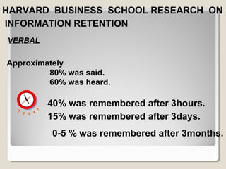
- 1. HHAARRVVAARRDD BBUUSSIINNEESSSS SSCCHHOOOOLL RREESSEEAARRCCHH OONN IINNFFOORRMMAATTIIOONN RREETTEENNTTIIOONN Approximately 80% was said. 60% was heard. VERBAL 40% was remembered after 3hours. 15% was remembered after 3days. 0-5 % was remembered after 3months.
- 2. VERBAL + VISUAL Approximately 60% was remembered after 3days. 40-50% was remembered after 3 months.
- 3. VERBAL + VISUAL + NOTES + + Approximately 80% was remembered after 3days. 60-70 % was remembered after 3months.
- 4. Titles Bullets Graphs Fonts Colors YYoouurr SSlliiddeess
- 5. Appear on every page Attention-getting Short Forceful TTiittlleess
- 6. Don’t list exactly what you plan to say Outlines are best No more than 5 lines per frame ◦ Use bullets/numbers to organize ideas No more than 6 words per line Use the same verb tense, cases and number (s or p) BBuulllleettss
- 7. Use graphs rather than just charts and words ◦ Data in graphs is easier to comprehend & retain than is raw data ◦ Trends are easier to visualize in graph form Always title your graphs GGrraapphhss -- GGoooodd
- 8. January February March April Blue Balls 20.4 27.4 90 20.4 Red Balls 30.6 38.6 34.6 31.6 GGrraapphhss -- BBaadd
- 9. GGrraapphhss -- GGoooodd Items Sold in First Quarter of 2002 100 90 80 70 60 50 40 30 20 10 0 January February March April Blue Balls Red Balls
- 10. GGrraapphhss -- BBaadd 20.4 27.4 90 20.4 30.6 38.6 34.6 31.6 100 90 80 70 60 50 40 30 20 10 0 January February March April Blue Balls Red Balls
- 11. Minor gridlines are unnecessary Font is too small Colours are illogical Title is missing Shading is distracting GGrraapphhss -- BBaadd
- 12. MM&&EE PPrrooggrraamm WWoorrkksshhooppss Budapest Wash DC Entebbe Mae Sot Participants 14 32 38 44 Projects 4 10 10 10 This table might be OK in a report, but it is much too detailed for an oral presentation. See next slide for a better suggestion. Headquarters 6 6 6 7 Topic Causal pathway RHRC Conference/ EpiInfo HIV/AIDS/ Excel GBV/ PowerPoint Evaluation Results Excellent Excellent Excellent ?????
- 13. NNuummbbeerr ooff MM&&EE PPrrooggrraamm WWoorrkksshhoopp PPaarrttiicciippaannttss Charts are often easier to understand than tables. Keep the chart simple. 14 32 38 44 50 45 40 35 30 25 20 15 10 0 5 Budapest Wash DC Ent ebbe Mae Sot
- 14. Avoid using all caps for large blocks of type ◦ISN’T THIS HARD TO READ? RRuulleess ffoorr TTeexxtt
- 15. Use boldface type instead of underlining to add emphasis RRuulleess ffoorr TTeexxtt
- 16. Limit your fonts to 1 or 2 below Recommended minimum size is 18 points ◦Sizes Sizes ◦Weights Weights RRuulleess ffoorr TTeexxtt
- 17. Use at least an 18-point font Use different size fonts for main points and secondary points ◦ this font is 24-point, the main point font is 28- point, and the title font is 36-point Use a standard font like Times New Roman or Arial FFoonnttss -- GGoooodd
- 18. If you use a small font, your audience won’t be able to read what you have written CAPITALIZE ONLY WHEN NECESSARY. IT IS DIFFICULT TO READ Don’t use a complicated font FFoonnttss -- BBaadd
- 19. Use a colour of font that contrasts sharply with the background ◦ Ex: blue font on white background Use colour to reinforce the logic of your structure ◦ Ex: light blue title and dark blue text Use colour to emphasize a point ◦ But only use this occasionally CCoolloouurr -- GGoooodd
- 20. Using a font colour that does not contrast with the background colour is hard to read Using colour for decoration is distracting and annoying. Using a different colour for each point is unnecessary ◦ Using a different colour for secondary points is also unnecessary Trying to be creative can also be bad CCoolloouurr -- BBaadd
- 21. Use backgrounds such as this one that are attractive but simple Use backgrounds which are light Use the same background consistently throughout your presentation BBaacckkggrroouunndd -- GGoooodd
- 22. Avoid backgrounds that are distracting or difficult to read from Always be consistent with the background that you use BBaacckkggrroouunndd –– BBaadd
- 23. Show one point at a time: ◦ Will help audience concentrate on what you are saying ◦ Will prevent audience from reading ahead ◦ Will help you keep your presentation focused SSlliiddee SSttrruuccttuurree –– GGoooodd
- 24. Do not use distracting animation Be consistent with the animation that you use SSlliiddee SSttrruuccttuurree -- BBaadd
- 25. Avoid superimposing words over graphics RRuulleess ffoorr GGrraapphhiiccss
- 26. Use adequate margins for each frame Leave equal margins at top and sides Leave slightly larger margin at the bottom RRuulleess ffoorr MMaarrggiinnss
- 27. Avoid superimposing words over graphics.
- 29. No more than four colors per slide Too busy if use more Viewers don’t know why you are using color The viewers don’t know what is important and highlighted if you use lots of colors CCoolloorrss ppeerr sslliiddee
- 30. Light yellow on a blue background White on a black background Black on a light yellow background Black on a white background may be too bright CCoolloorrss ttoo uussee
- 31. Turn your Screen BLACK and back again... oorr .. CCoonnttrroolllliinngg YYoouurr SSlliiddeess
- 32. Turn your Screen WHITE and back again... oorr ,, CCoonnttrroolllliinngg YYoouurr SSlliiddeess
- 33. To end your show CCoonnttrroolllliinngg YYoouurr SSlliiddeess EESSCC oorr CCTTRRLL++BBrreeaakk oorr MMiinnuuss oorr EENNDD
- 34. To advance to next slide CCoonnttrroolllliinngg YYoouurr SSlliiddeess MMoouussee CClliicckk oorr SSppaacceebbaarr oorr NN oorr RRiigghhtt AArrrrooww oorr DDoowwnn AArrrrooww oorr PPaaggee DDoowwnn
- 35. To return to previous slide CCoonnttrroolllliinngg YYoouurr SSlliiddeess BBaacckkssppaaccee oorr PP oorr LLeefftt AArrrrooww oorr UUpp AArrrrooww oorr PPaaggee UUpp
- 36. To go directly to a specific slide <<NNuummbbeerr>> EENNTTEERR CCoonnttrroolllliinngg YYoouurr SSlliiddeess