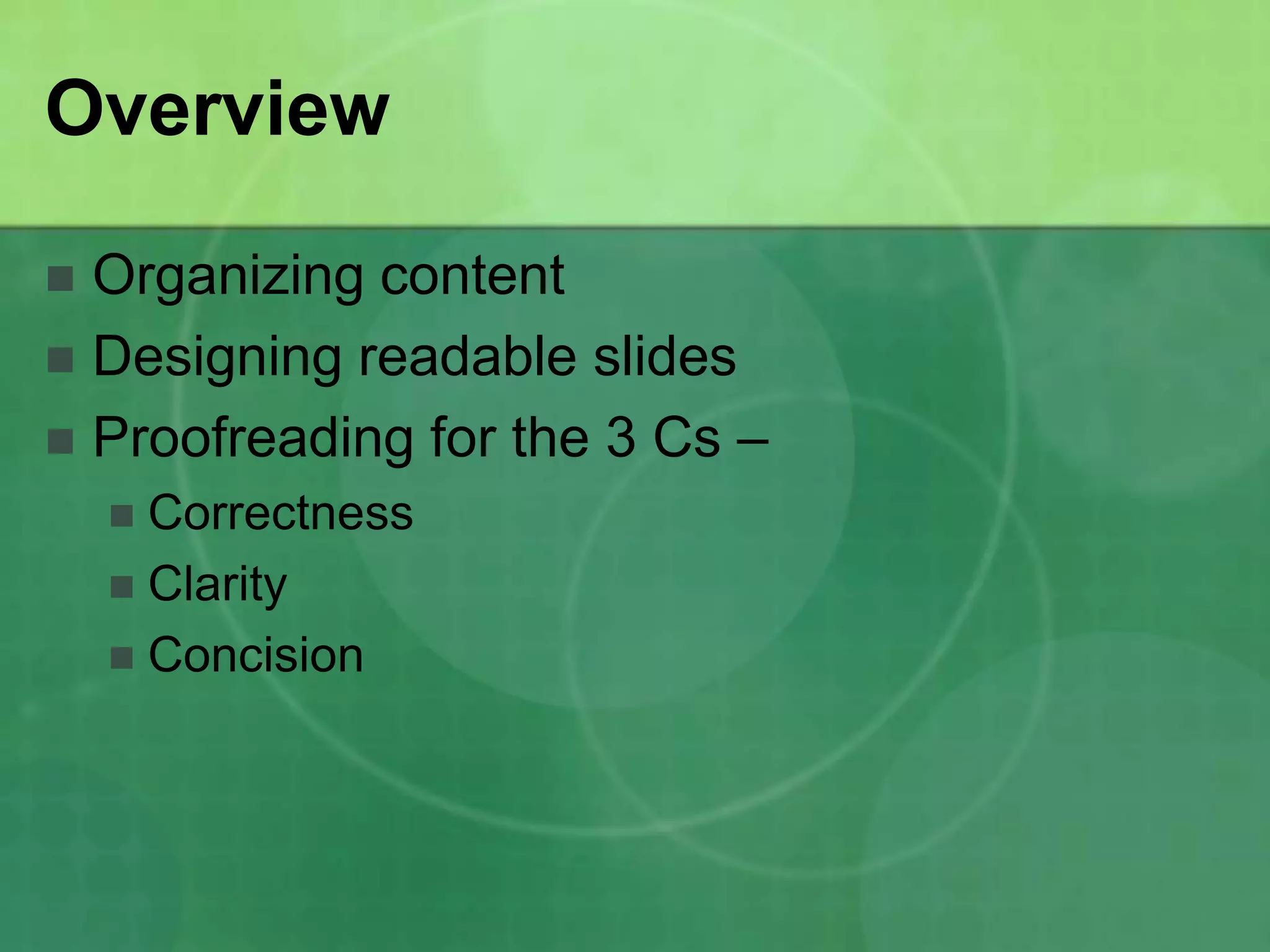
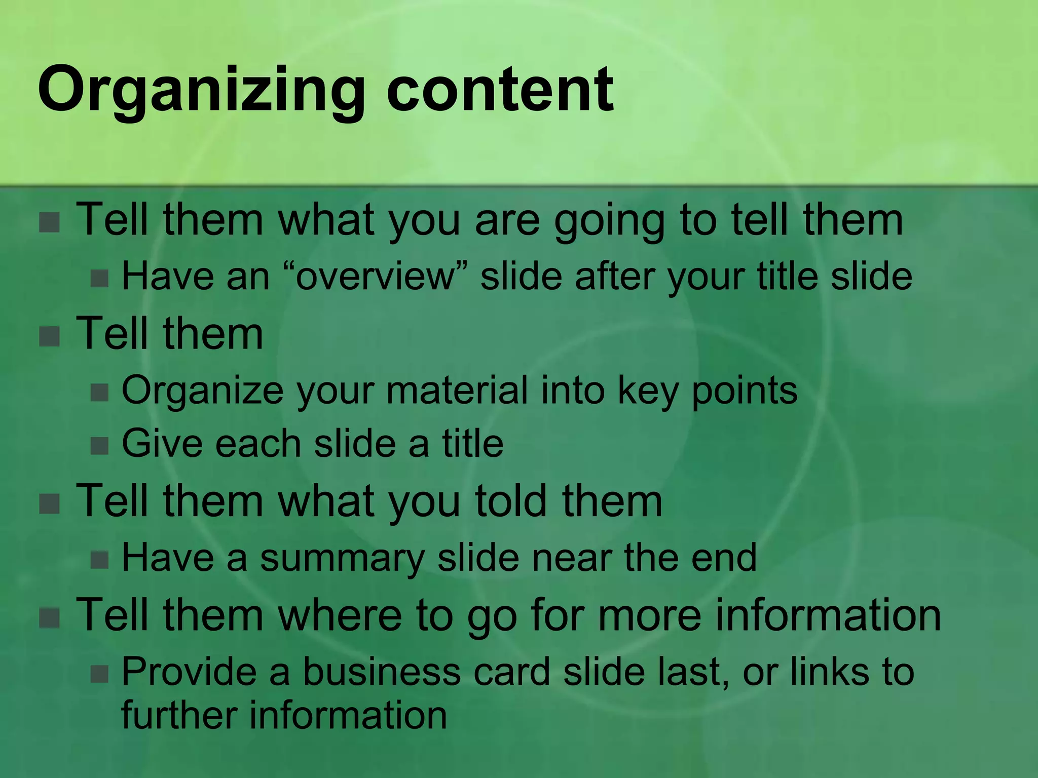
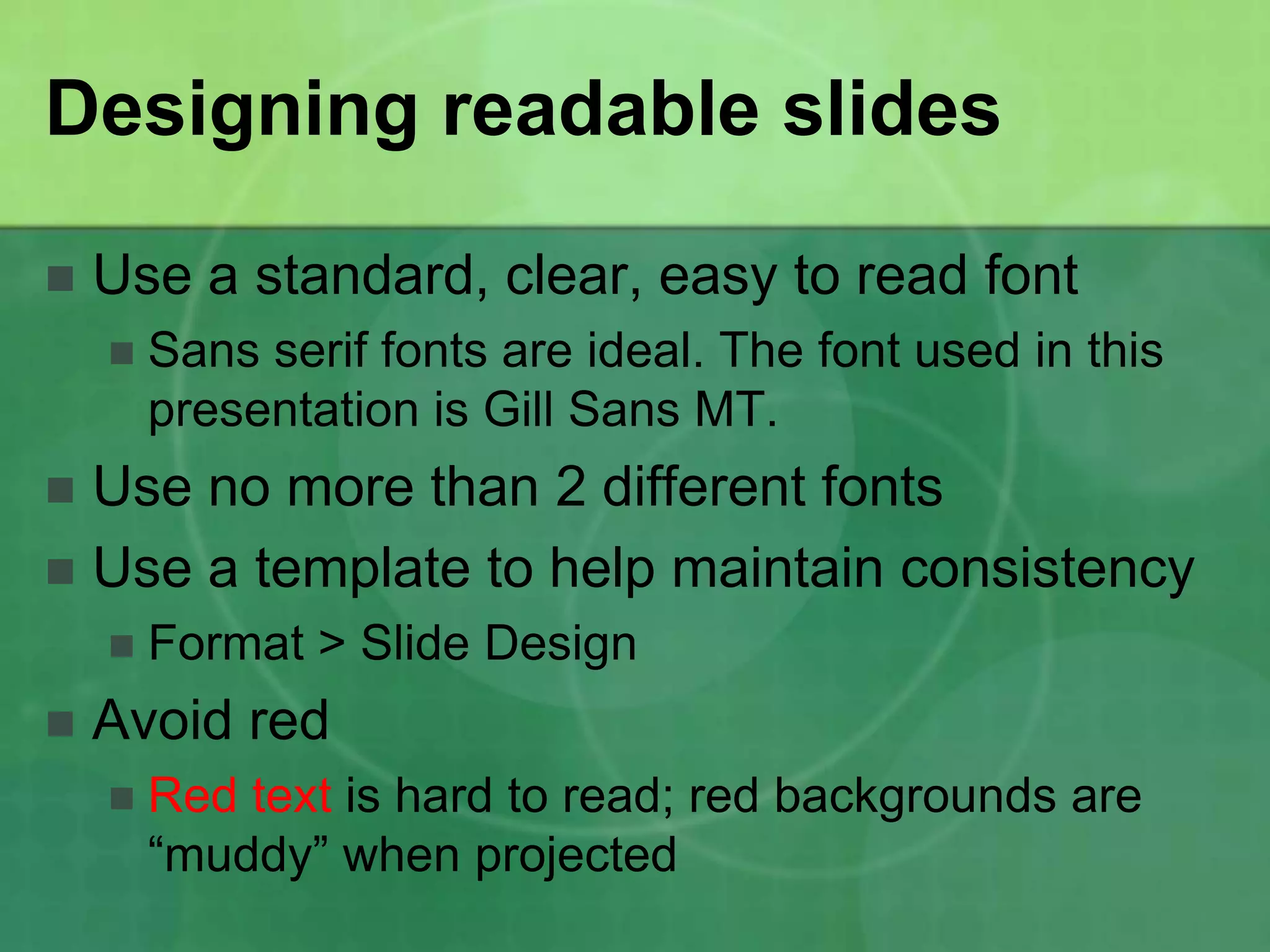
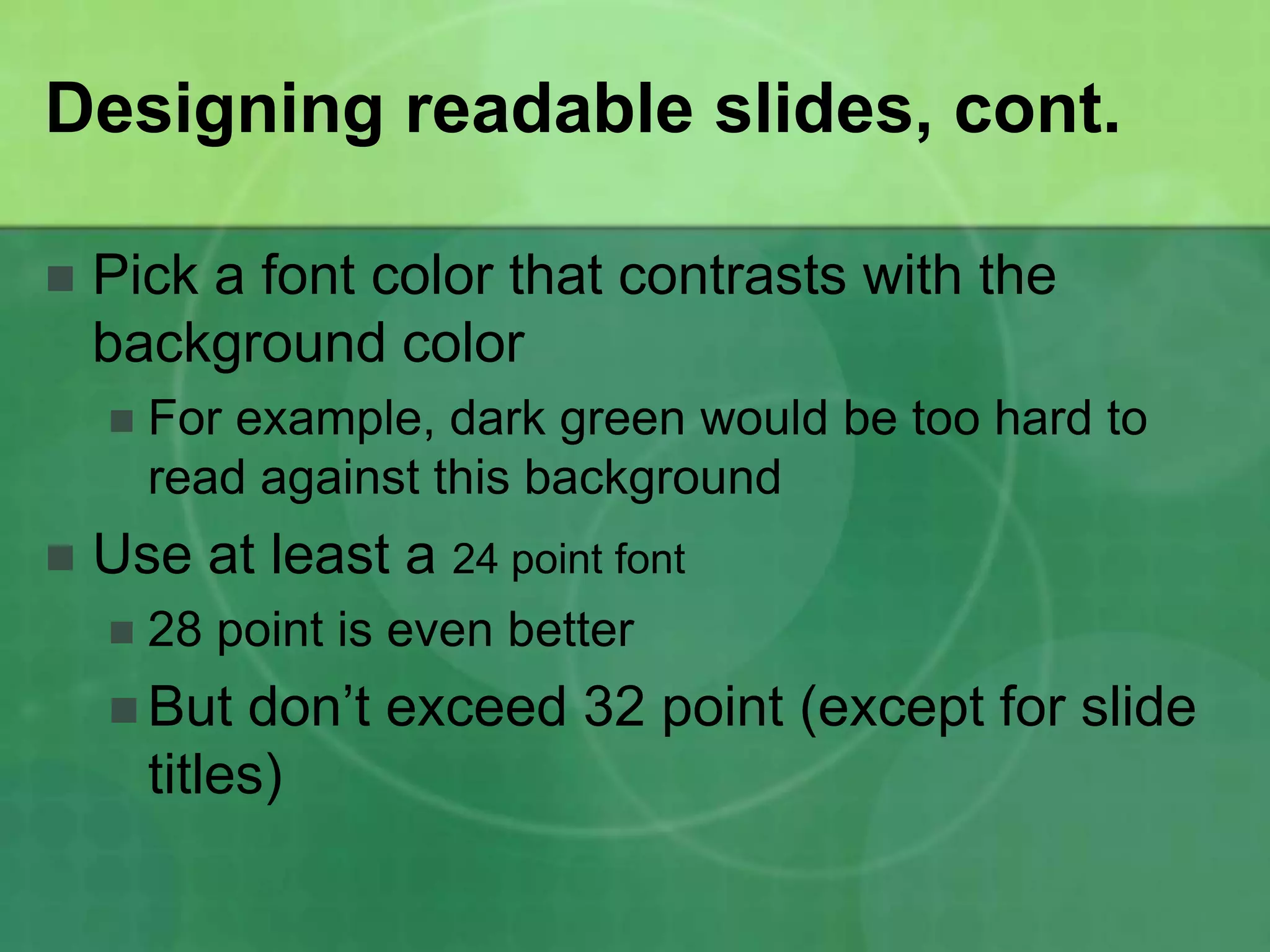
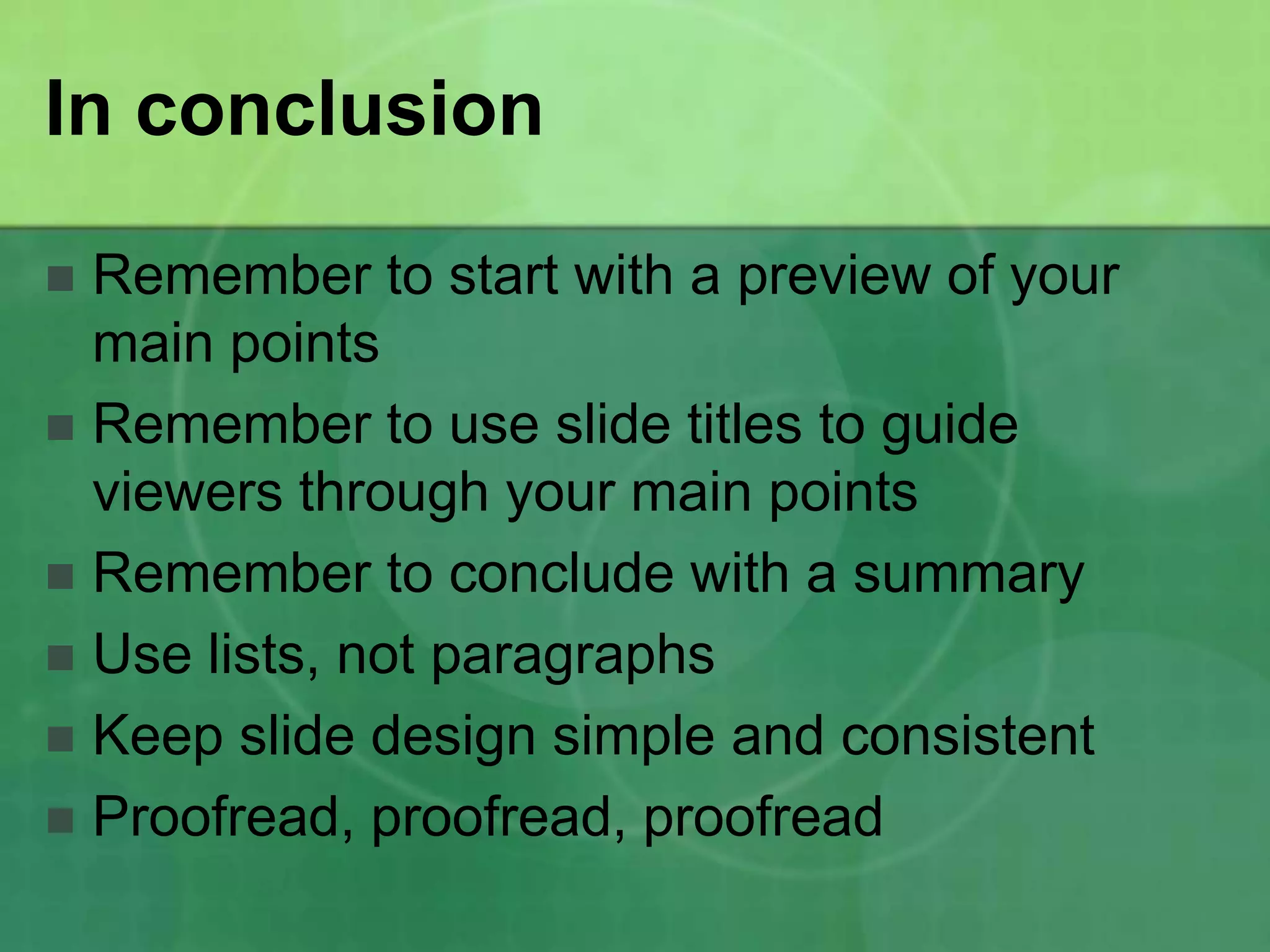
Developing Good PowerPoint
       Presentations
      By Laura Osborne


                  November 12, 2011
Overview

 Organizing content
 Designing readable slides
 Proofreading for the 3 Cs –
     Correctness
     Clarity
     Concision
Organizing content
   Tell them what you are going to tell them
       Have an “overview” slide after your title slide
   Tell them
     Organize your material into key points
     Give each slide a title
   Tell them what you told them
       Have a summary slide near the end
   Tell them where to go for more information
       Provide a business card slide last, or links to
        further information
Designing readable slides

   Use a standard, clear, easy to read font
       Sans serif fonts are ideal. The font used in this
        presentation is Gill Sans MT.
 Use no more than 2 different fonts
 Use a template to help maintain consistency
       Format > Slide Design
   Avoid red
       Red text is hard to read; red backgrounds are
        “muddy” when projected
Designing readable slides, cont.

   Pick a font color that contrasts with the
    background color
       For example, dark green would be too hard to
        read against this background
   Use at least a 24 point font
       28 point is even better
     But    don’t exceed 32 point (except for slide
        titles)
Designing readable slides, cont.

   Format content in bulleted lists
     Avoid long paragraphs
     Avoid numbered lists unless you are providing
      instructions
     Don’t exceed 6 main bullet points per slide; if you
      need more, start a new slide
   Keep list items consistent
     Only capitalize the first word
     Use consistent end punctuation (either have
      periods at the end, or don’t)
Designing readable slides, cont.

   Careful with the bells and whistles
       For this assignment, you don’t need:
          Animated   graphics
          Slide transitions

   Use graphics as (or if) needed
     Numerical data may be presented in a chart or
      graph
     Photos may be used to make a point
     Graphics should always be explained (as you
      are speaking) – the audience should understand
Graphics Example

Use the Paragraph dialog
box to adjust alignment,
indentation and spacing.

Notice the Spacing settings;
here’s where you adjust
spacing between paragraphs.
(Instructor’s note: The purpose of
the graphic is made clear, and the
relevant portion is marked.)
Proofreading for the 3 Cs
    Correctness
       Are  your facts correct?
       Is your grammar, spelling, punctuation, capitalization,
        and syntax correct?
    Clarity
       Are
          your ideas clearly presented in an order that
       makes sense?
    Concision
       Are any of your bullet points more than 2 lines long? If
       so, revise to omit needless words.
In conclusion

 Remember to start with a preview of your
  main points
 Remember to use slide titles to guide
  viewers through your main points
 Remember to conclude with a summary
 Use lists, not paragraphs
 Keep slide design simple and consistent
 Proofread, proofread, proofread
For further information

(either provide your contact information on this
  slide, as it would be formatted in a business
  card, or provide links to more information, or
  provide names of others who could be
  contacted for more information)

Developing Good Power Point Presentations

  • 1.
    Developing Good PowerPoint Presentations By Laura Osborne November 12, 2011
  • 2.
    Overview  Organizing content Designing readable slides  Proofreading for the 3 Cs –  Correctness  Clarity  Concision
  • 3.
    Organizing content  Tell them what you are going to tell them  Have an “overview” slide after your title slide  Tell them  Organize your material into key points  Give each slide a title  Tell them what you told them  Have a summary slide near the end  Tell them where to go for more information  Provide a business card slide last, or links to further information
  • 4.
    Designing readable slides  Use a standard, clear, easy to read font  Sans serif fonts are ideal. The font used in this presentation is Gill Sans MT.  Use no more than 2 different fonts  Use a template to help maintain consistency  Format > Slide Design  Avoid red  Red text is hard to read; red backgrounds are “muddy” when projected
  • 5.
    Designing readable slides,cont.  Pick a font color that contrasts with the background color  For example, dark green would be too hard to read against this background  Use at least a 24 point font  28 point is even better  But don’t exceed 32 point (except for slide titles)
  • 6.
    Designing readable slides,cont.  Format content in bulleted lists  Avoid long paragraphs  Avoid numbered lists unless you are providing instructions  Don’t exceed 6 main bullet points per slide; if you need more, start a new slide  Keep list items consistent  Only capitalize the first word  Use consistent end punctuation (either have periods at the end, or don’t)
  • 7.
    Designing readable slides,cont.  Careful with the bells and whistles  For this assignment, you don’t need:  Animated graphics  Slide transitions  Use graphics as (or if) needed  Numerical data may be presented in a chart or graph  Photos may be used to make a point  Graphics should always be explained (as you are speaking) – the audience should understand
  • 8.
    Graphics Example Use theParagraph dialog box to adjust alignment, indentation and spacing. Notice the Spacing settings; here’s where you adjust spacing between paragraphs. (Instructor’s note: The purpose of the graphic is made clear, and the relevant portion is marked.)
  • 9.
    Proofreading for the3 Cs  Correctness  Are your facts correct?  Is your grammar, spelling, punctuation, capitalization, and syntax correct?  Clarity  Are your ideas clearly presented in an order that makes sense?  Concision  Are any of your bullet points more than 2 lines long? If so, revise to omit needless words.
  • 10.
    In conclusion  Rememberto start with a preview of your main points  Remember to use slide titles to guide viewers through your main points  Remember to conclude with a summary  Use lists, not paragraphs  Keep slide design simple and consistent  Proofread, proofread, proofread
  • 11.
    For further information (eitherprovide your contact information on this slide, as it would be formatted in a business card, or provide links to more information, or provide names of others who could be contacted for more information)