How to Deliveran
Effective
Presentation
Madiha Fatima
PHBTM-22-01
Institute of Molecular Biology and Biotechnology, BZU.
2.
Contents
• Presentation Structure
•Font
• Background
• Color
• Images and Graphs
• Spelling and Grammar
• Time management
• Animations
• Consistency
• Credit Resources
• Delivery
4.
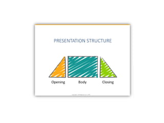
Try to followthe Order
• Introduction
• Outline
• Body
• Conclusion
5.
Introduction
• Tell theaudience who you are and present
your main argument with key background
information.
• Explain why your presentation is important.
• Build a rapport with the audience to help
them follow what comes next.
6.
Outline
• Make your1st or 2nd slide an outline of your
presentation
– Ex: previous slide
• Follow the order of your outline for the rest of the
presentation
• Only place main points on the outline slide
– Ex: Use the titles of each slide as main points
7.
Body
• The largestsection of your presentation
• It supports your main argument with specific
examples.
• Visual aids clarify your points and lend
credibility to your presentation.
8.
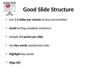
Good Slide Structure
•Use 1-2 slides per minute of your presentation
• Avoid writing complete sentences
• Include 4-5 points per slide
• Use key words and phrases only
• Highlight key words
• Align left
9.
Limit Each Slideto One Idea
• Will help audience concentrate
on what you are saying
• Will prevent audience from
reading ahead
• Will help you keep your
presentation focused
10.
Avoid wordiness
This pagecontains too many words for a presentation slide. It
is not written in point form, making it difficult both for your
audience to read and for you to present each point. Although
there are exactly the same number of points on this slide as
the previous slide, it looks much more complicated. In short,
your audience will spend too much time trying to read this
paragraph instead of listening to you.
Don’t give too much
information on slide
11.
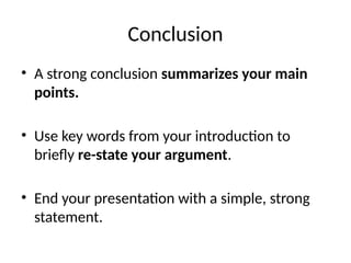
Conclusion
• A strongconclusion summarizes your main
points.
• Use key words from your introduction to
briefly re-state your argument.
• End your presentation with a simple, strong
statement.
13.
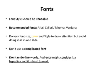
Fonts
• Font StyleShould be Readable
• Recommended fonts: Arial, Calibri, Tahoma, Verdana
• Do vary font size, color and Style to draw attention but avoid
doing it all in one slide
• Don’t use a complicated font
• Don’t underline words. Audience might consider it a
hyperlink and it is hard to read.
14.
The Larger TheBetter
• Standardize the Font Throughout
– Title : 44-40 point
– Subtitle or bullet : 32 point
– Content text no smaller 24 point
– 12 point font size is not recommended for content. See you can’t
read this.
• Combining small font sizes with bold or italics is not
recommended.
• Small fonts are okay for a footer, such as:
15.
Use Simple Fonts
•Don’t Sacrifice Readability for Style
• Don’t Sacrifice Readability for Style
• Don’t Sacrifice Readability for Style
16.
Caps and italics
•DO NOT USE ALL CAPITAL LETTERS
– Makes text hard to read –
– Conceals acronyms –
– Denies their use for EMPHASIS
• Italics
– Used for “quotes”
– Used to highlight thoughts or ideas
– Used for book, journal, or magazine titles
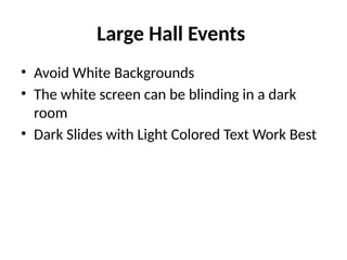
Background
• Use backgroundssuch as this one that are
attractive but simple
• Use backgrounds which are light
• Use the same background consistently
throughout your presentation
Colors
• Reds andoranges are high-energy but can be
difficult to stay focused on.
• Greens, blues, and browns are mellower, but
not as attention grabbing.
• Reds and Greens can be difficult to see for
those who are color blind.
26.
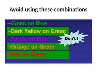
Color Wheel
• Colorsseparated by another color are
contrasting colors (complementary)
• Adjacent colors harmonize with one
another (Green and Yellow)
• Colors directly opposite one another
are said to CLASH
• Clashing colors provide readability
Orange on Blue
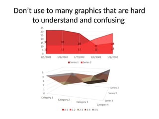
Images
• As arule, you should almost never have slides
that only contain text
• Multi-panel figure that you might include in a
manuscript should often be broken into 1
panel per slide.
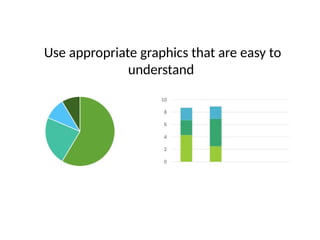
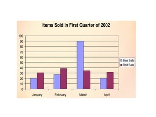
Graphs and Charts
•Use graphs rather than just charts and words
• Data in Bar graphs is easier to comprehend,
compare & retain than is raw data
• Trends are easier to visualize in line graph
form
• Pie chart is good to show Percentages
• Always add title to your graphs
Spelling and Grammar
•Proof your slides for:
– Speling mistakes
– The use of of repeated words
– grammatical errors you might have make
• If English is not your first language, please
have someone else check your presentation!
Limit animation andSound Effect
• Avoid using animations and transitions if not
necessary
– Too much animation and sounds can be
distracting.
– Be consistent with animation, choose one.
– Don’t go crazy with effects, sounds, and
animations
49.
Consistency
• Keep slidesconsistent
– Same font
– Same background/ design
– Same animations
– Same colors
50.
Credit Resources
• Givecredit, where credit is due
• credits can make it clear who did the work
• Name websites, books and resources
• Use Free images platforms with no copyrights
Tips for EffectiveDelivery
• Do not read your slides
• Do not use too many gimmicks (videos)
• Do not sway back and forth,
• Do not pace up and down but also don’t stand
rigid!
• Do not wave your pointer all over the slide
53.
Tips for EffectiveDelivery
• Do not talk to the screen rather maintain eye
contact with audience
• Practice ahead of time
• Stay Calm
• Take it slow, speak loudly and clearly.