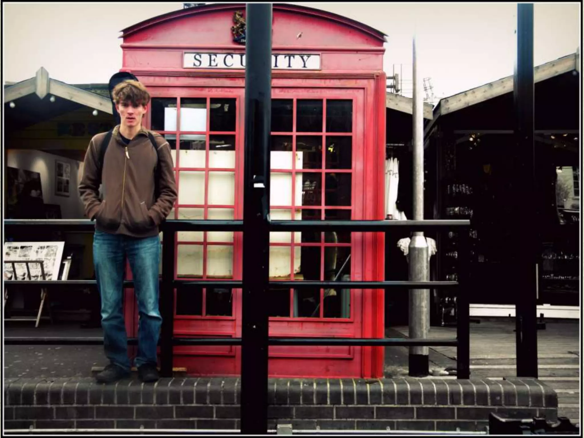
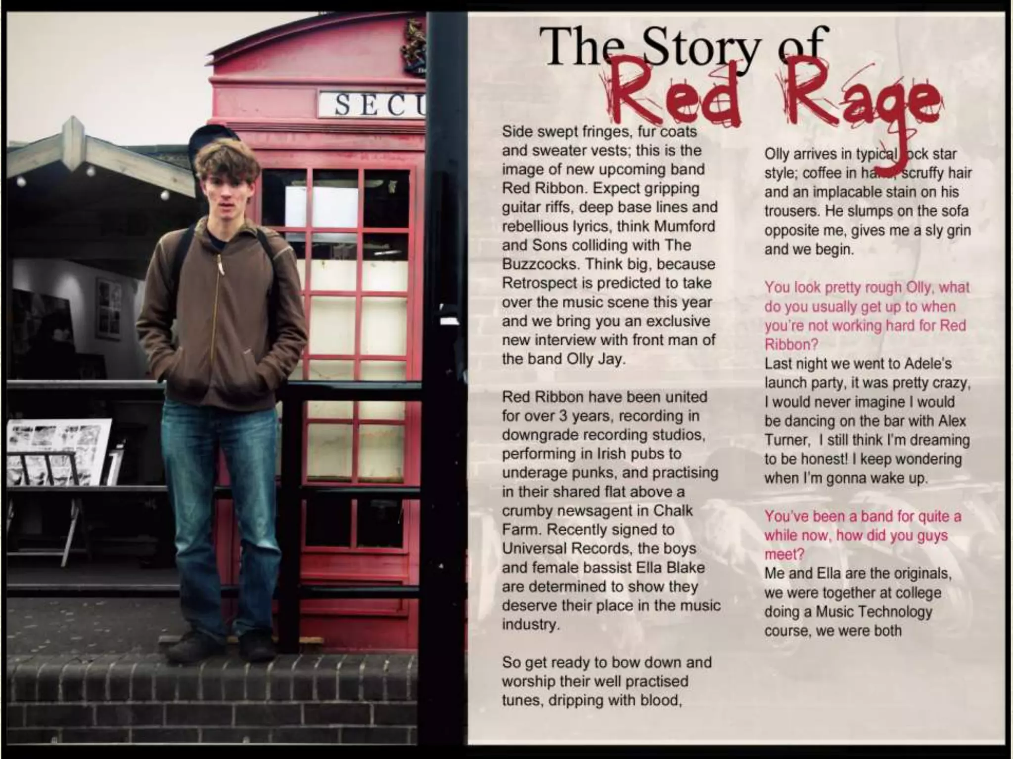
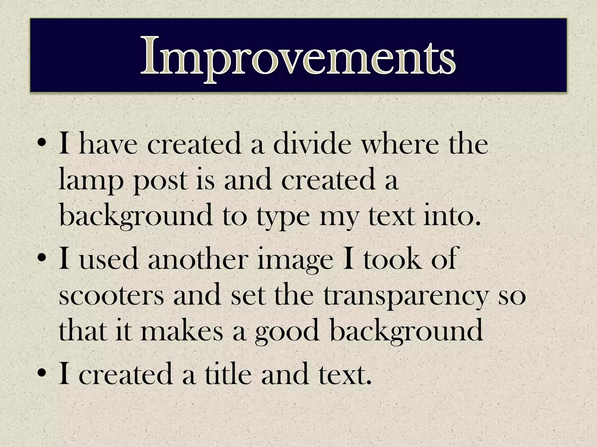
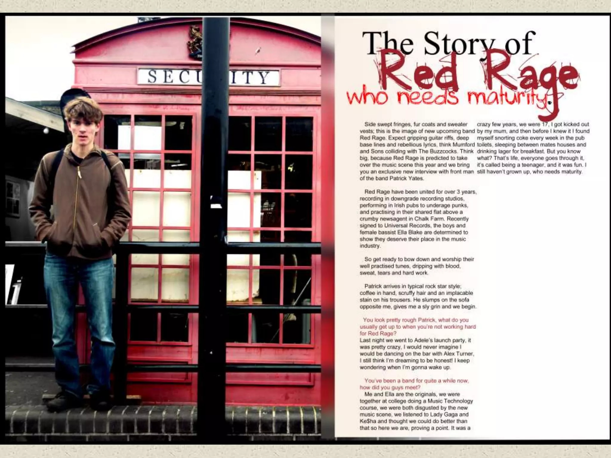
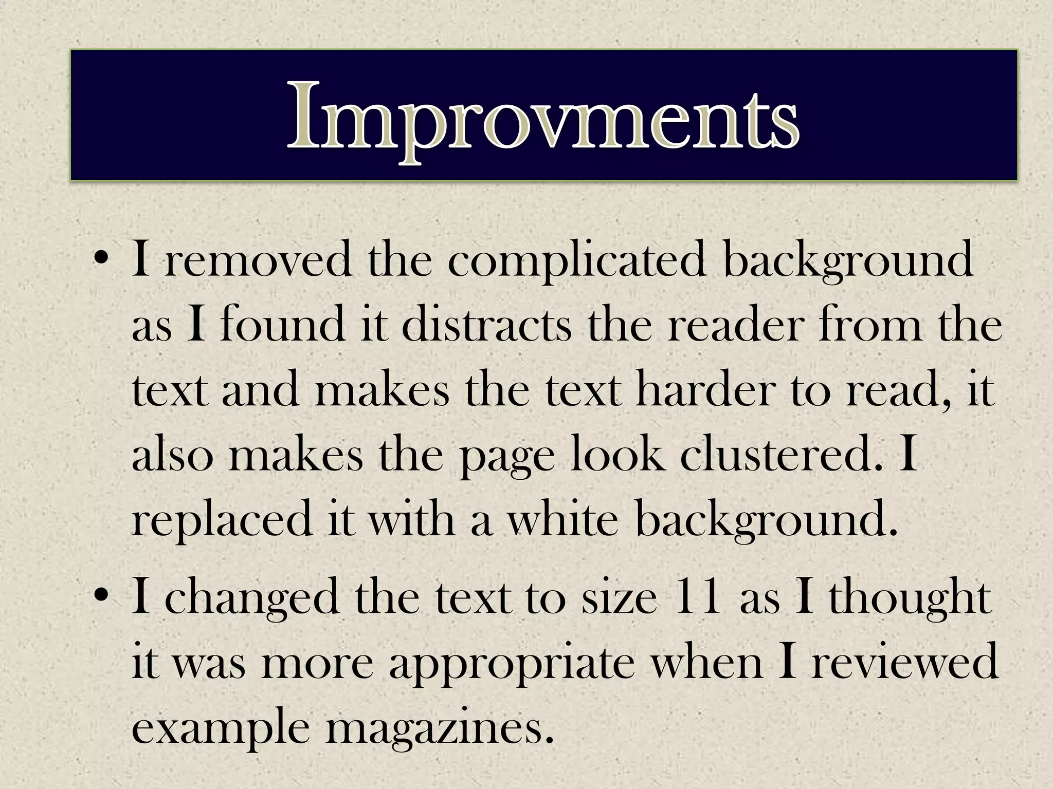
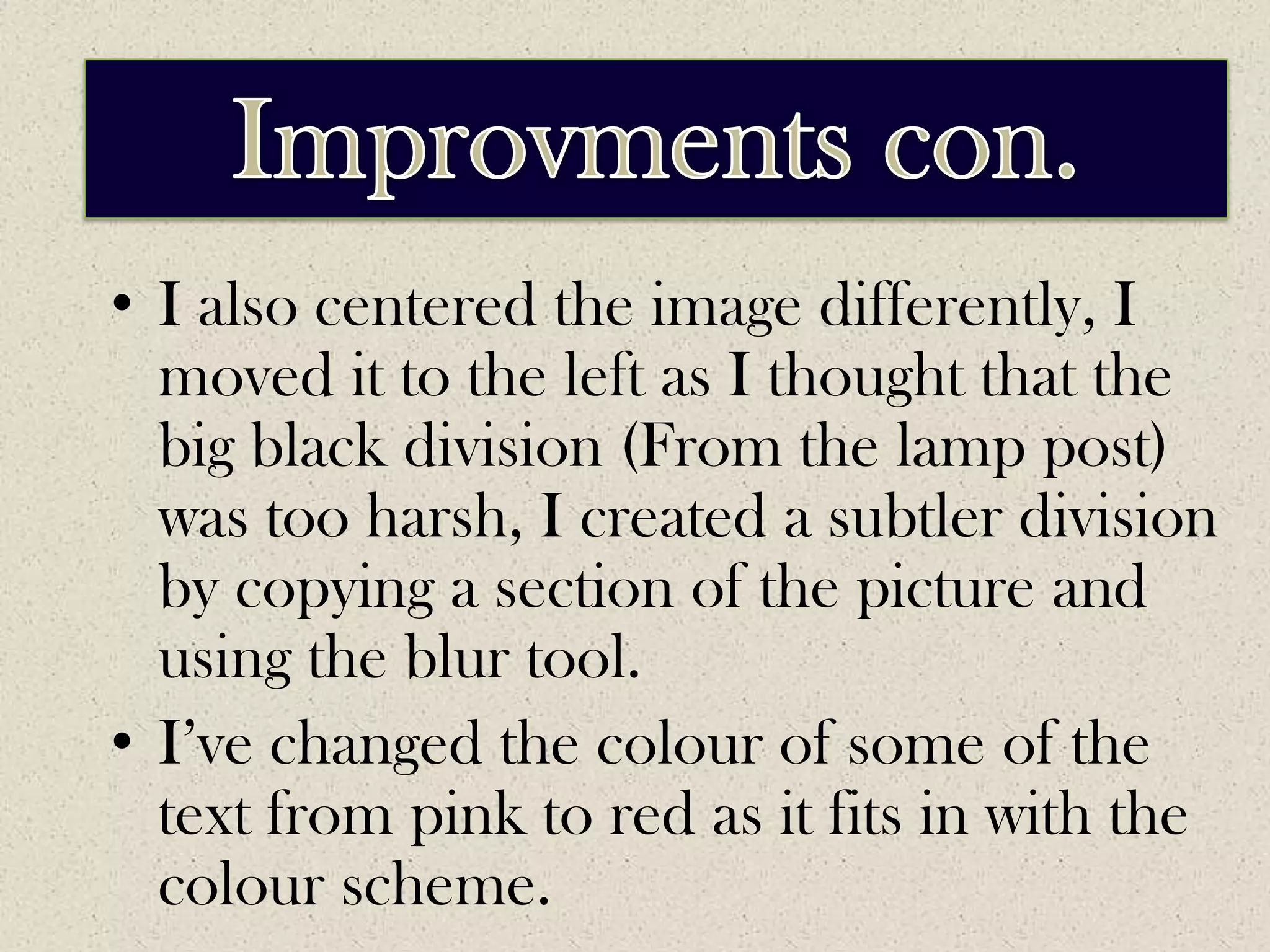
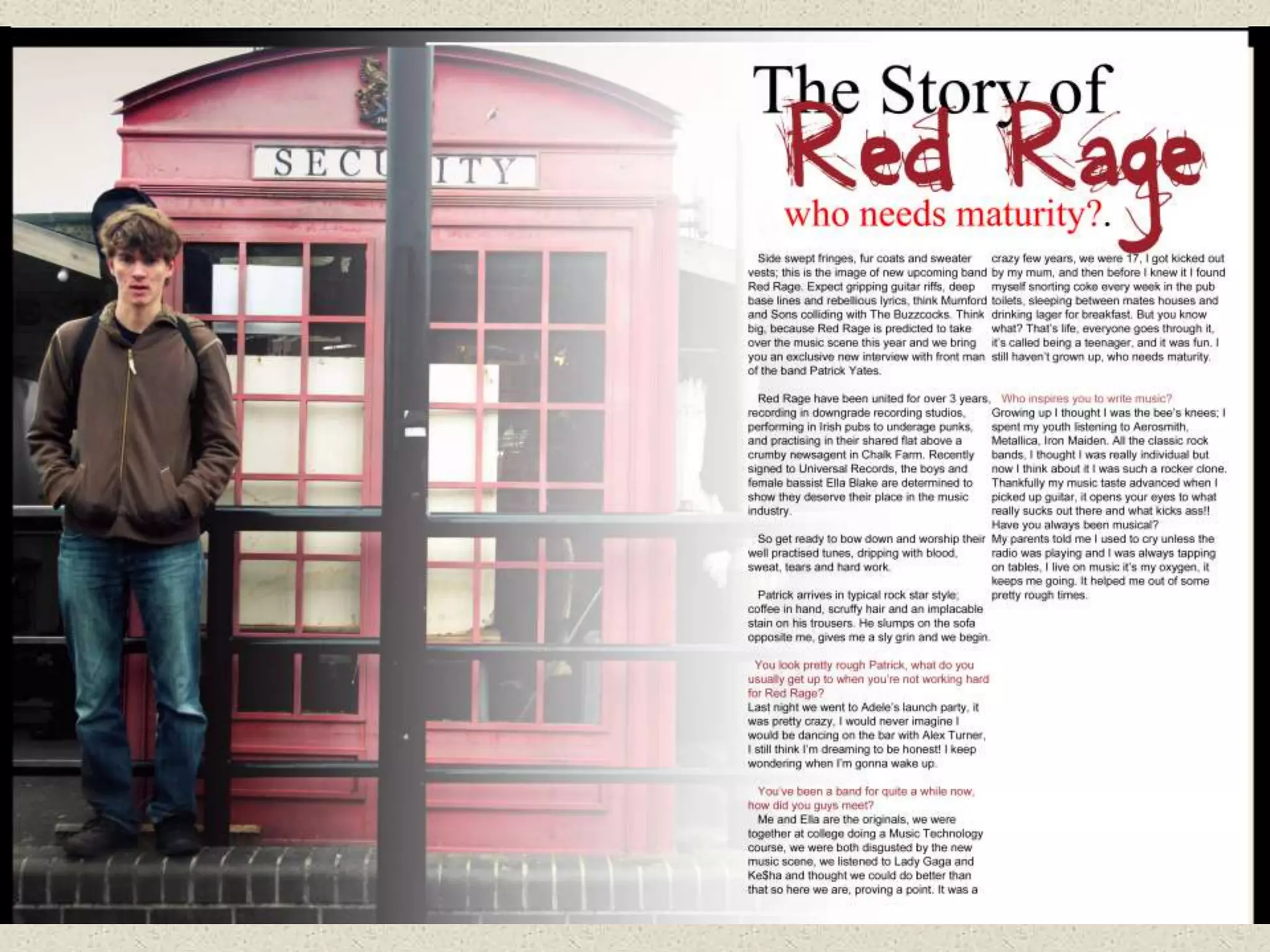
DPS DRAFTS
CHOSEN IMAGE
EDITED IMAGE
ImprovementsI used colour variation to improve the colours and make them brighter. I then removed all colour from the background leaving  Patrick and the phone box in colour, this subtly makes the object stand out in way that is almost 3D.
1ST DRAFT
ImprovementsI have created a divide where the lamp post is and created a background to type my text into.I used another image I took of scooters and set the transparency so that it makes a good backgroundI created a title and text.
2nd DRAFT
ImprovementsImprovmentsI removed the complicated background as I found it distracts the reader from the text and makes the text harder to read, it also makes the page look clustered. I replaced it with a white background.I changed the text to size 11 as I thought it was more appropriate when I reviewed example magazines.
ImprovementsImprovments con.I also centered the image differently, I moved it to the left as I thought that the big black division (From the lamp post) was too harsh, I created a subtler division by copying a section of the picture and using the blur tool.I’ve changed the colour of some of the text from pink to red as it fits in with the colour scheme.
3rd DRAFT
ImprovementsImprovmentsI have removed the division and instead I have created a new layer and created a gradient using the colours white and transparent. This layer merges my image and text background in a subtle and professional way.I have also added more text
ImprovementsFinal DraftIn order to submit a final draft I will have to:Neaten up the edges Write more context so that it fills up the pageAdd a few pull quotes

Dps drafts

  • 1.
  • 2.
  • 4.
  • 6.
    ImprovementsI used colourvariation to improve the colours and make them brighter. I then removed all colour from the background leaving Patrick and the phone box in colour, this subtly makes the object stand out in way that is almost 3D.
  • 7.
  • 9.
    ImprovementsI have createda divide where the lamp post is and created a background to type my text into.I used another image I took of scooters and set the transparency so that it makes a good backgroundI created a title and text.
  • 10.
  • 12.
    ImprovementsImprovmentsI removed thecomplicated background as I found it distracts the reader from the text and makes the text harder to read, it also makes the page look clustered. I replaced it with a white background.I changed the text to size 11 as I thought it was more appropriate when I reviewed example magazines.
  • 13.
    ImprovementsImprovments con.I alsocentered the image differently, I moved it to the left as I thought that the big black division (From the lamp post) was too harsh, I created a subtler division by copying a section of the picture and using the blur tool.I’ve changed the colour of some of the text from pink to red as it fits in with the colour scheme.
  • 14.
  • 16.
    ImprovementsImprovmentsI have removedthe division and instead I have created a new layer and created a gradient using the colours white and transparent. This layer merges my image and text background in a subtle and professional way.I have also added more text
  • 17.
    ImprovementsFinal DraftIn orderto submit a final draft I will have to:Neaten up the edges Write more context so that it fills up the pageAdd a few pull quotes