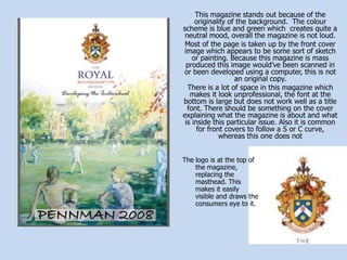
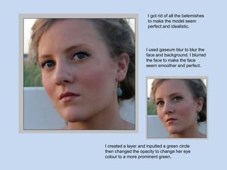
My Magazine
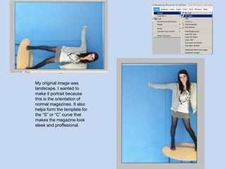
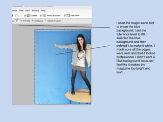
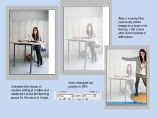
- The document discusses editing a landscape image to a portrait orientation to fit the template of magazines with an "S" or "C" curve. Background was erased and a blue strip was added to the bottom.
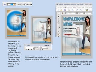
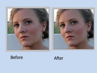
- Images of a person sitting at a table and a fill effect were added. Opacity was adjusted and text was inserted with the font Britannic Bold at size 96 pt.
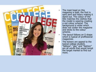
- The finished product magazine is compared to others, noting differences in layout, color scheme, and professionalism.