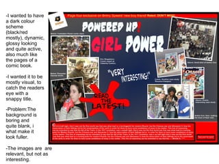
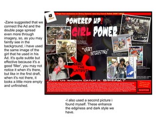
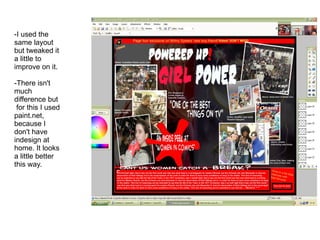
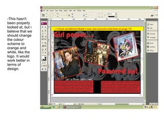
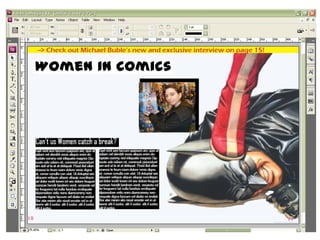
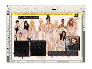
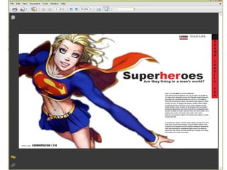
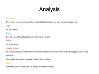
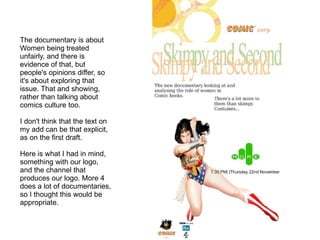
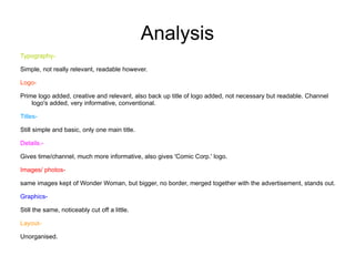
Ancillary work By Hannah Smith
Double Page spread
Draft  1
-I wanted to have a dark colour scheme (black/red mostly), dynamic, glossy looking and quite active, also much like the pages of a comic book. -I wanted it to be mostly visual, to catch the readers eye with a snappy title. -Problem:The background is boring and quite blank, i  what make it look fuller. -The images are  are relevant, but not as interesting.
Analysis Typography-
Different styles of text for variation and to keep the readers interest. Slightly childish with a bad resolution however. Slightly plain, but in keeping with the scheme of the page (dark e.g. red/black/).
Logo-
'Comic Corp.' logo shown, relevant and placed at the top left hand corner, however with a different colour scheme compared to the rest of the spread. Placed at an angle to make it match the rest of the page style.
Titles-
Big, bold, keeping with the colour scheme, however with bad resolution, too childish, not very imaginative placement, too bunched up together at the top.
Details.-
Bold standing out quotes, however with vague references i.e. 'read the latest', too much like an advertisement. Photo descriptions next to the pictures. 'Turn over' box at bottom right for next page + banner at the top relates to rest of the magazine.
Images/ photos-
Relevant photos, slightly unbalanced (i.e. too many about anime con.), the audience will be able to identify what the content might be about. Pictures have borders to make them stand out a little + slanted. Showing the presenter.
Graphics-
A bit plain, background mostly reliant of colour for fill.
Layout-
'Funky' feel, quite pop culture and spread out, very active, following a clear scheme of colour, bold. It has a banner at the top, the logo looks like a sticker. Big 'splat' in the middle with text to get readers attention.
Draft  2
-Zane suggested that we connect the Ad and the double page spread even more through imagery, so, as you may faintly see in the background, i have used the same image of the girl that he used in his Ad. It's quite subtle but effective because it's a good 'filler', you may not notice it when it's there, but like in the first draft, when it's not there, it looks a little more empty and unfinished. -I also used a second picture i found myself. These enhance the edginess and dark style we have.
Analysis Typography-
Five types of fonts used, one for the main title, one for the subtitle/quote/splatter text, one for the 'Comic Corp.' logo and the rest all have the same, simple times new Roman for it to be readable.
Titles- A subtitle for the text block.  Details.- More info relating to magazine above the 'turn over' box at the bottom. Images/ photos-
There are three on each side, equal and slanted for make them more interesting
Graphics-
Pictures added in the background for some filler and to make the pages look more engaging and less plain, makes it look more active and much more like pop culture material, not minimalistic. Two separate pictures added but blended together.
Layout- It's to busy, your eyes don't know where to look. Borders for the text block to keep everything organised. A faint gutter added.
Draft  3
-I used the same layout but tweaked it a little to improve on it. -There isn't much difference but  for this I used paint.net, because I don't have indesign at home. It looks a little better this way.
Analysis Logo-
Top left hand corner, here I have taken on the advice my teacher gave me and taken out the white part of the 'Comic Corp.' logo and this way it stands out more and looks more interesting. It's also good to have a little variation on the logo, not drastically changing it but to make it more interesting.
Details-
I have also changed the quote to something a little less vague, and the splatter text to something better as well so that when the reader is flicking through it, it will not only be eye catching but they can understand hopefully at a glance what they have there. The splatter text is to draw their attention.
Draft  4
-This hasn't been properly looked at, but i believe that we should change the colour scheme to orange and white, like the logo. It would work better in terms of design.
Analysis Typography-
Retro style fonts, related to pop culture. Four different types of fonts, one heading, one for the subtitle, one for yellow banner and one for everything else in times new Roman for readability.  Same colour scheme but swapped around a little.
Logo-
Logo at the top right hand corner, translucent so that it doesn't interrupt the colour scheme of the spread. White background removed. Not too visible or noticeable however.
Titles-
Spread out more, this makes it more interesting for the eyes. Subtitle narrower and edgy, in contrast to the main title.

Ancillary Presentation

  • 1.
    Ancillary work ByHannah Smith
  • 2.
  • 3.
  • 4.
    -I wanted tohave a dark colour scheme (black/red mostly), dynamic, glossy looking and quite active, also much like the pages of a comic book. -I wanted it to be mostly visual, to catch the readers eye with a snappy title. -Problem:The background is boring and quite blank, i what make it look fuller. -The images are are relevant, but not as interesting.
  • 5.
  • 6.
    Different styles oftext for variation and to keep the readers interest. Slightly childish with a bad resolution however. Slightly plain, but in keeping with the scheme of the page (dark e.g. red/black/).
  • 7.
  • 8.
    'Comic Corp.' logoshown, relevant and placed at the top left hand corner, however with a different colour scheme compared to the rest of the spread. Placed at an angle to make it match the rest of the page style.
  • 9.
  • 10.
    Big, bold, keepingwith the colour scheme, however with bad resolution, too childish, not very imaginative placement, too bunched up together at the top.
  • 11.
  • 12.
    Bold standing outquotes, however with vague references i.e. 'read the latest', too much like an advertisement. Photo descriptions next to the pictures. 'Turn over' box at bottom right for next page + banner at the top relates to rest of the magazine.
  • 13.
  • 14.
    Relevant photos, slightlyunbalanced (i.e. too many about anime con.), the audience will be able to identify what the content might be about. Pictures have borders to make them stand out a little + slanted. Showing the presenter.
  • 15.
  • 16.
    A bit plain,background mostly reliant of colour for fill.
  • 17.
  • 18.
    'Funky' feel, quitepop culture and spread out, very active, following a clear scheme of colour, bold. It has a banner at the top, the logo looks like a sticker. Big 'splat' in the middle with text to get readers attention.
  • 19.
  • 20.
    -Zane suggested thatwe connect the Ad and the double page spread even more through imagery, so, as you may faintly see in the background, i have used the same image of the girl that he used in his Ad. It's quite subtle but effective because it's a good 'filler', you may not notice it when it's there, but like in the first draft, when it's not there, it looks a little more empty and unfinished. -I also used a second picture i found myself. These enhance the edginess and dark style we have.
  • 21.
  • 22.
    Five types offonts used, one for the main title, one for the subtitle/quote/splatter text, one for the 'Comic Corp.' logo and the rest all have the same, simple times new Roman for it to be readable.
  • 23.
    Titles- A subtitlefor the text block. Details.- More info relating to magazine above the 'turn over' box at the bottom. Images/ photos-
  • 24.
    There are threeon each side, equal and slanted for make them more interesting
  • 25.
  • 26.
    Pictures added inthe background for some filler and to make the pages look more engaging and less plain, makes it look more active and much more like pop culture material, not minimalistic. Two separate pictures added but blended together.
  • 27.
    Layout- It's tobusy, your eyes don't know where to look. Borders for the text block to keep everything organised. A faint gutter added.
  • 28.
  • 29.
    -I used thesame layout but tweaked it a little to improve on it. -There isn't much difference but for this I used paint.net, because I don't have indesign at home. It looks a little better this way.
  • 30.
  • 31.
    Top left handcorner, here I have taken on the advice my teacher gave me and taken out the white part of the 'Comic Corp.' logo and this way it stands out more and looks more interesting. It's also good to have a little variation on the logo, not drastically changing it but to make it more interesting.
  • 32.
  • 33.
    I have alsochanged the quote to something a little less vague, and the splatter text to something better as well so that when the reader is flicking through it, it will not only be eye catching but they can understand hopefully at a glance what they have there. The splatter text is to draw their attention.
  • 34.
  • 35.
    -This hasn't beenproperly looked at, but i believe that we should change the colour scheme to orange and white, like the logo. It would work better in terms of design.
  • 36.
  • 37.
    Retro style fonts,related to pop culture. Four different types of fonts, one heading, one for the subtitle, one for yellow banner and one for everything else in times new Roman for readability. Same colour scheme but swapped around a little.
  • 38.
  • 39.
    Logo at thetop right hand corner, translucent so that it doesn't interrupt the colour scheme of the spread. White background removed. Not too visible or noticeable however.
  • 40.
  • 41.
    Spread out more,this makes it more interesting for the eyes. Subtitle narrower and edgy, in contrast to the main title.