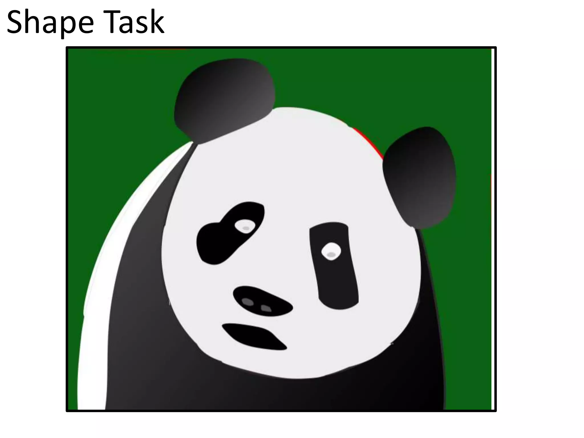
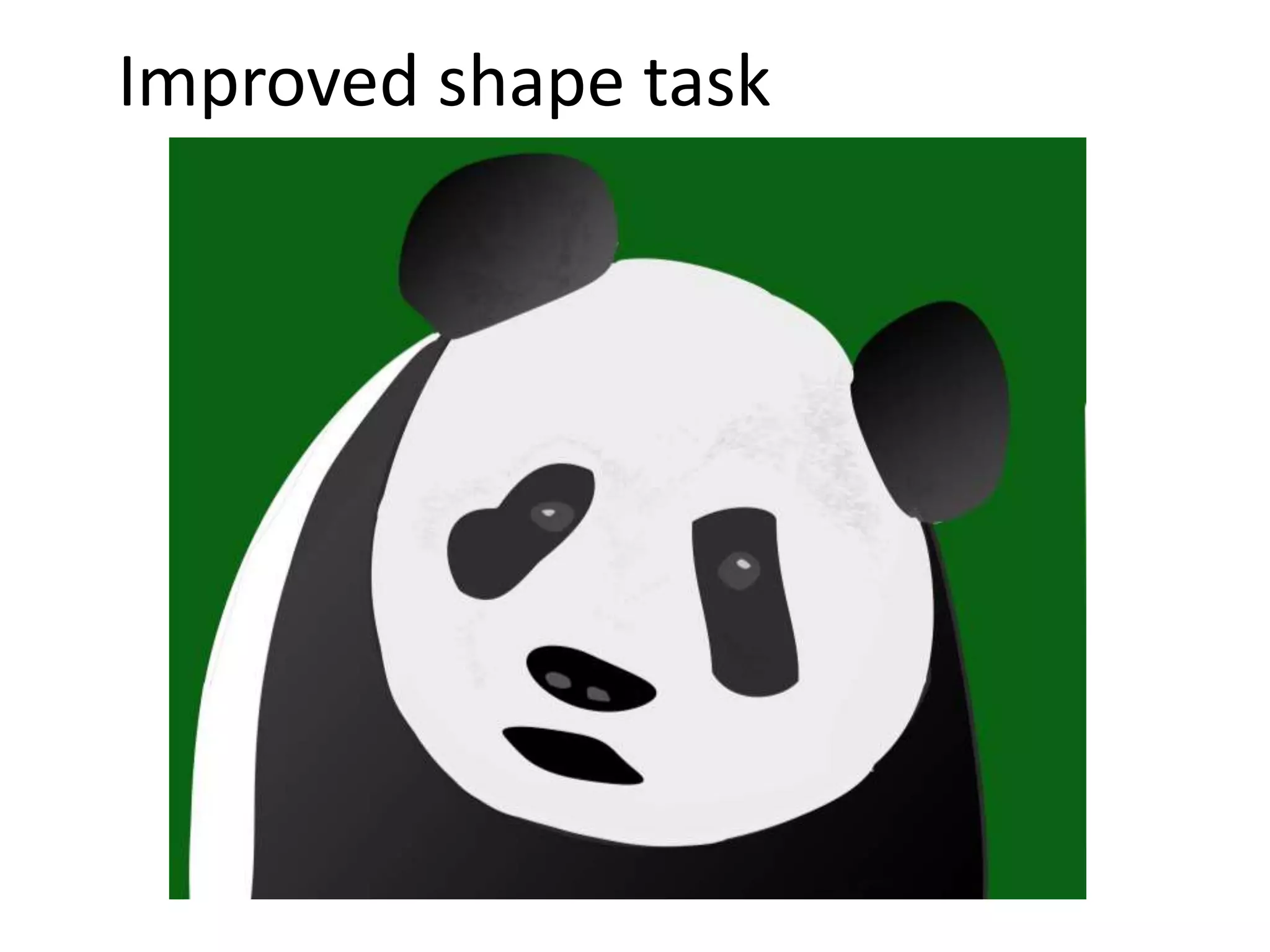
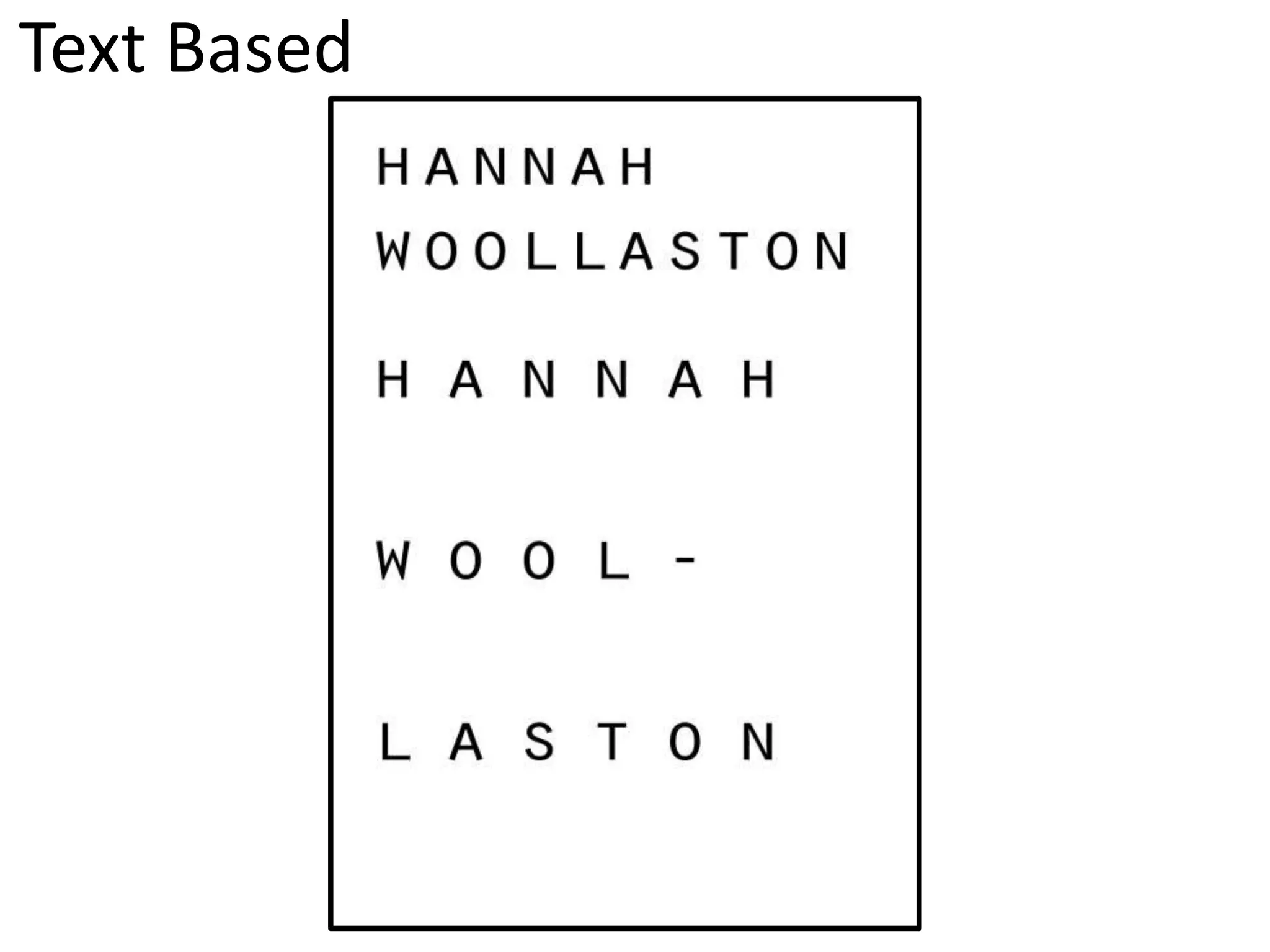
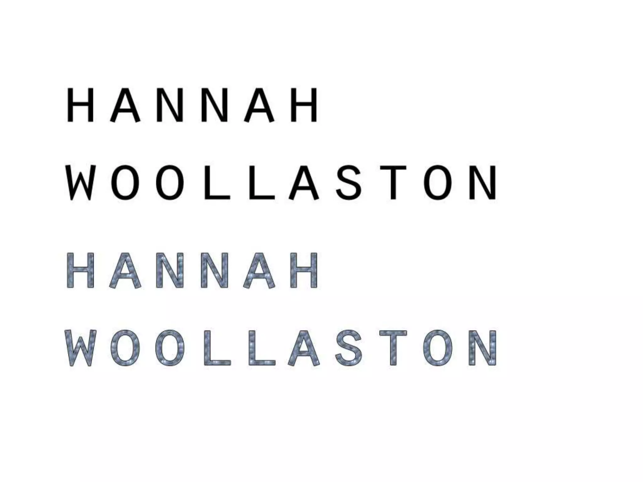
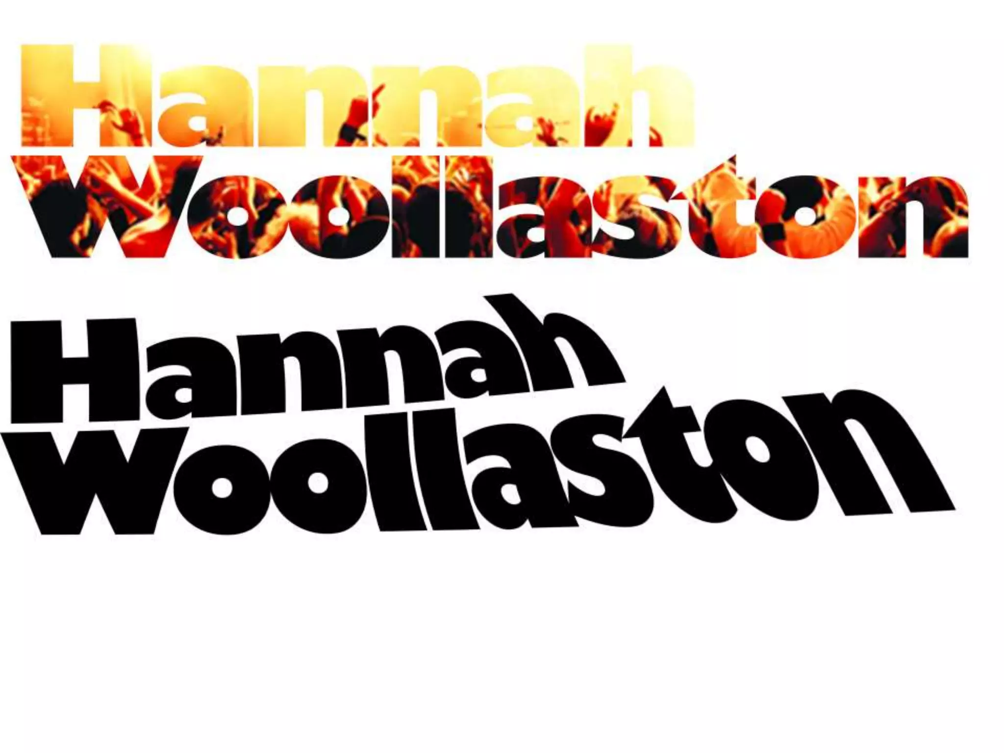
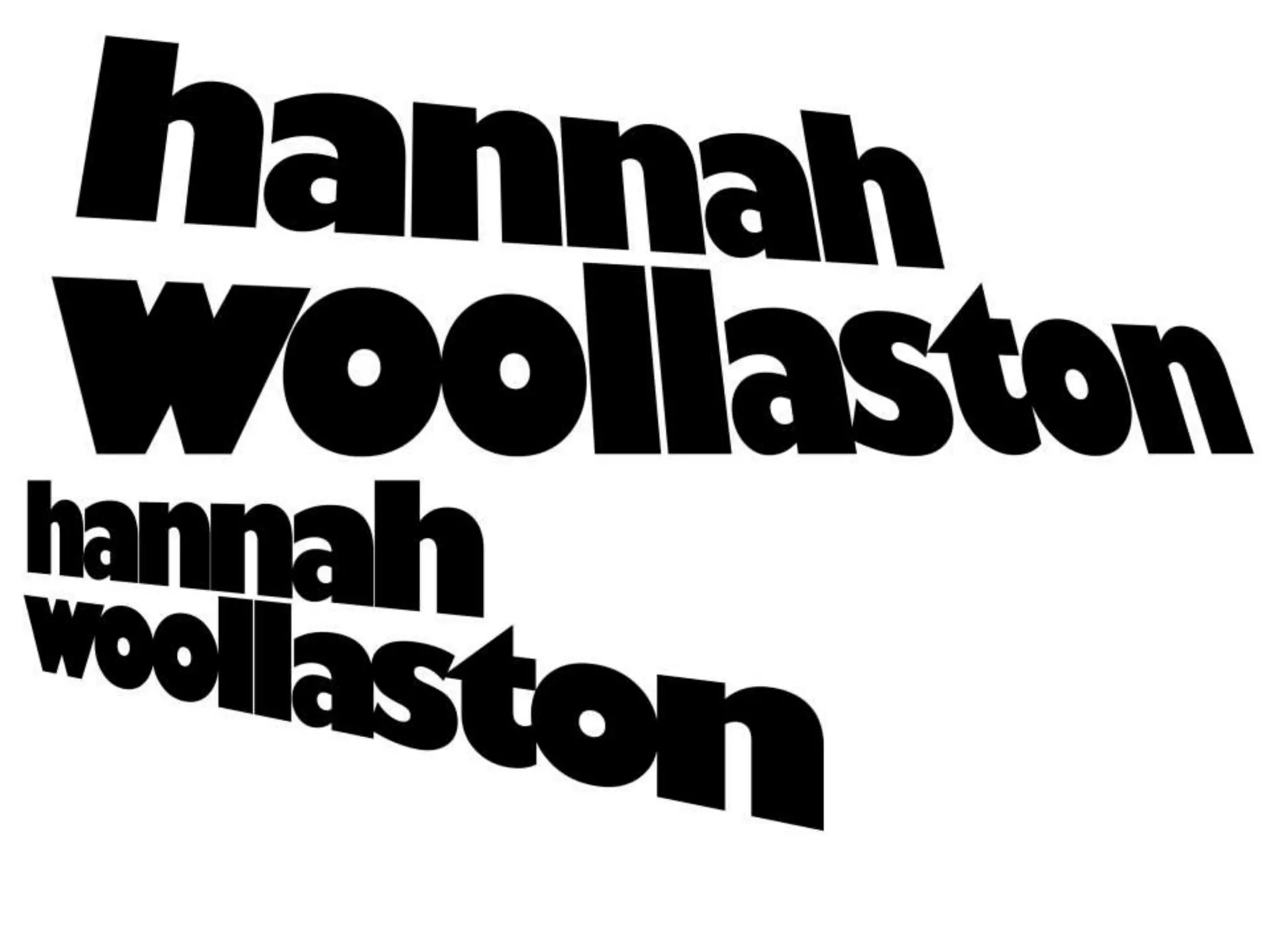
The document provides evaluations of various tasks completed as part of a digital graphic narrative development course. For a shape task, the student liked the gradients and details added to their panda image, and would improve gaps and add more strokes. For an improved shape task, the student preferred adding texture and changing eye color, and would smooth outlines. For a text-based task, the student liked techniques using tracking, layers, and clipping masks, and would add more interesting patterns.
3. Evaluation
What did you like about your image?
I liked the gradients in my image, especially on the ears I think this made the image look more realistic and as
if a light was shining on the panda. I also like the shape of the black parts around the eyes as this is a
distinctive part of the panda. I like the basic outline of the panda as I believe this makes it easily recognisable
as a panda, I also like the colours of the image, because I used a gray/white instead of a bright white, I think
this makes it look more realistic and natural.
What would you improve if you did it again?
I would improve the gaps in my image and make sure that the whole image was covered. I would also add
some more strokes into my image to see what the image would look like with them in, I think this would add
more depth to my image. I would add some circles to the eyes to make it look like it had a glint in its eye, this
would help to make the image look more natural. To make the panda look more realistic I would also try to
add more detail to the mouth. Finally, if I was to do this again I would try to add more texture to the panda as
I think this would make it look more realistic and add more depth to the panda itself.
5. Evaluation
• What did you like about your image?
This is my improved panda, I prefer this image because I added texture onto the panda, using colour range. I also like this
image because I changed the colour of the eyes using colour overlay, this has made the panda look more realistic. Also to
improve my image I went back over the image and filled in any gaps I had that were showing through as that made the
image look un-professional.
• What would you improve if you did it again?
• If I was to improve the panda image further I would make sure that, the outlines I created using the shape tool were
more smooth and not bumpy as this can spoil the effect on the image and make it look less realistic. Another thing I
would improve if I did this again is the background, I would try to create a more interesting one as this would help to
make the panda stand out more.
7. Evaluation
• What did you like about your image?
• I liked the clear outline and shape of the penguin I got from using the shape tool, I think this gives the
image a more realistic look. In this image I also used the texture tool to put texture on certain areas of
the image, I like this because I think it adds more depth to the penguin. Also, in this image I used the
polygon lasso tool to select face/nose area because there wasn’t any shapes that would’ve been able to
fit the shape of the face/nose properly, this is a benefit to the polygon lasso tool. In this image I also like
the colours used.
• What would you improve if you did it again?
• If I was to do this again I would add more detail to the penguin, maybe to the stomach, I would do this
by adding a subtle gradient to the shape.
14. Evaluation
What did you like about your image?
These images are my text practice images, the top image is showing how I used tracking and leading to spread out the words
and letters, I liked this because I think it could make the text very effective and prominent on the page if the words are spread
out. The second image is created by using ‘layer styles’ and ‘pattern overlay’ this makes the words stand out more, this tool
could be appropriate for a logo or advert etc, I liked the tool because it makes words look nicer and more prominent on the
page. The third technique was the clipping mask tool, to do this I had to write my name and make sure, using the tracking and
leading tool, that the letters were very cramped together. I then had to choose an image and place this on top of the text,
resize it and then right click on the layer to create clipping mask, because the most interesting part of the image wasn’t on my
text I used the move tool to move the image in my text. I really liked this technique and image because it is unusual and makes
the text more interesting to look at and read. The fourth image, on the same slide is the text edited using the warp tool, to do
this I had to rasterize my text layer to make it like a picture and then go onto ‘edit’, then ‘transform’ and then ‘warp’ I liked this
effect on the text because it creates an interesting shape to it. My fifth image was created using ‘distort’ this is done in the
same way as the warp image, I like this, however it is not my favourite technique I have used because I think it makes the text
look quite flat and boring, however I did like how it creates a perspective effect on the text. My final image is done using
‘skew’, again this is done in the same way as the warp and distort images, but I like this one because of how it draws you into
the text when you look at it.
What would you improve if you did it again?
If I did this again I would improve my ‘layer style pattern overlay’ text and maybe pick a more interesting pattern to go onto
the text, I think this would make it look more interesting.
25. Proposal
Dimensions
(number of pages and page size)
Export Format
Advantages:
Disadvantages:
Story Overview
(Provide an outline of your story)
26. Production Methods
(Explain the methods you are going to use to produce your pages. Show us the
thinking behind your decisions for a more detail response)
Audience
(Think about who you are targeting as your audience. Consider age, gender, class,
location and other characteristics which could define your audience.)
Deadline
27. What are the strengths of the proposal? What areas of the proposal need further work?
What are the strengths of the idea generation? What areas of idea generation could have been
further developed?
28. What are the strengths of the proposal? What areas of the proposal need further work?
What are the strengths of the idea generation? What areas of idea generation could have been
further developed?
29. What are the strengths of the proposal? What areas of the proposal need further work?
What are the strengths of the idea generation? What areas of idea generation could have been
further developed?
30. Feedback Summary
Sum up your feedback.
Which parts of your feedback do you agree with and why?
Which parts of your feedback do you disagree with and why?