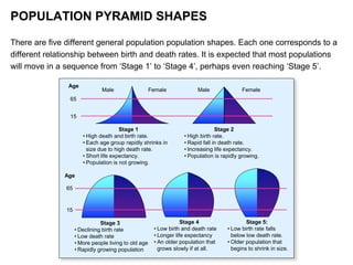
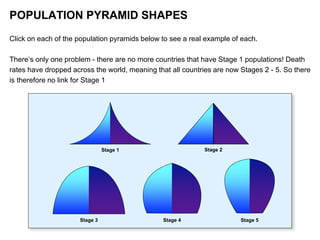
YEAR 7 GEOGRAPHY:
POPULATION
POPULATION
PYRAMIDS
WHAT ARE POPULATION PYRAMIDS?
Population pyramids are a special kind of graph that show how a country’s
population is structured. They show two main things:
1. The number or percentage of males and females in the population;
2. The number or percentage of people in different age categories.
Males Females
20-25 year old
male age group
55-59 year old
female age group
WHAT DO POPULATION PYRAMIDS SHOW?
The shape of a population pyramid can tell us a lot.
• It can tell us whether the population is growing, stable or shrinking.
• It can tell us things about the history of a country by what happened
to its people;
• It can also tell us about the future of a population as well.
POPULATION PYRAMID SHAPES
As a country becomes wealthier, its
population structure begins to transform due
to two major changes:
1. Death rate begins to fall;
2. Eventually, birth rate then begins to fall.
POPULATION PYRAMID SHAPES
Changes in death and birth rates cause changes in
the proportion of young people (14 years and below),
the economically active (15-64 years) and the
elderly (65+ years).
The number or percentage of people in each of these
three categories can inform us about some of the
opportunities and challenges that lie ahead for a
population.
An different way of looking at the distribution between
the age groups is pre-reproductive (0-14 years),
reproductive (15-44) and post-reproductive (45+
years). These too can inform us about the future of a
population.
65
15
Age
15
65
Age
Stage 1
• High death and birth rate.
• Each age group rapidly shrinks in
size due to high death rate.
• Short life expectancy.
• Population is not growing.
Stage 2
• High birth rate.
• Rapid fall in death rate.
• Increasing life expectancy.
• Population is rapidly growing.
Stage 3
• Declining birth rate
• Low death rate
• More people living to old age
• Rapidly growing population
Stage 4
• Low birth and death rate
• Longer life expectancy
• An older population that
grows slowly if at all.
Stage 5:
• Low birth rate falls
below low death rate.
• Older population that
begins to shrink in size.
Male MaleFemale Female
POPULATION PYRAMID SHAPES
There are five different general population population shapes. Each one corresponds to a
different relationship between birth and death rates. It is expected that most populations
will move in a sequence from ‘Stage 1’ to ‘Stage 4’, perhaps even reaching ‘Stage 5’.
Stage 1 Stage 2
Stage 3 Stage 4 Stage 5
POPULATION PYRAMID SHAPES
Click on each of the population pyramids below to see a real example of each.
There’s only one problem - there are no more countries that have Stage 1 populations! Death
rates have dropped across the world, meaning that all countries are now Stages 2 - 5. So there
is therefore no link for Stage 1

Year 7 Geography Population Pyramids

  • 1.
  • 2.
    WHAT ARE POPULATIONPYRAMIDS? Population pyramids are a special kind of graph that show how a country’s population is structured. They show two main things: 1. The number or percentage of males and females in the population; 2. The number or percentage of people in different age categories. Males Females 20-25 year old male age group 55-59 year old female age group
  • 3.
    WHAT DO POPULATIONPYRAMIDS SHOW? The shape of a population pyramid can tell us a lot. • It can tell us whether the population is growing, stable or shrinking. • It can tell us things about the history of a country by what happened to its people; • It can also tell us about the future of a population as well.
  • 4.
    POPULATION PYRAMID SHAPES Asa country becomes wealthier, its population structure begins to transform due to two major changes: 1. Death rate begins to fall; 2. Eventually, birth rate then begins to fall.
  • 5.
    POPULATION PYRAMID SHAPES Changesin death and birth rates cause changes in the proportion of young people (14 years and below), the economically active (15-64 years) and the elderly (65+ years). The number or percentage of people in each of these three categories can inform us about some of the opportunities and challenges that lie ahead for a population. An different way of looking at the distribution between the age groups is pre-reproductive (0-14 years), reproductive (15-44) and post-reproductive (45+ years). These too can inform us about the future of a population.
  • 6.
    65 15 Age 15 65 Age Stage 1 • Highdeath and birth rate. • Each age group rapidly shrinks in size due to high death rate. • Short life expectancy. • Population is not growing. Stage 2 • High birth rate. • Rapid fall in death rate. • Increasing life expectancy. • Population is rapidly growing. Stage 3 • Declining birth rate • Low death rate • More people living to old age • Rapidly growing population Stage 4 • Low birth and death rate • Longer life expectancy • An older population that grows slowly if at all. Stage 5: • Low birth rate falls below low death rate. • Older population that begins to shrink in size. Male MaleFemale Female POPULATION PYRAMID SHAPES There are five different general population population shapes. Each one corresponds to a different relationship between birth and death rates. It is expected that most populations will move in a sequence from ‘Stage 1’ to ‘Stage 4’, perhaps even reaching ‘Stage 5’.
  • 7.
    Stage 1 Stage2 Stage 3 Stage 4 Stage 5 POPULATION PYRAMID SHAPES Click on each of the population pyramids below to see a real example of each. There’s only one problem - there are no more countries that have Stage 1 populations! Death rates have dropped across the world, meaning that all countries are now Stages 2 - 5. So there is therefore no link for Stage 1