2. • Population Structure
– Fertility and mortality vary not only spatially but also
temporally within a country.
– A special bar graph known as a population pyramid can
visually display a country’s distinctive population
structure.
• X-axis
–Percent male displayed to the left of zero
–Percent female displayed to the right of zero
• Y-axis
–Age cohorts typically grouped in 5-year intervals
–Youngest displayed at bottom and oldest at top
3. Age/Sex
Distribution:
• Sex Ratio: Number of males
per hundred females in the
population
• More males are born each
year, but they have lower life
expectancy
• Varies greatly from country to
country
• Examples:
– Europe and North America
= 95:100
– Rest of World = 102:100
Russia and other European
countries have high percentages of
elderly people who need pensions,
health care, and other services.
4. Age Distribution:
• Dependency Ratio: number
of people who are either too
old or too young to work
(dependents), compared with
those people in their
‘productive years’
• The higher the dependents,
the greater the financial
burden on working
population
Dependency Ratio:
0-14 = Dependents
15-64 = Workers
64+ = Dependents
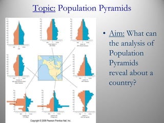
5. Population Pyramids:
• A country’s stage in
Demographic Transition gives it
a distinctive population structure
that displays age and gender of a
given population
• Males are on left, females on
right.
• Youngest people on base of
pyramid and older people at the
top
• The shape of a country’s
population pyramid tell a lot
about the country
6. • Each 5 year group with
the youngest 0-4 years
old at the base of the
pyramid are called
cohorts.
• A wide-based pyramid
indicates a country in
Stage 2 of the
Demographic transition.
7. For wealthier countries, the chart is shaped like a
lopsided vase. Population is aging, TFRs are
declining.
8. For poorer countries, the chart is shaped like a
pyramid. Infant mortality rates are high, life expectancy
is shorter.
9. • Four Patterns of Population Structure
• Each nation faces different problems due to a large
base with many young or negative growth.
10. POPULATION PYRAMIDS FOR THE UNITED STATES
AND SELECTED U.S. COMMUNITIES Laredo has a broad
pyramid, indicating higher percentages of young people and
fertility rates. Lawrence has a high percentage of people in their
twenties because it is the home of the University of Kansas.
Naples has a high percentage of elderly people, especially women,
so its pyramid is upside down.
12. • Attendants or “pushers”
on the Japan Train
system. Despite having a
declining population,
Japan has a very high
population density.
13. JAPAN’S CHANGING POPULATION PYRAMIDS Japan’s
population pyramid has shifted from a broad base in 1950 to a
rectangular shape. In the future, the bottom of the pyramid is
expected to contract and the top to expand.
14. Slow Growth:
• A country in stage 4 of the
Demographic Transition Model
• Large number of “older people”
• Smaller % of young people
15. No Growth:
• End of stage 4, entering Stage 5
• Large number of “older people”
• Very small % of young people
16. Affect of AIDS on
population pyramid
for South Africa.
Predicted population
for 2035, without and
with AIDS.
With AIDS, looks like a
population “chimney.”
18. • 1995 Population Pyramids reflect the economic prosperity of
Western Europe and the less developed countries of Sub-
Saharan Africa. In the mid-1990s almost 50% of Africa’s
population was under 15 years of age.
• By contrast the number of people 65 and older in Western
Europe is 5 times that of sub-Saharan Africa.
19. What do these pyramids reveal about their respective
nations? List all the information you can surmise,
both explicit and implicit.
20. Age Structure of a Population:
• The populations of many areas are aging. Europe and
Japan are good examples, whereas some nations have
very young populations (e.g. - Iran where the median
age is 26.4 years for males)
Bordeaux,
France