The document discusses the definitions and categories of visual impairments, listing various conditions such as low vision and blindness along with statistics on their prevalence. It emphasizes the importance of accessible design in visualization, detailing design strategies for individuals with color blindness and low vision, including contrast, layout, and the use of tactile and auditory elements. Recommendations for creating inclusive graphics and visualizations are provided, aimed at enhancing understanding for people with different visual abilities.
In this document
Powered by AI
Overview of visual impairments, including definitions and categorization; 285.4M affected globally.
Definitions and distinctions of blindness according to WHO and the International Council.
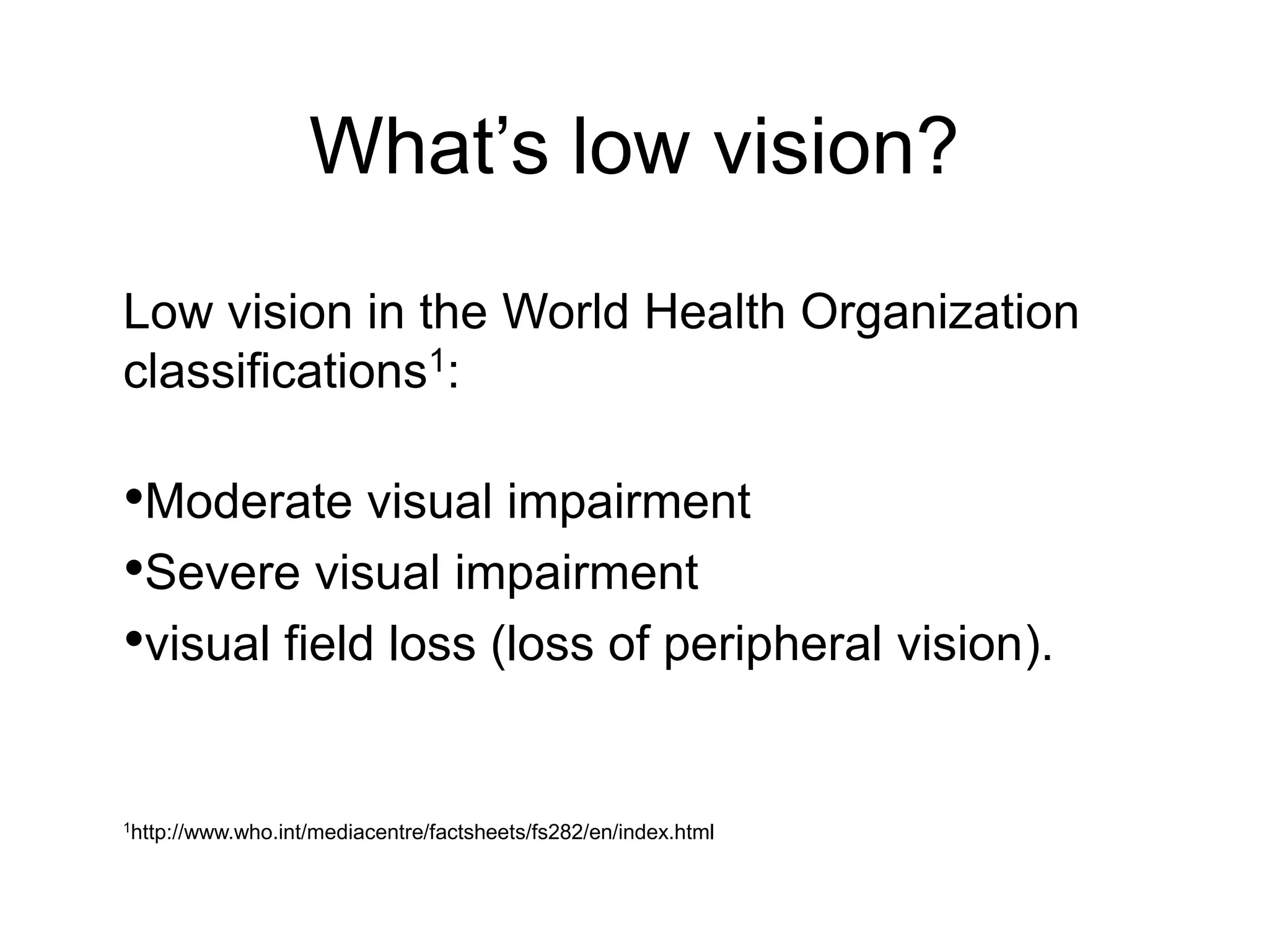
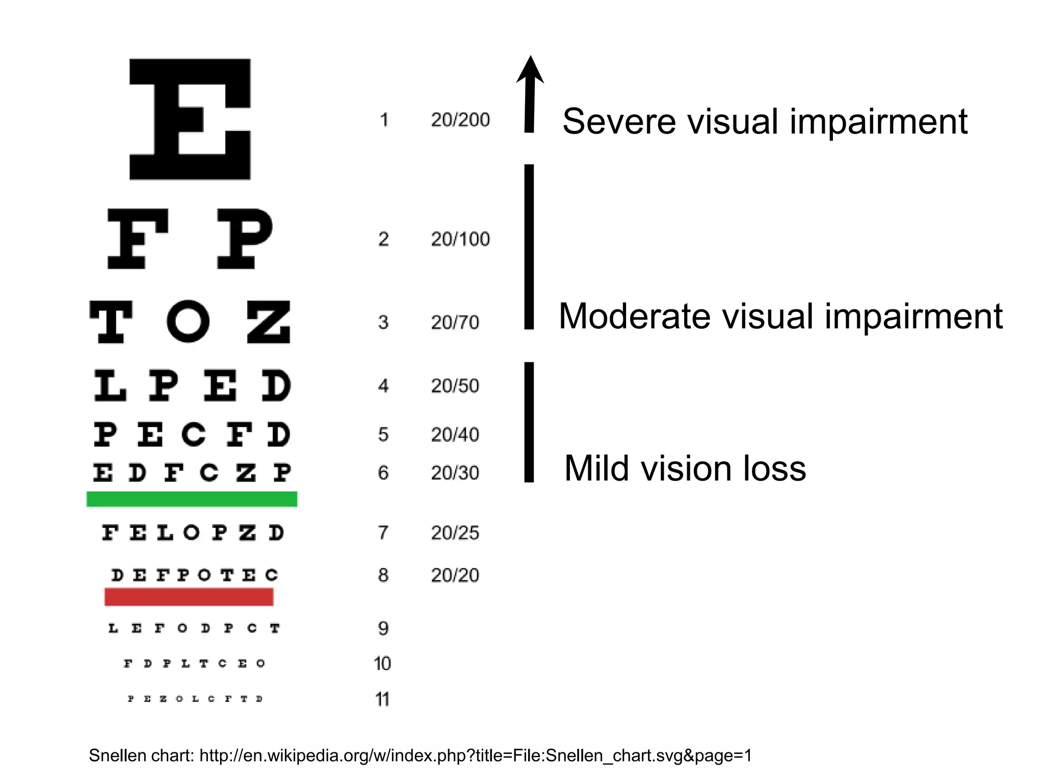
Definitions of low vision and causes, including uncorrected refractive errors and cataracts.
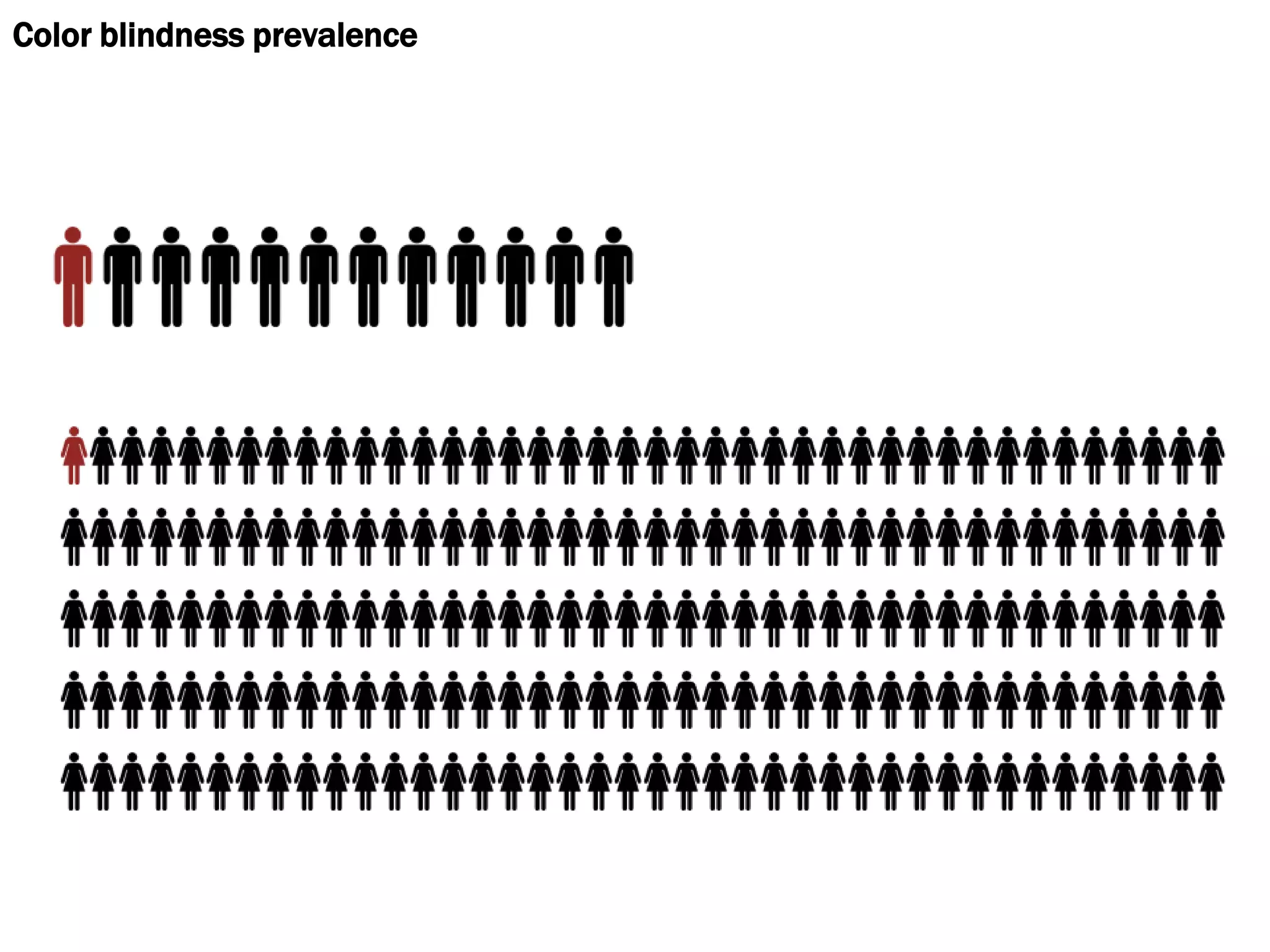
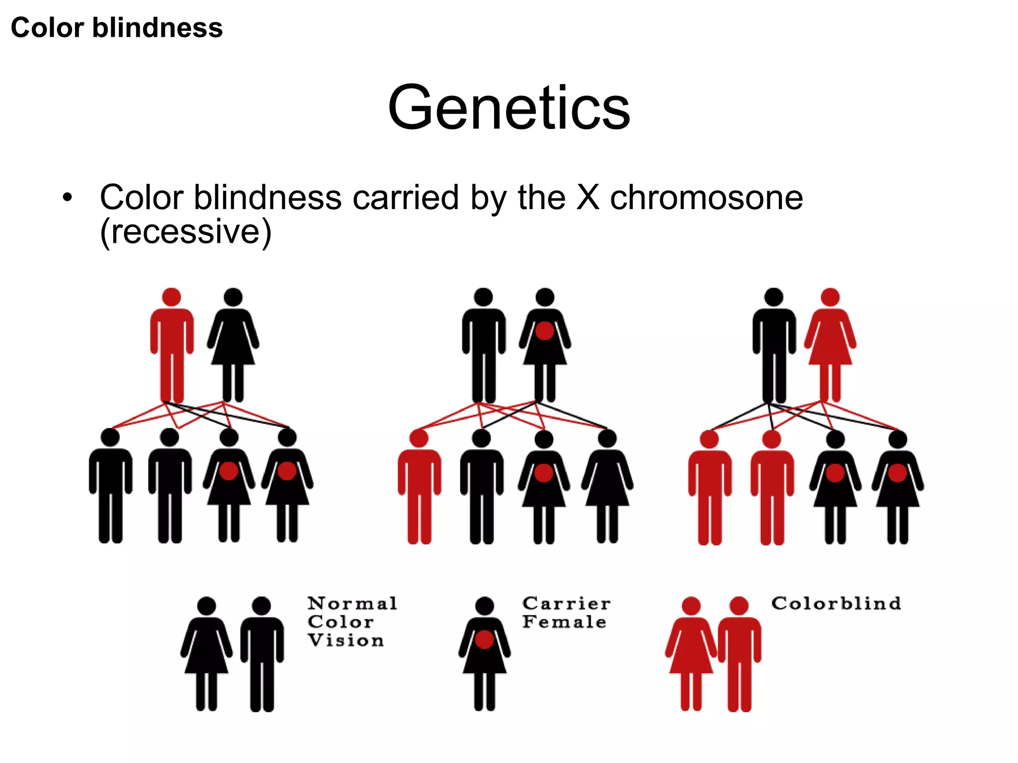
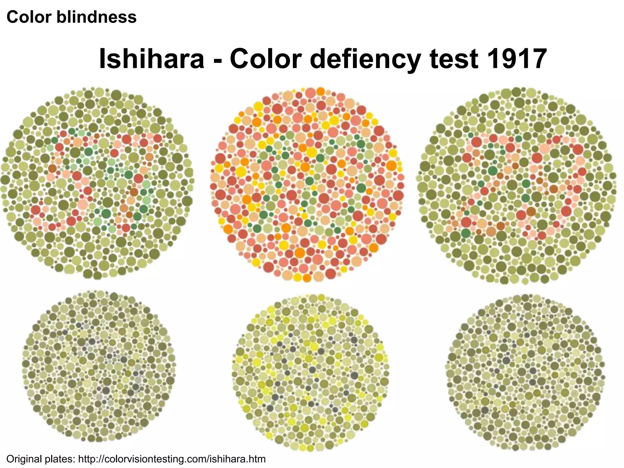
Color blindness types, perception issues, and no existing cure; genetics involved.
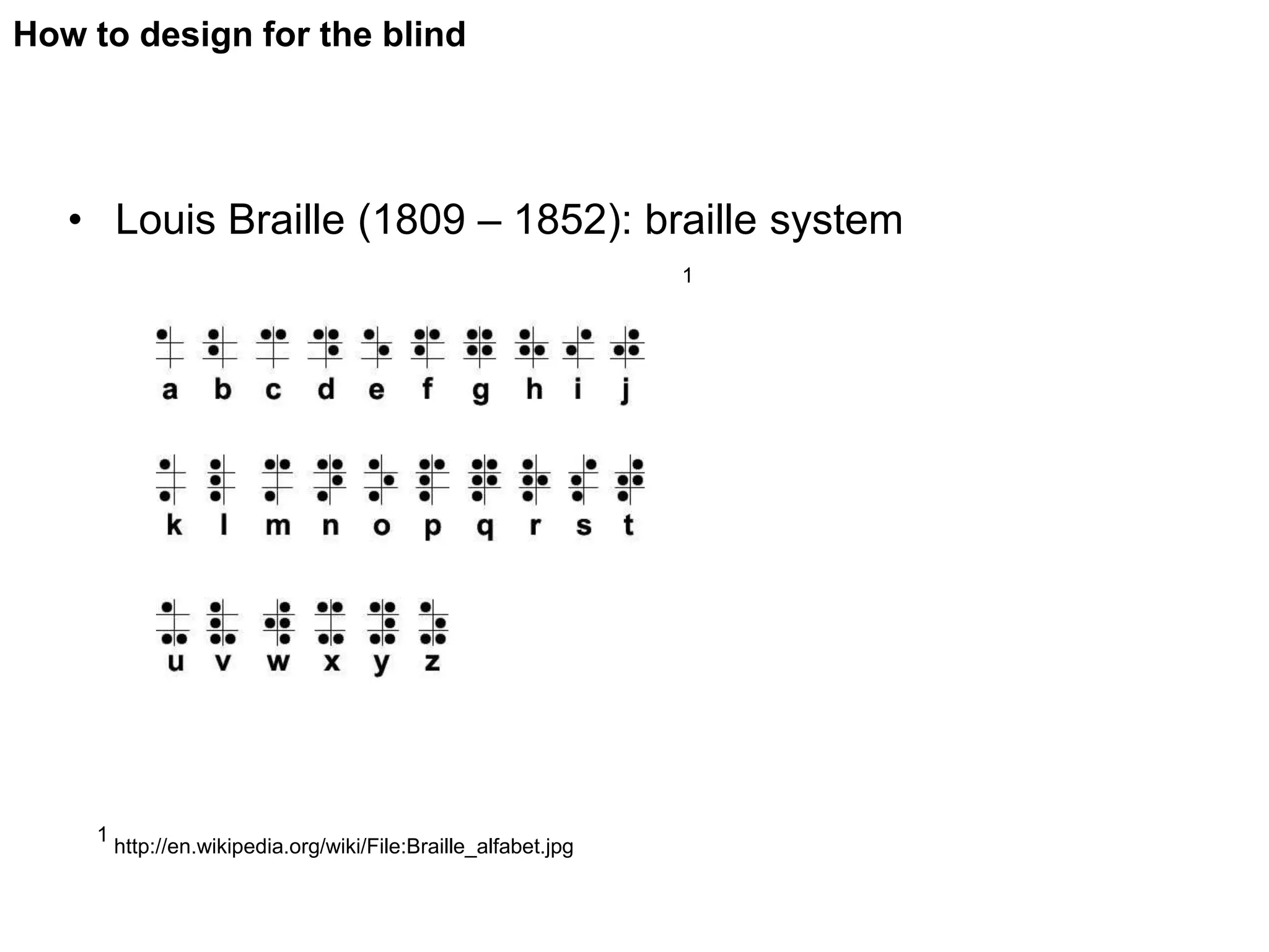
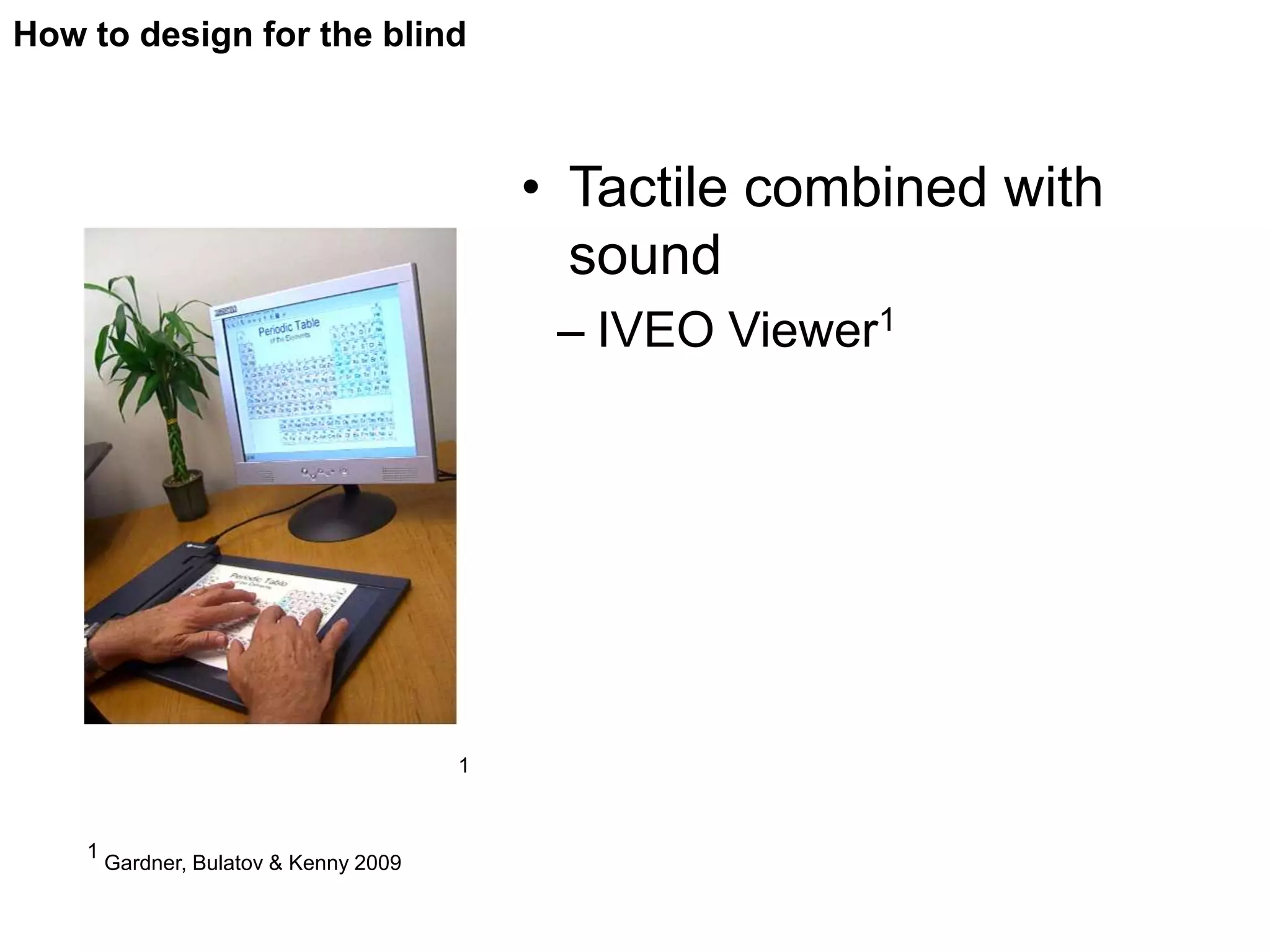
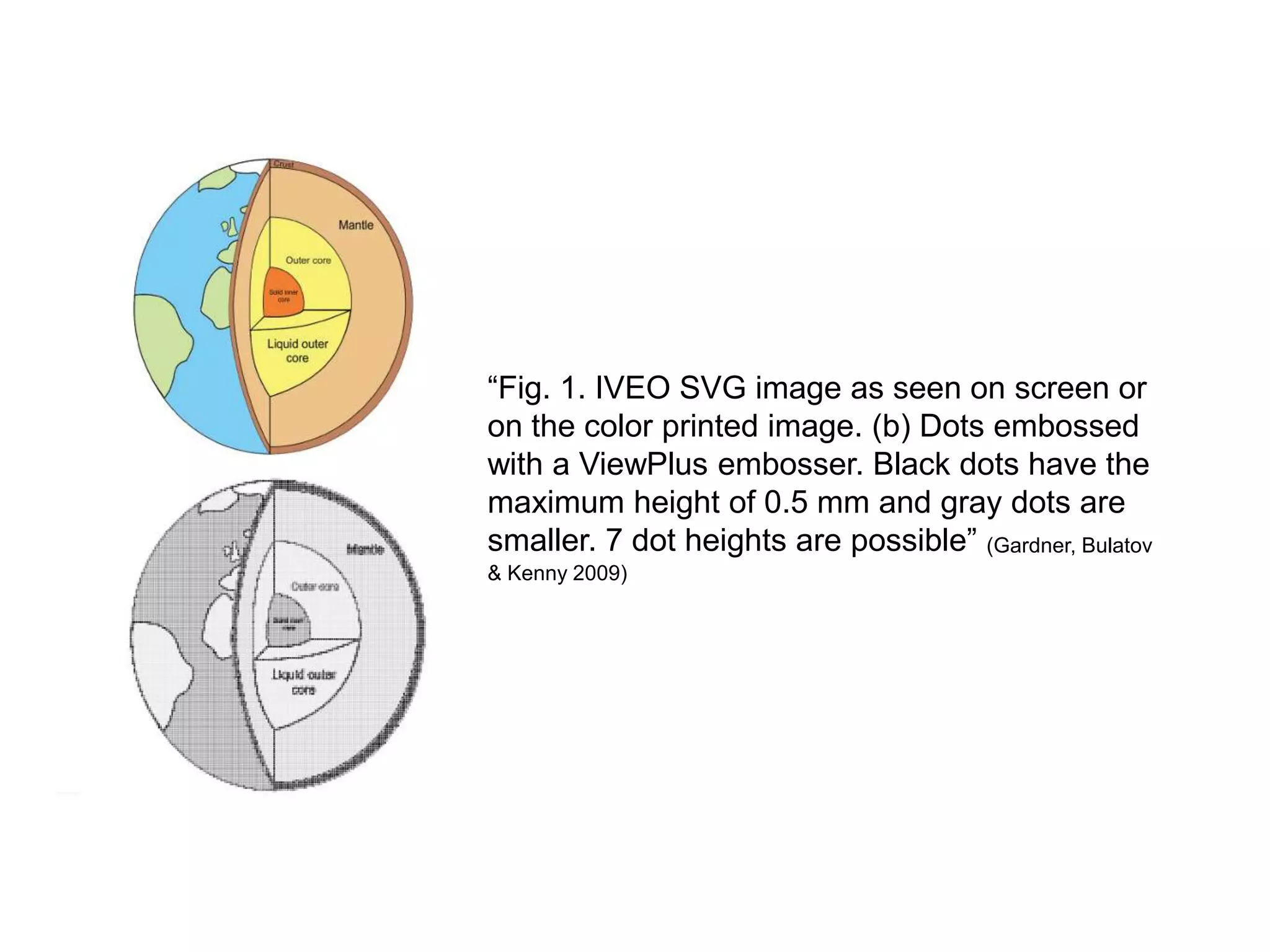
Strategies for designing accessible content for blind/low vision users including tactile methods.
Guidelines to enhance accessibility: proper contrast, text size, layout considerations.
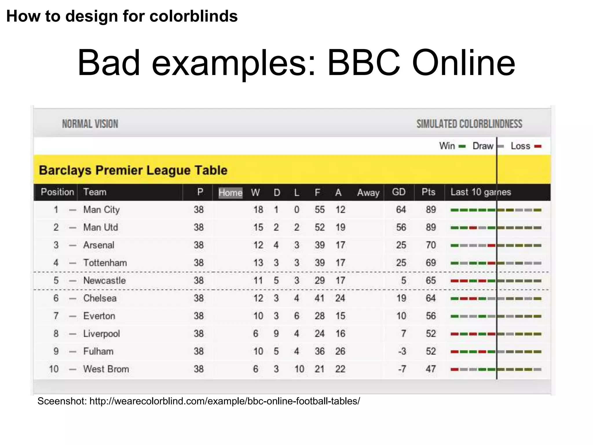
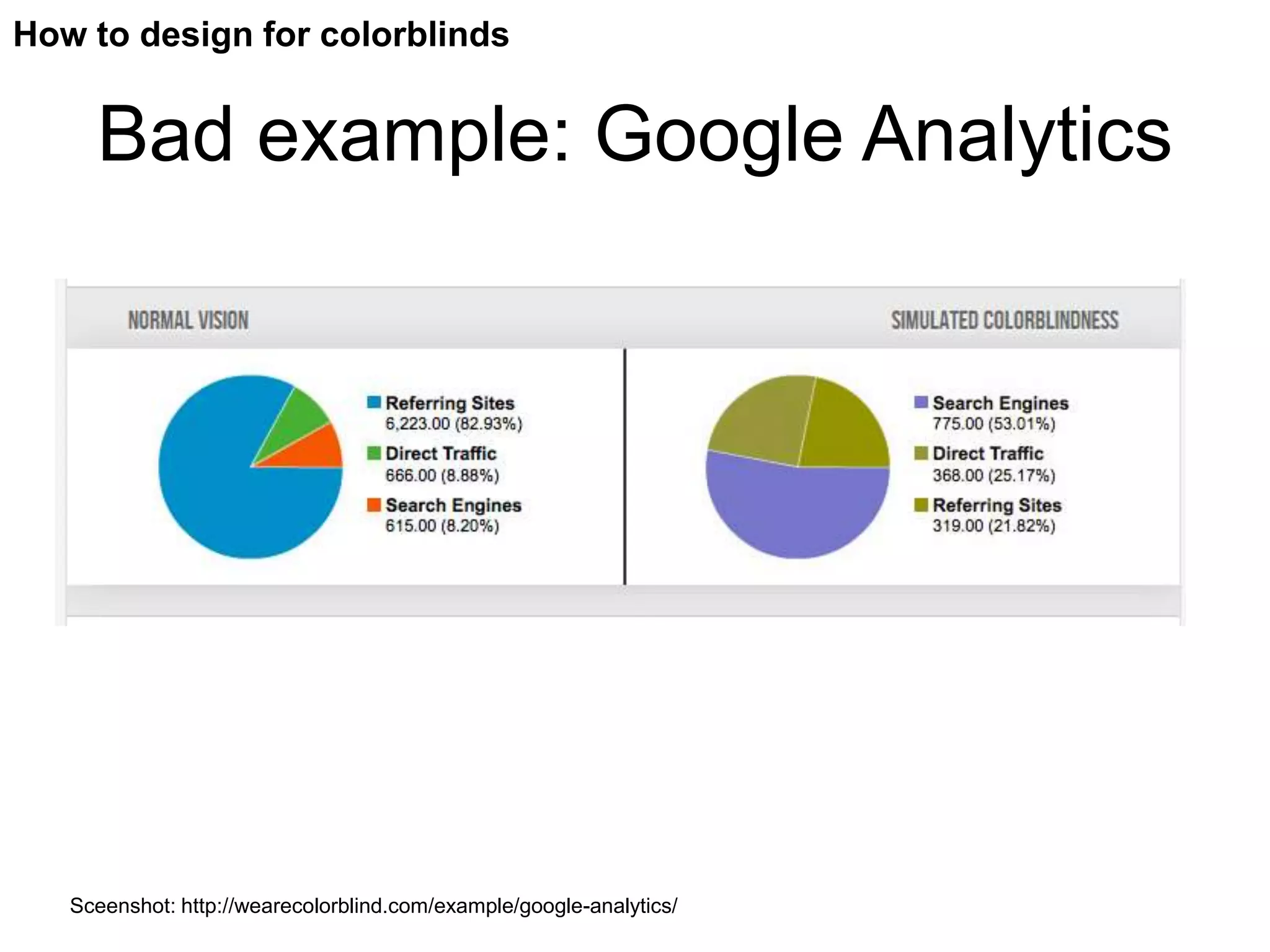
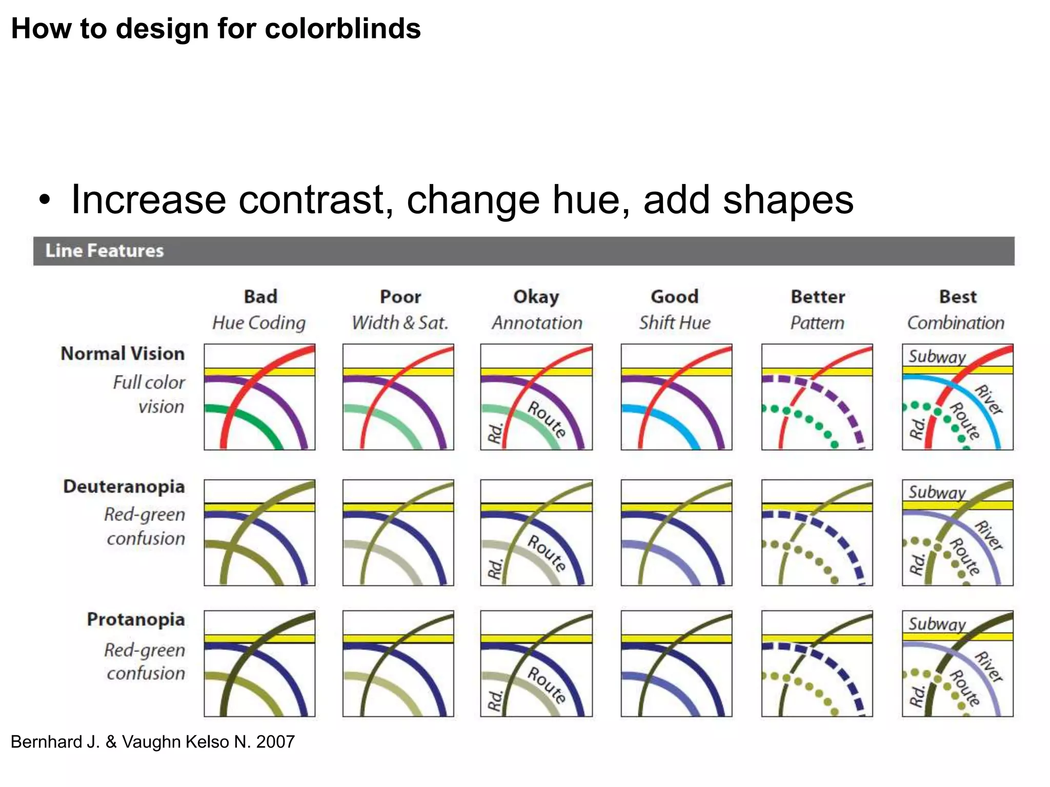
Important tips for designing to prevent miscommunication for colorblind users.
Tools for testing design effectiveness regarding visual impairments and key design principles.
Visual Impairments
• Visually impaired – categorization between1:
– Low vision / partially sighted2
– Blind
• Based on WHO definition
– Visual acuity & visual field defect
1
http://www.nkl.fi/fi/etusivu/tietoa/maarittely
2
http://www.nkl.fi/fi/etusivu/tietoa/sanastoengl
4.
Visual Impairments
• 285.389M visually impaired people (2010 estimate)1
– Enough reason to visualization for visually impaired
1
http://www.who.int/blindness/en/
5.
Why to consider?
“Awell-designed visualization facilitates the
understanding of the key messages, speeds
the process and reduces strain.
Great visualizations take into consideration,
how people receive and utilize information.”
Näsänen, 2007
Accessible design
6.
Why to consider?
“The power of the web is in its universality. Access
by everyone regardless of disability is an essential
aspect.”
Tim Berners-Lee, creator of WWW
Blindness
• The WHO definition from 19721
– Case for revision:
• Interesting issue – definition of blindness:
• No distinction when it comes to perception of light
1
http://www.who.int/blindness/Change%20the%20Definition%20of%20Blindness.pdf
9.
Blindness
• Another angle:
– International Council of Ophthalmology
recommends1
• Blindness: only total vision loss
• Low vision: lesser degrees of vision loss
• Visual impairment: loss of visual functions at the
organ level
1
Colenbrander 2002, 17
10.
Blindness
• Complete blindness is rare1,2
• So what exactly is visualization and to
whom can we visualize?
1
http://www.nkl.fi/fi/etusivu/tietoa/maarittely
2
Nelson 2003, 29
What’s low vision?
Lowvision in the World Health Organization
classifications1:
•Moderate visual impairment
•Severe visual impairment
•visual field loss (loss of peripheral vision).
1http://www.who.int/mediacentre/factsheets/fs282/en/index.html
13.
Severe visual impairment
Moderate visual impairment
Mild vision loss
Snellen chart: http://en.wikipedia.org/w/index.php?title=File:Snellen_chart.svg&page=1
14.
Low vision
Why does it occur?
• Uncorrected refractive errors
(myopia, hyperopia or astigmatism), 43 %
• Cataract, 33%
• Glaucoma, 2%
World Health Organization1
1http://www.who.int/mediacentre/factsheets/fs282/en/index.html
Color blindness
• The colorblind have a narrowed color
perception
• There is no treatment or cure for color
blindness
Pic: http://understandinggraphics.com/wp-content/uploads/2009/10/color-blind-chart.png
17.
Color vision
• Red cones – L cones
• Green cones – M cones
• Blue cones – S cones
Normal Vision Color Blindness (Protanopia)
Pic: http://www.cis.rit.edu/fairchild/WhyIsColor/Questions/3-
Color blindness
Genetics
• Color blindness carried by the X chromosone
(recessive)
22.
Color blindness
Ishihara - Color defiency test 1917
Original plates: http://colorvisiontesting.com/ishihara.htm
23.
Color blindness
Hue Color Vision 1949
1
Color arrangement test 1947
2
1 Screenshot: http://www.colblindor.com/farnsworth-munsell-100-hue-color-vision-
2 Screenshot: http://www.colblindor.com/color-arrangement-test/
test/#prettyPhoto
How to designfor the blind
• Louis Braille (1809 – 1852): braille system
1
1
http://en.wikipedia.org/wiki/File:Braille_alfabet.jpg
29.
How to designfor the blind
• Contrast
– “-- visual acuity depends on the contrast” 1
– ”-- contrast sensitivity thus depends on the
size of the object” 1
1
Näsänen 2007, 12
How to designfor the blind
• Tactile textures
– Boundaries are easy to find1
• Tactile maps
– Abstract concepts can be demonstrated2
1
Anderson 1992, 290
2
Skytt 2012, 10–12.
How to designfor the blind
• Tactile combined with
sound
– IVEO Viewer1
1
1
Gardner, Bulatov & Kenny 2009
37.
“Fig. 1. IVEOSVG image as seen on screen or
on the color printed image. (b) Dots embossed
with a ViewPlus embosser. Black dots have the
maximum height of 0.5 mm and gray dots are
smaller. 7 dot heights are possible” (Gardner, Bulatov
& Kenny 2009)
38.
How to designfor the blind
• What about Scalable Vector Graphics in
mainstream context?
39.
How to designfor the blind
• “To be scalable means to increase or
decrease uniformly. In terms of graphics,
scalable means not being limited to a
single, fixed, pixel size.”
(http://www.w3.org/TR/SVG11/concepts.html)
• Screen readers& special displays
– Design & development might target only a
specific (seeing) group
• Microsoft Windows first not accessible by screen
readers1
1
Vehmas 2005, 130
42.
How to designfor low vision
Distinguishable letters
When a picture is formed into the retina,
small details have lower contrast than larger
items. 1
Use bigger letters and graphical elements.
Letterforms need to be easily
distinguishable 1,2
1Näsänen 2007
2Dolan, RGD Ontario 2010
How to designfor low vision
Enough difference in color
value
Brains compensate for a certain range of blur
that eye optics create. This applies only to
the difference in brightness, not in color. 1
A good rule of thumb is to ensure at least a
70% difference in color value between e.g.
type and a background tone. 2
1Näsänen 2007
2Dolan, RGD Ontario 2010
How to designfor low vision
Focus on layout
We see sharply only in the center of the
visual field because the amount of ganglian
cells reduces when not in the focus point. 1
information needs to be clearly placed, and
the layout can be understood with one
glance.1
1Näsänen 2007
How to designfor low vision
Is extra bling bling needed?
Every day we do approximately 100 000 eye
fixations. Each fixation takes at least 0,15
seconds.1
Avoid animations and flashy content if they
don’t bring extra value to the visualization.
However, use of graphic visualizations is
recommended.1
1Näsänen 2007
How to designfor low vision
Make it accessible
There is a wide variance in users’ ability to
operate a mouse, keyboard or other input
device. Some people may use voice-
recognition programs with spoken
commands. 1
Make all functionality fully accessible from a
keyboard and create content that can be
presented in different ways.1
1Dolan, RGD Ontario 2010
How to designfor color blinds
• Colors should never be the only method of
conveying important information!
This is important
56.
How to designfor colorblinds
• Avoid placing red and green together
– Also minor color &contrast differences 2
• Desaturate images to see if they still have
impact
1
1http://blog.templatemonster.com/2012/03/21/designing-colorblind-friendly-website/
2 http://www.tfl.gov.uk/assets/downloads/standard-tube-map.pdf
57.
How to designfor colorblinds
Bad examples: BBC Online
Sceenshot: http://wearecolorblind.com/example/bbc-online-football-tables/
58.
How to designfor colorblinds
• In graphs
– Place the legend directly in
the chart
– Display the type of data for
each element in a tooltip
Blue Green Purple Red
• Name the color in text as
well
59.
How to designfor colorblinds
Bad example: Google Analytics
Sceenshot: http://wearecolorblind.com/example/google-analytics/
60.
How to designfor colorblinds
• Increase contrast, change hue, add shapes
Bernhard J. & Vaughn Kelso N. 2007
61.
How to designfor colorblinds
• Use varied icons and shapes
Bernhard J. & Vaughn Kelso N. 2007
62.
How to designfor colorblinds
Problematic colors
High Medium Low
Light Green and
Green and Red Blue and Yellow
Yellow
Green and Brown Blue and Grey Yellow and Violet
Blue and Purple Green and Grey Dark blue and Black
Green and Blue Green and Black
Pic: http://jfly.iam.u-tokyo.ac.jp/color/
63.
How to designfor colorblinds
Unambiguous Colors
• For both to colorblinds and non-colorblinds
Simulation
Original Protan Deuter Tritan
Black
Orange
Sky Blue
Bluish Green
Yellow
Blue
Vermillon
Reddish Purple
Colors: http://jfly.iam.u-tokyo.ac.jp/color/image/pallete.jpg
64.
Curious about colorblindness?
• Watch video: ”No such thing as color – what it
is like to be colorblind”
– http://www.nosuchthingascolor.com/
• We are colorblind - Blog by Tom van
Beveren, colorblind (deuteranomally)
• http://wearecolorblind.com/
65.
Test your designs
•Color blindness simulation
– http://vischeck.com/
– http://www.colblindor.com/coblis-color-
blindness-simulator/
• Contrast test
– http://www.checkmycolours.com/
– http://www.snook.ca/technical/colour_contrast
/colour.html
• Grayscale images and visualizations
66.
Conclusions
• Many peoplewith visual impairments
– Create accessible design
• Use guidelines in design
– Contrast
– Size
– Color
– Layout
– Format
67.
References
• Anderson, Frances 1992. Art for all the children: approaches to art therapy for children with
disabilities. Springfield, Charles C Thomas.
• Bernhard, J.& Vaughn Kelso, N. 2007. Color Design for the Color Vision Impaired.
Cartographic Perspectives, 58, p. 61-67.
• Bushell, David 2012. Resolution Independence With SVG. Read 30.10.2012.
http://coding.smashingmagazine.com/2012/01/16/resolution-independence-with-svg/
• Colenbrander, August 2002. Visual Standards: Aspects and Ranges of Vision Loss with Emphasis
on Population Surveys. International Council of Ophthalmology. Read 23.10.2012.
http://www.icoph.org/downloads/visualstandardsreport.pdf
• Color Blindness. Prevalence. Accessed 01.11.2012.
http://www.colour-blindness.com/general/prevalence/
• Dolan, D., A Practical Handbook on Accessible Graphic Design 2010, RGD Ontario
• Flück, D. 2012. Colblindor - Color Blindness viewed through Colorblind Eyes. Accessed 30.10.2012.
http://www.colblindor.com/
• Gabriel-Petit, P. 2007. Ensuring Accessibility for People With Color-Deficient Vision. Accessed
01.11.2012 http://www.uxmatters.com/mt/archives/2007/02/ensuring-accessibility-for-people-with-
color-deficient-vision.php
• Gardner, John; Bulatov, Vladimir & Kelly, Robert 2009. Making Journals Accessible to the Visually-
Impaired – The Future is Near. Learned Publishing 22(4) 2009 pp. 314-319. Read 30.10.2012.
http://www.viewplus.com/about/abstracts/09learnpubgardner.html
• ICD Update and Revision Platform: Change the Definition of Blindness. World Health Organization.
Read 23.10.2012.
http://www.who.int/blindness/Change%20the%20Definition%20of%20Blindness.pdf
• Malamed, C. 2012. Designing for Color Blindness.
http://understandinggraphics.com/design/designing-for-color-blindness/
• Mariotti, S. P., Global Data on Visual Impairments 2010, World Health Organization
68.
References
• Nelson, Scott 2003. A Professional Artist and Curator Who Is Blind. Art Beyond Sight – A Resource
Guide to Art, Creativity and Visual Impairments, 28–29. Ed. Axel, Elisabeth & Levent, Nina. New York,
AEB & AFB.
• New estimates of visual impairment and blindness: 2010. World Health Organization. Read
23.10.2012.
http://www.who.int/blindness/en/
• Näkövammaisuuden määrittely. Näkövammaisten Keskusliitto ry. Read 23.10.2012.
http://www.nkl.fi/fi/etusivu/tietoa/maarittely
• Sanastoa englanniksi. Näkövammaisten Keskusliitto ry. Read 23.10.2012.
http://www.nkl.fi/fi/etusivu/tietoa/sanastoengl
• Näsänen, Risto 2007. Visuaalisen käytettävyyden opas 2007. Read 18.10.2012.
http://www.ttl.fi/fi/ergonomia/kognitiivinen_ergonomia/visuaalinen_kaytettavyys/Documents/Visuaalise
n_kaytettavyyden_opas_2007.pdf
• Okabe, M. & Ito, K. 2002. Color Universal Design (CUD) - How to make figures and presentations that
are friendly to Colorblind people – Accessed 29.10.2012.
http://jfly.iam.u-tokyo.ac.jp/color/
• Saarelma, O. 2012. Värisokeus ja poikkeava värinäkö. Lääkärikirja Duodecim. Accessed 28.10.2012.
http://www.terveyskirjasto.fi/terveyskirjasto/tk.koti?p_osio=100&p_artikkeli=dlk00347&p_teos=dlk&p_s
elaus=7728
• Scalable Vector Graphics (SVG) 1.1 (Second Edition), W3C Recommendation 2011. Read
30.10.2012.
http://www.w3.org/TR/SVG11/concepts.html
• Schneider, Joel. 3-page Snellen Chart. Read 25.10.2012.
http://www.i-see.org/eyecharts.html/#download
• Skytt, Riitta 2012. Koskettavaa luettavaa. Tukilinja 3–4 2012. Read 16.10.2012.
http://www.virtualmagnet.eu/magnet/asiakkaat/Tukilinja/tukilinja_030412.html/
• Van Beveren, T. 2012. A quick introduction to colorblindness. Accessed 30.10.2012.