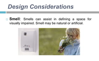
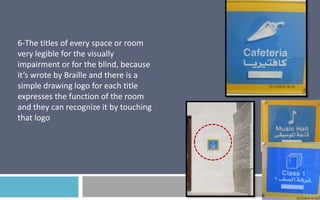
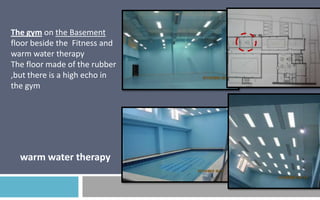
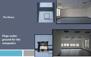
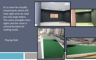
Downloaded 3,485 times

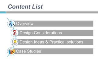


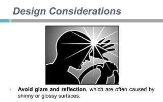
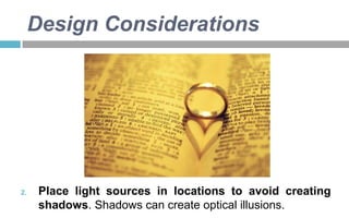
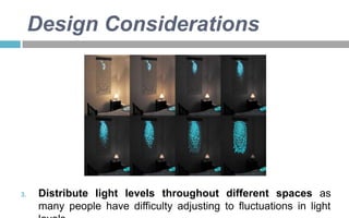
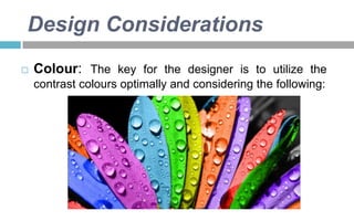
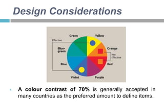
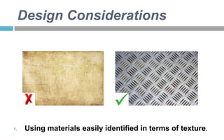
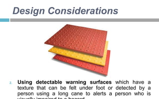
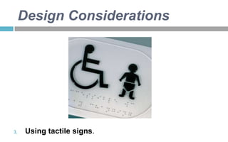
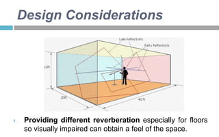
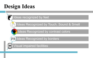
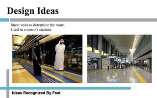
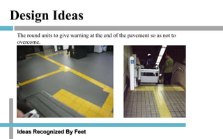
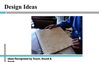
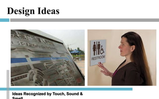
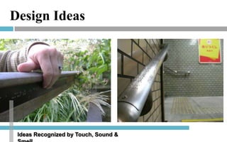
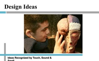


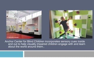
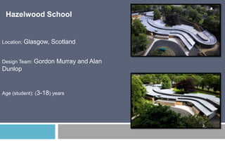

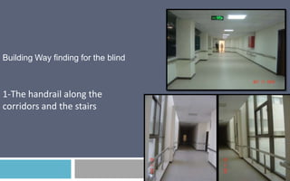
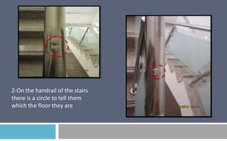
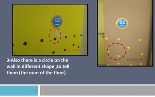
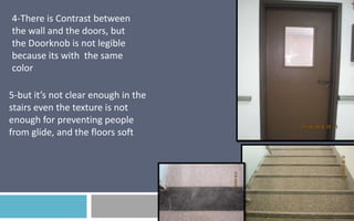

This document provides an overview of design considerations for visually impaired individuals. It discusses lighting, color, texture, acoustics, smell, and legibility as key design elements. It also categorizes types of visual impairment and their symptoms. Design ideas are presented that utilize tactile cues like texture floors and handrails. Case studies of the Anchor Center for Blind Children and Hazelwood School show how their designs incorporate sensory elements to aid navigation.


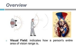
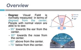
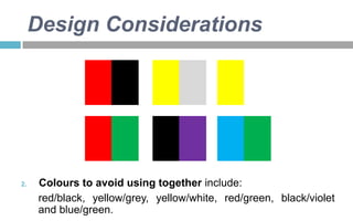
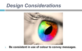
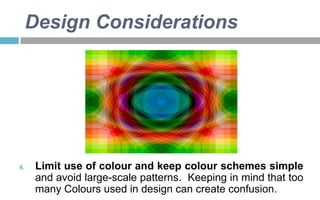
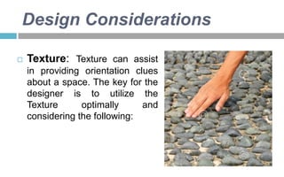
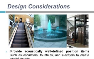
![UX Heuristics for Large Environments [DRAFT]](https://cdn.slidesharecdn.com/ss_thumbnails/stlarchitectsuxheuristics12182019-200409181649-thumbnail.jpg?width=640&height=640&fit=bounds)


