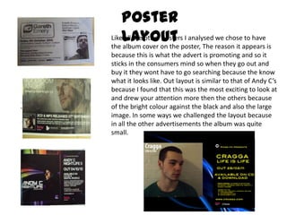
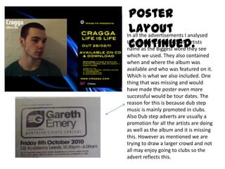
The document discusses the design choices for a poster promoting a dubstep artist's album. It was modeled after other dubstep posters which feature the artist's image and name prominently. Bright colors were chosen to make it stand out compared to more subtle colors used by other artists. While following conventions like artist image and name, the poster designers also made some challenges, like using brighter "electro" colors instead of darker colors typically seen in dubstep posters to try and appeal to a mainstream audience. Tour dates were not included which could have made the poster more effective at promoting the artist's live performances.