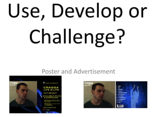
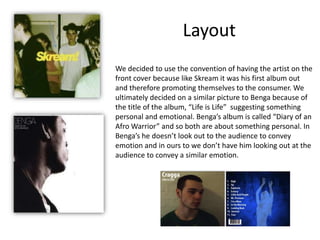
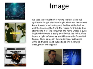
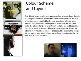
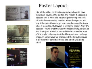
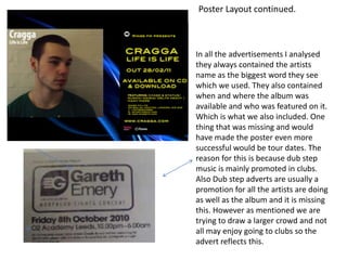
The document discusses the design choices for a poster promoting a dubstep artist's album. It was decided to feature the artist prominently on the cover to promote themselves, similar to other dubstep posters. Bright white font was used against a blue background to make the artist and album title stand out. While most dubstep posters use subtle colors, more vibrant electric blue was chosen to make the album stand out as different and appeal to a mainstream audience. The poster layout is similar to other effective dubstep posters, prominently featuring the album cover and key information. Tour dates were not included which could have made it more successful at promoting all the artist's activities.


![5G Explained! A High Level Overview [Introduction]](https://cdn.slidesharecdn.com/ss_thumbnails/5gexplainedahighleveloverview-260119165306-cc137a3e-thumbnail.jpg?width=640&height=640&fit=bounds)


