This document provides a self-evaluation of the student's work on a group project to design an advertising company. The student describes their individual logo, slogan, and bottle designs created for the project. They reflect that their initial logo name "Logomotion" did not seem professional but they liked the shape. They worked well as a group, completing all tasks on time. For their final bottle design, they created a print advertisement featuring a bottle reflection in icy water to represent the name "Quantic Fresh". Overall, the student feels they fully participated and successfully completed all parts of the challenging project.
Our Startup Branding Journey - Part 3: How To Build A Long-Term MissionCustomericare
Few weeks ago, we started sharing our startup branding journey with SlideShare.
You can find the previous parts here:
Part 1 - What Makes A Brand Memorable: http://www.slideshare.net/Customericare/our-startup-branding-journey-what-makes-a-brand-memorable
Part 2 - How To Create Brand Consistency: http://www.slideshare.net/Customericare/our-startup-branding-journey-how-to-create-brand-consistency.
In this part we'll see how to build your brand mission and think long-term. Hope you enjoy it and don't hesitate to leave a comment with your thoughts :D
A voluntary group of like-minded staff have now put together a sharing deck for all of you, which highlights some of these learnings and more importantly, how being a creative person impacts them personally and in the work they do at Collab Asia
1. Unit 18 evaluation
During the production of designing an advertising company I
chose the name ‘Logomotion’ with the slogan ‘Advertising your
future’. I initially chose it because I felt it fitted with what the
companydoese.g.advertise products. Howevernow I personally
don’t like this name because it doesn’t look professional and
seemsnaff.Idon’tlike the colourscheme however Ido quite like
the shape containing the ‘L’. If I were to change anything I would probably come up with a whole
new logo, name and slogan. This would hopefully include a more professional colour scheme and
icon which would help stand out if this were to be an actual company.
Whenwe bought our ideas as a group we decided on
the name Zephyr Advertising’ with the slogan
‘regenerating ideas’. This was created through a few
logoswhichour group had come up with, which I felt
was beneficial as then it wasn’t only one person’s
idea.HoweverIfeel the logocouldhave beencreated
more professionally and the colour scheme could
have beenchangedtosomething bolder, as well as using a different font to make it easier to read.
We then had to design a water bottle logo and slogan, I chose ‘Blue
cove’ as I felt it was different to other company names out there as
well asit soundfairlyprofessional. WhenIfirstthoughtof the name I
could imagine it being said with a deep voice over if it were in an
advert. I also felt that the blue colour scheme fitted well with its
name.I useda picture of the sea to emphasise the cove section of its
name. By editing it in Photoshop I was able to change the colour of
the beach to a true deep blue, which I feel enhanced the name.
Whenwe decidedonourfinal water bottle we chose ‘Quantic fresh’
which Rory had designed. We generally agreed as a team that it
looked professional and gave us many ideas for our TV advert. It
looks simple and stands out, however I am not sure with the
Japanese writing as I’m not sure what it means, although you could
look at it as it being a global brand.
As a team I feel we worked well, we each allocated individual rolls
and was able to create and finish an effective product. I feel that I
participated fairly to the group and was able to produce my own bottle design, print advert,
advertisingcompanylogo andhelpedfilmpartsof the TV advertas well askeepthe group in order. I
feel thatif theyweren’tfocusedI wasable to bring them back to what they were required to do, or
suggestedtasksthatneededtobe done,andwas occasionally one step ahead. I feel that everyone
pulled their weight evenly, for example if one person hadn’t participated much in one task they
wouldbe the leaderof the next.There were alsonoargumentsthroughoutthe topicwhichwas very
beneficial.
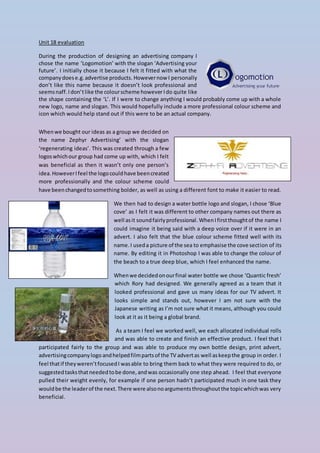
2. This is my final print advert design which I created in
Photoshop.
I like how the reflectionof the bottle fitswiththe reflection of
the mountain; I also love the fact that the water within the
bottle looks icy cold due to the colour bottle I had chosen.
HoweverIfeel thatif I were to adapt it I would have made the
slogan ‘cleanse your mind’ bigger and more centre from the
bottle tothe edge of the image. HoweverIfeel confident with
this design and feel it fits with the word ‘fresh’ from the logo
‘Quantic fresh’, due to the snowy mountains being cold, which is what I feel fresh represents.
I feel thatour grouppitchwentreallywell, andwe were able topresentourproductwithconfidence
and clarity. We each thought and planned out what we wanted to say about the product and
allocatedindividualsectionstotalkabout. I feel we were well rehearsed which the audience could
understand and put across what we wanted to say. The audience thought that we had presented a
good pitch and could understand that we had clearly practiced due to the presentation being
smoothand professional. Theyalsonoticedthatwe had written a clear and concise script which we
usedwell andsuccessfullyincludedstatisticsin the marketing campaign and produced excellent TV
and printadverts. Oureye line focuswasdirect and we were able to successfully answer any of the
questions that were thrown at us with confidence and clearly understood what we were talking
about due to researching in depth.
If I were to do this whole assignment again I would adapt the techniques we used to create our TV
advertand take more time when filming it, as many of the shots were either blurred/unfocused or
unsteady. Iwouldensure thisbyusing a tripod to efficiently keep the shots sturdy, as well as using
the manual focusto concentrate on the mainsubjectIrequired to focus on in that particular shot. If
I ensuredthishappenedIfeel the advertwouldlookmore professional andmayhave hada different
outcome due to all the shots having a similar standard and view.
To conclude Ifeel thatthistopicwas fairlychallenging due to how many different tasks we needed
to complete,butIsuccessfullycompletedthemall ontime andtothe highestonmy ability.Overall I
am pleased with my final outcomes.