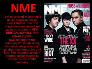
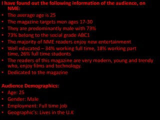
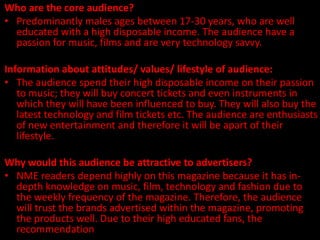
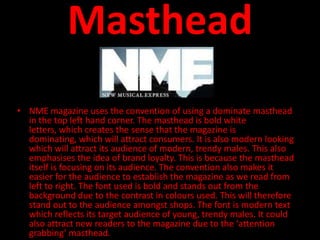
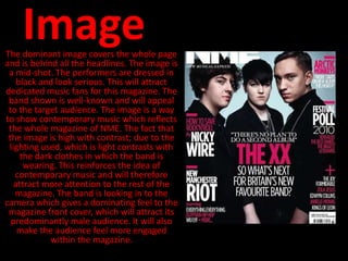
NME
I am interested in creating a
    music magazine for AS
    media studies. The first
  magazine front cover I am
   going to analyse is NEW
   MUSICAL EXPRESS, best
        known as NME.
     NME belongs to the
  company IPC media along
 with other magazines such
as, shooting times, chat and
 fate. The magazine uncut is
   another music magazine
     within the IPC media
          company.
NME magazine overview:


Audience:
                                                 Company: IPC media (Time
                                                 inc.)
                                                 Editor: Krissi Murison
                                                 Frequency: Weekly
                                                 Circulation: 56,284
                                                 Readership: 411,000
                                                 Country: United Kingdom
                                                 First Issue: 7th March 1952

    From looking at this front cover of this NME magazine, I would
   assume that it has a target audience of well-educated fans of bands
   and new music. They will enjoy reading about the wider subjects
   such as films. From the front cover I also assume that the audience
   will be mostly male readership, predominantly from the UK. They will
   be interested in a wide range of subjects including film and fashion.
   The front cover also suggests that the audience will be dedicated
   music fans and will be a regular buyer of this magazine.
http://www.nme.com/mediapack/pdf/nme_media_information_full.pdf
   This link shows the Demographic statistics and detailed information
   about NME’s target audience. This link is to NME magazine’s media
   pack.
I have found out the following information of the audience, on
   NME:
• The average age is 25
• The magazine targets men ages 17-30
• They are predominantly male with 73%
• 73% belong to the social grade ABC1
• The majority of NME readers enjoy new entertainment
• Well educated – 34% working full time, 18% working part
   time, 26% full time students
• The readers of this magazine are very modern, young and trendy
   who, enjoy films and technology.
• Dedicated to the magazine

Audience Demographics:
• Age: 25
• Gender: Male
• Employment: Full time job
• Geographic's: Lives in the U.K
Who are the core audience?
• Predominantly males ages between 17-30 years, who are well
  educated with a high disposable income. The audience have a
  passion for music, films and are very technology savvy.

Information about attitudes/ values/ lifestyle of audience:
• The audience spend their high disposable income on their passion
   to music; they will buy concert tickets and even instruments in
   which they will have been influenced to buy. They will also buy the
   latest technology and film tickets etc. The audience are enthusiasts
   of new entertainment and therefore it will be apart of their
   lifestyle.

Why would this audience be attractive to advertisers?
• NME readers depend highly on this magazine because it has in-
  depth knowledge on music, film, technology and fashion due to
  the weekly frequency of the magazine. Therefore, the audience
  will trust the brands advertised within the magazine, promoting
  the products well. Due to their high educated fans, the
  recommendation amongst their peers will be more respected.
Codes, conventions and
   mode of address
• The front cover of the magazine attracts its
 audience with the conventions and codes. By
   analysing this magazine I will see how the
  audience is addressed using the codes and
                  conventions.
Masthead
• NME magazine uses the convention of using a dominate masthead
  in the top left hand corner. The masthead is bold white
  letters, which creates the sense that the magazine is
  dominating, which will attract consumers. It is also modern looking
  which will attract its audience of modern, trendy males. This also
  emphasises the idea of brand loyalty. This is because the masthead
  itself is focusing on its audience. The convention also makes it
  easier for the audience to establish the magazine as we read from
  left to right. The font used is bold and stands out from the
  background due to the contrast in colours used. This will therefore
  stand out to the audience amongst shops. The font is modern text
  which reflects its target audience of young, trendy males. It could
  also attract new readers to the magazine due to the ‘attention
  grabbing’ masthead.
Image
The dominant image covers the whole page
and is behind all the headlines. The image is
 a mid-shot. The performers are dressed in
    black and look serious. This will attract
dedicated music fans for this magazine. The
 band shown is well-known and will appeal
 to the target audience. The image is a way
to show contemporary music which reflects
 the whole magazine of NME. The fact that
 the image is high with contrast; due to the
 lighting used, which is light contrasts with
     the dark clothes in which the band is
      wearing. This reinforces the idea of
   contemporary music and will therefore
   attract more attention to the rest of the
   magazine. The band is looking in to the
camera which gives a dominating feel to the
 magazine front cover, which will attract its
  predominantly male audience. It will also
    make the audience feel more engaged
             within the magazine.
Strap-lines
The main headline is situated in the middle of the
magazine. It shows the audience the main story featured
in it. The pink and white colours used together act as
complimentary and work well together, which will attract
the young trendy audience. The main headline has a “pull
quote” included in with it which will act as anchorage for
the target audience. The headline will appeal to its target
audience due to the fact that the band mentioned is well-
known and will appeal to the young, well-educated
audience. The headline, “so what’s next for Britain’s new
favourite band?” is a question which will draw the
attention of the audience. They will be intrigued of what
the answer will be and therefore, purchase the magazine.
The band’s name has been expanded within the rest of
the writing to attract the audience first. It is also been
used within a different colour, which makes it stand out
of the page. The band name contrasts with the
surrounding writing and further attracting the audience’s
attention.
• The other headlines are very clear to read which acts a
  boost. They overlap the image and are dominating.
  The headlines are placed all around the magazine
  cover. This acts as a convenience for the customers
  due to the fact that the headlines read from left to
  right. The headlines all follow the house style of the
  magazine following the same colour scheme used
  from the colour palette; pink and white. This creates a
  sense of simplicity through the way the magazine front
  cover has been set out. A few of the headlines have
  used “PULL QUOTES”. These draw the audience’s
  attention into reading the rest of the magazine, they
  give an insight into the contents of the magazine. The
  lexis used within the strap-lines will appeal to the
  audience, and potentially pull new audience into
  reading the contemporary magazine. Lexis such as
  ‘FESTIVAL’ will appeal to the audience as the audience
  enjoy music festivals and are dedicated to music. The
  bands stated in the strap-lines will appeal to the
  audience due to their contemporary style.
  Therefore, they will be attracted to the magazine.
Other
• The plus column will instantly appeal
  to its target audience as the bands
  mentioned will be of the genre in
  which the audience are dedicated
  to. The audience enjoy new
  entertainment and this magazine
  suggests that they provide this with
  new bands etc.
Representation of social
            class:
• From the front cover, I will consider the issues from analysing the
     headlines and conventions of this magazine front cover. Some
    words used such as ‘riot’ and ‘rock and roll’ can show that this
   magazine is represented for males. The use of the festival on the
     front cover, illustrates that dedicated readers to music will be
   attracted to this magazine. The way that the magazine has been
    positioned is in a sophisticated manner suggesting that a well-
    educated audience will read the magazine. The magazine front
    cover has also been created in a modern trendy way which will
 appeal to its young trendy audience. The magazine follows a house
    style with the use of the colours of pink and white, creating an
   identity for the magazine. The way that the masthead has been
  abbreviated suggests that the customers are loyal to the magazine
  and also the other way around. It engages the audience by trusting
          them, while also creating identity for the magazine.

Nme

  • 1.
    NME I am interestedin creating a music magazine for AS media studies. The first magazine front cover I am going to analyse is NEW MUSICAL EXPRESS, best known as NME. NME belongs to the company IPC media along with other magazines such as, shooting times, chat and fate. The magazine uncut is another music magazine within the IPC media company.
  • 2.
    NME magazine overview: Audience: Company: IPC media (Time inc.) Editor: Krissi Murison Frequency: Weekly Circulation: 56,284 Readership: 411,000 Country: United Kingdom First Issue: 7th March 1952 From looking at this front cover of this NME magazine, I would assume that it has a target audience of well-educated fans of bands and new music. They will enjoy reading about the wider subjects such as films. From the front cover I also assume that the audience will be mostly male readership, predominantly from the UK. They will be interested in a wide range of subjects including film and fashion. The front cover also suggests that the audience will be dedicated music fans and will be a regular buyer of this magazine. http://www.nme.com/mediapack/pdf/nme_media_information_full.pdf This link shows the Demographic statistics and detailed information about NME’s target audience. This link is to NME magazine’s media pack.
  • 3.
    I have foundout the following information of the audience, on NME: • The average age is 25 • The magazine targets men ages 17-30 • They are predominantly male with 73% • 73% belong to the social grade ABC1 • The majority of NME readers enjoy new entertainment • Well educated – 34% working full time, 18% working part time, 26% full time students • The readers of this magazine are very modern, young and trendy who, enjoy films and technology. • Dedicated to the magazine Audience Demographics: • Age: 25 • Gender: Male • Employment: Full time job • Geographic's: Lives in the U.K
  • 4.
    Who are thecore audience? • Predominantly males ages between 17-30 years, who are well educated with a high disposable income. The audience have a passion for music, films and are very technology savvy. Information about attitudes/ values/ lifestyle of audience: • The audience spend their high disposable income on their passion to music; they will buy concert tickets and even instruments in which they will have been influenced to buy. They will also buy the latest technology and film tickets etc. The audience are enthusiasts of new entertainment and therefore it will be apart of their lifestyle. Why would this audience be attractive to advertisers? • NME readers depend highly on this magazine because it has in- depth knowledge on music, film, technology and fashion due to the weekly frequency of the magazine. Therefore, the audience will trust the brands advertised within the magazine, promoting the products well. Due to their high educated fans, the recommendation amongst their peers will be more respected.
  • 5.
    Codes, conventions and mode of address • The front cover of the magazine attracts its audience with the conventions and codes. By analysing this magazine I will see how the audience is addressed using the codes and conventions.
  • 6.
    Masthead • NME magazineuses the convention of using a dominate masthead in the top left hand corner. The masthead is bold white letters, which creates the sense that the magazine is dominating, which will attract consumers. It is also modern looking which will attract its audience of modern, trendy males. This also emphasises the idea of brand loyalty. This is because the masthead itself is focusing on its audience. The convention also makes it easier for the audience to establish the magazine as we read from left to right. The font used is bold and stands out from the background due to the contrast in colours used. This will therefore stand out to the audience amongst shops. The font is modern text which reflects its target audience of young, trendy males. It could also attract new readers to the magazine due to the ‘attention grabbing’ masthead.
  • 7.
    Image The dominant imagecovers the whole page and is behind all the headlines. The image is a mid-shot. The performers are dressed in black and look serious. This will attract dedicated music fans for this magazine. The band shown is well-known and will appeal to the target audience. The image is a way to show contemporary music which reflects the whole magazine of NME. The fact that the image is high with contrast; due to the lighting used, which is light contrasts with the dark clothes in which the band is wearing. This reinforces the idea of contemporary music and will therefore attract more attention to the rest of the magazine. The band is looking in to the camera which gives a dominating feel to the magazine front cover, which will attract its predominantly male audience. It will also make the audience feel more engaged within the magazine.
  • 8.
    Strap-lines The main headlineis situated in the middle of the magazine. It shows the audience the main story featured in it. The pink and white colours used together act as complimentary and work well together, which will attract the young trendy audience. The main headline has a “pull quote” included in with it which will act as anchorage for the target audience. The headline will appeal to its target audience due to the fact that the band mentioned is well- known and will appeal to the young, well-educated audience. The headline, “so what’s next for Britain’s new favourite band?” is a question which will draw the attention of the audience. They will be intrigued of what the answer will be and therefore, purchase the magazine. The band’s name has been expanded within the rest of the writing to attract the audience first. It is also been used within a different colour, which makes it stand out of the page. The band name contrasts with the surrounding writing and further attracting the audience’s attention.
  • 9.
    • The otherheadlines are very clear to read which acts a boost. They overlap the image and are dominating. The headlines are placed all around the magazine cover. This acts as a convenience for the customers due to the fact that the headlines read from left to right. The headlines all follow the house style of the magazine following the same colour scheme used from the colour palette; pink and white. This creates a sense of simplicity through the way the magazine front cover has been set out. A few of the headlines have used “PULL QUOTES”. These draw the audience’s attention into reading the rest of the magazine, they give an insight into the contents of the magazine. The lexis used within the strap-lines will appeal to the audience, and potentially pull new audience into reading the contemporary magazine. Lexis such as ‘FESTIVAL’ will appeal to the audience as the audience enjoy music festivals and are dedicated to music. The bands stated in the strap-lines will appeal to the audience due to their contemporary style. Therefore, they will be attracted to the magazine.
  • 10.
    Other • The pluscolumn will instantly appeal to its target audience as the bands mentioned will be of the genre in which the audience are dedicated to. The audience enjoy new entertainment and this magazine suggests that they provide this with new bands etc.
  • 11.
    Representation of social class: • From the front cover, I will consider the issues from analysing the headlines and conventions of this magazine front cover. Some words used such as ‘riot’ and ‘rock and roll’ can show that this magazine is represented for males. The use of the festival on the front cover, illustrates that dedicated readers to music will be attracted to this magazine. The way that the magazine has been positioned is in a sophisticated manner suggesting that a well- educated audience will read the magazine. The magazine front cover has also been created in a modern trendy way which will appeal to its young trendy audience. The magazine follows a house style with the use of the colours of pink and white, creating an identity for the magazine. The way that the masthead has been abbreviated suggests that the customers are loyal to the magazine and also the other way around. It engages the audience by trusting them, while also creating identity for the magazine.