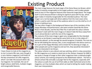
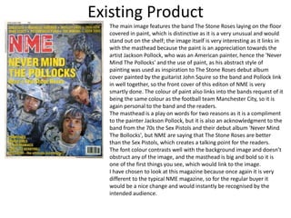
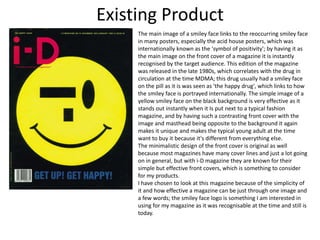
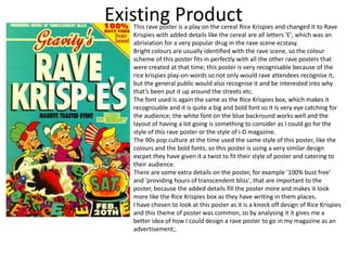
The document provides an analysis of existing magazine covers and posters from the 1990s related to rave culture and music. It examines features such as prominent images, color schemes, fonts, and references to establish recognizability and appeal to target audiences. The analysis considers incorporating similar aspects into a new 1990s rave fashion magazine.
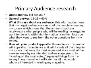
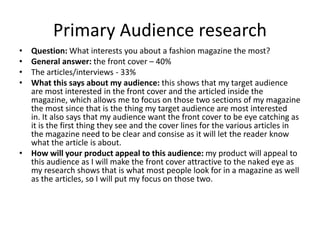
Here are some key insights from your practical research:
- Using a 35mm film camera will help capture photos with a nostalgic, retro 90s aesthetic that fits the theme of your magazine. Film cameras were very common in the 90s before digital became mainstream.
- Shooting on film requires a different photographic approach than digital. You'll need to be more selective with your shots since you can't review images immediately. This may result in more candid, natural-looking photos versus heavily posed shots.
- Film processing adds an authentic element that enhances the 90s vibe. Readers may enjoy seeing the behind-the-scenes of developing rolls of film for the magazine.
- Some limitations of film like grain,
The document provides information on existing magazines that could serve as examples for the author's planned fashion magazine. Proper Mag is highlighted as a Manchester-based independent magazine that focuses on streetwear fashion and culture. MixMag is a British electronic music magazine known for its simple but effective design style featuring a prominent DJ image and single-colored background. Rolling Stone is summarized as a popular American magazine about pop culture known for its iconic bold red masthead and large central images highlighting the main articles.
- Pop magazines like We Love Pop and Top of the Pops target young girls ages 8-14 and feature popular artists and celebrities to promote fashion, beauty, and lifestyle topics relevant to their audience.
- The magazine covers follow conventions like prominent images and mastheads in bright colors complementing the main image to draw readers' eyes and sell lines to intrigue readers to purchase. Language is simplified and uses terms like "omg" to connect with readers.
- Features typically include fashion advice, celebrity gossip, competitions, and free gifts like posters to attract young readers and decorate their rooms, following the interests of their target audience. The magazines aim to inspire girls through the lifestyles of celebrities and support identification with
The document analyzes the front covers of several music magazines, comparing their design elements and how they target different audiences. For Top of the Pops magazine, which targets teenage girls, the analysis notes the use of bright colors, celebrities, and slang to appeal to readers. Billboard magazine, aimed at ages 16-28 of both genders, features Katy Perry and uses pink and blue to attract multiple demographics. Kerrang magazine, focused on rock music, has a bold title and short headlines featuring exclamation points to grab attention. Across magazines, common design elements include the masthead, barcodes, and consistent color schemes, while language, images and styles are tailored to each publication's unique genre and readership.
The document discusses practicing an interview with a student to gain experience for when interviewing a specialist for their fanzine, noting that the interviewee was knowledgeable about their topic and answered questions thoroughly, and that follow-up questions allowed for more in-depth answers and approaching questions from different angles.
The document outlines an interview opportunity with Jo Ward, a trauma specialist of 37 years, to discuss mental health topics like trauma, causes of mental health issues, where to get help, and Ward's interest in the
The document provides information on Adverse Childhood Experiences (ACEs), which are potentially traumatic events that can occur during childhood, such as experiencing or witnessing violence, abuse, or neglect. It also lists several mental health professionals who are available for an interview, including Jo Ward, Dale Ward, and Jake Mawer, who have various years of experience working in mental health and specializing in trauma. The document requests discussing issues related to mental health, trauma, and getting help or raising awareness on these topics in the proposed interviews.
The magazine cover features Jake Bugg looking directly at the camera with a stern expression to seem serious and connect with readers. The main story is about him giving up alcohol at age 18, which would attract readers with its personal nature. Other design elements aim to position the magazine as rebellious and promote its target artists, including the informal name "NME", bold colors, and taglines about bands like Nirvana. Overall the cover design strives to intrigue and attract readers through personal stories, prominent images and text, and associations with featured rebellious musicians.
Researching codes and conventions of music magazines double page spreadEvijaKapeljuha
The document discusses the codes and conventions used in music magazines including Q Magazine, Kerrang!, and Billboard. Some common conventions discussed include:
- Using large, prominent images of artists that take up an entire page to highlight their importance.
- Employing direct eye contact in photos to create a personal connection with readers.
- Organizing articles in columns for easy reading.
- Maintaining consistent color schemes and fonts to build brand recognition over time.
- Including additional photos on double page spreads to provide more insight into the featured artist.
The document discusses practicing an interview with a student to gain experience for when interviewing a specialist for their fanzine, noting that the interviewee was knowledgeable about their topic and answered questions thoroughly, and that follow-up questions allowed for more in-depth answers and different approaches to questions. Conducting the practice interview helped the interviewer learn what works well and what does not work as well when interviewing.
The document provides details about various music magazines, including their target audiences, cover designs, and content layouts. NME targets 15-24 year old males but includes various artists to attract a wider audience. Top of the Pops targets 11-16 year old girls with bright colors, jokes, and prizes. Kerrang uses dark colors and images of rock bands to appeal to fans of rock music. The magazines employ various design techniques tailored to their target demographics.
The document discusses how various elements of magazine covers provide cues to readers about the genre or target audience of the magazine. These elements include the colors used, the models or celebrities featured, mastheads or titles, and the types of articles mentioned in cover lines. Specific examples are provided of how magazines focused on genres like pop, rock, jazz, and rap would differ in their visual design choices to clearly signal their musical focus to readers.
The document discusses a media studies coursework assignment evaluating a student's mock magazine. It provides details on the magazine's design elements, conventions used, target audience, and how it represents and attracts that audience. Specifically, it summarizes that the magazine draws inspiration from Kerrang magazine's style and targets young adult rock music fans, using formal language, fashion photography, and references to bands like Florence and the Machine to appeal to and represent that social group.
The document summarizes the analysis of a Billboard magazine cover:
- The masthead is simple and recognizable even partially covered.
- The main image uses Miley Cyrus, a well-known pop singer, to appeal to fans and portray a serious music industry.
- The main cover line asks a rhetorical question about Miley Cyrus to engage readers about her article inside.
- Additional lines briefly highlight other artists and articles to indicate the magazine's music genre.
- The color scheme is simple, sophisticated, and modest using light shades of purple, silver, yellow, and white.
The document summarizes the key things the author learned from constructing their media product, a music magazine. They learned about:
1) Design conventions for magazine covers, contents pages, and spreads from researching real magazines.
2) The importance of audience research to understand what would attract their target readership.
3) Digital skills like using Photoshop, InDesign, and iMovie to design, edit photos and record audio for the magazine.
4) The value of planning, research, and understanding conventions before beginning a media project.
This magazine cover targets a rock and indie music audience aged 16-29. The large red title stands out against the black background. The main image shows a band that could be featured in the main article. Additional images and text provide information on bands and articles inside the issue, including a free poster. While there is some empty space, key elements like the price and issue date are included.
This document discusses the design choices made for an indie rock magazine called "Noise". The cover features the bold masthead in red with the artist Lucy as the main image. On the contents page, features are listed relating to indie rock and images continue promoting Lucy as the focus of the main article. Continuity is created through consistent fonts, colors and imagery of Lucy across the pages. The target audience of 16-24 year olds interested in indie rock is addressed through the genre-focused content and social media links.
The document discusses research conducted for a student's music magazine coursework project on hip hop genres. It includes an analysis of an existing hip hop magazine called Vibe and a questionnaire distributed to students aged 14-20 about their music preferences and what they want in a magazine. Key findings from the questionnaire indicated that most listeners were 14-16, listened to hip hop and R&B, and preferred gossip features in a magazine that costs £1-2.
The document summarizes how the student's music magazine uses, develops, and challenges conventions of real music magazines. The magazine uses conventions like a short, music-related title ("SOUNDS") and placing the date/issue below the title. However, it challenges conventions by placing the cover line above rather than beside the cover image for clarity. The magazine represents the R&B genre and its typical audience of teenagers and young adults, especially of black heritage, through the cover image, colors, and styles. The magazine could be distributed by the student online through social media promotion or by a large company using various advertising. The intended audience is those interested in R&B music ages 14+. The magazine aims to attract this audience through its
My music magazine evaluation questionsJamesSlator1
This document discusses the design process for a music magazine called Nostalgia. It summarizes that the magazine is aimed at readers who enjoy music from previous decades. Stylistic choices were made to evoke nostalgia through fonts, colors, and modeling styles inspired by past eras. Research was done on popular music magazines' conventions to determine what works and what could be adapted to fit this retro-focused magazine. The target demographic was identified as broad to encompass many age groups and backgrounds united by a shared nostalgia for older music.
The document analyzes the contents pages of several music magazines, including Billboard, Q, Rolling Stone, Vibe, and NME. Some key points made:
1. Contents pages use images, headings, and brief descriptions to entice readers to specific articles.
2. Layouts are clear with sections, page numbers, and lists of articles for easy navigation.
3. Designs mirror the magazines' brands with consistent colors, logos, and styles to feel recognizable to readers.
4. Images are prominently featured to draw readers in using popular artists or celebrities from featured stories.
The document provides information about Kerrang! magazine, including its purpose, publisher, form and style, content, genre, and target audience. Kerrang! aims to provide rock music news and information to its primarily male readership between ages 15-24. It uses a bold design with red and black colors to match the rock genre. The publisher, Bauer Media, owns over 80 brands across magazines, radio, TV, and online.
The document provides details on the design and layout of a music magazine cover focusing on the band Oasis. Key points include:
- The cover uses a clear color scheme of black, red, and white with a large pull quote about Oasis on the left side.
- The main photo in the center shows band member Liam Gallagher staring directly at the camera to catch the reader's eye.
- Additional stories are listed down the right side to attract readers interested in other artists.
- Collectors stickers are included to encourage fans to purchase both magazine covers.
- Overall the layout maintains a consistent font, color scheme, and organization to appear polished and professional.
Q magazine stands out from other music magazines through its distinctive style and focus on rock and indie music. It uses a limited color palette and bold, thick fonts. The logo prominently features bright red. Articles address the reader directly to encourage connection. Photos depict older artists to appeal to the magazine's older target audience. Q focuses on bands that have been around for a long time and showcases their rock music. It releases issues monthly to increase demand and allows raising prices to boost profits.
Through completing a course on media, the document discusses creating a music magazine front cover, contents page, and double page spread using Photoshop. Research was conducted on the history of pop music and case studies were used to create the three media pieces. The pieces were designed to follow conventions of real pop music magazines through using bright colors, common layouts, and representing various female social groups that enjoy pop music.
The document provides an in-depth textual analysis of the layout, design elements, and intended audience of music magazine covers and contents pages. It analyzes elements such as the masthead, images, fonts, pull quotes, and color schemes used and discusses how they relate to the magazine's target demographic and goal of promoting music in the rock/indie genres. Key details like the placement of the magazine name and use of simple yet striking fonts and colors are examined. The intended audience is identified as people aged 18-30 interested in rock/indie music.
This document provides details on planning and designing a music magazine targeted towards 16-24 year olds. It includes a reader profile describing the target audience, mission statement, cover price and frequency, color inspiration, font and title inspiration, cover and content page picture inspiration and plans, and preferred setting and location for photography. The target audience is primarily female, interested in a wide range of music genres, and fashion/technology. The magazine will be published monthly at £4.99 and feature the latest music news, interviews, photos, and reviews.
Through completing a course on media, the document discusses creating a music magazine front cover, contents page, and double page spread using Photoshop. Research was conducted on the history of pop music and case studies were used to create the three media pieces. The pieces were designed to follow conventions of real pop music magazines through using bright colors, common layouts, and representing typical social groups that read pop music magazines.
- The first music magazine was founded in 1894 called Billboard which was devoted to the music industry. Music magazines became popular in the 1950s-1960s with magazines like NME and Rolling Stone.
- Some of the biggest music magazine publishers today include Rolling Stone, NME, Smash Hits, Kerrang, and Billboard. They cover various genres of music and have large international readerships.
- Music magazine covers use visual elements like photos and minimal text to attract readers' attention. Colors, layouts, and logos are consistent to help readers recognize the magazine. Covers aim to appeal to the target demographic for each publication.
The interview discusses Mia McClune's rise to fame as a newcomer in the music industry. Mia talks about how music has always been a big part of her life and how surprised she was by her success, including having her single "Number One" reach the top of the charts. She also discusses enjoying performing live for her fans at venues like Wembley Arena and dealing with increased public attention from paparazzi. When asked for advice, Mia encourages others interested in singing to pursue their dreams and not have any regrets.
The document describes how the author's media product, a music magazine called Jukebox, uses conventions of real music magazines. It discusses design elements like the masthead, cover lines, and use of black and white photos on the cover and contents pages to mimic magazines like Rolling Stone. Photoshop was used to edit photos and layout the pages in Publisher. Feedback from test audiences informed changes between the preliminary task and full magazine, such as relocating the logo and barcode and keeping the eye-catching red text color. The author learned about magazine design conventions and technologies like Photoshop and Publisher in creating their media product.
The document discusses how the author's music magazine product uses and develops conventions of real music magazines.
It describes several key conventions the product follows, including using a masthead with a distinctive font to create a strong brand identity, including "lures" like advertisements to attract readers, avoiding covering band members' faces with text, and placing cover lines above images in a prominent color.
The contents page, double-page spread, and other elements also follow conventions for layout, branding and design found in magazines like Rolling Stone and Classic Rock. The author learned to effectively use design software like Photoshop and Publisher to construct the magazine product.
The document discusses how the media product, a music magazine called Jukebox, uses conventions of real music magazines. It describes how the front cover uses conventions like a masthead, cover lines, and a lure to attract readers. The contents page also follows conventions like consistent branding and providing navigation. The double page spread similarly uses conventions from other magazines like columns, quotes, and a folio. The document also discusses how the product represents its target audience of older teenagers and younger adults interested in classic rock.
The document discusses potential genres that could be chosen for a magazine: R&B, classical, and pop. Pop is selected as the genre because the author is most familiar with pop music, artists, news, and magazines in that genre. Potential masthead names are also discussed: Harmonise, Fusion, Melody, Chorus, Fantasia. Research is done on existing pop music magazines like Billboard and We Love Pop to analyze layout, design, and content. Different article styles are also examined including a Q&A, behind the scenes, and what's hot this week format. At the end, a question will be included in a questionnaire to get others' opinions on the masthead name.
Grace Arnell is proposing to create her own music magazine focused on the genre of pop rock. She has researched existing magazines in this genre such as Kerrang, Q, Top of the Pops, and Rolling Stone to inform her decisions. Her magazine will be published monthly and target an audience of males and females aged 16-25 from social classes B and C1. She plans to include photos of a female cover model wearing pop rock-inspired outfits, as well as black and white interior photos with a feature article. The magazine will be published by Bauer Media Group due to their experience with similar rock magazines.
The document provides an analysis and evaluation by Samantha Pople of various magazine covers in order to inform the design of her own music magazine cover. She looks at color schemes, layouts, fonts, and main images on existing covers from magazines like Q, Rolling Stone, and NME. Samantha decides on a 2-4 color scheme with contrasting colors and either bold or pastel hues. She also experiments with editing photos and choosing appropriate fonts and images for her own cover.
The document discusses ideas for two music magazines called Flat Bass and TV. For Flat Bass, the summary proposes keeping a casual layout seen in the inspiration magazine XXL, including repeating its color scheme and placing the main headline at the bottom of the cover. For TV, it suggests a more professional design seen in the inspiration magazine, with a bold font, memorable masthead, and color scheme of black, red, and yellow. Both magazines aim to attract mature music fans through interviews, gossip, and previews of upcoming content to encourage monthly purchases. Repetition of elements from inspiration magazines and subtle differences are intended to clearly communicate the genre while keeping the magazines unique.
The document discusses plans for producing a monthly music magazine, including scheduling content creation, editing, layout, printing, and distribution. Key stages involve assigning articles, designing pages, proofreading, and approving the final printed copies before mass production. The production process is outlined day-by-day to coordinate all tasks needed to launch each issue of the magazine on time.
The document discusses plans for two hip-hop magazines called Tune and RW. It includes details on the magazines' mastheads, colour schemes, target audiences, layouts, and designs. For inspiration, it examines the popular magazine XXL. The document explores font styles, mood boards, draft covers, and double page spreads. It aims to establish brand identity and appeal to 15-35 year olds interested in hip-hop music and culture.
The document discusses how the media product uses, develops, and challenges conventions of real magazines. It summarizes how the magazine's masthead, fonts, layout, and photos on the cover both follow and challenge common conventions. For example, the masthead font is simple like most magazines but not as bold, and the cover photo was swapped from the planned main story to have a more professional studio shot. The document also discusses how the magazine represents social groups by featuring both male and female models in a casual, non-gendered way and having a color scheme not biased to any gender.
This document discusses the key features and characteristics of music magazines. It explains that music magazines cover a range of music genres and are aimed at advertising those genres to audiences through interviews, release dates, and merchandise ads. Content includes images of artists, venues, and studios to provide visuals related to stories. Characteristics that music magazines typically share are visual style, varied fonts and colors, language tailored to the target audience, and frequent publication rates. Standard features found across magazines are mastheads, cover lines, price, main cover image, and color schemes, which help identify the magazine and attract intended readers.
The document discusses how the author's music magazine product uses conventions of real music magazines.
It describes several design elements used that follow conventions, such as a masthead, cover lines placed above the main image, and no text covering faces on the cover. Photoshop was used to edit images to black and white to give an "old effect."
The contents page also uses conventions like page numbers and headings to help navigation. A website link is included to promote the brand online. Text formatting and layout of articles on inside pages similarly follow conventions of other magazines.
The magazine aims to engage with mod culture through its design elements that reference symbols of mod subculture like the Union Jack. These include the masthead, cover lines in red, white and blue, and a feature photo of a band member addressing the camera intensely. The double page spread continues these design elements and features a large photo of a band in black clothes against a background with graffiti, appealing to the aesthetic tastes of the target audience. The magazine targets males aged 18-45 interested in mod music, fashion, and lifestyle, especially those interested in reliving the mod revival era or passing the culture to younger generations.
My audience are Indie music fans aged 16 years old from working and middle class backgrounds. They enjoy reading interviews and have a chance to win prizes in a magazine priced between £2-£3. The magazine covers all aspects of Indie music through sophisticated colours and balanced text and images to appeal to a wide readership.
The document describes a music magazine the author created focused on the pop genre targeting young female audiences. Key details include:
- The magazine uses bright colors and images of popular young artists to attract young readers and allow them to indulge in information about their favorite musicians.
- Both male and female artists are featured to serve as role models or "crushes" for the target audience and intensify their desire to purchase the magazine.
- In creating the magazine, the author took inspiration from existing popular magazines like "We Love Pop" in its design conventions and layout.
Max Schofield discusses the creation of their music magazine "Jukebox". They followed conventions of real music magazines by including a masthead, organizing text and images, and using techniques like black and white photos. Photoshop was used to edit images and layer text. The target audience is older teenagers and young adults interested in classic rock. Key elements like the front cover and contents page were designed to attract this audience through bold colors, fonts, and band mentions. Through this project, Max learned skills in Publisher, Photoshop, and magazine design conventions.
This evaluation form provides guidance for evaluating creative media projects at Level 3. It recommends using appropriate terminology, staying concise and focusing on key points, evaluating statements, and focusing on work judgements rather than process. The document outlines sections for project overview, research, development, outcomes, personal response, evaluation, and analysis. It provides a framework to critically reflect on successes and challenges, and rate the overall quality of the completed project.
Through attending the Aesthetica film festival with classmates from York College's media department, the student witnessed a Film4 masterclass on developing shorts into features. The masterclass featured an interview with director Alexandra Brodski discussing her previous short film 'Joy' and TV series, as well as her upcoming work. Though not pursuing a career in media, the student found the discussion inspiring as it provided insight into the careers of young directors and the hard work required to succeed in the film industry.
This document contains a production diary for Alfie Jones' mental health fanzine project. It includes drafts of opening articles, interview layouts and questions, cover designs, and illustrations. Feedback was provided on early drafts from Alfie's tutor. Final drafts of interviews with Joanne and Dale Ward were developed based on their detailed responses. The back pages were updated with different helpline information.
Alfie Jones is a 17-year-old creative media student currently in his second year at York College. He has worked as a waiter at Wheatlands Lodge Hotel since February 2019 and as a customer assistant/personal shopper at Tesco since September 2020. Alfie is looking for new shifts on Mondays and Tuesdays as he wants some weekends free. He has skills in being hard working, productive, conscientious, and able to work independently or as part of a team.
This document outlines the planning and production schedule for a fanzine on mental health. It includes developing a mood board for inspiration, deciding on content such as 3 interviews on mental health over time, and illustrations. A pagination plan is provided showing the layout and order of content. Organizational documents like interview questions and message proofs will be created. The 4-week production schedule details tasks like conducting interviews, writing and designing content, and additions before the deadline.
This document contains information about conducting interviews for a fanzine project. It discusses practicing an interview with a student to gain experience. Some things that went well included the interviewee's knowledge on the topic, asking open-ended follow up questions, and researching beforehand. Things that did not go as well were not taking thorough notes during the interview, not ending on a strong question, and questions could have been more creative. The document also discusses experiments with layout design, image filters, and page concepts for the fanzine. It explores using pastel colors, different filters to alter images, and incorporating illustration pages between interview sections.
Alfie Jones proposes creating a fanzine about mental health aimed at 16-24 year olds. They will conduct interviews with experts in the field and include information pages about mental health over different decades. Alfie will take photos on their iPhone and edit them in Photoshop. They will research mental health topics to inform interview questions and content. The fanzine will be evaluated through weekly reflections and a final self-evaluation to improve future projects.
This document outlines the planning and production schedule for a fanzine on mental health. It includes ideas for content such as interviews from practitioners over different decades and informational articles. The planning details a pagination outline with illustrations interspersed between content. Organizational documents like interview questions and proofs are also mentioned. A 4-week production schedule is provided, with tasks broken down by week such as conducting interviews, writing content, and designing layouts.
This document outlines the planning and production schedule for a fanzine on mental health. It includes ideas for content such as interviews with mental health professionals from different eras and informational articles. A mood board shows inspiration for the pastel color scheme and homemade aesthetic. A detailed pagination plan lists what will be on each page, including interviews, illustrations and help resources. Organizational documents like interview questions and proofs are also mentioned. Finally, a 4-week production schedule is provided, breaking down tasks like conducting interviews, writing content and designing pages to be completed each week before the fanzine's completion.
Alfie Jones proposes creating a fanzine about mental health aimed at 16-24 year olds. They will take photos on their iPhone and edit them in Photoshop. The fanzine will feature 2-3 interviews about mental health to raise awareness and educate young people. Alfie has experience with Photoshop from previous projects and conducting interviews. They will research mental health topics and fanzines for inspiration. The project will be evaluated through weekly reflections and a final self-evaluation.
This document provides a treatment for a project focusing on the progression of mental health from the 1990s to present day. The project will take the form of a fanzine targeted at a young audience. It will include interviews with three individuals who have worked in the mental health industry for varying lengths of time, from nearly 40 years to just 5 years. The purpose is to raise awareness of mental health issues and educate people, with a focus on trauma. Visual materials will come from sources like Pinterest, scanned textbooks, and archives. The fanzine will have 12 pages covering the history of mental health perceptions and treatment over time as well as the three interviews. Creating a fanzine links to the creator's specialism of print
This project treatment proposes creating a fanzine to raise awareness about mental health and its progression over time from the 1990s to today. The fanzine will feature interviews with three people who have worked in the mental health industry for different lengths of time, from 37 years to 5 years, to provide perspectives on how the field has developed and changed. The intended audience is young people, and the fanzine will use illustrations and bright colors to appeal to this group and show them that suffering from mental health issues is normal and there are healthy ways to cope. The fanzine will include sections on mental health in different eras and interviews to look at the topic in-depth from different angles.
The student is considering creating either a lifestyle/fashion magazine or album cover/music poster as their final major project. They enjoyed creating a magazine for a previous project and want to try something different this time. They feel their project will be personally important as it will portray the lifestyle they currently live or want to live. Some influences for their idea include the I-D magazine for inspiring their previous project and their friends who have different lifestyles. They want their project to make the audience think about whether they are happy with how they live and dress. They plan to employ a minimalistic tone and color scheme like their previous project to make it an easy read while still engaging the audience. Portraying different fashion styles will allow them
This document outlines a series of photography experiments and activities to improve DSLR and photography skills. It includes experiments such as taking photos that follow the rule of thirds composition, photos of shadows, reflections, close-ups of everyday objects from different angles, photos focusing on one object from different perspectives, photos of textures and colors, and photos that utilize negative space in their composition. The instructions encourage photographers to take multiple photos for each activity and choose the best examples to include.
Alfie Jones is applying to university through UCAS to study media-related degrees. He has achieved strong GCSE results including grades 5-7. Currently, he is studying an Extended Diploma in Creative Media Production at York College where he has created various media projects developing skills in Adobe Premiere Pro, animation, and magazine design in Adobe Photoshop. Alfie is interested in studying either music or fashion media at university to further his career in the media industry. He works part-time jobs to support himself and plays football in his free time, demonstrating commitment.
The student evaluated their production process for a 1990s fashion magazine FMP. Their strengths included thorough research of existing magazine covers and a rave flyer, which helped them understand conventions and informed their own designs. Their planning was detailed and helped ensure they could adapt to any issues. Weaknesses included neglecting research of other magazine elements beyond covers. Their time management was good for production but poor for research, limiting detail. Overall the experience helped them learn to better balance research across elements and manage time more efficiently.
The document is a production diary detailing the process of creating a magazine. Over 15 days, the diary documents revisions made to the front cover, contents page, and double page spreads. Key revisions included changing images and color schemes to improve layouts and consistency across pages. Photos were taken with an iPhone and 35mm film camera, with some film photos preferred for their vintage look. Spray painting was done to include an acid house smiley face in a double page spread background. The diary shows the iterative creative process of refining and finalizing the magazine design.
Alfie Jones proposes a project to create multiple pages for a 1990s-themed magazine, including a cover, contents page, and spreads. They will take photos and layout the pages in Photoshop. Their rationale is that they enjoyed creating a magazine cover previously and have experience laying out pages. The project will evaluate the magazine pages and Alfie's reflections through weekly journals and a final self-evaluation.
The document provides details for the pre-production of a fashion magazine focused on the 1990s rave scene. It includes potential style sheets with font and color scheme options, layout plans, costume ideas, location options to scout, model details, and a production schedule. The pre-production planning addresses the purpose, target audience, content, branding, photography, and timeline for the magazine.
Alfie Jones proposes creating a magazine from the 1990s focusing on rave culture for his project. He will take photos for the cover, contents page, two double page spreads, and two single page ads. Alfie has experience making magazines and wants to transport readers back to 1990s UK rave scenes. He will research 1990s fashion, culture and magazines to authentically capture the decade. Alfie will evaluate his work through weekly reflection journals and a final self-reflection to improve for next year.
Boudoir photography, a genre that captures intimate and sensual images of individuals, has experienced significant transformation over the years, particularly in New York City (NYC). Known for its diversity and vibrant arts scene, NYC has been a hub for the evolution of various art forms, including boudoir photography. This article delves into the historical background, cultural significance, technological advancements, and the contemporary landscape of boudoir photography in NYC.
This tutorial offers a step-by-step guide on how to effectively use Pinterest. It covers the basics such as account creation and navigation, as well as advanced techniques including creating eye-catching pins and optimizing your profile. The tutorial also explores collaboration and networking on the platform. With visual illustrations and clear instructions, this tutorial will equip you with the skills to navigate Pinterest confidently and achieve your goals.
Hadj Ounis's most notable work is his sculpture titled "Metamorphosis." This piece showcases Ounis's mastery of form and texture, as he seamlessly combines metal and wood to create a dynamic and visually striking composition. The juxtaposition of the two materials creates a sense of tension and harmony, inviting viewers to contemplate the relationship between nature and industry.
Fashionista Chic Couture Maze & Coloring Adventures is a coloring and activity book filled with many maze games and coloring activities designed to delight and engage young fashion enthusiasts. Each page offers a unique blend of fashion-themed mazes and stylish illustrations to color, inspiring creativity and problem-solving skills in children.
2. Existing Product
The main image features the lead singer of the Stone Roses Ian Brown, which
makes it instantly recognisable to the target audience, and it makes people
want to buy it if the magazine features their favourite singer/band. The image
itself is iconic because Brown is doing his signiture pose with his lips, which
again makes it instantly recognisable for the intended audince. The main
image is at a normal angle with direct address from the main cover artist,
which is used to catch the eye of the audience when it is on the shelf as it is if
Brown is looking at you.
The two other images in the background feature two of the members of the
Happy Mondays mid performance, who were another band like the Stone
Roses in that decade, and the blue filter fits in well with the colour scheme
and doesn’t clash with the main image as it doesn’t take the focus away from
it as it almost blends in with the rest of the magazine.
The costume of the main image is again very recognisable for the intended
audience as Ian Brown is wearing the same tshirt as he is in the video of 'I
wanna be adored', so the average fan would recognise it instantly. The man on
the far left holding the maracas, Bez, is very recognised in the dance scene as
he is part of the Happy Mondays and is known for his dancing on stage, so
when people pick up the magazine and see him, they would be interested if
they are interested in Ian Brown.
The colour scheme is very vibrant and eye catching, which is a key convention
for 90s magazines as it needs to stand out on the shelves, however for NME it
was quite a change of image as their other magazines have a relatively bright
colour scheme, but nothing compared to this Madchester edition. The font is
almost cartoon like and adds a younger feel to the magazine, especially with
the colours as well; the use of serif font adds an older fashioned sense to the
magazine, so it has multiple vibes which can lead to letting the reader making
their own interpretation.
I have chosen to look at this magazine as
to me it screams 90s rave, even though it
is not a fashion magazine it still holds all
the key conventions of a 90s magazine,
which I can take into account when I do
my magazine. For example, the use of
bright colours, bold fonts, multiple images
and recognisable features.
3. Existing Product
The main image features the band The Stone Roses laying on the floor
covered in paint, which is distinctive as it is a very unusual and would
stand out on the shelf; the image itself is very interesting as it links in
with the masthead because the paint is an appreciation towards the
artist Jackson Pollock, who was an American painter, hence the 'Never
Mind The Pollocks' and the use of paint, as his abstract style of
painting was used as inspiration to The Stone Roses debut album
cover painted by the guitarist John Squire so the band and Pollock link
in well together, so the front cover of this editon of NME is very
smartly done. The colour of paint also links into the bands request of it
being the same colour as the football team Manchester City, so it is
again personal to the band and the readers.
The masthead is a play on words for two reasons as it is a compliment
to the painter Jackson Pollock, but it is also an acknowledgment to the
band from the 70s the Sex Pistols and their debut album 'Never Mind
The Bollocks', but NME are saying that The Stone Roses are better
than the Sex Pistols, which creates a talking point for the readers.
The font colour contrasts well with the background image and doesn’t
obstruct any of the image, and the masthead is big and bold so it is
one of the first things you see, which would link to the image.
I have chosen to look at this magazine because once again it is very
different to the typical NME magazine, so for the regular buyer it
would be a nice change and would instantly be recognised by the
intended audience.
4. Existing Product
The main image of a smiley face links to the reoccurring smiley face
in many posters, especially the acid house posters, which was
internationally known as the 'symbol of positivity'; by having it as
the main image on the front cover of a magazine it is instantly
recognised by the target audience. This edition of the magazine
was released in the late 1980s, which correlates with the drug in
circulation at the time MDMA; this drug usually had a smiley face
on the pill as it is was seen as 'the happy drug', which links to how
the smiley face is portrayed internationally. The simple image of a
yellow smiley face on the black background is very effective as it
stands out instantly when it Is put next to a typical fashion
magazine, and by having such a contrasting front cover with the
image and masthead being opposite to the background it again
makes it unique and makes the typical young adult at the time
want to buy it because it's different from everything else.
The minimalistic design of the front cover is original as well
because most magazines have many cover lines and just a lot going
on in general, but with i-D magazine they are known for their
simple but effective front covers, which is something to consider
for my products.
I have chosen to look at this magazine because of the simplicity of
it and how effective a magazine can be just through one image and
a few words; the smiley face logo is something I am interested in
using for my magazine as it was recognisable at the time and still is
today.
5. Existing Product
This rave poster is a play on the cereal Rice Krispies and changed it to Rave
Krispies with added details like the cereal are all letters 'E', which was an
abriviation for a very popular drug in the rave scene ecstasy.
Bright colours are usually identified with the rave scene, so the colour
scheme of this poster fits in perfectly with all the other rave posters that
were created at that time; this poster is very recognisable because of the
rice krispies play-on-words so not only would rave attendees recognise it,
but the general public would also recognise it and be interested into why
that’s been put it up around the streets etc.
The font used is again the same as the Rice Krispies box, which makes it
recognisable and it is quite a big and bold font so it Is very eye catching for
the audience; the white font on the blue backround works well and the
layout of having a lot going is something to consider as I could go for the
style of this rave poster or the style of i-D magazine.
The 90s pop culture at the time used the same style of this poster, like the
colours and the bold fonts, so this poster is using a very similar design
excpet they have given it a twist to fit their style of poster and catering to
their audience.
There are some extra details on the poster, for example '100% bust free'
and 'providing hours of transcendent bliss', that are important to the
poster, because the added details fill the poster more and makes it look
more like the Rice Krispies box as they have writing in them places.
I have chosen to look at this poster as it is a knock off design of Rice Krispies
and this theme of poster was common, so by analysing it it gives me a
better idea of how I could design a rave poster to go in my magazine as an
advertisement;.
6. Research Analysis
• What common features do the researched products have?
• Each product is very colourful, with exception to i-D magazine however
the main smiley face has colour, so it links in. Each product has a very clear
masthead and main cover line, which is something I will focus on when it
comes to my product as I want the reader to know what is what, and I
want it to stand out from the other magazines, but still look like a 90s rave
fashion magazine.
• What aspects of the research will you include within your own
production work?
• I will include the bright colour scheme that is in all the existing products I
have analysed as I think it is easily recognised and is a key convention for
rave products in the 90s. Having a big and noticeable masthead is
something I will make sure I include as it is one of the first things the
reader will notice; by making the masthead, cover lines etc look unique
from all the other magazines on the shelf.
8. Secondary Audience research
• NME Magazine is a music-based magazine with a sub-genre of youth culture as
they focus their stories on music but link it to current topics like fashion of the
time; with their audience being a young, male dominated audience, music and
fashion is a key attraction to them and makes them want to buy it. With my
magazine being a fashion-based magazine with a sub-genre of music it is similar
overall, but the main genre are not the same, and the target audience are the
same as both magazines are targeting young males who have a high interest in
music and fashion.
• The music tastes for both magazines are different, however the youth culture is
what makes the two magazines similar as they share the interest of being young
and enjoying themselves wether that’s through rave music or indie music.
• The target age for NME magazine is 16-25 as it is aiming at young people to
portray youth culture through music, and my magazines target age is 16-25 as I
want to aim it at people who have never experienced a rave, so I want to try and
give them an insight on what they would've experienced. However, I sent my
survey to people of all ages, so the results are varied but the majority of the
9. Primary Audience research
• Question: Would you be interested in reading a 1990s fashion magazine?
If so, why?
• General answer: the overall response from this question was yes because
they are interested in the fashion from the 90s, they want to learn about
the fashion, or they want to read it to relive their youth.
• What this says about my audience: this says that my intended
audience are interested in a fashion magazine, as 60% of my responses are
from my target audience, so people from the age of 16-25 are
interested in what I want to make.
• How will your product appeal to this audience: my product will appeal to
my target audience as in my survey the answers showed that they are
interested in the fashion side of the 90s compared to the rave scene, so I
will make my product more fashion based than more rave scene based. I
will do this by writing about different fashion designers/fashion trends
compared to the rave scene itself, however I will still write about raves and
what happened as some of my responses show my target audience are
still interested in in, but just not as much as the fashion side of it.
10. Primary Audience research
• Question: What decade of music do you listen to the most?
• General answer: 90s – 26%
• 00s – 30%
• Modern – 23%
• What this says about my audience: the figures from this question show
that most of my audience listen to either the 00s or the 90s, which shows
that even people who don’t particularly listen to music from the 90s are
still interested in the fashion from the 90s. It also shows that the 90s
culture is still relevant and still in fashion as most of the people who said
they listened to 90s music did not live through the 90s.
• How will your product appeal to this audience: my product will appeal to
my audience as it will include information about music from the 90s as
particularly the rave fashion was heavily influenced by the music being
played at the raves, so by writing about the music at the time not only will
it appeal to the part of the audience that like the music from the 90s, but
also the other part of the audience that like the fashion.
11. Primary Audience research
• Question: How old are you?
• General answer: 16-25 – 60%
• What this says about my audience: this information shows
that my target audience are most of the people answering
my survey, which shows that the answers that I am
receiving are what people who will be reading my magazine
want to see in it; with this information I can then focus on
what they want to see from the other questions from my
survey.
• How will your product appeal to this audience: my product
will appeal to my audience as it will include all the things in
my survey that were the most requested since most of the
answers were by my intended audience age group. By
including all the most voted/requested things from my
survey in my magazine it will cater for all the people
who are interested in reading my magazine.
12. Primary Audience research
• Question: What interests you about a fashion magazine the most?
• General answer: the front cover – 40%
• The articles/interviews - 33%
• What this says about my audience: this shows that my target audience
are most interested in the front cover and the articled inside the
magazine, which allows me to focus on those two sections of my magazine
the most since that is the thing my target audience are most interested
in. It also says that my audience want the front cover to be eye catching as
it is the first thing they see and the cover lines for the various articles in
the magazine need to be clear and consise as it will let the reader know
what the article is about.
• How will your product appeal to this audience: my product will appeal to
this audience as I will make the front cover attractive to the naked eye as
my research shows that is what most people look for in a magazine as well
as the articles, so I will put my focus on those two.
13. Subject Research - Madchester
Madchester was scene in the late 1980s in Manchester for music and culture
aimed at young people where indie music linked in with rave music. The term
‘Madchester’ was first created by the label Factory Records in the early 1990s
when they had bands like The Stone Roses, Happy Mondays and 808 State.
The Madchester scene was heavily influenced by drugs, especially psychedelic
drugs like MDMA.
The Hacienda nightclub was almost seen as the base of Madchester since that
is where everyone across the country wanted to go to experience this new
scene in all its glory.
The new wave of music by Happy Mondays, The Stone Roses, 808 State, The
Charlatans etc. was the focus point of the new and upcoming scene as it was
new everybody and became the new wave of music that has lasted decades.
The culture side of Madchester was the fashion of baggy and oversized
clothes that were colourful to stand out in the nightclubs; the drug use of the
Madchester scene was massive as the drug ecstasy had just been discovered
in England, which was a big incentive for most people as it gave people a
sensation they have never felt before.
14. Subject Research - Raves
This survey shows that most ravers like to attend raves with their friends, so for my magazine
I could get some photos of multiple in rave gear, however it depends on the COVID
restrictions. Most ravers prefer to listen to house music, although this survey is for modern
ravers and not people who attended them in the late 80s/90s so by considering this
information when writing my articles it would not be accurate.
16. Practical Research
For my magazine I will be using a 35mm film camera for some/all the photos as it gives the photos a 90s vibe, and makes
the magazine look more professional. Also, when I get my photos developed, I will get them developed to the highest
definition possible to make the images look the best the can, and so the magazine looks as professional as possible.
17. Practical Research
I will incorporate the use of a fisheye lens in my products as I like the retro look that it brings
to various products. I will achieve this by either buying a fisheye lens to clip onto the back of
my IPhone or download an app that allows me to use a fisheye lens.
19. Bibliography
1. Jones, Alife (2021) Target Audience Research Survey (conducted on 3rd
March 2021)
2. Stewart, J. (2015). NME Media Pack. Available:
https://www.slideshare.net/jooly19/nme-media-pack-47505588. Last
accessed 14th April 2021.
3. Acosta, A. (). Ravers - Subcultures and Sociology. Available:
https://haenfler.sites.grinnell.edu/subcultures-and-scenes/ravers/. Last
accessed 14th April 2021.
4. Various Authors. (2021). Madchester. Available:
https://en.wikipedia.org/wiki/Madchester. Last accessed 14th April
2021.
Editor's Notes
Choose a recent product similar to your own and annotate it
Type of image- studio/location, angle, effects, post-production
Use of lighting/composition/mise en scene/costume/props/location/colours/fonts etc.
Audience appeal- how does it make its audience want to buy/watch/play it?
Why have you chosen to look at this? What have you learned that can help you in your project?
Use this space to record any secondary audience research you might do. This is finding out about the audience for existing products.
Use this for any primary audience research that you do. Questionnaires, interviews, vox pops, focus groups… whatever you did, record the responses here and note what you have learned and how it will influence your project.
If you do any additional subject research, record that here. This might be most relevant if you are producing a magazine or a documentary but even a fiction trailer might require some additional research in to a particular subject.
Getting some background information on your subject would be a really good idea.
Find some resources, log them, read them and write something about them.
Undertaking practical research is another great way to improve your project. Experimenting with techniques, equipment and processes you might want to use in you project will help you plan for the future.
Think about what you will research. It could be studio photography, or sound recording, or post-production techniques for video or animation techniques for a video game. Tutorials are useful here.
Make something similar but unrelated to your chosen idea.
Do not make it a version of your final product; it is an experiment
Provide a reflection of the processes you used and how it has been useful.
Don’t do something that you already know how to do.
List all products researched in previous sections. Include anything additional you have watched/read in preparation for production. Alphabetise your list.