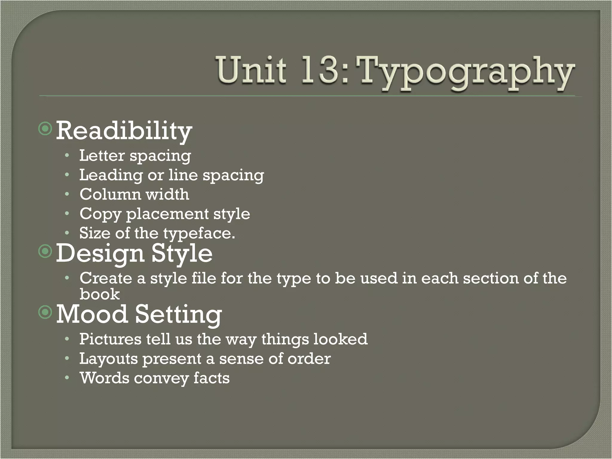
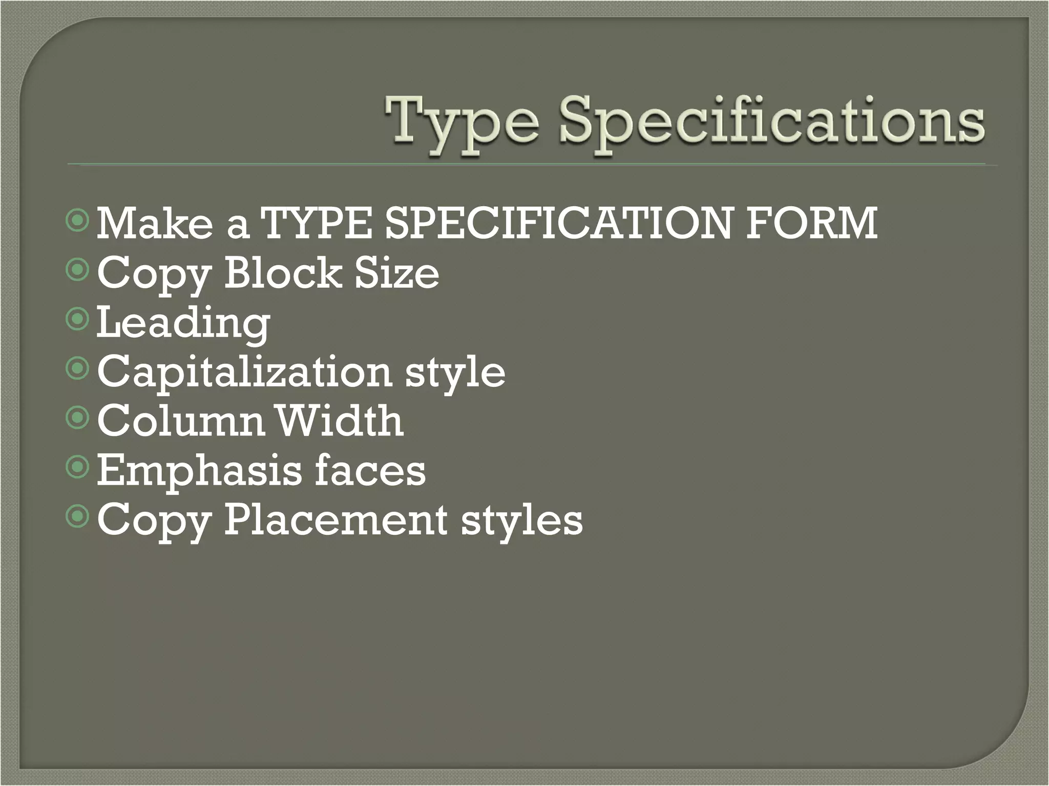
The document discusses various typography elements including:
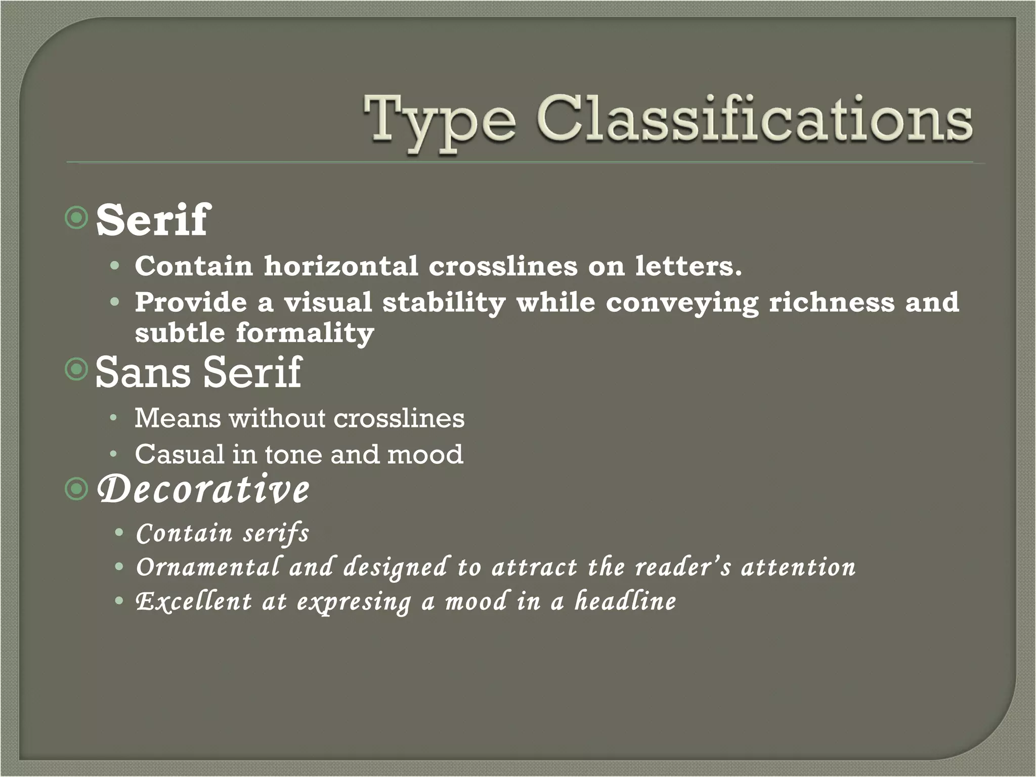
1. Typefaces have different styles such as serif, sans serif, and decorative that convey different tones and moods.
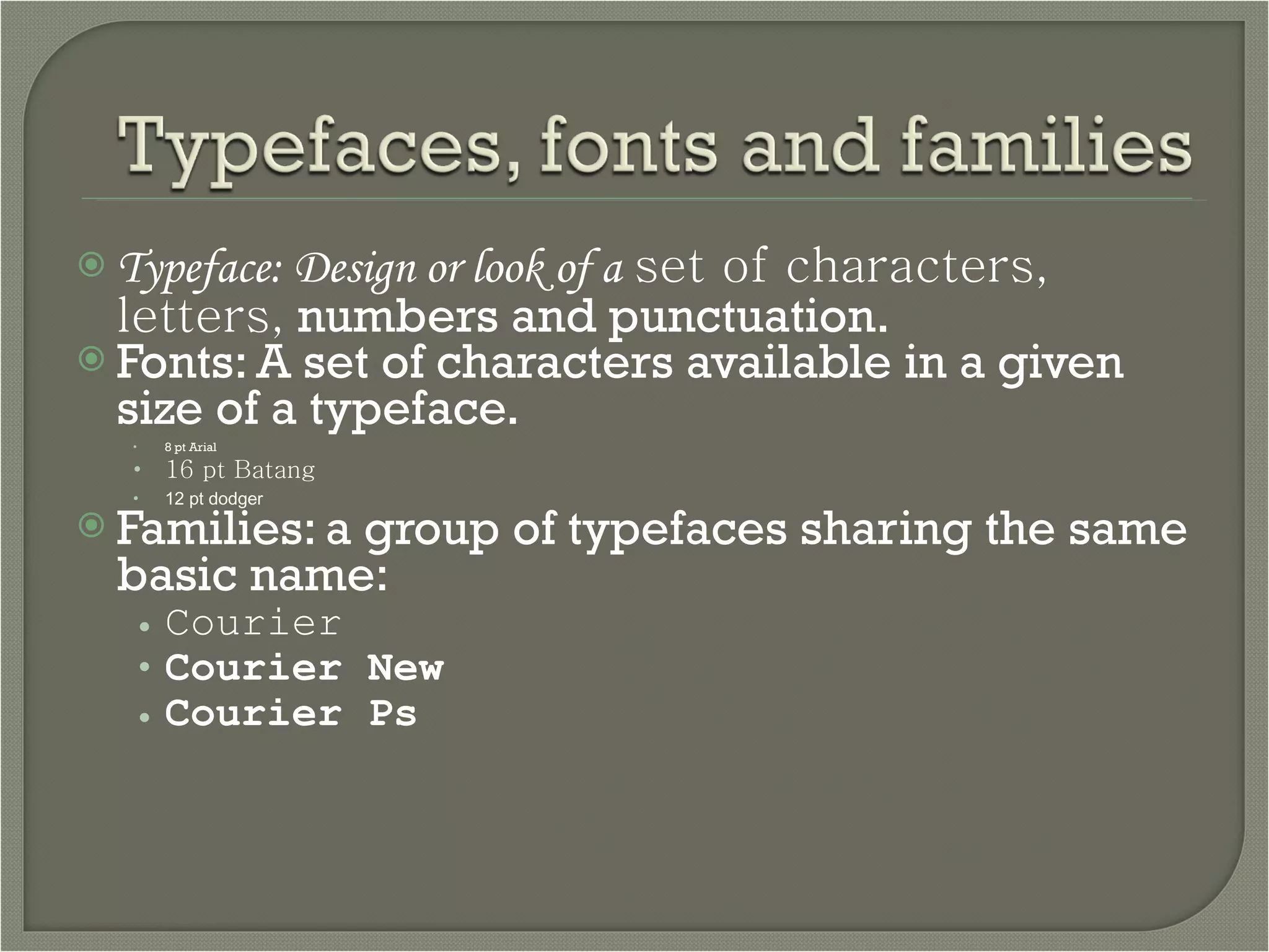
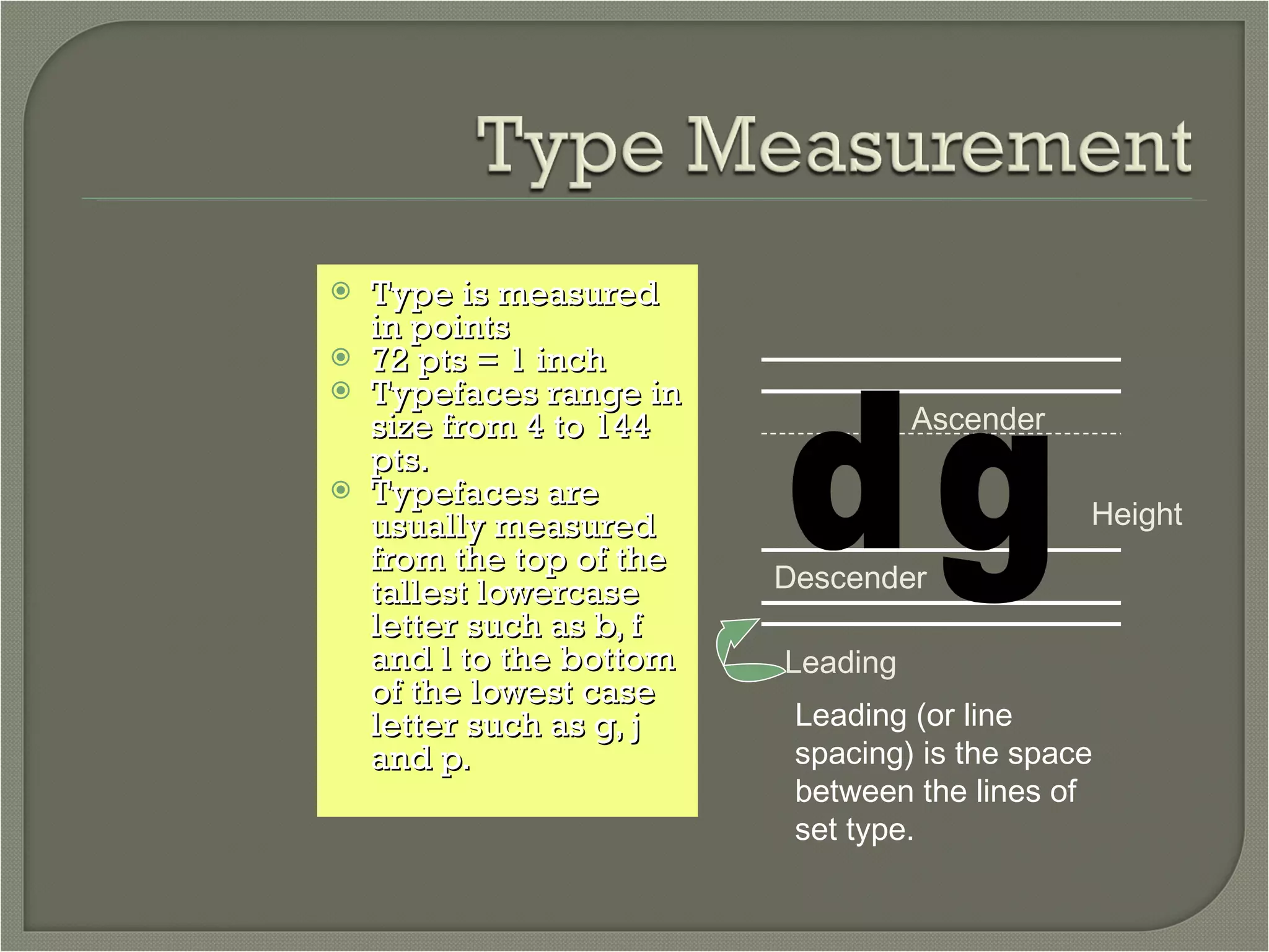
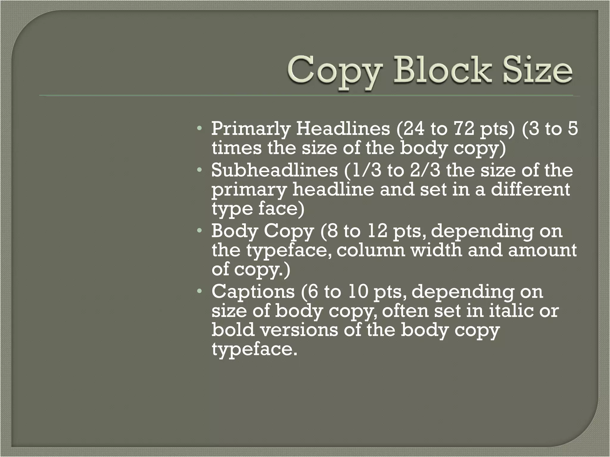
2. Fonts refer to a specific size of a typeface family. Type is measured in points and sizes range from 4 to 144 points.
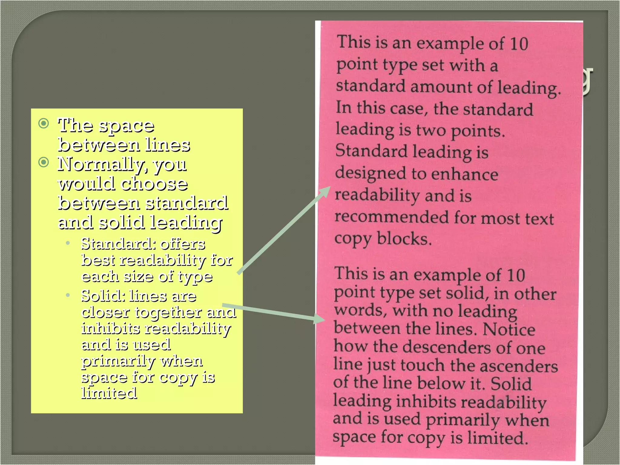
3. Leading, or line spacing, is the space between lines of type and impacts readability. Proper leading is important for layout and copy placement.
4. Headlines, subheadings, body copy, and captions have standard size ranges to create a visual hierarchy and guide the reader.


![[DevDay2019] Spacing and Typography, keys to a professional UI design - By Ng...](https://cdn.slidesharecdn.com/ss_thumbnails/duongnguyen-typographyspacing-190408082945-thumbnail.jpg?width=640&height=640&fit=bounds)
![Wd133 unit 4 module 1 learning about type fonts and properties[2]](https://cdn.slidesharecdn.com/ss_thumbnails/wd133unit4module1learningabouttypefontsandproperties2-150519234732-lva1-app6892-thumbnail.jpg?width=640&height=640&fit=bounds)
![Dig imag unit 4 module 1 learning about type fonts and properties[2]](https://cdn.slidesharecdn.com/ss_thumbnails/digimagunit4module1learningabouttypefontsandproperties2-150522194724-lva1-app6892-thumbnail.jpg?width=640&height=640&fit=bounds)


![[BROCHURE] Italy Tour Project | @SlideON](https://cdn.slidesharecdn.com/ss_thumbnails/brochure8-251215152319-2805af68-thumbnail.jpg?width=640&height=640&fit=bounds)


